
Text Placement vs. No Text: Thumbnail Impact
Thumbnails can make or break your video’s performance on YouTube. The choice between adding text or relying solely on visuals directly impacts click-through rates (CTR) and audience engagement. Here’s the key takeaway:
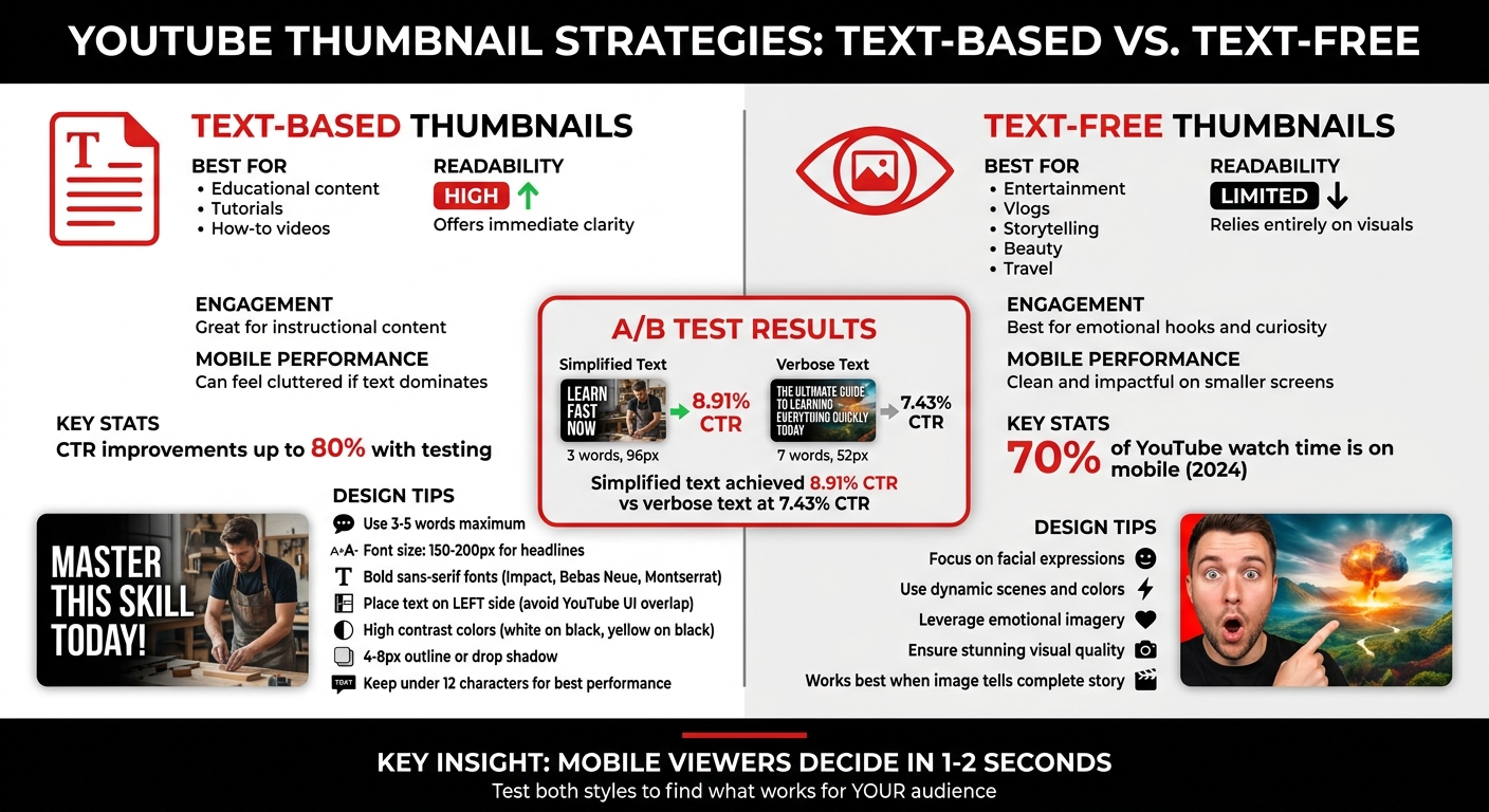
- Thumbnails with text work best for educational or instructional content. They provide clarity and context, helping viewers quickly understand the video’s value.
- Thumbnails without text excel at grabbing attention through visuals alone. They’re ideal for entertainment, vlogs, or storytelling where emotions and curiosity matter most.
Quick tips for better thumbnails:
- Use bold, readable fonts for text-based designs. Keep it short (3-5 words max).
- For text-free thumbnails, focus on facial expressions, colors, or dynamic scenes.
- Test both styles to see what resonates with your audience - CTR improvements can reach up to 80%.
Your thumbnail isn’t just a design choice - it’s a tool to drive clicks and grow your channel.
Text vs. No Text on Thumbnails: Which Gets Views?
sbb-itb-b59debf
Text Placement vs. No Text: Main Differences
Text vs No Text Thumbnails: Performance Comparison Guide
Choosing between text-heavy vs minimal text thumbnails isn’t just a design choice - it’s a strategic decision that shapes how your video connects with viewers. Text-based thumbnails excel at delivering instant clarity, making them perfect for audiences searching for specific answers. On the other hand, text-free thumbnails rely on visuals to tell a story, using elements like facial expressions, colors, or composition to spark curiosity and emotional engagement. Understanding these approaches can help you align your thumbnail strategy with your content and audience expectations.
Comparison Table: Text vs. No Text
| Factor | Thumbnails With Text | Thumbnails Without Text |
|---|---|---|
| Readability | High; offers immediate clarity for tutorials | Limited; relies entirely on visuals |
| Engagement | Great for how-to and educational content | Best for entertainment and emotional hooks |
| Mobile Performance | Can feel cluttered if text dominates | Clean and impactful on smaller screens |
| Aesthetic Appeal | May appear too busy without good design | Relies on stunning visuals for appeal |
Benefits of Using Text
Text on thumbnails delivers value quickly. For example, if someone searches for "how to fix a leaky faucet", a thumbnail that reads "3 Simple Steps" instantly shows the video’s purpose. This is especially effective for instructional or educational content, as highlighted by Derral Eves.
Text also serves as a secondary hook. When viewers skim through search results, they often notice thumbnails before reading titles. A well-designed thumbnail with attention-grabbing text can make the difference in that split-second decision. Using keywords that stand out visually - without simply repeating the title - helps your video stand apart in crowded niches. For instance, in a sea of similar tutorials, a thumbnail with concise, impactful text can highlight your unique take.
However, there are times when words aren’t necessary. If your content thrives on emotional appeal or visual intrigue, text-free thumbnails might be the better choice.
Benefits of No Text
When your goal is to evoke curiosity or emotion, text-free thumbnails can be incredibly effective. A dramatic facial expression, a breathtaking landscape, or a suspenseful scene can communicate more than words ever could. This approach works especially well for vlogs, entertainment, and storytelling content, where the focus is on the journey rather than a specific answer. Derral Eves explains:
"I've found that if people are looking to be entertained... you can get away with just doing more of a ha ha in a thumbnail, or in a shocked look... to grab [attention]."
Text-free designs also shine on mobile devices, where smaller screens make cluttered thumbnails harder to read. Without text competing for attention, the visuals can stand out and make a stronger impression. Beauty channels, travel vlogs, and cinematic content often benefit from this approach, as high-quality imagery can deliver the message on its own. In fact, adding text to such thumbnails might detract from the visual impact that naturally draws viewers in.
These contrasting strategies highlight the importance of tailoring your thumbnails to your content and audience, setting the stage for further analysis in mobile performance and A/B testing results.
How to Use Text Placement Effectively
When it comes to text-based thumbnails, placement and styling can make or break their effectiveness. Here's how to position text for maximum readability and visual appeal.
Where to Place Text
The left side of your thumbnail is ideal for text placement. Why? YouTube's interface often overlays elements like timestamps and "watch later" icons on the right side, which can obscure your message. If your thumbnail features a subject, like a person's face, on the right, placing text on the left not only avoids clutter but also creates a balanced design.
Avoid placing text in the center, as this area is best reserved for the main image or focal point. Instead, use the rule of thirds by aligning text with the points of an imaginary 3x3 grid. This approach provides a polished, professional look. The lower third is particularly effective since it aligns with natural reading patterns.
To ensure your text remains visible across all devices, maintain a 40-60 pixel margin around the edges. This prevents your text from being cut off in different viewing contexts. Attention to these details can significantly improve click-through rates - up to 40% in some cases.
Once you've nailed text placement, the next step is choosing fonts and styles that enhance readability.
Font Sizes and Styles
Thumbnails shrink significantly on mobile devices, often down to 168x94 pixels. At this size, small text becomes unreadable. For a standard 1280x720 thumbnail, aim for 150-200 pixels for primary headlines and 80-120 pixels for secondary text.
Bold, sans-serif fonts like Impact, Bebas Neue, or Montserrat Extra Bold ensure your text remains clear even at smaller sizes . Adding a 4-8 pixel outline or drop shadow helps separate the text from busy backgrounds. High-contrast color pairings - like white on black, yellow on black, or black on white - are particularly effective at grabbing attention. Always test your thumbnail at its smallest size (168x94 pixels) to confirm legibility.
Keep Text Short
Stick to 3-5 words maximum for your thumbnail text. Longer phrases can create clutter and dilute your message. Instead of repeating your video title, distill it into a concise, eye-catching phrase. For example:
- "How I Made $10,000 in One Month" becomes "I MADE $10K."
- "The Complete Beginner's Guide to..." simplifies to "BEGINNER GUIDE".
Short, impactful phrases in all caps create urgency and draw attention. If you find yourself needing more than five words to convey your message, it’s worth revisiting your concept for clarity. The goal is to communicate your hook at a glance while amplifying the visual impact of your thumbnail. This approach ensures your content stands out, even on crowded platforms like YouTube.
Performance Data: Text vs. No Text
A/B Testing Results
A/B testing provides clear insights into how text impacts click-through rates (CTR). In December 2025, Marcus Chen, a YouTube optimization consultant, conducted an A/B test for a personal finance channel with 142,000 subscribers. The video, focused on credit scores, used two thumbnail designs. Variant A featured seven words: "The Hidden Factor Destroying Your Credit Score" (text height: 52px). Variant B simplified the message to just three words: "Credit Score Mistake" (text height: 96px). With 4,891 impressions per variant, Variant B achieved an 8.91% CTR, outperforming Variant A's 7.43% CTR (p=0.0002).
"Mobile-first design constraints force clarity, which benefits all viewers." – Marcus Chen, YouTube Optimization Consultant
When it comes to CTR, text legibility is the second most influential factor (Cohen's d=0.54), following the presence of faces and emotional expressions. Across 127 tested videos, optimized thumbnails led to CTR increases ranging from 18-34%, with a median improvement of 23%. High-contrast designs, where text stands out from the background using effects like drop shadows or strokes, outperformed alternatives in 83% of tests (19 out of 23).
The type of content also plays a huge role. Channels focused on education and finance benefit from bold, clear text, while gaming content often thrives with minimal text or raw gameplay visuals. For instance, a tech review channel with 287,000 subscribers tested two thumbnail styles: one with just the product and another featuring the creator’s surprised face. The face-inclusive thumbnail achieved a 9.19% CTR, a 25.5% improvement over the product-only thumbnail’s 7.32% CTR.
These findings emphasize the importance of clarity, especially for mobile viewers.
Mobile Viewing Statistics
Mobile devices dominated YouTube watch time in 2024, accounting for 70% of total viewing hours. This shift has critical implications for thumbnail design. On a 6.1-inch smartphone screen, viewers typically decide whether to click in just 1–2 seconds. If text isn't immediately legible, it becomes a distraction rather than a draw.
The data backs this up. Thumbnails with fewer than 12 text characters consistently outperform those with more cluttered designs. While average CTRs hover around 3-4%, top-performing channels regularly achieve 5-10% through rigorous testing. A CTR below 3% signals room for improvement, 4-5% is solid, and anything above 7% is exceptional. For smaller channels, proper testing requires at least 1,500-2,000 impressions per variant to avoid the 43% false positive rate associated with tests under 1,000 impressions.
Together, these results highlight the dual importance of clear text and mobile-friendly design in maximizing CTR.
When to Use Text vs. No Text
When to Use Text
Text works best when your audience needs quick context or a sense of urgency. Channels focused on education, tech reviews, or how-to content often rely on clear text to grab attention. If your video explains a process, solves a problem, or simplifies a complex topic, including text in your thumbnail can immediately set expectations for viewers.
For example, tutorial channels benefit greatly from text-heavy thumbnails. When someone is scrolling through search results, they want to know exactly what they'll gain from clicking. The trick is to make the text add value without duplicating the title. If your title is "How to Fix Your Credit Score", a thumbnail with the phrase "Hidden Factor" adds a fresh angle and piques curiosity.
When to Skip Text
On the other hand, text-free thumbnails excel in niches where visuals alone can tell the story. Beauty, travel, food, and entertainment channels often see better results without text because the images themselves are naturally engaging. Experts agree that audiences looking for entertainment often prefer striking visuals over cluttered text. If your image is already captivating, skip the text. However, if the visual feels too plain or generic, adding a touch of text might help.
The key takeaway? Evaluate your thumbnail's impact through testing to see what connects best with your audience.
Using ThumbnailCreator for Testing
Testing both styles is crucial to finding what resonates with your viewers. Tools like ThumbnailCreator (https://thumbnailcreator.com) make this process simple. With AI-powered text editing and pre-designed templates, you can quickly experiment with different thumbnail styles. Create one version with bold text and another without, then track performance using YouTube Analytics. Research shows that testing thumbnail variations can boost click-through rates by up to 80%.
ThumbnailCreator also offers features like face swapping, object swapping, and customizable text placement, allowing you to tweak designs without starting from scratch. Testing is the quickest way to discover what grabs your audience’s attention.
Conclusion
Key Takeaways
Deciding whether to include text on your thumbnails isn’t about sticking to a one-size-fits-all rule - it’s about tailoring your design to fit your content and audience. For instance, educational or how-to videos often benefit from clear, concise text that highlights the value of the content. On the other hand, entertainment or vlogging thumbnails tend to shine when they rely on striking visuals and emotional imagery to grab attention.
One thing to avoid is redundancy. Your thumbnail and title should complement each other, not duplicate the same message. If your thumbnail text simply mirrors the title, you’re missing an opportunity. Instead, use the text to add a new layer - perhaps showcasing a specific detail or offering a unique angle. As YouTube strategist Derral Eves explains:
Whatever grabs your attention to have them click on that video, that's the most important thing.
This mindset opens the door to a more strategic, data-driven approach.
Testing different thumbnail styles can reveal what resonates most with your audience. Split testing, for example, can show just how impactful your choices are. Eves shares:
I've seen on bigger campaigns where we did that [split testing], we would see 80% more click through rate, which would get a lot more views.
Let your data do the talking. Experiment with both text-heavy and text-free designs, and monitor your click-through rate (CTR) to see what works best. Since thumbnails are often the first thing viewers notice, aligning your design with what the numbers show will help you refine your strategy and boost engagement.
FAQs
How do I choose text vs. no text for my niche?
When deciding whether to include text on your thumbnail, think about your audience and the type of content you create. Text is ideal for instructional or educational videos because it provides quick context and clarity, especially on smaller screens. On the other hand, no text often works better for entertainment or reaction content, where striking visuals or emotional expressions grab attention. Experiment with both approaches to find what connects best with your viewers and fits your channel's style.
What text size stays readable on mobile?
A text size between 150 and 200 pixels works well for mobile thumbnails. This range keeps the text clear and easy to read, even on smaller screens.
How can I A/B test thumbnails without hurting views?
To test thumbnails effectively without disrupting your view count, use controlled experiments lasting 7–14 days. Tools like YouTube's 'Test & Compare' or ThumbnailCreator are great for this purpose. Focus on testing just one element at a time - such as text placement or color - to get clear insights. Aim for at least 1,000 impressions per variation to ensure your results are reliable. Running longer tests helps you maintain steady engagement while pinpointing the exact impact of each tweak before locking in any permanent changes.