
Ultimate Guide to Thumbnail Text for Mobile Users
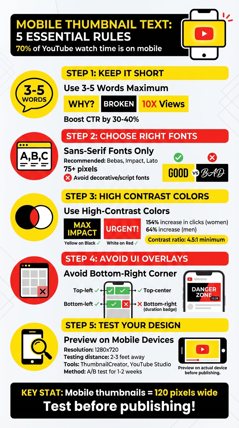
Want more clicks on your YouTube videos? Start with better thumbnails. Over 70% of YouTube watch time happens on mobile devices, where small screens make readability a challenge. If your thumbnail text is too small, cluttered, or unclear, you’re losing potential viewers. Here's how to fix that:
- Stick to 3–5 words. Short, bold phrases like "WHY?", "BROKEN", or "10X Views" grab attention quickly.
- Use sans-serif fonts like Bebas or Impact, sized at 75 pixels or larger for clarity.
- High-contrast colors (e.g., yellow on black) improve visibility and can increase clicks by up to 154%.
- Avoid YouTube overlays. Keep text out of the bottom-right corner to prevent it from being covered by video duration badges.
- Test your design. Preview thumbnails on smartphones and use tools like ThumbnailCreator to ensure readability.
Clear, bold, and well-placed text can boost your click-through rate (CTR) by 30–40% or more. Let’s dive into the details.
Mobile Thumbnail Text Best Practices: 5-Step Optimization Guide
Best Fonts for YouTube Thumbnails Plus 12 Canva Tips for Words
sbb-itb-b59debf
Core Principles for Mobile Thumbnail Text
Mobile thumbnails are tiny - just 120 pixels wide. That means every design choice needs to emphasize clarity and legibility. Here’s how to make sure your text stands out and delivers your message effectively on small screens.
Keep Text to 3-5 Words
When it comes to mobile thumbnails, less is more. Text-heavy thumbnails become unreadable at such a small size. By sticking to 3–5 words, you’re forced to zero in on your most attention-grabbing idea. Instead of trying to explain your entire video, focus on bold, emotional words like "TRUTH", "BROKEN", or "WHY?".
Think of your thumbnail as a mini billboard. You’ve got just a few seconds to hook someone. Phrases like "You're Doing It Wrong", "10X Your Views", or "Avoid This Mistake" grab attention instantly because they promise value. Incorporating action verbs, numbers, and powerful words like "Reveal", "3 Steps", or "Shocking" keeps your message punchy and direct. Once you’ve nailed the wording, the next step is choosing the right font to make it pop.
Choose the Right Fonts and Sizes
For mobile thumbnails, sans-serif fonts are your best friend. Options like Bebas, Impact, and Lato are perfect because their bold, clean lines stay sharp and readable on small screens. To ensure your text remains clear, aim for a font size of 75 pixels or larger.
Avoid decorative or script fonts - they may look fancy, but they’ll lose all legibility when scaled down. Keeping your text simple and bold ensures it’s easy to read, even at a glance.
Use High-Contrast Colors
High-contrast colors are a game changer for thumbnail visibility. A study by Sprout found that thumbnails with strong color contrast led to a 154% increase in clicks for women and 64% for men. Combinations like yellow on black or white on red make your text stand out. For the best results, aim for a contrast ratio of at least 4.5:1.
Stick to one or two colors to avoid overwhelming the viewer. Too many colors can create visual clutter and dilute your message. Adding a box or background behind your text in a contrasting color is another simple way to make your text pop. This small tweak can make a big difference in readability on mobile screens.
Design Techniques for Mobile Thumbnail Text
Once you've nailed down the right fonts and contrasts, it's time to think about placement and structure. These design techniques help ensure your text stays readable and avoids being covered by YouTube's interface elements on mobile screens. Here's how to keep your message clear and visually engaging.
Avoid YouTube UI Overlays
YouTube overlays key interface elements - like the video duration (bottom-right corner) and sometimes a play icon - directly on thumbnails. If your text is placed in these areas, it might get blocked or become unreadable. To avoid this, position your most important text in areas that YouTube typically leaves untouched. The top-left or top-center are your safest bets, while the bottom-left is usually fine too. However, steer clear of the bottom-right corner where overlays are common. Always preview your design on mobile devices to spot any potential overlap or design mistakes.
Create Clear Text Hierarchy
When using multiple text elements in your thumbnail, size and weight play a major role. Your primary message should dominate the design - make it the largest and boldest element, acting as the "headline." Supporting text should be smaller (approximately 30% smaller) and styled differently to create a clear distinction. For instance, if your main text is bold and 90 pixels in size, keep the secondary text lighter and closer to 60 pixels. Following a thumbnail size guide ensures these elements remain crisp across all mobile resolutions. This hierarchy grabs attention and directs the viewer's focus, which is critical when they’re deciding whether to click in just a fraction of a second.
Align Text with Video Titles
Your thumbnail text should work hand-in-hand with the video title, not repeat it. Use the thumbnail to spark curiosity or deliver an emotional hook, while the title provides the full context. For example, if your video title is "How I Gained 100K Subscribers in 30 Days", your thumbnail could simply say "100K in 30 DAYS" or "THE SECRET." This combination creates intrigue and avoids redundancy, increasing the likelihood of a click.
Tools and Methods to Test Thumbnail Text
Thumbnail text needs to be clear and readable, even on mobile screens where thumbnails can shrink to just 120 pixels wide. It's crucial to test your design before publishing to ensure it performs well. Here are some practical ways to check the effectiveness of your thumbnail text on mobile devices.
Test on Mobile Devices
One of the easiest ways to test is to view your thumbnail directly on a smartphone. Export your design at the standard 1280x720 resolution, then open it on your phone. Hold the device 2–3 feet away to mimic how users typically scroll through content. If the text appears unclear or hard to read, tweak your design accordingly. Make sure to test on both iOS and Android devices since screen sizes and resolutions can differ. You can also take screenshots of your thumbnail as it appears in the YouTube app to see how it looks among other videos in search results or recommendations.
Use ThumbnailCreator for Mobile-Optimized Designs
ThumbnailCreator offers a handy AI-powered tool to make sure your thumbnails are mobile-friendly. It provides specialized features for text editing, helping you pick fonts, sizes, and placements that stay readable on smaller screens. The tool also lets you preview your design at different sizes to ensure clarity. With mobile-optimized templates, ThumbnailCreator avoids UI overlay problems and automatically applies the correct resolution (1280x720) and file formats, so you can focus on creating engaging text.
A/B Test Different Text Versions
Once your thumbnail is live, A/B testing can help identify the most effective text variation. Create multiple versions of your thumbnail with different text options and upload them through YouTube Studio. Let each version run for 1–2 weeks, then analyze the click-through rate (CTR) using YouTube Analytics. This data will show which text resonates better with your audience. For instance, testing options like "10X Your Views" versus "Boost Views Now" can reveal which one drives more clicks. A/B testing works well for both new uploads and older videos that need a refresh.
Conclusion: Mobile Thumbnail Text Best Practices
Creating effective mobile thumbnail text boils down to three key principles: keep it short, make it clear, and test thoroughly. Stick to 3–5 bold words using high-contrast colors and large, sans-serif fonts like Bebas, Impact, or Lato, sized at 75 points or larger. This ensures your text remains legible, even in fast-scrolling feeds.
Every design choice should support these principles. Smart design makes thumbnails stand out. For example, avoid placing text in the bottom-right corner - this is where YouTube’s duration badge appears. Also, make sure your thumbnail text is distinct from the video title to spark curiosity. Use attention-grabbing words like "WHY?", "TRUTH," or "BROKEN" to intrigue viewers. Additionally, aim for a contrast ratio of at least 4.5:1 between the text and background for optimal visibility.
Testing is where good design becomes great. Export your thumbnail at 1280x720 resolution and view it on your smartphone to replicate the real user experience. Tools like ThumbnailCreator simplify this process with AI-assisted text editing and mobile-friendly templates. This final step ensures your thumbnail aligns with earlier tips on text, layout, and hierarchy. When done right, effective thumbnails can increase click-through rates by up to 154%, according to Quick Sprout studies.
FAQs
What words work best for thumbnail text on mobile?
When crafting mobile thumbnail text, focus on keeping it short, bold, and attention-grabbing. Aim for 3–5 words to ensure the text remains clear and readable, even at smaller sizes.
For fonts, go with bold, sans-serif options like Montserrat or Roboto. These styles enhance clarity and make your text stand out. To improve visibility, use high-contrast colors, and consider adding outlines or shadows to separate the text from the background.
Finally, make your text emotionally engaging and to the point. Phrases like "Top 5 Tips" work well because they quickly communicate the video’s topic and grab attention, especially from fast-scrolling mobile users.
How do I keep thumbnail text readable on small screens?
To make thumbnail text easy to read on smaller screens, stick to high-contrast colors and bold, sans-serif fonts. Keep the text short - ideally 3–5 words. Adding outlines or shadows can help the text stand out, especially if the background is busy. Always test your design at smaller dimensions, such as 168x94 pixels, to ensure it remains clear. Simplify the layout and prioritize strong contrast between the text and background for better readability on mobile devices.
How can I A/B test thumbnail text in YouTube Studio?
To test different thumbnail text in YouTube Studio, you can use the Test & Compare feature to see how each version performs with actual viewers.
Here’s how to do it:
- Upload multiple thumbnail options: Create and upload the variations you want to test.
- Enable the "Test & Compare" feature: Activate this in the video’s settings.
- Run the test for 7 to 14 days: Give it enough time to gather meaningful data.
- Analyze key metrics: Focus on stats like click-through rate (CTR) and watch time to determine performance.
- Use the winning thumbnail: Apply the version that delivers the best results.
This process helps you identify which thumbnail resonates most with your audience.