
Ultimate Guide to Thumbnail Text Contrast
Your YouTube thumbnail text can make or break your video's success. Poor contrast makes text hard to read, especially on small mobile screens, where over 70% of YouTube views happen. High-contrast designs boost click-through rates (CTR) by up to 41%, with combinations like yellow and black leading the pack. This guide explains how to improve text visibility using color contrast, font choices, and layout techniques that work across devices.
Key takeaways:
- High-contrast text grabs attention and improves readability, even at small sizes.
- Bright colors (e.g., yellow) paired with dark backgrounds (e.g., black) work best.
- Use bold sans-serif fonts, outlines, and shadows to enhance clarity.
- Limit text to 3–5 words and test designs at 168×94 pixels for mobile readability.
- Tools like Adobe Color and WCAG Contrast Checkers can verify contrast ratios.
Want your thumbnails to stand out? Focus on contrast, simplicity, and readability to drive more clicks.
How To Make a Thumbnail 'POP'? - Color Theory In Thumbnails
sbb-itb-b59debf
Why Text Contrast Matters for Thumbnails
Text contrast plays a crucial role in driving video clicks. High-contrast text works as a visual "pattern interrupt", helping your thumbnail stand out and grab attention in a sea of endless scrolling.
Impact on Viewer Attention
The numbers speak for themselves: high-contrast designs can boost click-through rates (CTR) from an average of 5.1% to 7.1%, and a yellow–black color combination can push that number to 8.2% - a potential increase of up to 41%. This is because high-contrast text makes key information instantly visible, even during a quick scan. For viewers who spend less than a second deciding whether to click, readability is everything. Adding simple enhancements like 4–8px outlines or shadows can further improve text clarity, increasing CTR by 23%.
This heightened attention doesn't just improve engagement - it ensures your thumbnail gets noticed across all platforms and devices.
Mobile and Desktop Visibility
Contrast isn't just about catching the eye; it ensures your thumbnails remain clear and readable on any device. Since over 70% of YouTube watch time happens on mobile, optimizing for smaller screens and varied lighting conditions is essential. On smartphones, thumbnails shrink to 168×94 pixels in search results, making low-contrast text nearly unreadable, one of many common thumbnail mistakes that hurt performance.
"Even people with good vision struggle to read low-contrast text, especially in bright sunlight or on smaller screens." – Brynn Wilkes
Desktop users might enjoy larger thumbnails (360×202 pixels), but the majority of your audience is still on mobile. Additionally, your thumbnails must stand out against YouTube's interface. For example, pure white text can disappear in light mode, while low-contrast designs tend to blend into dark mode’s gray background.
The WCAG guidelines recommend a minimum contrast ratio of 4.5:1 for standard text. But for YouTube thumbnails, where competition is fierce, pushing contrast levels even higher could give your content the extra edge it needs to be impossible to overlook.
Core Principles of Text Contrast
Creating text with high contrast isn't just about picking bright colors. It's about understanding how brightness, color relationships, and typography work together. These principles can determine whether your thumbnail grabs attention or gets overlooked.
Brightness and Saturation Basics
Luminance contrast - the difference in lightness between text and its background - is the most critical factor for readability. As Sarah Lee puts it, "Luminance Contrast... is key for readability". For example, pairing light yellow with dark blue creates better contrast than two bright colors with different hues.
The World Wide Web Consortium (W3C) recommends a minimum contrast ratio of 4.5:1 for normal text and 3:1 for large text (18pt or larger). However, for thumbnails competing in crowded spaces, aim for higher ratios. Black text on a white background achieves the maximum ratio of 21:1, while white on dark gray (#333333) reaches 12.6:1.
Saturation, while less important than brightness, adds depth and hierarchy. Pairing a highly saturated accent color with a neutral background can create strong visual separation. Warm colors like red or orange naturally draw more attention than cooler blues or greens, making them great for highlighting key words or calls to action.
Avoid using colors with similar luminance values, as they can blend together and reduce readability - especially on smaller screens.
Using Complementary and Opposite Colors
Strategically pairing colors can enhance visual separation. The best combinations often feature bright, saturated text against darker or neutral backgrounds, such as bright yellow on navy or red on black. This creates "layered contrast", where the background appears to recede, allowing the text to pop.
The 60-30-10 rule is a helpful guide: dedicate 60% of your design to a dominant background color, 30% to a secondary subject, and 10% to accent text. This keeps the design clean and ensures the text remains the focus.
"The contrast creates visual separation that your eye can't ignore, even when the thumbnail is the size of a postage stamp." – Unkoa
For accessibility, remember that 1 in 12 men (8%) and 1 in 200 women (0.5%) experience color blindness. Red-green combinations are particularly challenging for those with deuteranopia, as these colors can appear nearly identical. To address this, use the "Black and White Test" - convert your design to grayscale to ensure tonal contrast remains strong.
When designing thumbnails, keep text to 20-30% of the frame and limit it to 3-5 words. This "billboard effect" ensures your message is instantly clear, even when the thumbnail is reduced to 168×94 pixels on mobile. These color strategies naturally complement font choices to enhance contrast further.
Font Weight and Size Considerations
Once you've nailed your color pairing, the next step is choosing the right font weight and size. Bold sans-serif fonts with weights of 700 or heavier are ideal for maintaining readability, even when scaled down. For designs at 1280×720 resolution, aim for 150-200px for primary headlines and 80-120px for secondary text.
The true test comes when you shrink your design to 168×94 pixels, the size thumbnails appear on mobile devices. If your text isn't instantly readable at this scale, either increase the font size or reduce the word count. Using Extra Bold or Black weights for primary headlines ensures they stand out, even on cluttered backgrounds.
For thinner fonts, adding a 4-8px contrasting outline can significantly improve readability by separating the text from its background. Additionally, using all caps for short phrases (1-3 words) can increase visual weight and urgency, making key messages stand out more than sentence case ever could.
Best High-Contrast Color Combinations
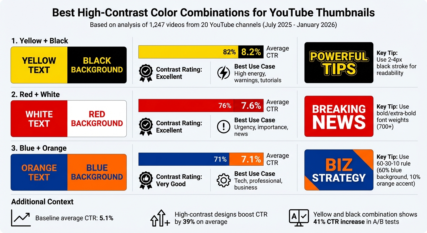
High-Contrast Color Combinations for YouTube Thumbnails: CTR Performance Comparison
High-contrast color pairings can make a big difference in driving engagement. Between July 2025 and January 2026, NoteLM analyzed 1,247 videos from 20 YouTube channels (subscriber counts ranging from 10,000 to 1,000,000). The results? Thumbnails with high-contrast colors boosted click-through rates (CTR) by 39% compared to those without. In a subset of 10 controlled thumbnail A/B tests, switching to yellow and black alone led to a 41% increase in CTR. Here’s a closer look at the standout combinations that can elevate your thumbnail game.
Black and Yellow
This duo leads the pack with an average CTR of 8.2%. The magic lies in yellow's brightness, which creates a sharp visual separation from black - perfect for grabbing attention. It works especially well for tutorials, warning messages, and high-energy content like gaming or reaction videos. To ensure readability, use yellow text with a 2–4px black stroke, especially on busy backgrounds or mobile screens. Don’t forget to test how it looks in both light and dark modes, since yellow can blend into white backgrounds.
White and Red
Coming in with a 7.6% average CTR, white and red offer a bold and striking combination. This pairing is ideal for content emphasizing urgency, drama, or major announcements. Red's ability to evoke emotional responses makes it great for urgent or exciting themes. To avoid the white text looking faint on lighter backgrounds, use bold or extra-bold font weights (700 or higher).
Blue and Orange
With a 7.1% average CTR, blue and orange are a complementary pair that works wonders for professional, tech, and business-related content. Blue conveys trust and authority, while orange adds a pop of energy and creativity. This is why many creators use blue thumbnails for educational content to establish credibility. A good rule of thumb is to make blue the dominant background color (about 60% of the design) and use orange as an accent (about 10%), following the 60-30-10 design principle. For maximum impact, opt for a saturated orange (#FF6600) paired with a deep navy blue (#003366) to maintain strong contrast, especially for mobile viewers.
| Color Combination | Average CTR | Best Use Case | Contrast Rating |
|---|---|---|---|
| Yellow + Black | 8.2% | High energy, warnings, tutorials | Excellent |
| Red + White | 7.6% | Urgency, importance, news | Excellent |
| Blue + Orange | 7.1% | Tech, professional, business | Very Good |
Common Text Contrast Mistakes to Avoid
Strong contrast is essential for effective design, but some common mistakes can derail even the most polished visuals. According to a 2025 WebAIM analysis, 94.8% of home pages had detectable WCAG 2 failures, with low contrast being the top offender. These aren't just technical issues - they can hurt click-through rates and alienate users who rely on accessible design.
Using Low-Contrast Colors
One of the most frequent mistakes is using light gray on white. For example, a text color like #999999 on a #FFFFFF background creates a contrast ratio of 2.8:1, which falls short of the 4.5:1 accessibility standard. Pastel-on-pastel combinations are just as problematic, especially on mobile screens where thumbnails shrink to 168×94 pixels. Placing text over busy images without adding overlays also reduces readability. Even when colors technically meet contrast standards, thin or decorative fonts can make text harder to read, especially at smaller sizes.
"Low-contrast text is the most common accessibility failure and weakens readability." - pacgie.com
To improve contrast quickly, try these fixes:
- Swap light grays for darker ones, like #595959.
- Add a 60% opacity dark overlay between background images and white text.
- Use bold sans-serif fonts with a weight of 700 or heavier.
Also, avoid cramming too much text into your designs. Overloading a layout with excessive words can dilute your message and make it visually overwhelming.
Overcrowding Text in Thumbnails
Too much text can clutter thumbnails and reduce their impact. A January 2026 study by NoteLM Team examined 1,247 videos across 20 YouTube channels and found that reducing text from 7 words to 4 increased click-through rates (CTR) by 34%. In contrast, thumbnails with 6 or more words experienced a 31% drop in CTR compared to those with 3–5 words. Since over 70% of video watch time happens on mobile, excessive text becomes especially hard to read.
To keep things clear and engaging:
- Replace long titles with concise phrases, like "BEGINNER GUIDE".
- Use the "Shrink Test": resize your thumbnail to 168×94 pixels. If the text isn’t instantly readable, simplify it or increase its size.
Ignoring Audience Accessibility
Relying solely on color to convey meaning can exclude users. For example, using red to indicate "stop" or "error" without accompanying icons or labels leaves colorblind viewers in the dark. Additionally, poor contrast can make content hard to see in brightly lit environments, affecting all users.
To create more inclusive designs:
- Pair colors with icons, patterns, or text labels to ensure clarity.
- Test your designs in both light and dark modes, as a design that works well in one mode might fail in the other.
- Use contrast checkers that follow WCAG 2.1 guidelines to verify your designs meet accessibility standards.
- When placing text over busy images, add solid or gradient overlays (e.g., 60% opacity black) to maintain readability.
Accessible design doesn’t just meet technical standards - it ensures your message is clear and visible to everyone, no matter their needs or viewing conditions.
Tools and Techniques for Better Text Contrast
Use WCAG standards and AI tools to design thumbnails that stand out with sharp contrast across all devices.
Using WCAG Guidelines for Contrast Ratios
The Web Content Accessibility Guidelines (WCAG) offer a solid framework for evaluating color contrast. To calculate contrast ratios, use the formula: (L1 + 0.05) / (L2 + 0.05), where L1 and L2 represent the luminance of the lighter and darker colors. For regular-sized text, a contrast ratio of at least 4.5:1 is required. For larger text (18pt or more), the minimum ratio drops to 3:1. For example, white text (#FFFFFF) on a black background (#000000) achieves the maximum ratio of 21:1, while white text on medium gray (#666666) hits exactly 4.5:1, just meeting the guideline.
Tools like Adobe Color, Snook's Colour Contrast Checker, and the WCAG Color Contrast Analyzer can help confirm these ratios before you finalize your designs.
For a practical approach, try the 168×94 Test. Shrink your thumbnail to 168×94 pixels - the smallest size typically displayed on mobile screens - to assess readability. If the text isn’t clear at this size, adjust by increasing font size, shortening the text, or adding a 4-8px outline to separate it from complex backgrounds.
AI Tools like ThumbnailCreator
ThumbnailCreator simplifies the process of optimizing contrast using AI-powered features. Its text-to-image tool can generate custom backgrounds designed with ample space for high-contrast text. Additional features like the Background Remover and AI Eraser help eliminate distractions, while bold fonts, outlines, and shadows enhance text visibility.
To ensure thumbnails remain sharp on any device, the platform includes AI upscaling tools. Plus, its template library offers pre-designed layouts that follow contrast best practices. Experimenting with complementary color pairings - like blue and orange or yellow and black - can also help identify what resonates most with your audience.
Conclusion
High-contrast thumbnail text isn’t just about making words readable - it’s about creating an immediate visual impact that grabs attention. Considering that the human brain processes images 60,000 times faster than text, your thumbnails need to stand out instantly. Keep text short and impactful - ideally 0–3 words or fewer than 12 characters - and opt for bold sans-serif fonts sized at 75pt or larger for clarity across all devices.
With over 70% of YouTube views happening on mobile, testing your thumbnail designs at small scales is a must. Use the Three-Foot Rule: if you can’t read the text from three feet away, it’s likely too small for mobile users. To improve visibility, add bold outlines or subtle drop shadows to make text pop against busy backgrounds.
"YouTube thumbnail text should be a garnish, not the main course." - ThumbnailAI
Make sure your designs follow WCAG contrast guidelines. Tools like Adobe Color or the WCAG Color Contrast Analyzer can help you verify contrast ratios. If you’re looking to save time, tools like ThumbnailCreator offer AI-powered features to optimize contrast, create custom backgrounds, and provide templates built on proven design principles.
Start by reviewing your existing thumbnails. Identify which ones have the clearest text and highest click-through rates, then apply those successful strategies to future designs. Small tweaks - like adjusting font weight, improving color combinations, or refining text placement - can lead to noticeable gains in viewer engagement and channel growth. By mastering these contrast techniques, your thumbnails won’t just catch the eye - they’ll drive results.
FAQs
What contrast ratio should my thumbnail text have?
For your thumbnail text to be easy to read and stand out, aim for a contrast ratio of at least 4.5:1 between the text and its background. This helps ensure the text is clear and accessible, following design and accessibility best practices.
How do I make text readable on mobile thumbnails?
To make text readable on mobile thumbnails, stick to high-contrast colors and bold sans-serif fonts like Impact or Bebas Neue. Keep your message concise - aim for just 3-5 words. Always test your design at small sizes, like 168x94 pixels, to ensure clarity. Adding outlines or shadows can boost contrast, making your text pop against busy backgrounds and stay legible on tiny screens.
What’s the best way to add outlines or shadows to text?
To ensure text in thumbnails stands out, try adding high-contrast outlines between 4-8 pixels thick or using subtle shadows. White or black outlines are excellent choices for readability, particularly on busy or colorful backgrounds. Shadows can also create depth, helping the text pop and remain legible, even on smaller screens.