

7 Steps to Optimize Thumbnails for Rankings
A thumbnail can change whether people click or scroll past. On YouTube, more clicks often mean a better CTR, and strong search results can see around 15%–20% CTR.
If I want more views from Search, Home, and Suggested, I keep my thumbnail process simple:
- Use the right file size: 1,280 x 720
- Show one main subject
- Add just 3–5 words
- Make text and subject stand out
- Match the thumbnail to the title and video
- Test 2–3 versions
- Check CTR after 48–72 hours in YouTube Studio
In short: clear beats crowded. A thumbnail should make sense in about one second, even on a phone screen.
| Step | What I focus on | What it helps |
|---|---|---|
| 1 | Correct specs | Clean display on YouTube |
| 2 | One focal point | Faster topic recognition |
| 3 | Short text | Better readability |
| 4 | Strong contrast | More visual pop in feeds |
| 5 | Match title and video | Better viewer trust |
| 6 | Test versions | Better odds of higher CTR |
| 7 | Review analytics | Smarter next changes |
I treat thumbnail work like a simple loop: make it clear, test it, check the numbers, and improve the next one.
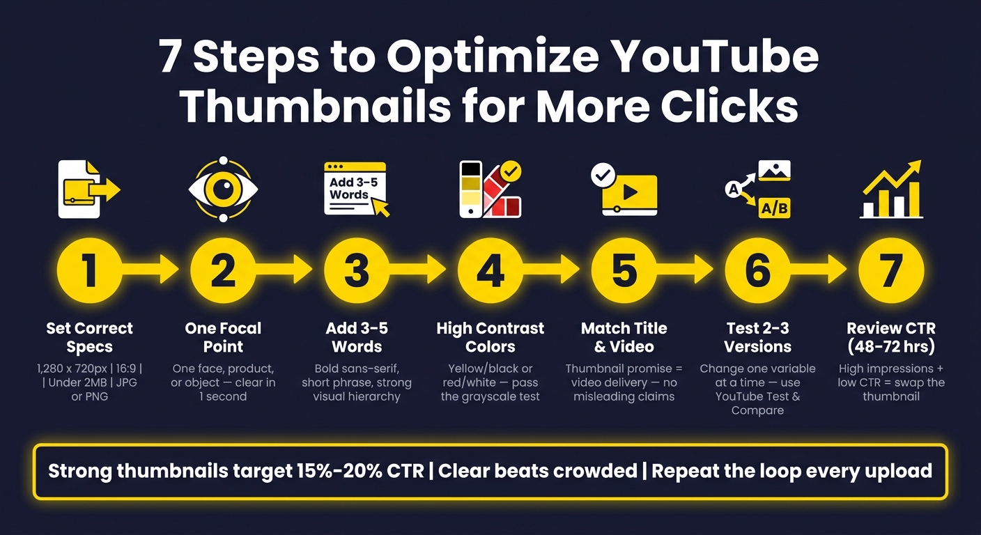
7-Step YouTube Thumbnail Optimization Workflow
Steps 1–2: Set the Right Specs and Pick One Clear Subject
Step 1: Use the Correct YouTube Thumbnail Specs
Readable thumbnails get more clicks, and clicks can help rankings. So before you touch color, text, or layout, start with the file itself.
YouTube thumbnails should be 1,280 x 720 pixels with a 16:9 aspect ratio, stay under 2 MB, and use a supported format like JPG, PNG, GIF, or BMP. In most cases, JPG and PNG are the safest picks for image quality and smooth uploads.
These specs matter for a simple reason: thumbnails usually show up small. In YouTube Search, Home, and recommended feeds, your image has to grab attention at a tiny size. If you cram in too much detail, it turns into visual noise, which is why mastering thumbnail composition is essential.
A smart move is to design at 1,280 x 720, then zoom out until it looks closer to phone size. If anything gets hard to read, cut it. Simplify until the thumbnail still makes sense at a glance. Once it looks clean in a small preview, you’re ready to decide what should own the frame.
Step 2: Build the Thumbnail Around One Focal Point
Pick the one thing people should notice first, then build the thumbnail around that. One face, one product, or one object gives the eye a clear place to land.
Close-up faces with strong expression often work well because people can read emotion fast, even on a small screen. A look of shock, focus, frustration, or excitement can say a lot without a single word. Faces looking straight at the camera also tend to get more clicks than faces looking off to the side.
If the video is technical or centered on a product, the item itself may do the job better. A microphone, camera, or software interface can tell viewers what the video is about right away. That main subject then gives your text and color choices a clear anchor for the next steps.
Here’s a simple gut check: Could someone guess the topic in one second from the main visual alone? If not, the thumbnail is probably too crowded. Cut the extra stuff. Keep the one detail that matters most, and leave the rest for the title or description.
sbb-itb-b59debf
Steps 3–5: Make the Thumbnail Readable and True to the Video
Step 3: Add 3–5 Words of Large, Readable Text
Once you have one clear subject, add text that supports it, not text that fights for attention.
Keep it short: 3 to 5 words. Not a full sentence. Phrases like "Grow on YouTube", "Beat the Algorithm," or "Edit Faster" spell out the outcome fast without stuffing the frame. More words can lower CTR because the thumbnail starts to feel crowded.
Use bold sans-serif fonts that stay readable at small sizes. Thin scripts and condensed fonts tend to fall apart when the image shrinks. Stick with one main phrase in large text. If you need a second word or a number, make it much smaller so the visual hierarchy is clear.
A simple check helps: zoom out. If you can't read the main phrase right away, make it bigger or cut it down.
Step 4: Use High Contrast and Strong Color Separation
Contrast is what makes a thumbnail readable when it's sitting next to dozens of other images in search results.
High-contrast color pairings like yellow/black or red/white stand out fast in a busy feed, which supports a higher CTR. The goal is simple: make the text easy to read in a split second.
To pull the main subject away from the background, you can:
- Blur or darken the background
- Keep the subject sharp and bright
- Add a soft outline or color halo around the subject
That extra separation helps without making the design look heavy-handed.
A grayscale check is a good gut test. Strip out the color. If the text, subject, and background still stand apart, your contrast is probably strong enough.
That said, readability only helps if the thumbnail still lines up with the video.
Step 5: Match the Thumbnail to the Title and Video Content
The thumbnail and title need to make the same promise.
Misleading thumbnails hurt trust and can lower watch satisfaction. Many experienced creators stick to a simple rule: show real emotion, not fake claims. If you use excitement, curiosity, or surprise, the video has to deliver on that exact idea.
"show real emotion, not false claims."
The best thumbnails don't just get the click. They set up the right expectation. When the image is clear and the message is accurate, viewers know what they're about to watch.
Once the thumbnail is both clear and honest, test a few versions before you publish.
FREE YouTube Thumbnail Workshop - How to Make Better Thumbnails for Higher CTR
Step 6: Create and Review Thumbnail Variations Before Publishing
Now that your thumbnail is accurate and high-contrast, the next job is simple: figure out which version is most likely to turn that clarity into clicks.
Once the thumbnail is clear and honest, test 2–3 versions before publishing. The goal is to find the version most likely to improve CTR.
Compare Versions by Subject, Text, Color, and Clarity
Test 2–3 versions that change only one variable at a time. That could be the subject framing, the text, or the color.
Why does that matter? If you change everything at once, you won't know what actually helped. One version might have stronger text. Another might have a tighter crop. A third might use a better color contrast. Isolate the change so the result means something.
Before you pick a winner, preview each version at mobile size. If the subject or text isn't clear on a small screen, revise the design. Then ask one teammate to choose the clearest version. A second set of eyes can catch issues you stop noticing after staring at the same image for too long.
Use YouTube's built-in test to check your strongest options before publishing. YouTube's native Test & Compare feature lets you upload 2–3 thumbnail variations for a single video. YouTube shows each version evenly and picks the winner based on performance.
Use ThumbnailCreator to Build Variations Faster
If you need to make test versions faster, use ThumbnailCreator to build them in one pass.
It helps speed up the process with AI generation, templates, face swapping, object swapping, and text editing. So instead of rebuilding each thumbnail from scratch, you can make small changes fast and get your test set ready with less manual work.
Step 7 and Conclusion: Check CTR in YouTube Analytics and Repeat
Step 7: Review CTR in YouTube Analytics and Adjust
After you publish, check the numbers to see if the thumbnail did its job. Go to YouTube Studio → Analytics → Reach tab and watch Impressions and Click-through rate (CTR).
Look at CTR during the first 48–72 hours after upload. For older videos, review the last 28 days. When you compare results, stay within the same traffic source and stack them against your own past videos.
The clearest signal that a thumbnail may need a swap is high impressions, low CTR. If a video is getting plenty of impressions but not enough clicks, test a new thumbnail. When CTR is weak, start with the thumbnail before changing anything else.
Keep the test clean:
- Change one element at a time
- Wait 48–72 hours
- Compare CTR before and after with the same traffic source filter
That way, you're not mixing apples and oranges by choosing data over intuition.
Over time, sort your videos by CTR in Analytics and look for patterns. Your best thumbnails usually have a few things in common. Use those traits in the next upload.
Conclusion: A 7-Step Thumbnail Workflow to Use on Every Video
Use the same workflow for every upload: clear specs, one subject, short text, strong contrast, accurate messaging, testing, and CTR review. That closes the test-and-improve loop.
Think of thumbnail optimization as a process you can run again and again. Let the data guide the next change, then repeat it on every upload.
FAQs
What is a good YouTube thumbnail CTR?
A good YouTube thumbnail click-through rate usually falls between 4% and 6%. That said, there’s no single magic number. CTR can shift a lot based on your channel size and where your views come from.
For many channels:
- 2% to 5% is average
- 5% to 10% is strong
- Above 10% is elite
Traffic source changes the picture quite a bit. Search traffic often gets 8% to 15% because people are already looking for something specific. Home page browse traffic is often lower, around 2% to 5%, since viewers are just scrolling and choosing what grabs them.
CTR also doesn’t tell the whole story. A thumbnail might get the click, but if the video doesn’t match what people expected, they’ll leave fast. That’s why it’s smart to track CTR alongside watch time. The goal isn’t just to win the click. It’s to make sure your thumbnail lines up with the content people actually get.
Should I change a thumbnail after publishing?
Yes. Changing a thumbnail can improve performance, but timing matters.
Wait 48 to 72 hours after publishing so early subscriber data doesn’t skew the results.
It makes sense to update the thumbnail when:
- Click-through rate is low but average view duration is solid
- You want to refresh older evergreen content
If you’re running an A/B test, let it run for 7 to 14 days and avoid manual changes during that window.
How do I know which thumbnail version won?
Check YouTube Studio’s Test & Compare results in Analytics → Reach.
If you see Winner, that thumbnail won the test and becomes the default on its own.
If you see Performed Same, there’s no clear winner. In that case, stick with your preferred version or keep the original.
If you see Inconclusive, there wasn’t enough data, so the original thumbnail stays in place.