

Checklist for Optimizing Educational Thumbnails
A good educational thumbnail should explain the lesson in about 1–2 seconds. If I can’t tell the topic, outcome, and general promise at a glance, the thumbnail needs work.
Here’s the short version:
- Show the lesson fast: one main subject, short text, and a clean layout
- Match the video: no bait, no mismatch, no inflated promise
- Stay readable on mobile: follow the YouTube thumbnail size guide (1,280 × 720 px, 16:9, JPG/PNG, under 2 MB)
- Keep text short: about 2–5 words
- Use contrast well: high-contrast designs can hit 5.8%–7.2% CTR, while low-contrast ones can fall below 4%
- Review at small size: thumbnails may appear near 120 × 90 px on small screens, so I should test readability before upload
- Compare versions: I should check at least 2–3 variants before picking one
What matters most is simple: clarity beats hype. If the thumbnail shows the topic, points to the result, and still reads on a phone, it’s doing its job.
I’d treat this as a pre-publish check for four things: message, layout, text, and mobile readability.
Optimizing Your YouTube Video: Thumbnails, Titles & Descriptions That Work | Creator Bootcamp Ep. 6
sbb-itb-b59debf
Technical Checklist: YouTube Specs and Mobile Readability
Technical quality protects clarity. If a thumbnail looks blurry or hard to read, the lesson is lost before anyone clicks. So once the lesson is clear, make sure the file stays sharp and easy to read on YouTube’s smallest screens.
Check Size, Aspect Ratio, and File Format
Use a 1,280 × 720 px canvas with a 16:9 ratio. Upload JPG or PNG files under 2 MB. Go with JPG for thumbnails that use photos, and PNG for sharp text or diagrams, as long as the file still stays under 2 MB.
Before you upload, compare mobile and desktop previews and run through these four checks:
- Canvas: 1,280 × 720 px ✓
- Aspect ratio: 16:9 ✓
- Format: JPG or PNG ✓
- File size: Under 2 MB ✓
A file can match the specs and still fall apart on mobile screens.
Preview at Small Size Before Uploading
Thumbnails often show up at about 120 × 90 px on small screens. At that size, crowded layouts and tiny text can turn into a blur, which makes people less likely to click.
After you finish the design, preview it at about 150 px wide - either by zooming out on your screen or checking it on your phone at a small size. If parts start to blend together, cut things down. If it still reads at a small size, the lesson is still clear at a glance.
Use strong contrast so text stays readable on small screens. If the main subject and text still look clear at thumbnail size, it’s ready.
Visual Checklist: Focal Point, Layout, and Clarity
Once the thumbnail is clear on a technical level, composition does the next job: it should make the lesson obvious in a split second.
Use One Main Subject and a Clean Background
Stick to one main focal point - a face, diagram, or result - so people get the lesson right away.
If that main subject is a face, let it take up a big part of the frame. Crop in tight, or add a soft overlay to pull it away from a busy background. The subject should be the first thing people notice. No confusion, no visual tug-of-war.
Before you move on, check these:
- One focal point only (face, diagram, or result) ✓
- Main subject fills a large part of the frame ✓
- Background is clean, blurred, or low-contrast ✓
- No competing objects or text blocks behind the subject ✓
Once the focal point is locked in, placement helps direct the eye.
Use Layout and Placement to Guide the Eye
Use a simple hierarchy: main subject first, one small support element second, background third.
Place the subject on a rule-of-thirds point or center it for impact. Then keep the support element small and low-contrast. A simple setup works well here: a face on one third, a bold short text hook on the opposite side, and a low-contrast background behind both.
Here’s a good gut check: cover the small support element on your phone. If the topic still reads clearly, the hierarchy is doing its job.
Next, use text and color only to support that hierarchy.
Text, Color, and Symbols Checklist for Educational CTR
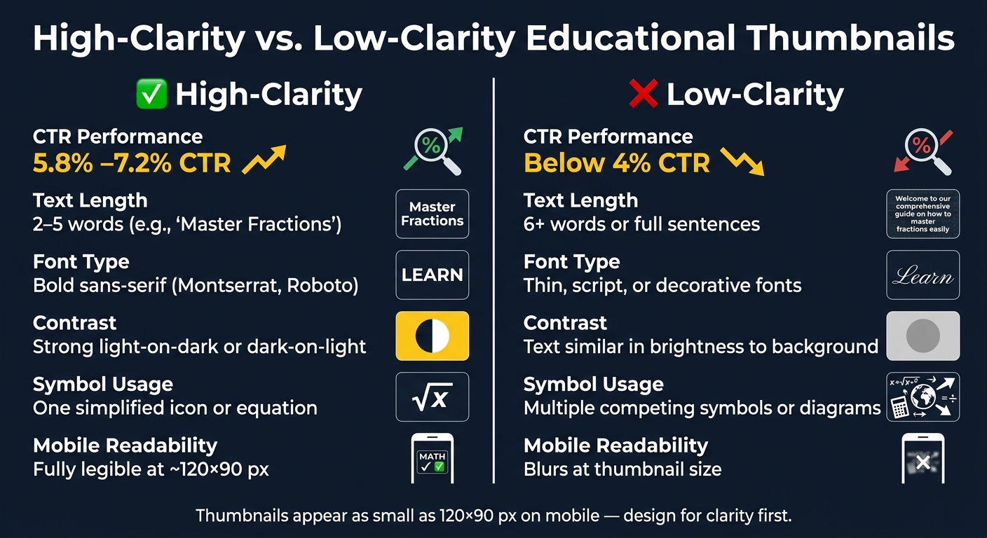
High-Clarity vs. Low-Clarity Educational Thumbnails: CTR & Design Comparison
Text, color, and symbols should support the visual hierarchy, not fight it.
Keep Text Short and Focused on the Outcome
Once the layout is in place, use text to make the lesson clearer.
Stick to 2–5 outcome-focused words. Longer phrases tend to hurt CTR. "Master Chain Rule" works better than "Chain Rule Tutorial" because it tells viewers what they’ll get. The text should add something to the title, not say the same thing again.
Use bold sans-serif fonts that still read well when the thumbnail shrinks down. Keep it to one main phrase across 1–2 lines. No extra text blocks competing for attention.
Before uploading, check:
- 2–5 words total ✓
- Bold sans-serif font ✓
- Outcome-focused wording ✓
- Text adds something the title doesn't already say ✓
- No extra punctuation, emojis, or secondary phrases that clutter the frame ✓
Use Contrast and Simple Visuals That Stay Readable
Thumbnail color psychology and contrast help the text and main symbol stand out from the background.
High-contrast thumbnail designs reach 5.8–7.2% CTR, while low-contrast versions drop below 4%. White or yellow text on a dark background is a safe pick. If you're using a photo or diagram behind the text, add a black overlay at 60–80% opacity or use a light drop shadow.
For symbols and equations, keep it simple: use one simplified symbol or equation. A quadratic formula with the discriminant highlighted in yellow can signal the topic in less than a second. Use one accent color to draw attention to the part the video covers, and keep everything else muted.
| Style Aspect | High-Clarity | Low-Clarity |
|---|---|---|
| Text length | 2–5 words (e.g., "Master Fractions") | 6+ words or full sentences |
| Font type | Bold sans-serif (Montserrat, Roboto) | Thin, script, or decorative fonts |
| Contrast | Strong light-on-dark or dark-on-light | Text similar in brightness to background |
| Text effects | Subtle stroke or drop shadow | No separation from background |
| Symbol usage | One simplified icon or equation | Multiple competing symbols or diagrams |
| Mobile readability | Fully legible on mobile | Blurs at thumbnail size |
At thumbnail size, the main phrase and symbol should be easy to read at a glance. That’s the standard to hit before moving into the creation workflow and final review.
Creation and Review Checklist with ThumbnailCreator
Follow a Step-by-Step Thumbnail Workflow
Once you know what to check, turn that into a simple workflow you can move through fast. Start with the learning outcome in one sentence. Then trim it down to a 2–5 word thumbnail phrase. After that, choose one focal point, like a face, object, or concept keyword, add the short text, and check the design at mobile size.
The goal is simple: make the thumbnail easy to understand at a glance. And that means avoiding common thumbnail mistakes like emotional bait that may get more clicks but hurt watch time.
Use the tool to move through the checklist faster, not to change the plan.
Use ThumbnailCreator Features to Speed Up Revisions
ThumbnailCreator can generate thumbnail drafts fast. The best way to use it is to tie each feature to a specific checklist goal:
| ThumbnailCreator Feature | Checklist Goal | How to Use It |
|---|---|---|
| AI-generated drafts | Faster iteration | Compare bold vs. clean drafts |
| Templates | Visual hierarchy | Pick layouts with one dominant focal area |
| Text editing | Readability & outcome clarity | Test 2–5 word outcome phrases with high-contrast colors |
| Face swapping | Trust & focal point | Swap in a clearer or more expressive educator image |
| Object swapping | Concept clarity | Replace clutter with one concept-relevant visual |
Generate 2–3 variants, then pick the clearest option. For more data-driven results, follow a thumbnail A/B testing guide to see which version actually performs better.
Final Pre-Publish Checklist
Before you publish, do one last pass for clarity, accuracy, and mobile readability.
- Upload specs pass: 1280×720 px, 16:9, JPG or PNG ✓
- Readable at thumbnail size ✓
- One focal point: no competing subjects or background clutter ✓
- 2–5 words of text: outcome-focused, not a repeat of the video title ✓
- Honest framing: thumbnail matches the actual scope of the lesson ✓
- Variant reviewed: compared at least two versions before choosing ✓
FAQs
How do I know if my thumbnail is too cluttered?
Try a squint test: shrink the thumbnail to about 120 × 90 pixels. If the main subject doesn’t stand out right away, or the text gets hard to read, the design is probably too cluttered.
A cleaner thumbnail usually works better. Aim for one main focal point and no more than two or three elements. If you need a second set of eyes, ThumbnailCreator can help you check visual hierarchy so your thumbnails stay clear and mobile-friendly.
What words work best in educational thumbnail text?
Keep it short and clear. Aim for 3 to 5 words so people can read it fast on mobile.
Curiosity-driven lines often do better than plain labels. Think surprising questions, “This is why” phrasing, action words, and numbers.
Use mixed case instead of ALL CAPS for a more polished look.
For readability, choose high-contrast text, like white or yellow on dark backgrounds.
How often should I test new thumbnail versions?
Run A/B tests for 7 to 14 days so you catch both weekday and weekend traffic. And before you pick a winner, make sure each version has at least 1,000 impressions.
Check performance at 24 hours, 7 days, and 28 days. Change just one thing at a time - like the text, facial expression, or layout - so you can tell what’s driving the result. ThumbnailCreator can help you make and preview multiple versions fast.