

Top 5 Thumbnail Styles for Engagement
A thumbnail has one job first: get the click. Then it has to help the video keep viewers watching. From the article, the five styles that show up most are Bold Reaction Face, Minimal Text Curiosity, Split-Screen Before-and-After, Big Number Results, and High-Contrast Object Focus.
Here’s the short version:
- Faces often get more clicks than thumbnails without faces, with reports in the 30%–40% range.
- Short text wins. Thumbnails with 1–5 words averaged 7.2% CTR, versus 4.1% for thumbnails with 11+ words.
- Specific numbers help. Clear claims like $10,457, 143%, or 7 steps tend to beat vague wording.
- Before-and-after layouts work when the change is easy to see in one second.
- One clear subject and strong contrast matter most on mobile.
If I had to boil the whole article down to one rule, it would be this: pick the style that matches what the viewer wants, then make sure the video pays off the promise.
The New Thumbnails Dominating YouTube in 2026
Quick Comparison
| Style | Best for | Main strength | Main risk |
|---|---|---|---|
| Bold Reaction Face | Vlogs, challenges, commentary | Fast emotional pull | Feels like bait if the video does not match |
| Minimal Text Curiosity | Storytelling, explainers, updates | Sparks interest with very few words | Can be too vague |
| Split-Screen Before-and-After | Tutorials, makeovers, case studies | Shows change at a glance | Can look crowded on phones |
| Big Number Results | Finance, business, education, fitness | Puts the outcome front and center | Can feel overhyped if the number is not explained |
| High-Contrast Object Focus | Tech, products, gear, demos | Clear subject with low clutter | Can feel cold in personality-led content |
A good thumbnail is not about style alone. It is about CTR, watch time, and retention working together. That is the lens I would use for every test.
What Makes a Thumbnail Style Work
A thumbnail works when it does three things fast: it gets attention, makes the topic clear, and sets up the same promise the video keeps.
The five styles below all do that in their own way. The first one leans hardest on faces, because faces can stop the scroll in a split second.
Emotional signals that earn attention
Strong facial emotion can lift clicks, especially surprise. People notice faces almost instantly, and a clear reaction gives the viewer a fast reason to care.
Still, this only works when the video pays it off. If the thumbnail shows shock, the video needs to earn that reaction. That’s why the first style depends so much on facial expression.
Curiosity without confusion
A good thumbnail hints at the outcome without handing over the whole answer. It can tease a result - a $10,000 month, a channel hitting 100,000 subscribers, or a dramatic transformation - without spelling out how it happened.
The key is balance. The viewer should feel curious, but they should also know what the video is roughly about within one second. If they have to puzzle it out, you’ve probably lost them.
Thumbnails with fewer than four words of text often generate about 30% higher CTR than text-heavy designs, because the hook lands right away.
Even a strong hook falls flat if no one can read it on a phone.
Contrast and readability on mobile
Mobile is the main test. Keep it simple:
- One subject
- Strong contrast
- Large, easy-to-read text
If the design looks busy at full size, it usually looks worse when it shrinks down.
Match the thumbnail promise to the video
The thumbnail promise has to match the video. Clicks matter, but retention matters more. If the image sets one expectation and the video delivers something else, viewers leave fast.
That mix of emotion, clarity, and contrast is what makes bold reaction faces work so well. With those rules in place, the first style is the most direct attention-grabber: bold reaction faces.
1. Bold Reaction Face
This style puts a big, expressive human face front and center. Crop in tight so the emotion reads at a glance. Go with a strong reaction like surprise, excitement, or concern. At thumbnail size, subtle looks tend to vanish. This works best when the face is the main hook, not just a nice extra.
Why It Works
Thumbnails with faces get an average 30–40% higher CTR than thumbnails without them. And not all expressions perform the same.
- Surprise is the top trigger, with a 43% lift in clicks.
- Anticipation follows at +38%.
- An open-mouth expression can add about 29% more clicks on its own.
That said, there's a catch. Fear-heavy shock faces can lead to a 22% drop in average view duration if the video doesn't match the intensity promised by the thumbnail.
Match the Emotion to the Video
The reaction has to fit the video's actual payoff. If you dial the face up to full shock, the video needs to earn it. Otherwise, you may win the click and lose the viewer.
Surprise and anticipation are usually the safer play. They build interest without making the thumbnail feel like bait.
Small-Screen Readability
The face should take up about 30–50% of the full thumbnail area. Keep it to one clear subject, use a clean background, and make sure the contrast is strong so the expression stands out in a crowded browse feed. That's a big deal when viewers make a click decision in about 50 milliseconds.
One face tends to beat a crowded layout, with a 15–25% CTR edge over thumbnails that show multiple faces. Placement matters too. Put the face on the right side of the frame. Eye-tracking data points to an 11% performance boost versus center or left placement.
When the face alone can't do all the work, the next styles lean more on layout and curiosity.
2. Minimal Text Curiosity
Reaction-face thumbnails sell emotion. This style sells mystery.
Minimal text curiosity uses one strong image and three words or less, while the title does the heavy lifting for context. It works best when the image already says most of what needs to be said, like with vlogs, challenges, or cinematic updates. Phrases such as "I Quit", "Don't Do This," or "Worth It?" pair well with a clear visual.
CTR Lift Potential
A study of 1,000 YouTube thumbnails found that 1–5 word thumbnails averaged a 7.2% CTR, compared with 5.8% for 6–10 words and 4.1% for thumbnails with 11 or more words. That adds up to a 75% relative CTR difference between the shortest and longest text groups.
Watch-Time Intent Match
Use a partial reveal, not a full tease. The goal is to spark interest without sending viewers down the wrong path.
Mobile Readability
On mobile, short text wins.
Thumbnails with fewer than 12 characters of text keep beating text-heavy designs on phones. And each word added beyond seven cuts CTR by about 8% because the text gets harder to scan on a small screen.
At roughly 150 px wide, tiny details vanish in a hurry. So keep it simple:
- one subject
- one short text block
- a clean background
High-contrast outlines or drop shadows can help the text stand out from the image. Before you publish, shrink the thumbnail down and make sure both the words and the main visual still read clearly.
ThumbnailCreator can help speed up thumbnail testing with AI concepts and fast edits.
When a video leans on comparison or transformation, the next style makes the payoff easier to see.
3. Split-Screen Before-and-After
Use split-screen thumbnails when the video's value comes from a clear transformation. Put two states of the same subject side by side: before on the left and after on the right. Viewers get the point in a split second. They see the change, then click to see how it happened.
That makes this format a strong match for videos built around visible change, like tutorials, makeovers, fitness progress, home projects, and photo or video editing.
CTR Lift Potential
This format works because it shows proof right away instead of hiding everything behind mystery. Before-and-after and side-by-side comparison thumbnails have seen a 45% increase in trending videos recently, pushed in large part by transformation and review content. Add a curiosity gap by showing the end result but not the process, and CTR can go up by as much as 54%.
The catch is simple: the change has to be obvious at a glance. If the contrast between the two sides isn't strong, the idea falls flat. And if people can't read both halves on a phone, you've lost them.
Mobile Readability and Visual Clarity at Small Size
Keep both sides close-up, high-contrast, and light on text. Check the thumbnail at about 168 px wide so you can spot details that vanish at small size.
A few design rules keep showing up for this style:
- Make the before side duller or darker
- Make the after side brighter and more saturated
- Keep text to 2–4 short words max
Here's the gut-check: if you can't tell which side is which after a one-second glance on a phone, the contrast isn't strong enough.
ThumbnailCreator can make split-screen testing easier with templates and text tools.
When the change is less visual, the next style leans on numbers to deliver that same instant payoff.
sbb-itb-b59debf
4. Big Number Results
Use a big number when the video's payoff is concrete, not fuzzy. Put one clear number front and center: $10,457, 143% increase, 7 steps, or 28 days. Specific claims drive about 53% more clicks than vague ones. That makes this format a natural fit for finance, business, education, and fitness content, where people are often looking for a clear result. Creators like Ali Abdaal often lean on clean, minimal layouts that keep one central number as the focal point.
Why does this work so well? The number sets the promise right away. 7 Steps tells viewers they're getting a structured walkthrough. $0 to $10,457 tells them the kind of outcome they can expect. That kind of alignment helps protect watch time. If the payoff can be measured, the number should be the main visual in the thumbnail.
CTR Lift Potential
Short text plus a bold number is a strong combo. One A/B test found that cutting thumbnail text from 8 words to 3 lifted CTR from 2.1% to 6%. Keep text to 1–4 words: one large number and just enough context to make it clear.
For U.S. audiences, formatting matters:
- Use $ with commas for dollar amounts: $10,457, not $10.457
- Use % for growth figures
- Use plain counts for steps or days
Watch-Time Intent Match
The number in the thumbnail needs to match the video exactly, or viewers may drop off early. If the thumbnail says 7 Steps, the video should deliver exactly 7 steps, clearly labeled. If it says $10,457, show how that figure was reached. Think of the number as a promise, not just a hook.
Mobile Readability
Make the number the largest element in the frame - larger than any logo, face, or secondary text. Use a heavy font weight (600 or higher) and place it on a solid or lightly textured background instead of a busy scene. Dark solid backgrounds can beat complex photo backgrounds because they isolate the number and cut visual noise. At mobile size, the number should be the ONLY dominant element.
When the hook is a single object, not a result number, use the next style.
5. High-Contrast Object Focus
Use this style when the object itself is the hook. Put one clear subject front and center on a high-contrast background with very little clutter. The object should be the reason someone clicks, not just a nice extra in the frame.
This works especially well for tech reviews, unboxings, product tutorials, finance explainers, cooking, fitness transformations, and any video where one object carries the main idea.
CTR Lift Potential
Pick one strong contrast pair, like light on dark, warm on cool, or saturated on muted, so the subject stands out right away. That helps the thumbnail stay easy to read in a crowded feed.
Watch-Time Intent Match
Use this style when the object in the thumbnail is the exact same item the video shows, explains, or breaks down. That alignment matters. It tells viewers they're getting what they clicked for.
Mobile Readability
Let the main subject take up most of the frame. Keep the color palette to 2–3 colors and check the thumbnail at phone size. If the object isn't clear within one second, crop tighter or cut extra elements.
ThumbnailCreator can help speed this up by isolating the subject and swapping backgrounds.
Choosing the Right Style for Your Channel
The biggest mistake? Copying a thumbnail style just because a big channel uses it.
That can backfire fast. A style that works for entertainment might flop on finance or tutorial content. The right choice depends on your niche, your format, and what the viewer wants right now. The same core rules still apply, but you need to use them based on audience intent.
Best fits for entertainment and vlogs
When personality is the main hook, Bold Reaction Face is usually the best place to start. Challenge videos, travel vlogs, pranks, and “I tried X for 30 days” content often win clicks because the creator’s energy does a lot of the work.
If the hook is more about the situation than the person, Minimal Text Curiosity tends to work better. A clean image with 3–5 words can open an information gap and pull people in without putting a face front and center.
Best fits for education, tutorials, and reviews
When viewers want help, clarity beats personality.
That’s why Split-Screen Before-and-After is often the strongest option for tutorials. It answers the viewer’s main question - will this actually help me? - before they even click. Use the split-screen format to show the change right away.
When the outcome itself matters most, Big Number Results works well because it tells outcome-focused viewers what they’ll get. For educational videos, calmer or curious expressions usually fit better than exaggerated shock.
Best fits for tech and finance channels
When viewers want precision, the thumbnail should signal proof, not drama.
Big Number Results works best when the video is about performance data, money, or measurable outcomes - think $10,000 in 30 days or 3.5% APY vs. 0.4%. If the real story is a product, chart, or interface, High-Contrast Object Focus is the better pick. MKBHD is a clear example of this style used at scale.
In these niches, clarity and credibility matter more than hype.
Match style to viewer intent
Before you design any thumbnail, ask one question: What is this viewer trying to get from this video?
Browsing viewers tend to react to emotion, so Bold Reaction Face and Minimal Text Curiosity fit best.
Search-driven viewers usually want proof, so Split-Screen Before-and-After and Big Number Results do that job at a glance.
Comparison-intent viewers want clarity. In that case, High-Contrast Object Focus paired with a short text label gives them the signal right away.
This isn’t just about design. It affects watch time too. Wrong clicks often lead to early drop-offs, and that can hurt performance.
| Niche | Primary Intent | Best Style(s) |
|---|---|---|
| Entertainment / Vlogs | Be entertained | Bold Reaction Face, Minimal Text Curiosity |
| Education / Tutorials | Learn or solve a problem | Split-Screen Before-and-After, Big Number Results |
| Tech Reviews | Examine a specific product | High-Contrast Object Focus |
| Finance / Data | Understand results or metrics | Big Number Results, High-Contrast Object Focus |
Thumbnail Style Comparison Table
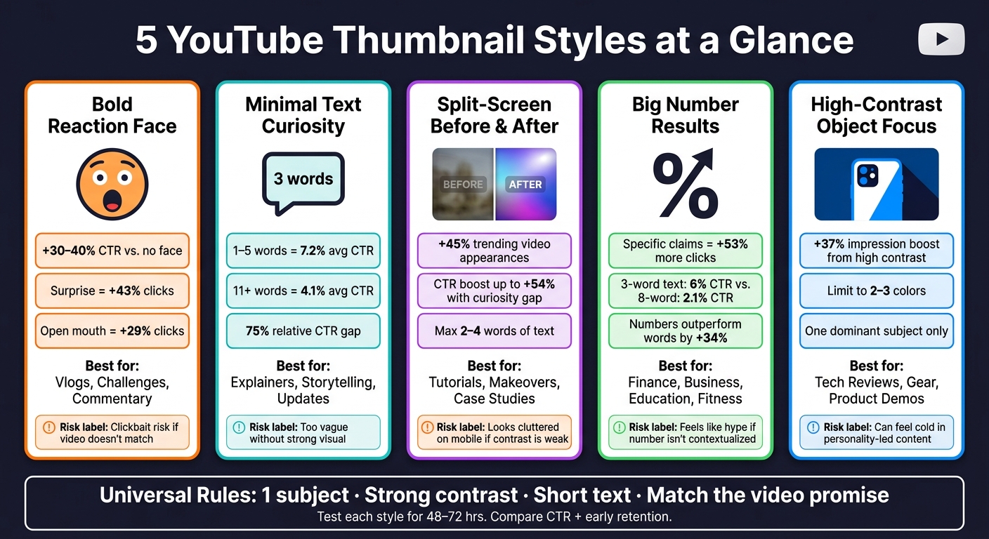
5 YouTube Thumbnail Styles: CTR Data & Best Use Cases
Side-by-side comparison of all 5 thumbnail styles
Use this table to compare the five styles at a glance and pick the best fit for your next video. It helps you match each style to the topic, the click intent, and how well it reads on a small screen.
Each one stands out for a different reason: emotion, curiosity, proof, specificity, or clarity.
| Thumbnail Style | Best Use Cases | Main Engagement Strength | Retention Strength | Main Risk | Best Fit Channels |
|---|---|---|---|---|---|
| Bold Reaction Face | Challenges, reactions, high-energy vlogs | Emotional pull; shocked expressions offer a +45% CTR boost vs. neutral faces | Strong early retention - viewers stay to see what caused the reaction | Can feel clickbaity if the video doesn't match the expression | Entertainment, vlogs, commentary |
| Minimal Text Curiosity | Explainers, storytelling, thought-leadership | Curiosity gap; open-ended phrasing pulls clicks without giving away the answer | Steady retention as viewers look for the answer | Too vague if the visual doesn't anchor the topic | Education, tutorials, science |
| Split-Screen Before-and-After | Transformations, makeovers, case studies | Visual proof of change in a single frame | Mid-to-late retention - viewers stay to see the full transformation | Can look cluttered on mobile if both sides are too busy | Fitness, DIY, design, coding |
| Big Number Results | Income reports, milestones, data-driven videos | Specificity and authority; numbers outperform words alone by +34% | Viewers stay for the story and strategy behind the number | Can feel like hype if the number isn't put in context in the video | Finance, business, YouTube growth |
| High-Contrast Object Focus | Tech reviews, product spotlights, gear guides | Visual clarity; high contrast drives a +37% impression boost | Strong watch time per session for viewers with specific intent | No human element - can feel impersonal in personality-driven niches | Tech, gear, photography, repair |
Once you pick a style, test it with your audience and fine-tune it based on the results.
How to Test and Improve Thumbnail Performance
Track the right YouTube metrics
After you pick a style from the comparison table, the next step is simple: check if it gets clicks and keeps people watching.
Focus on three YouTube metrics: click-through rate (CTR), average view duration (AVD), and audience retention. CTR tells you how many people clicked. AVD and retention tell you whether the thumbnail matched what viewers expected once they got into the video.
That difference matters a lot. If CTR is high but retention is low, the thumbnail likely promised more than the video gave. In plain English, it got the click, then lost the viewer.
Don’t judge a thumbnail in a vacuum. Compare each upload against your own channel average and watch for steady gains over time. The gap between CTR and retention is often the clearest clue for what to change next.
Change one variable at a time
Keep your tests clean. Change one variable at a time.
Start with background color. Then test facial expression. After that, test text. Small layout shifts usually don’t move CTR enough to tell you much, so they’re not the best place to start.
Here’s where the biggest movement tends to happen:
- Background color: 18–25% CTR swings
- Facial expressions: 12–18%
- Major text changes: 8–15%
Run each test for 48 hours before choosing a winner.
If you want to make clean variations without turning it into a whole production, ThumbnailCreator can help with templates, face swapping, object swapping, and text editing. That makes each version easier to compare, and the winner is usually much easier to spot.
Review results and refine the next version
Log every test in a spreadsheet. Include the thumbnail style, the variable you tested, CTR, AVD, and retention.
Then read the results like a story, not just a pile of numbers. If a new thumbnail lifts CTR but hurts AVD or retention, don’t throw out the whole idea. Keep the part that got attention, but make the image line up more closely with what the video actually delivers.
Track it. Compare it. Refine the next version. Then do it again.
Conclusion
Key takeaways from the 5 styles
Once you know how each style works, the next move is simple: pick the one that fits your video.
Each style lines up with a different kind of viewer intent. Some thumbnails lean on emotion. Others spark curiosity. Some promise change, show proof, or put the product front and center. The goal isn’t to use every style. It’s to use the one that matches what the viewer wants from that video.
Next step for creators
The strongest thumbnails do three things well: clarity, contrast, and an accurate promise the video actually delivers. That’s what you should look at when you test your next thumbnail.
Pick one style that fits your next video and your viewer’s intent. Then make two versions:
- your current thumbnail
- a new version based on that style
After 48 to 72 hours, compare CTR and early retention. Keep the version that gets more clicks without hurting retention.
FAQs
Which thumbnail style should I test first?
Start with background color. It usually has the biggest effect on click-through rate, often around 18% to 25%.
Then test facial expressions. Those tend to affect engagement by 12% to 18%.
Keep it simple: change one variable at a time. Run each test for 7 to 14 days so you can collect reliable, statistically sound data.
How do I know if my thumbnail is hurting retention?
Check CTR next to average view duration and early retention in YouTube Studio. That combo tells a much clearer story than CTR alone.
If clicks are high but people leave fast, your thumbnail may be overselling the video or setting the wrong expectation. In plain English: it got the click, but it didn’t match what viewers thought they were getting.
It also helps to compare results by traffic source. A thumbnail can work one way in Browse and another in Search, so looking at the mix matters.
Give each variation about 1,000 impressions before you judge it. That gives you a better read on what’s happening.
If CTR is low but AVD is high, that usually means the video lands well with the people who do click. In that case, the issue may be the thumbnail itself. Stronger visuals or clearer text could help more people give it a shot.
How often should I change my thumbnails?
Treat thumbnail design like something you tune over time, not a set-it-and-forget-it job.
Small updates can go a long way. Try refreshing pieces like fonts, colors, or layouts every 3 to 4 months. Then, once a quarter, review your top 10 and bottom 10 videos to see what’s pulling people in and what’s falling flat. Every 6 months, look back at your last 20 thumbnails and check for consistency.
A dip in click-through rate is often the clearest warning sign. If your CTR falls by more than 20% over four weeks, your design likely needs another pass. ThumbnailCreator makes that easier by letting you swap text or faces fast while keeping your brand layout the same.