

Bright vs. Dark Colors in Thumbnails
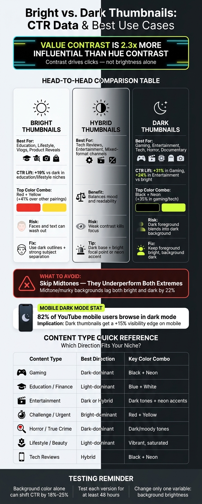
Dark often wins, but not because dark is magic. Contrast is what drives clicks. In the article, the clearest pattern is simple: thumbnails with stronger light-dark separation tend to do better, while midtone backgrounds tend to do worse. Dark backgrounds often help bright faces, text, and objects pop, which is one reason they showed a 31% edge in gaming and 24% in entertainment. On the other hand, bright backgrounds showed a 19% higher CTR in areas like education, lifestyle, and similar topics.
If I had to boil the article down into a few plain takeaways, it would be this:
- Pick contrast first, not brightness first
- Use dark backgrounds when you need bright subjects or text to stand out
- Use bright backgrounds when your niche leans clean, light, and easy to scan
- Skip murky midtones, which lagged both bright and dark options by 22%
- A/B test both versions with the same layout, because background color alone can shift CTR by 18% to 25%
- Design for mobile, where 82% of YouTube mobile users browse in dark mode
The article also makes one point that matters more than “bright vs. dark” by itself: value contrast is 2.3x more influential than hue contrast for guiding attention. So a loud color mix won’t help much if the face, text, or object blends into the background.
Bright vs. Dark Thumbnails: CTR Data & Best Use Cases
How To Make a Thumbnail 'POP'? - Color Theory In Thumbnails
sbb-itb-b59debf
Quick Comparison
| Option | Tends to Work Best For | Main Upside | Main Risk |
|---|---|---|---|
| Bright thumbnails | Education, lifestyle, vlogs, product-focused content | Clean look, easy fit for light topics | Faces and text can wash out |
| Dark thumbnails | Gaming, entertainment, tech, horror, documentary | Strong pop for bright text, faces, and icons | Can look muddy if the foreground is dark too |
| Hybrid thumbnails | Entertainment, tech, mixed-format channels | Good balance of mood and readability | Can lose focus if contrast is weak |
So if you want the short answer: use the color direction that makes your subject easiest to notice and your text easiest to read, then match that to your niche and mobile versus desktop viewing. That’s the core idea behind the full article.
Bright Thumbnails: Where They Work and Where They Fall Short
When Bright Colors Help a Thumbnail Stand Out
Bright thumbnails tend to do best in education, lifestyle, vlogs, and product reveals. In those categories, light backgrounds drive a 19% higher CTR than dark options. But brightness alone isn't enough. It helps when it makes the thumbnail easier to read, not when it just makes the image louder.
The color mix matters too. Red and yellow beat every other pairing by 41%, mostly because they create a sense of urgency and excitement. That makes them a strong fit for reaction videos, challenge content, and any format that needs to feel fast and high-energy. In most cases, bright colors work best when they're paired with a dark subject or dark text so the main idea doesn't get lost.
Common Problems With Very Bright Designs
The biggest issue is weak separation. If the background and subject sit at similar luminance levels, faces can look flat and text can get hard to read, especially at the small sizes YouTube shows in mobile feeds. When saturation is high but separation is poor, the thumbnail starts to feel cluttered instead of clickable.
Mobile makes that problem worse. Since 82% of YouTube mobile users browse in dark mode, a bright thumbnail needs clear edges and enough contrast to keep its shape against a dark interface. The fix is pretty simple:
- Use stronger edges
- Add dark outlines
- Keep one clear focal point
Bright can work well, but only if the subject still stands out at a small size.
Bright Thumbnail Pros and Cons
- Strength: Works well in education, lifestyle, and vlogs
- Weakness: Can flatten faces and text
- Fix: Use strong subject separation and dark text or outlines
When bright colors lose that separation, dark backgrounds often solve the same problem in a cleaner way.
Dark Thumbnails: Why They Often Perform Better
Why Dark Backgrounds Can Support Higher CTR
When bright thumbnails start to look flat or crowded, dark backgrounds often clean things up. They give bright subjects more contrast, so they stand out faster. On mobile, that matters even more: dark thumbnails get a 15% visibility edge for the 82% of YouTube users who use dark mode.
The data points in the same direction. Dark-background thumbnails beat light ones by 31% in gaming and 24% in entertainment. Deep blues, charcoal grays, and black help bright elements jump off the screen without looking washed out. By contrast, medium-gray or muted backgrounds do worse than both light and dark ends of the spectrum by 22%.
The Bright Subject, Dark Background Formula
The most dependable setup is simple: pair your brightest element with your darkest background. White text on charcoal. Yellow highlights on black. A well-lit face against a near-black backdrop. Same idea every time: the eye moves first to the point of highest contrast in the frame.
A bright face on a dark background also adds more depth and cleaner separation. That can make the image feel sharper at a glance, especially on small screens. In gaming and entertainment, dark backgrounds with neon accents perform 35% better.
Still, this isn't a one-size-fits-all move. It works in some niches and falls flat in others.
Dark Thumbnail Pros and Cons
- Best use: Text, icons, and faces with strong lighting
- Main risk: Dark foregrounds can blend into dark backgrounds
- Best fit: Tech, gaming, tutorials, horror, documentary
One thing to watch: dark doesn't always mean high contrast. If your subject is dark too, or the lighting is weak, the thumbnail can get muddy fast. The fix is simple. Keep the foreground bright, keep the background dark, and use that contrast as the starting point for the content-type and device-fit choices in the next section.
When to Use Bright or Dark: Content Type, Device, and Brand Fit
Once contrast is handled, the next call comes down to your niche, the device people use, and your brand colors. That’s what usually tips the scale between a bright or dark thumbnail.
How Content Type Changes the Better Choice
Dark-heavy palettes tend to work best for gaming, entertainment, horror, and true crime. They match the mood and help the thumbnail feel more dramatic.
Light-heavy palettes are usually a better match for education, finance, lifestyle, and beauty. They feel cleaner, easier to scan, and more in line with what viewers expect in those spaces.
One thing to skip: midtone backgrounds. They usually land in an awkward middle ground and don’t perform as well as either bright or dark extremes.
How Mobile Viewing Affects color decisions
On mobile, thumbnails have to do their job fast. Small screens make weak color separation fall apart.
That’s why mobile-first thumbnails should lean into strong separation. A bright subject or bold text on a dark background is often the safer pick. Complementary color pairs can also pull more clicks than monochrome color schemes because they stand apart more easily at a glance.
Use the table below as a quick starting point.
Decision Table: Bright, Dark, or Hybrid Thumbnail Approaches
| Content Type | Best Direction | Key Color Combo |
|---|---|---|
| Gaming | Dark-dominant | Black + Neon |
| Education / Finance | Light-dominant | Blue + White |
| Entertainment | Dark or Hybrid | Dark tones + neon accents |
| Challenge / Urgent Content | Bright-dominant | Red + Yellow |
| Horror / True Crime | Dark-dominant | Dark/moody tones |
| Lifestyle / Beauty | Light-dominant | Vibrant, saturated |
| Tech Reviews | Hybrid | Black + Neon |
Start with niche fit, then make sure the thumbnail still lines up with your brand.
Applying and Testing Color Choices With ThumbnailCreator

Using ThumbnailCreator to Build High-Contrast Variations
Once you’ve picked a direction, make both a bright and a dark version with the same layout. That keeps the test clean and makes the result easier to trust.
ThumbnailCreator makes this pretty simple. You can build matched bright and dark thumbnail versions fast with AI generation, background removal, text editing, object swapping, and preview mode.
With Background Remover and Color Enhancer, you can flip between a dark and bright background while keeping the same subject, text, and layout in place. That matters more than most people think. If the layout changes too, the test gets muddy.
The AI Thumbnail Generator can also pull frames from a YouTube link, so you’re not staring at a blank canvas. And YouTube Preview mode lets you see how each version will look on YouTube before you publish. That gives you a quick way to spot contrast issues on small screens before they cost you clicks.
How to Run a Clean Bright vs. Dark Thumbnail Test
This test only works if brightness is the one thing that changes.
A clean test changes one variable: background brightness and contrast. Keep the subject pose, text, framing, and composition the same. If the bright version is also busier, or if it uses different text, you won’t know what caused the result.
A simple workflow looks like this:
- Build both versions in ThumbnailCreator with the same template and subject
- Publish one version first
- Switch to the second after the test window
- Track CTR and impressions for each version
Background color tends to be the biggest lever in thumbnail testing, with an average CTR shift of 18% to 25%, so give each version at least 48 hours before you decide anything.
Conclusion: Bright vs. Dark Is a Contrast and Context Decision
Bright vs. dark isn’t about personal taste. It’s about contrast and context.
Dark backgrounds often do better because they keep the subject clear and cut visual clutter, especially in gaming and entertainment. Bright backgrounds can also do well in education and lifestyle niches, where a 19% CTR lift has been seen.
In many cases, the middle ground works best. Hybrid designs, especially dark bases with bright focal points or neon accents, often strike the right balance. In gaming and tech content, black-with-neon combinations have been reported to perform 35% better.
Use ThumbnailCreator to make both versions of the same thumbnail, then let your CTR data make the call rather than relying on A/B testing vs gut feeling.
FAQs
Should I always choose dark thumbnails?
No. Don’t lock yourself into dark or light thumbnails. High contrast matters more if you want to grab attention.
What works best depends on your niche and how people watch. Dark backgrounds often fit gaming and entertainment. Light backgrounds tend to work better for education and lifestyle.
A lot of mobile users watch in dark mode, so dark thumbnails can help. But the main goal is simpler than that: your design should stand out from YouTube’s interface.
One thing to avoid is medium-brightness backgrounds. They often blend in and get ignored.
Why do midtone backgrounds perform worse?
Midtone backgrounds often do worse because they don’t create enough contrast to stand out in the YouTube feed.
They sit in the middle. Not dark enough to pop. Not light enough to catch the eye. So instead of standing out, the thumbnail can blend in with everything around it.
That medium-brightness penalty can cut performance by 22% compared with brighter or darker backgrounds.
How long should I test bright vs. dark thumbnails?
Run your A/B test for at least 48 hours so you have enough data to work with. If you want a steadier read on performance, let it run for 7 to 14 days.
During that window, try to get 1,000 to 5,000 impressions for each thumbnail version. If you're making variants in ThumbnailCreator, keep everything else the same so brightness is the only thing changing.