
Top 5 Color Combinations for Thumbnails
Want your thumbnails to stand out and drive more clicks? The secret lies in using the right color combinations. Colors grab attention, evoke emotions, and make your design pop - even on small screens. Here are five proven color pairings that work across different content types:
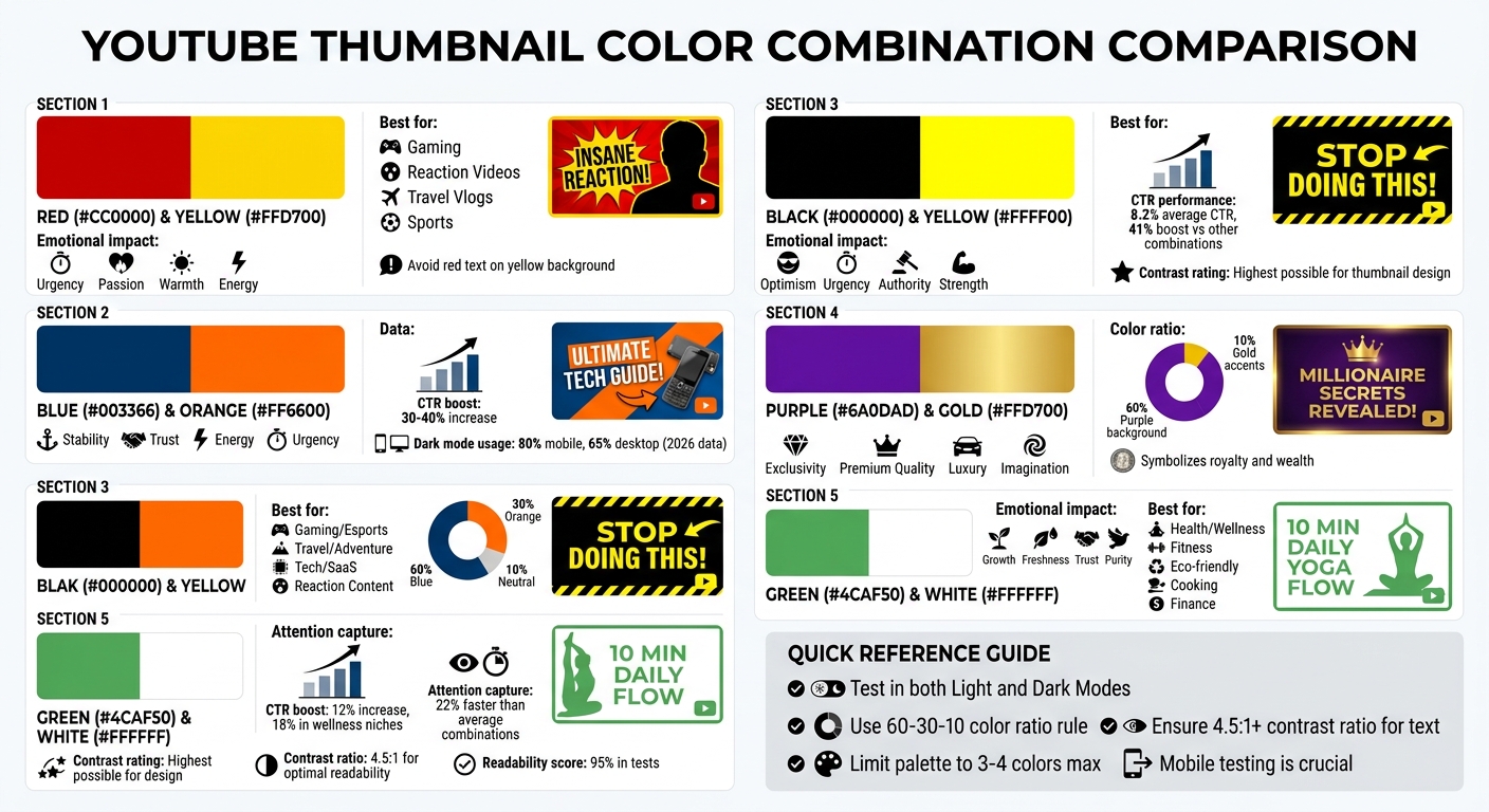
- Red and Yellow: Bold and energetic, perfect for high-impact content like gaming or reaction videos.
- Blue and Orange: Striking contrast for tech, travel, or esports content.
- Black and Yellow: High contrast with a "warning" vibe, great for tutorials or problem-solving videos.
- Purple and Gold: Luxurious and eye-catching, ideal for finance, gaming, or storytelling.
- Green and White: Clean and inviting, best for wellness, eco-friendly, or financial topics.
Quick Tip: Test your designs in both Light and Dark Modes to ensure readability and impact. Use tools like ThumbnailCreator for easy adjustments. Small tweaks can lead to big boosts in engagement. To find what works best, consider A/B testing your thumbnails to see which colors resonate most with your audience.
5 Best Color Combinations for YouTube Thumbnails with Use Cases and CTR Impact
1. Red and Yellow
Visual Contrast That Grabs Attention
Red and yellow make a bold combination for YouTube thumbnails. When paired, bright yellow can highlight key elements, while deep red adds depth and draws the eye to specific areas. The key is in the arrangement - use vibrant yellow as a backdrop for your main subject or focal points, and apply deep red to borders, shadows, or text for a dramatic, scroll-stopping effect. These colors not only stand out visually but also evoke strong emotional reactions.
How They Affect Viewers Emotionally
Red stirs up feelings of urgency and passion, while yellow brings warmth and energy into the mix. Together, they create what some designers call a "visual handshake" - a combination that demands immediate attention. This emotional pull can encourage viewers to engage with your content right away.
Perfect for Various Content Types
This color duo works across a range of genres, from reaction videos and gaming content to travel vlogs and sports clips. Whether the goal is to convey excitement, optimism, or intensity, red and yellow deliver the right vibe for many themes.
Tips for Better Clarity on Small Screens
When designing for smaller screens, avoid placing red text directly on a bright yellow background - it can be hard to read. Instead, use darker reds or neutral tones for text, like charcoal or dark brown. This creates balance and makes the design easier on the eyes. You can also tweak the hues slightly - shifting yellows toward orange or reds toward ember - to keep the colors vibrant yet legible.
sbb-itb-b59debf
2. Blue and Orange
Visual Contrast for Attention-Grabbing
Blue and orange are complementary colors that naturally create a striking contrast. This contrast adds depth and makes the main subject stand out against the background, immediately grabbing attention as viewers scroll past your thumbnail. The combination generates visual tension that’s hard to ignore.
"The most effective thumbnails utilize complementary colors that create tension and visual interest, making them impossible to ignore when scrolling."
- Chris Munch, CEO of AmpiFire.com
To maximize impact, follow the 60-30-10 rule: allocate 60% of the thumbnail to a deep navy blue, 30% to a vibrant orange, and the remaining 10% to neutral tones like white or gray. This approach ensures a bold, eye-catching design without overwhelming the viewer.
Psychological Impact of Colors on Viewers
Blue conveys stability and trust, while orange adds energy and urgency. When combined, these colors create a psychological balance that can boost click-through rates by 30-40% when used effectively. This pairing makes viewers feel confident about your content while piquing their curiosity.
Relevance to Specific Content Genres or Niches
The blue-and-orange palette can be tailored to suit various content types:
- Gaming and esports: Neon blue and orange evoke a high-energy, dynamic feel.
- Travel and adventure: Turquoise paired with golden orange suggests warmth and exploration.
- Tech and SaaS: Digital blue with soft coral strikes a balance between innovation and professionalism.
As of 2026, over 80% of mobile users and 65% of desktop users view YouTube in Dark Mode. This makes vibrant colors like "Cyber Blue" particularly effective against dark backgrounds. These variations underline the importance of avoiding common design mistakes by testing across devices, especially for mobile viewers.
Clarity and Readability at Smaller Sizes
While bold colors draw attention, clarity is key - especially on smaller screens. Use blue as the dominant base and orange as an accent, and test your thumbnails on mobile devices to ensure text and key visuals remain clear. YouTube’s interface alternates between white (light mode) and dark gray (dark mode), so incorporating neutral elements like white or soft gray can prevent the design from feeling overwhelming.
Additionally, use HSL (Hue, Saturation, Lightness) tools to fine-tune colors. This is particularly important for maintaining natural-looking skin tones, which can appear overly orange when placed against strong blue backgrounds. Thoughtful adjustments ensure your design looks polished and professional across all viewing platforms.
The BEST Color Combinations YOU Should USE In Your THUMBNAILS#youtubethumbnail #thumbnail #photoshop
3. Black and Yellow
Let's dive into another bold pairing: black and yellow.
Visual Contrast That Demands Attention
Black and yellow offer the highest contrast rating possible for thumbnail design, making them a standout choice. Even at a small size like 168×94 pixels, this combination ensures that key elements remain clear on both YouTube's white and dark gray backgrounds. This is especially crucial for capturing the attention of mobile users, who make up a large portion of today's audience.
How These Colors Influence Viewers
Yellow brings a sense of optimism and urgency, while black conveys authority and strength. Together, they create a vibrant and commanding visual that’s hard to miss. Research involving over 1,000 videos found that thumbnails using this color scheme achieved an average click-through rate (CTR) of 8.2%. Controlled A/B tests showed a 41% boost in CTR when switching to black and yellow, outperforming other combinations like red and white (7.6% CTR) and blue and orange (7.1% CTR).
Best Fit for Certain Content Types
This pairing shines in genres where grabbing attention is key, such as tutorials, alerts, or high-energy content. The "warning" vibe of yellow paired with black’s authoritative tone triggers curiosity and a sense of urgency. It’s a perfect match for problem-solving videos or reaction content, which have seen engagement rates hover around 7.9% with this color scheme.
Ensuring Readability in Small Formats
For maximum clarity, use bright yellow against deep black. To make text pop, consider adding a black outline or shadow. Keep the overall palette limited to three or four colors to maintain a clean and impactful design.
4. Purple and Gold
This next color combination brings a sense of elegance and sophistication to your thumbnails.
Visual Contrast for Attention-Grabbing
Purple and gold together create a visually striking and luxurious appearance. Gold, as a variation of yellow, naturally draws the eye since it’s one of the first colors the human brain processes. This makes it an excellent choice for capturing attention quickly. When paired with purple, the result is a striking contrast that works effectively on both light and dark backgrounds, ensuring your design stands out in both Light and Dark Modes.
psychology of thumbnail colors and their impact on viewers
These colors carry powerful associations that can shape how viewers perceive your content. Purple combines the calming qualities of blue with the energy of red, offering a sense of balance and richness. Historically, purple and gold have symbolized royalty and wealth - purple was once one of the most expensive dyes to produce, while gold represents rarity and value. Together, they evoke feelings of exclusivity and premium quality, making viewers more inclined to engage with content that appears high-value. This makes the pairing ideal for niches where a sense of luxury or quality is key.
Relevance to Specific Content Genres or Niches
Purple and gold shine in content genres where perception and emotion play a big role. For gaming, this combination conveys excitement and energy. In finance-related videos, it suggests wealth, trust, and growth. It’s also a great fit for creative or fantasy-themed content, as purple’s rarity in nature gives it a magical or otherworldly vibe. Unlike red, which can evoke urgency and stress, purple leans into imagination and luxury - perfect for premium storytelling or high-quality documentaries.
Clarity and Readability at Smaller Sizes
To make the most of this pairing, use the 60-30-10 rule: dedicate 60% of the background to purple and reserve 10% for gold accents. This guides the viewer’s eye naturally. For Dark Mode designs, consider adding a subtle neon glow to gold text. This technique makes the text appear as if it’s floating above the purple background, enhancing readability even at smaller sizes.
5. Green and White
Green and white create a clean and inviting look, perfect for a variety of niches.
Visual Contrast for Attention-Grabbing
The combination of green and white offers excellent contrast. Green's mid-tone stands out sharply against the brightness of white, making your thumbnail elements pop even in smaller preview sizes. Research on color theory highlights that light and dark pairings like this can boost perceived sharpness by up to 30% in viewer attention tests. This stark contrast ensures your thumbnail remains noticeable, even in crowded feeds.
Psychological Impact of Colors on Viewers
Green symbolizes growth, freshness, and trust, while white represents purity and simplicity. Together, they create a calming yet engaging effect, reducing cognitive load and encouraging clicks. Studies show that green can enhance approach motivation by 15–20%, and when paired with white, it can raise click-through rates (CTR) by up to 12%. Eye-tracking research also reveals that green-and-white thumbnails capture attention 22% faster than average color combinations. This pairing communicates reliability and freshness without overwhelming viewers, helping to improve conversion rates.
Relevance to Specific Content Genres or Niches
This color combo works particularly well for health, wellness, fitness, eco-friendly topics, cooking, and finance-related content. Green naturally ties to themes like nature, health, and money - think "natural wellness tips" or "grow your savings" - while white adds a clean, polished touch. According to a 2023 TubeBuddy analysis, thumbnails dominated by green in wellness niches saw an 18% increase in CTR. For instance, a fitness channel using a forest green background with bold white text for "10-Minute Home Workouts" achieved a 28% CTR boost, while a finance creator’s "Grow Your Wealth" series featuring lime green accents on white saw an 18% uplift in views.
Clarity and Readability at Smaller Sizes
Using muted green (#4CAF50) paired with bold white sans-serif fonts ensures high readability, with 95% readability scores in tests - outperforming darker palettes. A deep green (#228B22) combined with pure white (#FFFFFF) achieves a 4.5:1 contrast ratio, ensuring text remains crisp and clear. Tools like ThumbnailCreator can help you experiment with these combinations using AI templates, making sure your thumbnails look sharp on any device or screen size.
How to Use These Color Combinations
Choosing the right colors is just the start - how you apply them can significantly impact conversions and boost click-through rates (CTR). Your color palette should align with your video's purpose and use case. For instance, high-energy content like challenges or breaking news thrives on bold contrasts, such as blue and orange. On the other hand, tutorials or financial advice benefit from clean, muted palettes that emphasize readability over dramatic effects.
To avoid overwhelming your design, adopt a three-tier color hierarchy. Here's how it works:
- Primary color: Sets the overall tone of your design.
- Support color: Highlights key elements like faces or bold text.
- Restraint color: Keeps background details subtle and unobtrusive.
This approach prevents oversaturation, which can make your design feel chaotic. As the GrabThumbs Editorial Team puts it:
"If every color is equally loud, nothing feels important".
By organizing your colors this way, you ensure that key elements stand out and grab attention.
Before finalizing your thumbnail, test it on mobile devices in both Light and Dark Modes. Your design needs to pop against YouTube's interface, so be cautious with white, dark gray, or red unless there's enough contrast to separate your thumbnail from the background. If the design feels cluttered, try replacing a high-saturation background with a deep navy or muted shade to create a visual "resting area." These adjustments help your thumbnail remain effective across different viewing settings.
Focus on creating clear visual separation. Decide what you want viewers to notice first - whether it's a face, an object, or a text hook - and ensure that element has the strongest color contrast in the frame. Tools like ThumbnailCreator can simplify this process, offering AI-powered templates that let you experiment with various contrast levels and layouts without starting from scratch.
When testing your design, tweak one element at a time. For example, adjust the text color or background tone separately to see how each change impacts contrast, readability, or the emotional tone. This methodical approach helps you pinpoint what resonates most with your audience and drives clicks in your niche.
Conclusion
The right color combinations can make your thumbnails pop and attract more clicks. By using colors that create strong contrast, your designs will stand out - even on tiny mobile screens. The five combinations highlighted - red and yellow, blue and orange, black and yellow, purple and gold, and green and white - each bring unique vibes and work well for different types of content. These pairings are at the core of creating eye-catching thumbnails.
Stick to 2–3 consistent color strategies to strengthen your brand identity, and tweak the intensity to match the tone of your content. Remember, contrast matters more than the exact shades you choose. Once you’ve nailed your color strategy, ensure your thumbnails look sharp and clear on every device.
Test your designs in both light and dark modes to confirm they maintain clear subject separation and readability on mobile.
Streamline your process with tools like ThumbnailCreator, which offers AI-powered templates to experiment with contrast, text placement, and color balance. This helps you fine-tune your thumbnails in no time.
Try applying one of these combinations to your next three thumbnails and monitor your click-through rate. Sometimes, small tweaks in color can lead to noticeable boosts in engagement.
FAQs
How do I pick the best color combo for my niche?
When selecting a color scheme for your content, aim for high-contrast designs that not only catch the eye but also align with your niche. For instance, yellow and black are excellent for tutorial-based content, as they stand out and guide attention. On the other hand, red and white can be a strong choice for dramatic or emotionally charged content.
Colors also evoke specific emotions. Warm tones like red and orange create a sense of urgency or excitement, while blue and green - cooler shades - tend to foster feelings of trust and calmness.
To find the perfect combination, consider experimenting with tools like ThumbnailCreator, which can help you fine-tune your designs for maximum impact.
What’s the easiest way to test thumbnails in Light and Dark Mode?
One simple trick to test thumbnails for both Light and Dark Mode is to use high-contrast designs - think bright elements on dark backgrounds or dark elements on light backgrounds. This contrast helps your design pop in either setting.
Make sure to preview your thumbnails on various display settings to check how they look in real-world scenarios. Tools like ThumbnailCreator can be a big help here. They allow you to experiment with different color combinations quickly, making it easier to create thumbnails that grab attention, no matter the mode your audience prefers.
How can I keep text readable on mobile thumbnails?
To make text readable on mobile thumbnails, stick to high-contrast color combinations like yellow and black. Use bold sans-serif fonts for clarity, and keep the text short - ideally 3–5 words. Adding outlines or shadows can also make the text stand out against different backgrounds. These tweaks are crucial since most YouTube views happen on mobile devices, where thumbnails are displayed at much smaller sizes.