
Ultimate Guide to Contrast in Thumbnails
Want your YouTube thumbnails to stand out? It's all about contrast. High-contrast thumbnails grab attention faster, boost click-through rates (CTR), and perform better on mobile devices where most viewers are scrolling. Here's the key takeaway: focus on making your subject, text, and background visually distinct.
Key Points:
- Contrast Types: Use differences in brightness, color, size, and saturation to highlight key elements.
- Mobile Optimization: With 87% of YouTube views on mobile, ensure thumbnails stay clear at small sizes (120–150 pixels wide).
- Design Tips: Stick to three visual elements, use bold fonts, and test designs with tools like the Stamp Test, grayscale conversion, or thumbnail A/B testing.
- Proven Results: High-contrast thumbnails can increase CTR by 30–40%, while cluttered designs can reduce it by 23%.
Bottom Line: A well-designed thumbnail with clear contrast gets more clicks and signals YouTube's algorithm to recommend your content.
How To Make a Thumbnail 'POP'? - Color Theory In Thumbnails
sbb-itb-b59debf
Core Principles of Thumbnail Contrast
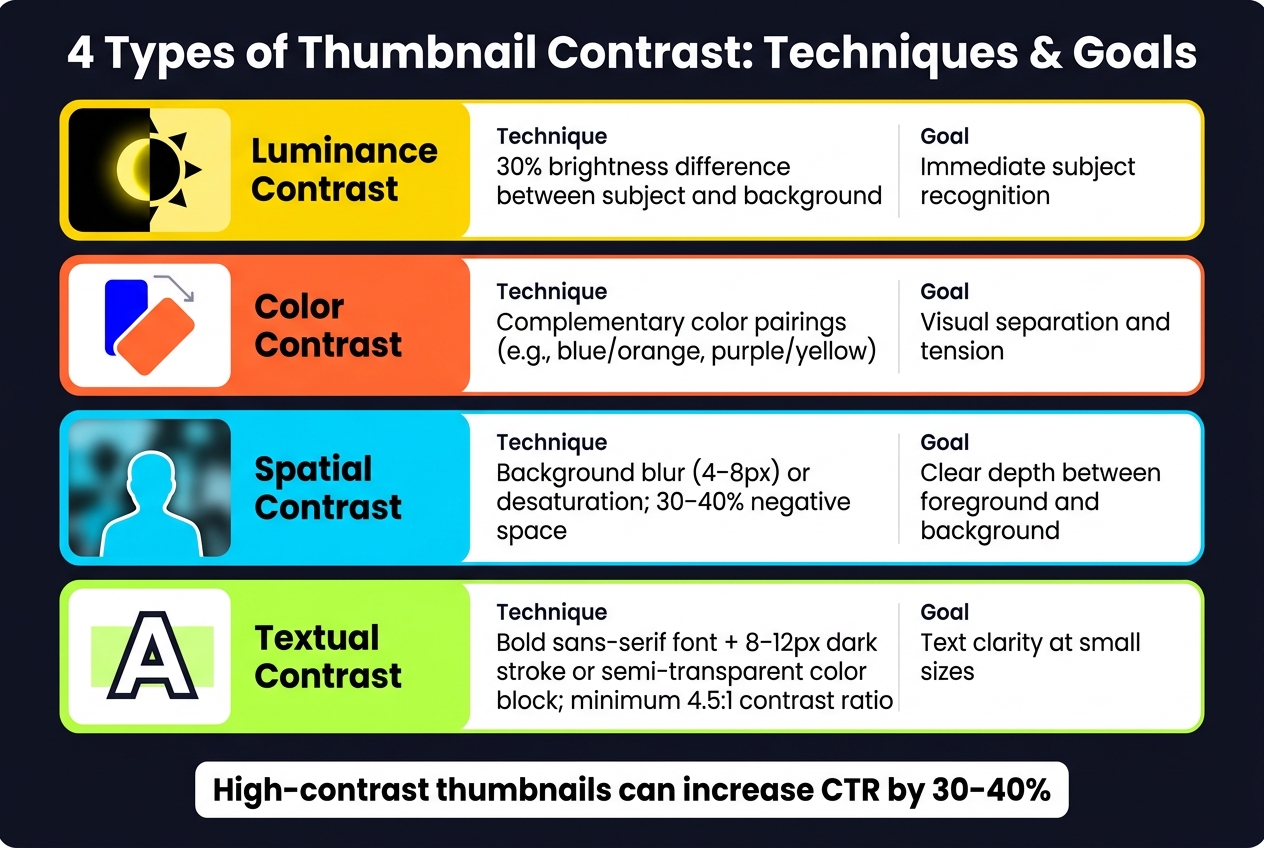
4 Types of Thumbnail Contrast: Techniques & Goals
Types of Contrast in Thumbnails
Contrast isn’t just one technique - it’s a collection of methods that work together to make elements stand out and guide the viewer’s attention. By understanding the four main types of contrast, you can design thumbnails with intention rather than relying on guesswork.
Luminance contrast refers to the difference in brightness between elements. For instance, placing a brightly lit face against a dark background creates immediate recognition. Aim for a 30% brightness difference between your subject and background for clarity. This is especially important for mobile users, as colors with similar brightness levels can blur together.
Color contrast involves hue, saturation, and temperature. Using complementary hues - like blue and orange or purple and yellow - creates natural tension and separation. Saturation contrast works by placing a vivid, highly saturated subject against a muted background, instantly drawing the eye. Temperature contrast, on the other hand, pairs warm tones (reds, oranges) with cool tones (blues, grays) to add energy or urgency.
Spatial contrast plays with depth perception. You can blur the background by 4–8 pixels or desaturate it to make the foreground subject pop. Negative space, where 30–40% of the frame is left empty, ensures the image doesn’t feel cluttered and gives the focal point room to stand out.
Textual contrast is its own category. Text should be treated separately from images. Bold sans-serif fonts like Impact or Bebas Neue pair well with an 8–12 pixel dark stroke or a semi-transparent color block behind the text. This ensures readability over busy backgrounds. For mobile screens, aim for a contrast ratio of at least 4.5:1, with 7:1 being ideal.
| Contrast Type | Technique | Goal |
|---|---|---|
| Luminance | 30% brightness difference | Immediate subject recognition |
| Color (Hue) | Complementary color pairings (e.g., blue/orange) | Visual separation and tension |
| Spatial | Background blur (4–8px) or desaturation | Clear depth between foreground/background |
| Typography | Bold sans-serif with dark stroke or color block | Text clarity at small sizes |
These techniques tap into how our brains naturally process visuals, making them essential for creating effective thumbnails.
How the Eye Responds to Contrast
The way our eyes respond to contrast is almost instinctive. The brain processes color in under 200 milliseconds and can recognize a face in just 170 milliseconds. High-contrast areas grab attention in less than 200 milliseconds, which is critical when thumbnails are competing for clicks in a crowded feed.
"Contrast is communication, and on a platform where your thumbnail competes with hundreds of others in a single feed view, communication speed is everything." - TubeAI
Visual hierarchy plays a key role here. The primary focal point - often a face or key object - should be the largest, brightest, or most saturated element, with other elements supporting it rather than competing. As the GrabThumbs Editorial Team puts it, "If every color is equally loud, nothing feels important.". Oversaturation, for example, can flatten an image and make it harder to focus on the key subject.
A brightly lit subject against a dark background is a classic approach because it triggers a natural visual response rather than relying on fleeting trends. To test your thumbnail’s effectiveness, try the Squint Test: squint at the image until it blurs. If the main focal point still stands out, your contrast is doing its job.
Practical Contrast Techniques for Thumbnails
Using Color to Build Strong Contrast
To make your thumbnails pop, use complementary colors like blue and orange, yellow and violet, or red and cyan. These combinations create natural visual tension, ensuring your design stays eye-catching even when shrunk down for mobile screens. Stick to a three-color rule: one dominant color, one accent color, and one muted background. For instance, reducing the saturation of the background by 60–80% can make the subject stand out while keeping the overall palette balanced.
Avoid blending your colors with YouTube's interface (white, dark gray, and red). Opt for slightly warmer or cooler variations of these shades to help your thumbnail stand out.
"The best colors for YouTube thumbnails are not universal magic colors. They are the colors that keep the subject, text, and emotional cue readable when the image is reduced inside the feed." - GrabThumbs Editorial Team
These color tips naturally lead into layering techniques and styles, which ensure each element in the thumbnail remains distinct.
Separating Background, Subject, and Text
Good contrast isn't just about colors - it’s also about clear layering. Start with the background. Solid colors create a clean base, while subtle gradients can add depth without making the image feel busy. Using YouTube thumbnail templates can help you quickly implement these foundational layers. If you're working with photo backgrounds, try desaturating them or applying a soft blur to keep the focus on the subject.
To make the subject stand out, add a 4–8 pixel outline or a subtle outer glow. This is especially helpful in darker or low-contrast scenes where the subject might otherwise blend into the background. For text, positioning plays a key role in maintaining separation.
Text legibility requires extra attention. A 2–4 pixel drop shadow or a semi-transparent color block (set to 60–70% opacity) behind the text can make it pop against busier backgrounds. Use bold, sans-serif fonts like Impact, Bebas Neue, or Montserrat Extra Bold, and keep the font size at least 60pt for primary text. Also, avoid placing critical text or visuals in the bottom-right corner - it’s where YouTube’s duration badge appears.
"The first job of a thumbnail is not to be pretty. It is to be legible at speed." - GrabThumbs Editorial Team
Keeping Contrast Clear at Small Sizes
Even with colors and layers optimized, thumbnails must stay clear when viewed on mobile. Since 87% of YouTube visits come from mobile devices, thumbnails are often displayed at just 120–150 pixels wide. Designs that look great on desktops can blur when scaled down. Use the Stamp Test - resize your thumbnail to 120 pixels wide. If elements blur together, simplify the design.
Another great method is the grayscale test. Remove all color from your thumbnail. If the focal point doesn’t stand out in black and white, your brightness contrast might be too weak to handle mobile compression.
For maximum clarity on mobile, limit your design to three visual elements - ideally, one face, one text hook, and one graphic. Thumbnails with more than three elements tend to see a 23% drop in click-through rates. Keep text brief, sticking to 3–5 words, and ensure a minimum contrast ratio of 4.5:1 between text and background.
"I reduced my thumbnail text from 12 words to 3. My CTR jumped from 3.2% to 7.8% overnight." - Ali Abdaal, Creator
Measuring and Improving Thumbnail Contrast
Tools for Checking Contrast Objectively
Once you've designed your thumbnail, it’s essential to check its contrast objectively. Tools like the WebAIM Contrast Checker and ContrastAnalyzer.com allow you to input two colors and instantly calculate their contrast ratio based on WCAG 2.1 standards.
| Standard | Element Type | Required Ratio |
|---|---|---|
| WCAG AA | Normal Text | 4.5:1 |
| WCAG AA | Large Text (18pt+ or 14pt bold) | 3:1 |
| WCAG AA | UI Components & Graphics | 3:1 |
| WCAG AAA | Normal Text (Enhanced) | 7:1 |
Aim for a contrast ratio of at least 4.5:1 for text, even for larger fonts, as YouTube compresses and scales down thumbnails. This ensures text remains readable after compression. Specifically, measure contrast where text overlays the background, as global averages can miss localized issues.
For a more detailed analysis, try the ClickyApps Thumbnail Contrast Checker. This tool lets you sample specific areas of your image rather than relying on an average. Its "Auto-tune" feature can automatically add a dark plate behind text to meet the desired contrast ratio. Plus, all processing happens locally in your browser, keeping your image files private.
These tools provide a reliable starting point before you move on to live testing.
Running A/B Tests on Thumbnail Contrast
After confirming your thumbnail’s contrast meets objective standards, test how it performs in practice. YouTube’s "Test and Compare" tool (available in YouTube Studio for eligible creators) is designed for this purpose, allowing you to compare A/B testing vs gut feeling when selecting designs. It measures watch time per impression, identifying thumbnails that not only attract clicks but also keep viewers engaged.
"YouTube favors combinations that get viewers to click AND keep them watching." - Influencer Marketing Hub
When running A/B tests, focus on big-picture changes rather than minor tweaks. For instance, testing a bright background with dark text against a dark background with a glowing subject outline will yield more actionable insights than simply swapping shades of blue. Aim for at least 1,000 impressions per variant, but for more reliable results, shoot for 10,000+ impressions. Running tests over at least 7 days helps account for variations in viewer behavior across weekdays and weekends.
A practical method is the Safe-Safe-Wildcard approach: test two designs that align with your usual style and one "wildcard" that pushes boundaries with extreme contrast or a completely different layout. This approach balances maintaining your brand identity while exploring new possibilities.
Building on Contrast Patterns That Work
A/B testing can uncover contrast strategies that resonate with your audience. For example, a study by the NoteLM Team analyzed 1,247 videos across 20 channels between July 2025 and January 2026. They found that high-contrast thumbnails achieved a 39% higher average CTR (7.1%) compared to low-contrast designs (5.1%). Specifically, Yellow + Black designs delivered a 41% increase in CTR during controlled tests.
Use this data to refine your design strategy. Keep a record of successful thumbnails, noting details like color combinations, text styles, background treatments, and CTR. Over time, these records will help you identify patterns that work for your audience. Based on these insights, create a brand style guide with:
- 2–3 primary colors (defined by HEX codes)
- 1–2 fonts
- A standard contrast rule, such as ensuring the subject is at least 30% brighter or darker than the background
For example, WIRED applies this strategy on YouTube by using solid-color backgrounds to differentiate series - green for "Autocomplete Interview" and blue for "Tech Support." This consistency helps returning viewers instantly recognize their content.
Once you’ve nailed down a contrast formula, build master templates with these settings. Use them for new uploads and consider updating thumbnails for older videos that have high impressions but low CTR. A refreshed thumbnail with proven contrast patterns can breathe new life into a video’s performance without altering its content.
Using ThumbnailCreator to Apply Contrast Principles
Let’s dive into how ThumbnailCreator makes it simple to apply contrast principles that can boost your thumbnails' effectiveness.
AI Tools for Quick Contrast Adjustments
ThumbnailCreator leverages AI to analyze your YouTube video URL and generate multiple thumbnail options in just seconds. With its element-specific regeneration feature, you can tweak background colors, text overlays, and subject placement without starting over. As YouTube Ads Expert Aleric Heck puts it: "The AI Optimize feature automatically improves thumbnails, and the fully AI-generated options keep getting better." This efficient workflow not only shortens production time from hours to minutes but also delivers thumbnails that achieve a 73% higher click-through rate.
Templates and Editing for High-Contrast Designs
Beyond its AI features, ThumbnailCreator offers pre-designed templates tailored to high-contrast visuals, making it accessible even if you're not a designer. Here’s what’s available:
- Gaming templates: Neon text and glowing effects create strong visual separation.
- Split-screen templates: Ideal for content that thrives on contrasting visuals.
- Spin Variations: Quickly generates alternate color schemes and text layouts in under two minutes, perfect for A/B testing without extra effort. This is a crucial part of thumbnail testing at scale for high-volume channels.
- Built-in editor: Includes tools for face swapping and object editing, ensuring your subject stands out against the background.
A Time-Saving, Contrast-Focused Workflow
For creators posting regularly, having a consistent thumbnail style is key. ThumbnailCreator simplifies this with AI-driven variations and an intuitive editor, allowing you to finalize a perfectly sized 1280 x 720 thumbnail in minutes. More than 15,000 creators already rely on this workflow to save hours on design tasks every week. One user shares: "Now, my thumbnails are finished within a few mins and they look (and convert) better as well." If you’re interested, the platform offers a 7-day free trial to explore its features before committing. With these tools, you’ll create thumbnails that consistently grab attention and boost engagement.
Conclusion: Getting Contrast Right in Your Thumbnails
Contrast is the backbone of a thumbnail that grabs attention. It ensures your subject, text, and background remain easy to read, even on the smallest mobile screens.
The data supports this approach. Thumbnails with high contrast consistently deliver better click-through rates (CTR). Small but intentional design choices - like using complementary colors, bold fonts, and clearly separating the subject from the background - can significantly impact performance.
"Your thumbnail is a promise. Your video is the fulfillment. If they don't match, viewers leave and the algorithm punishes you." - Paddy Galloway
FAQs
What’s the fastest way to tell if my thumbnail contrast works on mobile?
To test if your thumbnail contrast is effective for mobile viewers, shrink it down to a tiny size - think postage stamp small. This helps you see if the main subject and text remain clear and easy to identify. Use high-contrast elements to make your thumbnail pop. Boosting contrast with stronger saturation or complementary colors can also make a big difference. Remember, most YouTube viewers are on mobile, so clarity on small screens is key.
How do I increase contrast without making the thumbnail look oversaturated or “too loud”?
To make your design pop without going overboard, stick to bold, complementary colors like yellow on violet or blue on orange. Keep your color palette simple - just a few hues - to maintain clarity and ensure the most important elements grab attention.
Always test your design at smaller sizes, such as 120 pixels wide, to check if everything stays legible. Prioritize brightness contrast and make sure there’s a clear distinction between elements. This helps you avoid a design that feels cluttered or too overwhelming.
When should I A/B test contrast changes versus changing the thumbnail layout?
When you’re trying to figure out how visual elements like color or brightness affect your thumbnail's click-through rate (CTR), A/B testing contrast changes is the way to go. This approach focuses on isolating the impact of contrast on how viewers interact with your content.
If you’re looking at the bigger picture - like rearranging elements or tweaking the overall composition - then it’s time for layout testing. While contrast tests fine-tune individual elements, layout tests are designed to assess how well the overall design works.