

Case Studies: Successful Branding in Thumbnails
Want more clicks on your videos? Start with better thumbnails.
Thumbnails that follow a clear, recognizable branding system can boost click-through rates (CTR) by 15–25%. Here's why: consistent use of colors, fonts, and layouts makes your videos stand out in crowded feeds. Viewers spot your content instantly, even without reading the title, building trust and driving more clicks over time.
But here's the catch: sticking to the same style without occasional updates can make your thumbnails feel stale. The key is balancing consistency with small variations to keep things visually engaging.
Key Takeaways:
- Consistency matters: Use 2–3 signature colors, 1–2 fonts, and repeatable layouts.
- Faces work: Thumbnails with faces boost CTR by 38–49%.
- Short text wins: 3–5 words increase CTR by 28% compared to longer text.
- Contrast is king: High-contrast designs can improve impressions by 37%.
- Test everything: A/B testing small changes like colors or facial expressions can increase CTR by up to 25%.
This article dives into how creators like MrBeast, Veritasium, and MKBHD use data and design to create thumbnails that drive millions of views. Stick around to learn how to build your own thumbnail branding system that delivers results.
How We Evaluated Thumbnail Branding Success
How the Case Studies Were Selected
To ensure meaningful insights, we focused on creators who showcased clear design changes, measurable performance data, and deliberate branding strategies. Priority was given to those who transitioned from relying on instinct to adopting a data-driven approach - using tools like A/B testing, visual audits, and structured brand kits. Channels that merely followed trending styles without understanding their effectiveness were left out. What mattered most was whether creators could explain why their thumbnails worked - not just that they performed well.
Now, let’s break down the metrics used to validate their success.
Metrics Used to Measure Success
The cornerstone metric in these case studies was Impressions Click-Through Rate (CTR) - the percentage of viewers who clicked after seeing a thumbnail. However, CTR alone isn’t enough. Misleading thumbnails might boost clicks but can harm overall watch time, which negatively impacts a channel's algorithmic performance.
To address this, Average View Duration (AVD) and the impressions-to-views ratio were also analyzed. These metrics ensured that branding changes attracted the right audience - viewers who stayed engaged, not just those who clicked. For reference, channels that actively test thumbnails report a median CTR increase of 32.7%, and thumbnails featuring faces achieve an average CTR of 9.2%, compared to 6.1% for those without.
"A thumbnail that effectively conveys the content and value of your video can lead to higher watch time, as it will be more likely to attract the right viewers." - Vireo Video Marketing Agency
These metrics helped establish clear benchmarks for successful branding.
What Balanced Branding Looks Like
Balanced branding strikes a middle ground: thumbnails should be recognizable but not overly repetitive. A strong brand kit typically includes 2–3 signature colors, 1–2 consistent fonts, and a repeatable layout (such as always placing the subject’s face on the right side).
The 80/20 rule is a helpful guideline here: 80% of thumbnails should stick to the brand system, while 20% can allow for creative variation, such as for milestones or collaborations. Channels that follow this balance often see a 15–25% increase in CTR from returning viewers. The table below highlights key branding elements and their measurable effects:
| Branding Element | Performance Impact | Metric |
|---|---|---|
| Faces in thumbnails | +38% to +49% | CTR boost |
| Red + yellow color palette | +41% | CTR boost |
| Brand logo presence | +19% | Trust signal |
| 3–5 words of text | +28% | Advantage over longer text |
| High contrast | +37% | Impression boost |
One simple test you can try: scroll through the last 20 thumbnails of a channel. If you can’t spot a consistent use of colors, fonts, or layouts, the branding likely isn’t pulling its weight.
sbb-itb-b59debf
How To Create Great Branded YouTube Thumbnail Designs to get more subscribers
Case Studies: YouTube Creators Who Got Thumbnail Branding Right
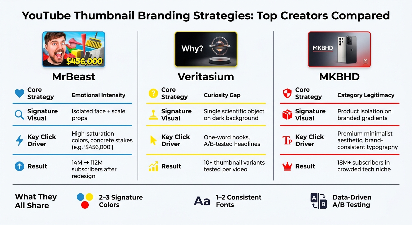
YouTube Thumbnail Branding: MrBeast vs Veritasium vs MKBHD
Here are some real-world examples of how top YouTube creators have nailed their thumbnail branding. Each case study breaks down the creator's niche, branding strategy, click-driving techniques, and results, so you can see exactly what works.
Case Study 1: MrBeast (Jimmy Donaldson)
MrBeast's journey to thumbnail mastery is one of the most well-documented on YouTube. Between 2019 and 2022, his lead designer, Chucky Appleby, revamped the channel's visuals. Gone were the basic, "MS Paint-looking" images, replaced by high-contrast, face-focused designs with a consistent color palette: "MrBeast Blue" (#228fda), Alert Red (#FF0000), and High-Vis Yellow (#FFFF00). This overhaul coincided with massive growth - from 14 million to 112 million subscribers.
The standout tactic? The "YouTube Face": a single person showing an exaggerated emotion (shock, triumph, fear), isolated from the background and placed on a bold, high-contrast backdrop. To drive clicks, they added clear visual stakes - like a stack of cash or a "$456,000" figure - directly into the thumbnail. One example is the thumbnail for the November 2021 video "Squid Game In Real Life", which used this formula and racked up over 600 million views by 2026.
By 2023, A/B testing revealed a shift in what worked. Closed-mouth smiles began outperforming the previously popular open-mouth "slack-jawed" expressions. MrBeast explained the change:
"Every A/B test, less cringe expression won... once I started closing my mouth and smiling and making it a little less cringe, a lot of other creators started switching over." - Jimmy Donaldson (MrBeast)
Chucky Appleby also shared his thoughts on the process:
"There is no ego in the optimization process." - Chucky Appleby, Lead Designer for MrBeast
Now, the team creates up to 20 thumbnail variants per video before choosing the final version.
Next, let's look at a creator who takes a completely different approach, focusing on intrigue instead of spectacle.
Case Study 2: Veritasium (Derek Muller)
Veritasium, led by Derek Muller, has carved out a unique niche in the educational space. With over 20 million subscribers as of 2026, the channel's branding relies on "specificity without spoiling". Instead of leading with a face, Veritasium often highlights a single scientific object or diagram on a dark blue or black background, paired with a short, punchy headline.
This restrained strategy sparks curiosity. While MrBeast hooks viewers with emotional intensity, Veritasium's thumbnails create a curiosity gap - viewers feel compelled to click to uncover the mystery. Clean, sans-serif typography adds a touch of authority without feeling overly academic.
Muller and his team test over 10 thumbnail variations per video, tweaking the single-word or short-phrase headline to maximize intrigue. The result? A channel identity that's instantly recognizable: dark backgrounds, precise visuals, and minimal text. Returning viewers know exactly what to expect before they click.
Now, let's shift gears to a creator who prioritizes a sleek, minimalist aesthetic.
Case Study 3: MKBHD (Marques Brownlee)
Marques Brownlee, or MKBHD, proves that you don't always need a face in your thumbnails to succeed. His team focuses on "category legitimacy", showcasing products in a clean, polished way. Devices are shot on uncluttered backdrops, cut out, and placed on branded gradients with consistent typography.
By 2026, MKBHD's channel had grown to over 18 million subscribers, standing out in the crowded tech review space. The minimalist aesthetic - no busy backgrounds, no exaggerated expressions - builds trust with viewers. It signals professionalism and thoroughness, setting MKBHD apart from competitors who rely on flashy, over-the-top visuals.
Consistency is the cornerstone of this strategy. Scroll through the channel, and you'll see a clear pattern: gradient backdrops, isolated products, and simple text. This predictability isn't a drawback - it reinforces the brand and makes returning viewers click faster. It’s a perfect example of how steady branding boosts click-through rates.
| Creator | Core Strategy | Signature Visual Element | Key Click Driver |
|---|---|---|---|
| MrBeast | Emotional intensity | Isolated face + scale props | High-saturation colors, concrete stakes |
| Veritasium | Curiosity gap | Scientific objects on dark backgrounds | One-word hooks, A/B-tested headlines |
| MKBHD | Category legitimacy | Product isolation on branded gradients | Premium aesthetic, brand-consistent typography |
Patterns and Lessons from the Case Studies
Creators from various niches consistently use core design principles - like limited color schemes, minimal text, and strong contrasts - to craft thumbnails that stand out instantly. These strategies are grounded in time-tested design methods.
Branding Elements That Consistently Improve CTR
One recurring theme is the value of simplicity. For instance, MrBeast sticks to three signature colors, while Veritasium focuses on a single, clear design element. Across the board, the formula is straightforward: 2–3 colors, 1–2 fonts, and one clear focal point per thumbnail.
Short, punchy hooks of 2 to 5 words tend to perform better than longer text. Research shows thumbnails with 0–2 words average a 6.8% CTR, while those with 6 or more words drop to 4.3%. This brevity is crucial, especially on mobile devices, where more than 70% of YouTube views occur, and thumbnails are displayed at roughly 200×113 pixels.
Contrast plays an equally important role. Many creators enhance color saturation to ensure thumbnails pop on mobile screens. High-contrast designs can boost CTR by 154% compared to low-contrast ones. By carefully balancing these elements, creators can maintain a visually striking and recognizable style.
Staying Consistent Without Getting Repetitive
Consistency doesn't mean every thumbnail has to look the same. Introducing occasional design changes - like for milestone videos, collaborations, or special content - can keep things fresh without losing brand identity. The trick lies in sticking to core elements such as face placement, color schemes, and fonts, while experimenting with details like emotional expressions, text hooks, or supporting graphics. Varying the emotional tone - whether it's curiosity, intensity, or quiet confidence - also helps avoid viewer fatigue from seeing the same face repeatedly.
Using Data to Guide Branding Decisions
Successful creators rely heavily on data to refine their thumbnails. Every design tweak is informed by analytics. For example, testing one variable at a time - be it facial expressions, background colors, or text hooks - until a thumbnail reaches 1,000 impressions can provide meaningful insights. Small adjustments can have a big impact: background color changes can shift performance by 18–25%, while tweaking facial expressions can influence CTR by 12–18%.
Tracking the split between returning and new viewer CTR is also valuable. Channels with consistent thumbnail branding often see a 15–25% higher CTR from returning viewers compared to those with inconsistent designs. A widening gap here is a good sign that your branding is connecting with your audience.
"The thumbnail that makes the best promise that the video then delivers on is the one that we measure as the winner for you." - Rene Ritchie, Head of Editorial, YouTube
Lastly, it’s important to review your last 20 thumbnails every six months. Look for any "visual drift" - subtle inconsistencies that may have crept in - and confirm that any outlier designs were intentional, not accidental.
A Step-by-Step Framework for Building Your Thumbnail Branding System
Building a Thumbnail Branding Kit
Creating a thumbnail branding kit involves defining a few key elements: 2–3 signature colors, 1–2 fonts, a consistent layout, and a specific style for image treatment (like always using high contrast or a particular color grade).
For fonts, bold sans-serif options such as Montserrat Bold or Bebas Neue are excellent choices - they stay clear and readable even when thumbnails are shrunk down on mobile screens. When it comes to layout, simplicity is key. A repeatable design, like placing your face on the left and text in the top-right corner, can make your channel instantly recognizable. Regularly reviewing your recent thumbnails ensures they maintain a cohesive look across your channel.
Once you’ve established your kit, you can speed up production by incorporating AI tools into your workflow.
Using AI Tools Like ThumbnailCreator
Efficiency is critical when applying your branding kit, and AI tools like ThumbnailCreator can help. These tools let you work with templates, swap out faces or objects, and create design variations - all while keeping your brand consistent. This approach ensures your thumbnails stand out while maintaining a high click-through rate.
A hybrid process often yields the best results. Use AI for tasks like background removal, enhancing colors, or generating layout options, but handle final text placement manually to ensure it aligns with your branding. Fully AI-generated thumbnails may fall short - underperforming by about 12% - because viewers might perceive them as less thoughtful or low-effort. To streamline the process, reusable prompt templates (e.g., "clean white background, bold yellow accent, cinematic lighting") can make tasks like subject swaps faster. With this method, thumbnail creation can take as little as 30–60 minutes per video. If it’s taking longer, there may be areas where your workflow could improve.
Testing, Measuring, and Refining Your Approach
Once you’ve established a consistent design process with tools like ThumbnailCreator, the next step is testing and refining. By systematically experimenting with your thumbnails, you can steadily improve their performance.
Focus on changing one element at a time - like the background color, facial expression, or text hook - to gather clear insights into what works best. Use YouTube Studio to track click-through rates (CTR), especially the difference between new and returning viewers. Channels with consistent thumbnail branding often see a 15–25% higher CTR among returning viewers. Updating thumbnails on older videos can also deliver surprising results, with some channels reporting up to a 45% boost in CTR.
Schedule regular reviews - every six months, for example - of your last 20 thumbnails to ensure your branding stays consistent. If you notice any drift in your visuals, consider small updates, like tweaking a color or adjusting font weight, every 12–18 months. Gradual adjustments are usually more effective than a full rebrand, helping you stay current while keeping your audience’s recognition intact.
Conclusion: Key Takeaways from These Thumbnail Branding Case Studies
Branding and click-worthiness go hand in hand. Case studies reveal that channels maintaining consistent thumbnail branding see a 15–25% higher CTR. Why? Because familiarity builds trust, making viewers more likely to click even before they read the video title.
Elements like consistent colors, clear fonts, and predictable layouts act as a "storefront" for your channel. When viewers recognize your style instantly, they’re more likely to return. Following the 80/20 rule - staying 80% on-brand while leaving 20% room for creative variation - ensures your channel remains distinct without becoming monotonous. These examples highlight how this balance between consistency and creativity directly impacts click-worthiness.
Every design decision should be rooted in data. As MrBeast's lead designer Chucky Appleby wisely said:
"There is no ego in the optimization process."
By testing one variable at a time, often using systems for testing at scale, analyzing the results, and making gradual adjustments, top creators manage to grow their channels while staying visually recognizable. This methodical, data-driven approach is further supported by practical tools.
Tools like ThumbnailCreator streamline this process, offering AI-assisted templates and locked brand elements. These features make it easier to maintain a cohesive look across uploads while saving time.
Ultimately, the formula is simple: create a system, let data guide your tweaks, and stay consistent. It’s a proven strategy that the most successful YouTube creators rely on to thrive.
FAQs
How do I create a thumbnail branding kit for my channel?
To build a thumbnail branding kit, start by selecting 2–3 primary colors that reflect your style and tone. Pair those with 1–2 bold, easy-to-read fonts to maintain a consistent look across all your thumbnails. Next, decide on a layout for key elements like your face, text, and logo - this helps make your thumbnails instantly recognizable. Tools like ThumbnailCreator can simplify this process with AI-driven templates that save time. Lastly, review your channel regularly to ensure your branding stays consistent and catches attention in busy feeds.
How can I A/B test thumbnails without hurting watch time?
To test thumbnails without impacting your watch time, you can use YouTube’s Test & Compare feature. This tool focuses on watch time share, ensuring that your thumbnails are pulling in viewers who stick around and engage with your content.
Here’s a smart approach: start testing on older videos. Modify just one element of the thumbnail - like the text, facial expressions, or colors. This keeps the test focused and makes it easier to pinpoint what works. For reliable results, aim for 1,000–5,000 impressions per variant before drawing conclusions.
Need help creating thumbnail variations? Tools like ThumbnailCreator can speed up the process, letting you design high-quality options in no time.
When should I update my thumbnail style so it doesn’t get stale?
When your click-through rates start to dip or level off, it’s a clear sign your audience might not be as drawn to your thumbnails anymore. But don’t panic - this doesn’t mean you need to scrap your entire branding. Instead, try small tweaks through A/B testing. Experiment with changes to specific elements like colors, text placement, or even the expressions on faces in your thumbnails.
Tools like ThumbnailCreator can make this process easier, allowing you to test variations while keeping your overall branding intact. This way, your thumbnails stay engaging without losing the visual identity your audience recognizes.