
Ultimate Guide To Thumbnail Branding
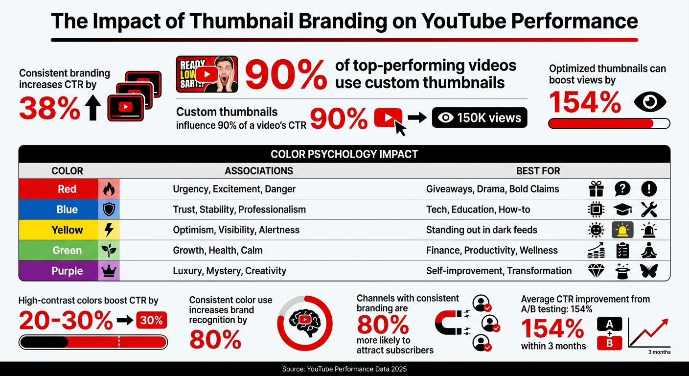
Your thumbnail is the first thing viewers notice - it's your video’s digital handshake. On YouTube, 90% of top-performing videos use custom thumbnails, and consistent branding can increase click-through rates (CTR) by 38% or even boost views by 154%. This makes thumbnails an essential part of your channel's success across different content types.
Key takeaways:
- Custom thumbnails outperform generic ones, influencing 90% of a video's CTR.
- Consistent use of colors, fonts, and logo placement creates a recognizable "visual DNA."
- Thumbnails with bold colors, clear text, and expressive faces drive more engagement, especially on mobile.
- High-performing thumbnails help YouTube algorithms recommend your content to a broader audience.
To stand out, focus on three elements: color palette, typography, and logo placement. Use A/B testing to refine your designs, ensuring they resonate with your audience and improve performance over time. A well-thought-out thumbnail strategy doesn’t just attract clicks - it builds trust and drives long-term growth.
Thumbnail Branding Statistics and Performance Impact
Learn the secrets behind 20 powerful YouTube thumbnails
sbb-itb-b59debf
Core Elements of Thumbnail Branding
Creating a recognizable thumbnail brand revolves around three main elements: color, typography, and strategic logo placement. Together, these components form a cohesive visual identity for your channel, making your thumbnails instantly identifiable and driving clicks.
Building a Consistent Color Palette
Your color palette is the cornerstone of your thumbnail branding. Stick to 2–3 main colors to avoid clutter and follow the 60-30-10 rule: dedicate 60% to your primary color, 30% to a secondary accent, and 10% to a neutral tone like black or white for balance.
Take Tony Robbins, for instance - he uses a consistent shade of purple across his thumbnails, creating instant recognition for his brand. Similarly, MrBeast employs a high-energy mix of blue, yellow, and red, making his content pop.
Color psychology also plays a big role. Yellow, for example, is one of the most attention-grabbing colors because it stimulates more receptors in the eye, naturally standing out. High-contrast combinations like yellow and orange can boost click-through rates by 20–30%, while consistent color use can increase brand recognition by as much as 80%.
| Color | Psychological Impact | Best For |
|---|---|---|
| Red | Urgency, Excitement, Danger | Giveaways, Drama, Bold Claims |
| Blue | Trust, Stability, Professionalism | Tech, Education, How-to |
| Yellow | Optimism, Visibility, Alertness | Standing out in dark feeds |
| Green | Growth, Health, Calm | Finance, Productivity, Wellness |
| Purple | Luxury, Mystery, Creativity | Self-improvement, Transformation |
To make your thumbnails stand out against YouTube’s predominantly white, black, and red interface, consider vibrant colors like orange, electric blue, or bright yellow. Complementary colors (e.g., blue and orange) can create a striking "visual punch" that draws attention.
For readability, aim for a contrast ratio of at least 4.5:1 between text and background. This ensures accessibility for all viewers, including those with visual impairments.
Once your color palette is locked in, it’s time to focus on typography to further define your brand’s visual identity.
Selecting Fonts and Setting Up Text Hierarchy
Typography plays a critical role in thumbnail design. Opt for bold, sans-serif fonts like Impact, Bebas Neue, or Montserrat Extra Bold. These fonts remain legible even when thumbnails are scaled down.
Establish a clear text hierarchy to guide the viewer’s eye. At the standard YouTube thumbnail resolution of 1280×720, recommended font sizes are:
| Element | Recommended Size (1280×720) | Recommended Weight |
|---|---|---|
| Primary Headline | 150–200px | Extra Bold / Black |
| Secondary Text | 80–120px | Bold |
| Small Details | 60–80px | Bold (use sparingly) |
Keep your text concise by following the "3–5 word rule" - longer text can clutter the design and become illegible on mobile devices. Every word should have a purpose.
To improve readability, add a 4–8px outline or drop shadow to separate text from busy backgrounds. Position text in "safe zones", such as the sides or lower thirds, to avoid overlapping with the main subject or YouTube’s timestamp.
Test your thumbnail’s visibility by shrinking it to 168×94 pixels, the size it appears in mobile search results. If the text isn’t readable, adjust the font size or reduce the word count. Tools like ThumbnailCreator can help preview your design at different sizes to ensure clarity across all devices.
Adding Logos and Brand Elements
Logos are another key ingredient in thumbnail branding. Dedicate about 5–10% of the thumbnail space to your logo and place it consistently in the same spot across all designs. This reinforces your brand identity and makes your videos instantly recognizable.
For example, t3n, a tech-focused channel, uses standardized logo placement to ensure their content is easily identifiable in search results.
"Your logo should appear in the same location across all thumbnails."
– Vik Chadha, Founder & CEO of Magnt
Be mindful of over-branding. Thumbnails that look overly promotional can lead to lower engagement. A good balance was demonstrated by an educational YouTube channel in February 2025, which implemented consistent logo placement and a defined color palette. This effort, led by marketing manager Alex Johnson, resulted in a 25% increase in click-through rates over three months.
To maintain consistency, create a Thumbnail Style Guide. Document your chosen colors (including hex codes), fonts, logo placement, and design rules. This guide ensures that every thumbnail aligns with your brand’s visual standards, regardless of who designs it. A consistent visual identity not only looks polished but also builds trust with your audience.
Applying Thumbnail Branding to Different Content Types
If your channel features tutorials, reviews, vlogs, or educational videos, each format will naturally have its own visual style. However, your branding should still be instantly recognizable across all of them. The key is finding the sweet spot between consistency and flexibility.
Start by sticking with the core elements of your visual identity - your primary color palette, fonts, and logo placement. These should stay the same no matter the content type. Meanwhile, let adaptable elements like image styles, text layout, and secondary graphics change based on the theme of the video. A good rule of thumb is the 60-30-10 Rule: dedicate 60% of the thumbnail to content visuals unique to the video, 30% to brand elements, and 10% to your logo. This approach helps keep your branding steady while allowing room for creativity.
Different types of content thrive with specific thumbnail designs. Tutorials often benefit from before-and-after layouts that highlight a transformation. Reviews should emphasize the product and include a clear rating or verdict. For vlogs, expressive close-ups paired with short, engaging text can create an emotional connection with viewers. Consistent thumbnail branding not only signals professionalism but can also make your channel up to 80% more likely to attract subscribers. By creating a system that adapts to your content yet stays true to your brand, you’ll build familiarity while keeping things visually fresh.
Using Templates for Consistency
Templates are your best friend when it comes to maintaining a cohesive look across your channel while saving time.
A three-tier template system can cover most of your needs. First, your Standard Template should handle the bulk of your uploads - this is your go-to design with fixed zones for colors, text, and logo placement. Next, create a Special Content Template for collaborations, series, or premium videos that need a distinct but consistent appearance. Lastly, have a Seasonal/Event Template ready for holiday or trending topics, offering a timely twist on your established branding.
"Templates aren't constraints - they're freedom machines." – Chatwoot
Decide which elements in your templates remain constant and which can adapt. Your primary colors, headline font, and logo placement should be non-negotiable, while elements like background images, secondary text, and graphic treatments can vary depending on the video. Tools like ThumbnailCreator simplify this process by letting you save your brand kit with pre-set colors, fonts, and layouts, making it easy to batch-create thumbnails. Always test your templates at 160×90 pixels to ensure clarity on mobile screens.
Custom thumbnails significantly boost performance - channels using them account for 90% of YouTube’s top-performing videos, and consistent branding can increase click-through rates by up to 38%.
Once your templates are in place, you can focus on fine-tuning thumbnails to match specific video themes.
Modifying Branding for Different Video Themes
Adapt your visuals thoughtfully to suit different video themes while keeping your core identity intact.
Consider adding subtle visual cues, like colored corner tabs - blue for tutorials or red for reviews - or applying slight color overlays to signal the video's theme while sticking to your primary palette. For loyal subscribers, feature familiar faces or elements they associate with your channel. For new or casual viewers, prioritize attention-grabbing visuals and emotions that resonate universally.
When experimenting with modifications, test one element at a time - like changing the background color or tweaking a facial expression - and monitor results over 2–4 weeks. This ensures you can identify what works without straying from your brand identity.
| Content Type | Recommended Formula | Strategic Goal |
|---|---|---|
| Tutorials | Before/After or List/Number | Highlight transformation or clear value |
| Reviews | Product Focus + Rating/Verdict | Showcase the product and offer quick feedback |
| Vlogs | Face + Text (Expressive close-up) | Build a personal connection with viewers |
| Educational | Curiosity Gap (Intriguing visual) | Spark curiosity to encourage clicks |
Well-optimized thumbnails can boost viewership by as much as 154% for the same content. The goal isn’t to overhaul your brand for each video - it’s to create a flexible system that evolves with your content while staying unmistakably yours.
Testing and Improving Your Thumbnail Branding Strategy
Once you've set up your thumbnail branding system, it's time to put it to the test and fine-tune it. Even the most carefully crafted thumbnails might not hit the mark for every audience, and what works well today might need tweaking in the future. Testing is an ongoing process that builds on the visual consistency you've already established, ensuring your brand evolves based on real-world performance. Luckily, YouTube offers free tools to help you figure out what resonates best with your viewers.
A great place to start is comparing A/B testing vs gut feeling to see which thumbnail variations perform better. YouTube's "Test & Compare" feature allows you to upload up to three thumbnail options for the same video, automatically rotating them among viewers. For the best results, test one major element at a time - like switching the background color or changing facial expressions. Before running a test, set a clear hypothesis. For example, you might assume that red text will perform better than blue because it creates a sense of urgency.
Run your tests for 7–14 days, ensuring each variation gets at least 1,000 impressions before determining a winner. While click-through rate (CTR) is a key metric, YouTube's tool also focuses on watch time share, helping you ensure your thumbnail isn't just clickbait but actually attracts viewers who stay engaged. Creators who consistently A/B test their thumbnails often see impressive results - an average CTR boost of 154% within three months, with top performers achieving over 300% improvements. Even a modest 1% increase in CTR can double a video's total views. Use these insights to guide your next design tweaks.
After testing, dive into the performance data. Use YouTube Analytics to evaluate your results. Don’t just focus on CTR - also review metrics like average view duration. A high CTR is great, but it’s even better if viewers stick around and watch at least 50% of the video, confirming that your thumbnail honestly represents your content. Additionally, check impressions to see if low views stem from limited reach or an underperforming thumbnail. Monitor subscriber conversion rates too - this can reveal which designs turn casual viewers into loyal fans. As a general guide, CTR benchmarks fall into these ranges: 4–5% is average, 6–10% is strong, and anything over 10% hints at viral potential.
Use these findings to refine your branding. For instance, if tests show that bright colors outperform muted tones, adjust your secondary palette while keeping your core brand colors intact. If close-up facial expressions drive more clicks, incorporate them into your templates. Keep a detailed thumbnail testing log with screenshots, dates, and results to identify patterns you can replicate in future designs. Tools like ThumbnailCreator can help you save your brand assets and quickly create variations, making the testing process more efficient.
Conclusion: Building a Lasting Impression with Thumbnail Branding
Thumbnail branding gives your content a distinct, recognizable look that viewers can identify at a glance. By mastering the basics - sticking to a consistent color palette (2–3 colors), using one or two fonts, and placing your logo strategically - you can create a sense of trust that directly impacts click-through rates.
But remember, branding isn’t a one-and-done process. Use audience feedback to refine your approach over time, rather than relying solely on aesthetics. For example, running A/B tests for 7–14 days with at least 1,000 impressions per variation can provide valuable insights into what resonates with your viewers. It’s worth noting that 90% of the top-performing videos on YouTube utilize custom thumbnails.
"Your visual consistency acts like a mental bookmark, making it easier for people to find and trust your content." – Chatwoot
This quote highlights the importance of a cohesive visual strategy. A helpful guideline to keep your thumbnails balanced is the 60-30-10 rule: dedicate 60% to content-focused visuals, 30% to branding elements, and 10% to your logo. This ensures your thumbnails feel genuine rather than overly promotional. Keep text on thumbnails concise - 3–5 impactful words - and ensure a minimum contrast ratio of 4.5:1 for readability. Since most viewers will see your thumbnails on mobile devices, always preview your designs on smaller screens.
To simplify the process, tools like ThumbnailCreator can be a game-changer. It allows you to save your brand assets - like hex codes, fonts, and layouts - while still offering the flexibility to match different video themes. Its AI-powered features even help you quickly generate variations, making it easier to maintain high-quality designs as your content production scales.
Start crafting your visual identity today, test rigorously, and grow your channel by making your content instantly recognizable.
FAQs
How do I pick my channel’s 2–3 brand colors?
To make your channel stand out, choose 2–3 colors that capture its mood and personality. Colors aren’t just decorative - they’re emotional cues that tell viewers what your content is all about. For example, red can bring energy and intensity, while blue gives off a sense of calm and reliability.
Start by describing your channel in 3–4 words. Is it bold and adventurous? Fun and lighthearted? Serious and professional? Once you’ve nailed down your brand’s essence, create a moodboard with visuals that match those traits. This will help you find colors that align with your identity and vibe.
Sticking to these colors consistently - especially in thumbnails - can make your channel instantly recognizable. It’s a subtle way to build trust and familiarity, which can encourage more clicks and engagement.
What text is readable on mobile thumbnails?
Readable text on mobile thumbnails needs to be short, bold, and easy to spot. Stick to 3-5 words that grab attention. Use large, sans-serif fonts like Impact or Montserrat Extra Bold for maximum clarity. Adding outlines or shadows helps the text stand out, especially on busy backgrounds. Since thumbnails can be as small as 168x94 pixels, focus on simple, high-contrast phrases that are quick to read. Bold design choices make all the difference on mobile screens.
How can I A/B test thumbnails without hurting my views?
To test thumbnails effectively without risking your views, consider using tools like YouTube's "Test & Compare" feature or third-party options such as ThumbnailCreator. The key is to run controlled experiments by changing just one element at a time - this could be the color scheme, text, or even the facial expression in the thumbnail. Let the test run for at least two weeks or until you've collected enough impressions to draw meaningful conclusions. Pay close attention to metrics like click-through rate (CTR), watch time, and retention. This way, you can refine your thumbnails to boost performance while staying honest with your audience.