
Case Study: How Text Placement Boosted CTR by 30%
A small thumbnail text change led to more clicks. In this case, moving text to the top-left, cutting it down to 1–2 words, and using bold, high-contrast type pushed CTR from a weak starting point to a much better result.
If I boil the article down, here’s the main takeaway:
- Top-left text beat bottom-right text
- Short text beat long text
- Bold, easy-to-read fonts beat thin decorative fonts
- Strong contrast beat text placed on busy backgrounds
- Clean tests worked best when only one layout factor changed
The numbers tell the story. The control thumbnail sat at 3.1% CTR. The top layout hit 5.6% CTR, which is an 81% jump over the control. And when the team looked at the broader channel result, average CTR moved from 3.1% to 4.4%, which meant 13,000 more views per 1,000,000 impressions and about $65 more revenue at a $5 CPM.
If you want the short version, I’d say this: put short text where people see it first, keep it away from the timestamp, and make sure it optimizes for mobile screens. That was the whole win.
Starting Point: Baseline Performance and Original Thumbnail Problems
Baseline Metrics Before the Redesign
Before any changes, the channel’s thumbnails were getting 2.8% to 3.5% CTR. That sat well below the 4.1% median baseline seen in thumbnail tests.
That gap mattered. It showed the problem started before someone watched the video. The thumbnails weren’t doing enough to earn the click.
What the Original Text Placement Got Wrong
The original thumbnails made several common thumbnail mistakes that hurt performance. The biggest issue was text redundancy. The thumbnail copy mostly repeated the video title almost word for word, which gave viewers no new reason to click.
There was also just too much text. Most thumbnails used 7+ words, and that adds mental strain fast. Data shows thumbnails with 8 or more words tend to do worse than minimal-text designs by 20% to 30%. On mobile, that amount of text is close to unreadable.
Placement made things worse. The text was scattered instead of anchored in one clear spot. In several cases, it sat in the bottom-right corner, where the duration timestamp can block it on most devices.
Readability was another weak point:
- Fonts were decorative and thin, so they broke down at small sizes
- Contrast was poor because text sat right on busy backgrounds
- There was no stroke, outline, or background box to help the words stand out
The baseline pointed to a layout issue, not a topic issue. Viewers were being asked to read too much, with too little contrast, in spots where the text could disappear or get covered. That shaped the redesign test: fewer words, clearer hierarchy, and safer placement.
sbb-itb-b59debf
16 YouTube Thumbnail Mistakes That Kill CTR
Research and Test Design: What Was Changed and How It Was Measured
Those baseline issues led to one clear question: which text position would make thumbnails easier to read and more likely to earn clicks? From there, the team focused on one thing at a time. They tested which text placements improved CTR without changing the video itself.
To do that, they reviewed high-performing thumbnails from similar channels in the same niche. One pattern showed up again and again: the best performers used bold text sparingly and placed it with intent, covering only 25–35% of the total image area.
Patterns Found in High-Performing Thumbnail Layouts
The research pointed to a clean, high-contrast layout. The strongest thumbnails leaned on heavy negative space, one focal point, and 1–2 strong words instead of full phrases. Font choices had also moved toward geometric bold sans-serifs such as Bebas Neue, Montserrat Black, and Anton.
Each thumbnail candidate went through a simple readability check at small size: shrink it to about 120–160 pixels wide and make sure the text was still readable at a glance. If it fell apart at that size, it wasn't good enough.
A clear position pattern showed up too. Top-left text drew 34% more attention than text placed elsewhere, which lines up with normal left-to-right reading behavior.
The two positions that mattered most were:
- Top-left: easiest to scan and aligned with natural reading flow
- Bottom-right: weakest, since timestamps cover that area on most devices
Thumbnail Variants and Testing Controls
The test setup was tight. Only text placement and font treatment changed. Everything else stayed fixed so the team could isolate the CTR effect.
Each version needed at least 10,000 impressions before anyone made a call. Tests ran for a minimum of 48 hours, and lower-traffic uploads were stretched to 3–7 days when needed. CTR was the main metric, while watch time share served as the second check, since YouTube's internal Test & Compare tool picks winners based on watch time share, not raw CTR alone.
With the setup locked down, the data made the winning version easy to spot.
Results: Which Text Placement Won and Why
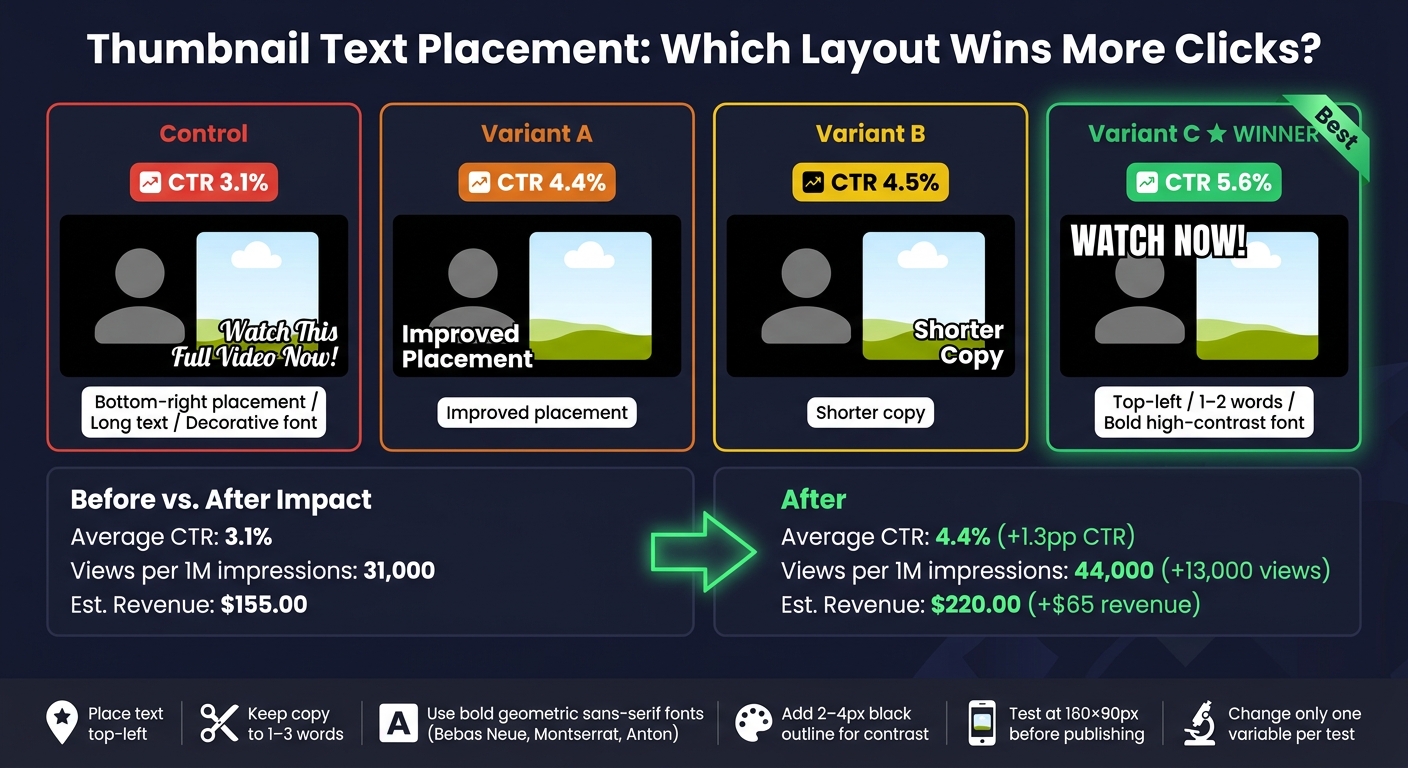
Thumbnail Text Placement: Control vs. Variants CTR Results
Variant C won. It used top-left text placement, just 1–2 words, and a bold sans-serif font with a high-contrast stroke.
Performance by Thumbnail Variant
Here’s how each variant performed.
| Variant | CTR |
|---|---|
| Control | 3.1% |
| Variant A | 4.4% |
| Variant B | 4.5% |
| Variant C | 5.6% |
Variant C - the minimal layout with 1–2 words, top-left placement, and bold, high-contrast text - led the group at 5.6% CTR. That’s an 81% lift over the 3.1% control. It also came out ahead in YouTube's Test & Compare on watch-time share.
The pattern across different YouTube thumbnail styles was pretty clear: fewer words, safer placement, and strong contrast pulled more clicks.
Before-and-After Business Impact
The redesign moved average CTR from 3.1% to 4.4%. That’s a gain of 1.3 percentage points. With 1,000,000 impressions, that added 13,000 more views and about $65.00 more revenue at a $5.00 CPM.
| Metric | Pre-Optimization | Post-Optimization | Change |
|---|---|---|---|
| Average CTR | 3.1% | 4.4% | +1.3 percentage points |
| Impressions | 1,000,000 | 1,000,000 | - |
| Views | 31,000 | 44,000 | +13,000 |
| Est. Revenue (USD) | $155.00 | $220.00 | +$65.00 |
Next: a repeatable workflow creators can use to test text placement faster.
How Creators Can Apply This Workflow
A Repeatable Text Placement Framework
Variant C won with minimal copy, top-left placement, and strong contrast. A simple way to copy that setup is to place your main subject - a face or key object - on one side of the frame, then put your text in the opposite top corner.
Keep thumbnail copy to 1–3 words. Aim for curiosity, not a mini version of the title.
Before you publish, do the 160 × 90 readability check: shrink the thumbnail to 160 × 90 pixels. If the text is hard to read at that size, cut words or make the text bigger. Add a 2–4 px black outline or drop shadow so the text still stands out on busy backgrounds. A bold geometric sans-serif like Bebas Neue, Montserrat Extra Bold, or Anton can also help the design hold up at small sizes.
Using ThumbnailCreator to Speed Up Testing and Iteration
ThumbnailCreator can speed up testing with AI templates, text editing, face swapping, and object swapping. Use it to make placement variants fast, then test only the text position.
Key Lessons From the 30% CTR Increase
The big lesson here is simple: text placement matters just as much as the words themselves. Bottom-right text often gets blocked by the timestamp, while top-left text lines up with how people usually scan a thumbnail.
Shorter copy tends to win. Fewer words mean less mental effort, especially on mobile. And when text stays off the face or main object, the layout feels cleaner and easier to scan in a split second. That's a big part of why Variant C came out on top.
To keep your test clean:
- Change one variable at a time
- Keep the title and video fixed
- Track CTR
FAQs
Why does top-left text get more clicks?
Text in the top-left area of a thumbnail gets read 34% more often because it lines up with how people read from left to right.
It also helps grab attention fast and stays clear of common interface elements, like the YouTube timestamp in the bottom-right corner. With ThumbnailCreator, you can place text in this high-performing spot so your message stays clear, especially on mobile.
How many words should a thumbnail use?
For best results, keep thumbnail text to three to five words. That tends to be the sweet spot between giving enough information and staying easy to read, and it can help click-through rates.
Try not to go past seven words. Extra text often hurts performance, especially on mobile. If you need to add more context, put it in the video title instead.
How can I test thumbnail text changes fairly?
Keep everything else the same: the image background, facial expressions, and video title. The goal is simple: change the text only.
Use YouTube’s native Test & Compare tool to run variants at the same time. That helps you avoid time-based bias. If you’re testing by hand, run each version for the same amount of time for at least 7 days, and don’t change any other metadata while the test is running. Try to get at least 5,000 impressions per variation.