

Checklist for Analyzing Thumbnails with Heatmaps
A heatmap can show where people look first, but it cannot tell me if they clicked or kept watching. So if I want to judge a thumbnail the right way, I need to pair the heatmap with YouTube Studio data like impressions, CTR, views from impressions, watch time from impressions, and early retention.
Here’s the short version:
- I start with one question: Do people notice the face, product, or text first?
- I log my baseline numbers before I change anything.
- I build 2–3 thumbnail versions and change one thing at a time.
- I check each version at small mobile size, since YouTube covers the lower-right corner with the timestamp.
- I read the heatmap in this order: main subject → text hook → distractions.
- I treat hot background spots, cold text, and scattered attention as design problems.
- Then I compare those heatmap patterns with CTR and the first 10–30 seconds of retention.
- Last, I decide whether to keep, revise, or retest.
A few numbers matter here. People often lock onto the main subject in about 0.4 seconds, and faces can pull gaze 16.6× more than areas without faces. That means if the face or product is not one of the hottest spots, I should fix that before I judge anything else.
In other words: heatmaps help me spot thumbnail problems fast, but YouTube metrics tell me whether those problems hurt performance. That’s the whole job of this checklist.
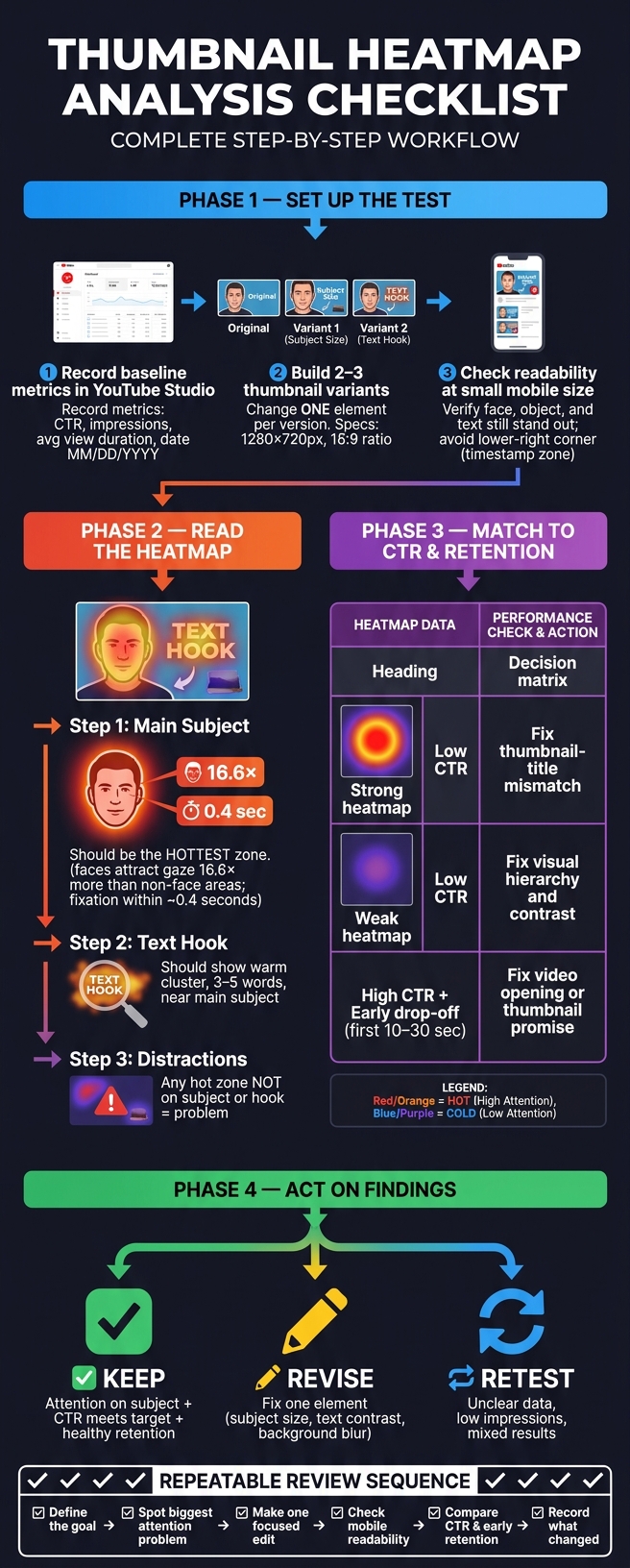
Thumbnail Heatmap Analysis Checklist: Step-by-Step Review Process
Checklist: Set Up the Thumbnail Test Correctly
A clean test setup is the ONLY way heatmaps tell you something useful. If the setup is messy, the data gets noisy fast. But when the test is set up well, the heatmap can point to actual thumbnail issues instead of test mistakes.
Record Baseline Metrics in YouTube Studio First
Before you change anything, log your baseline numbers in YouTube Studio. Track CTR, impressions, and average view duration. Record the date as MM/DD/YYYY so later comparisons stay easy and consistent.
These numbers are your reference point for every heatmap result.
Build 2 to 3 Variants, Each With One Change
Create 2 to 3 thumbnail variants. For each version, change only one element.
That matters more than it might seem. If you swap the text, image, and color all at once, you won't know what caused the difference. Keep the file size and layout specs the same too: 1280 × 720 px with a 16:9 ratio.
Check Readability at Small Mobile Sizes
Shrink each version down to mobile size before you look at the heatmap. Then check one simple thing: can viewers still read it fast?
At that smaller size, the face, main object, and text should still stand out right away.
Stay away from the lower-right corner. YouTube's duration stamp takes up that space on mobile. Anything important placed there can get covered up.
Also look at eye direction. If your subject's eyes point toward the text or the main object, attention tends to move there too. If the eyes point off-frame, you're pulling people away from the thing you want them to notice.
If a version falls apart on mobile, fix it before you read attention patterns. And if one variant is weak from the start, clean it up before you trust the heatmap.
sbb-itb-b59debf
Checklist: Read the Heatmap and Find Thumbnail Problems
Read each heatmap in the same order: main subject, text hook, then distractions. That simple sequence helps you spot one issue at a time instead of trying to judge the whole thumbnail at once.
Check Whether the Main Subject Falls in a Hot Zone
Start with the most important part of the thumbnail: the face, product, or main visual subject. On the heatmap, it should show up as one of the hottest areas. For faces, the strongest heat usually sits around the eyes and expression. For products, it should sit on the parts that make the item easy to recognize. The background should look cooler by comparison.
Eye-tracking studies show that faces attract gaze 16.6× more than similar regions without faces, and viewers usually fixate on the dominant subject within about 0.4 seconds. If the subject is not the hottest zone, it’s too weak or too buried.
One pattern to watch for: the hottest area lands on a background object, like a window, shelf, or wall, while the face or product shows only mild warmth. That’s a clear sign to enlarge the subject, increase contrast, or clean up what’s behind it. If the subject is cold, fix that visual hierarchy before you judge anything else in the thumbnail. This process is a core part of advanced thumbnail optimization for high-performing channels.
Check Whether the Text Hook Gets Enough Attention
Next, look at the text. The hook should show up as a warm cluster on the heatmap and sit close to, or overlap with, the main subject so both can be read in one glance. If the text block looks cold or barely registers, people are skipping it.
Keep the hook to 3–5 words. If the text reads cold, increase contrast, make it bigger, or cut it down.
Spot Distractions, Dead Space, and Misplaced Emphasis
After the subject and hook, scan everything else. Any hot zone that isn’t the subject or the hook is a distraction. Common trouble spots include bright corners, oversized logos, cluttered backgrounds, and decorative badges like “NEW” or “HD” stickers that steal attention from what matters.
Cold areas around key elements point to weak emphasis. In plain English: that part isn’t registering. If it matters, make it hotter by enlarging it, increasing contrast, or moving it closer to the subject.
The table below gives you a quick reference for common thumbnail elements and what to do when the heatmap doesn’t line up with your goal:
| Thumbnail Element | Desired Attention Level | Likely Issue When Pattern Is Wrong | Suggested Fix |
|---|---|---|---|
| Main face | High | Face is cold; background is hot | Enlarge face, blur or darken background |
| Text hook | High | Text is cold or scattered | Shorten hook, increase font size and contrast |
| Logo | Low | Logo is hotter than the face | Shrink logo, reduce contrast, move to a corner |
| Background | Low | Background competes with subject | Blur, desaturate, or replace with solid/gradient |
| Props or decorative elements | Low | Props draw more heat than the subject | Remove or reduce size; lower contrast on secondary items |
Map the attention path like this: subject → text → support. If the eye jumps somewhere else first, adjust contrast or placement. Those are the thumbnail issues to carry into CTR and retention review next.
Checklist: Match Heatmap Findings to CTR and Retention Data
After you read the heatmap, line it up with CTR and retention to see if attention turned into clicks and watch time. A heatmap shows where viewers looked. It does not show whether they clicked or kept watching. So before you change anything, review the same thumbnail in YouTube Studio too.
Compare Heatmap Results With CTR Patterns
Read the heatmap and CTR side by side. That helps you tell the difference between common design mistakes and a messaging issue.
Two patterns show up again and again. If the heatmap shows strong attention on the main subject but CTR is still low, the problem is often a thumbnail-title mismatch, not the layout itself. In plain English, people noticed the image, but the package didn't land. Check whether the thumbnail and title make one clear promise. If they don't, fix the packaging, not the layout.
If both attention and CTR are weak, the thumbnail likely needs a clearer visual order and stronger contrast, especially on small mobile screens.
Check Whether the Thumbnail Promise Matches Early Retention
High CTR only helps if viewers stay after they click. Open the audience retention graph in YouTube Studio and look closely at the first 10 to 30 seconds. If you see a steep early drop-off right after the click, that's a strong sign the thumbnail promised more than the video opening delivered. The click happened, but the first moments of the video didn't match what the thumbnail suggested.
When CTR is strong and early retention is strong too, that's usually a good sign the thumbnail matches the video.
Decide Whether to Keep, Revise, or Retest
Before you act on any result, make sure the test is worth trusting. Ask yourself:
- Did the thumbnail get enough impressions?
- Did traffic sources stay similar?
If impressions are low, the data may reflect random variation instead of a clear pattern.
Once you're confident the data is solid, use this table to decide what to do next:
| Heatmap Pattern | CTR Result | Early Retention | Recommended Action |
|---|---|---|---|
| Attention on intended subject | Meets channel target | Healthy, no early cliff | Keep - thumbnail is working |
| Attention on intended subject | Below target | Healthy | Revise title/topic framing - design is fine, message isn't |
| Attention scattered or on wrong element | Below target | Poor | Revise thumbnail - fix hierarchy, contrast, and focal point |
| Attention on intended subject | Above target | Sharp early drop-off | Revise video opening or adjust thumbnail promise |
| Mixed or unclear attention | Mixed results | Unclear | Retest with more impressions and a single isolated change |
Use the result to decide what to change in the next thumbnail version.
Checklist: Turn Heatmap Insights Into Better Thumbnail Variants
Use the heatmap to find the one edit most likely to move the needle. Then test that change. Don’t rebuild the whole thumbnail in one pass.
Make Specific Edits Based on What the Heatmap Shows
Tie each edit to what the heatmap shows. If the face or main subject sits in a cooler area, make it larger or move it into the hottest zone. If the text hook gets lost in a busy spot, cut it down to 3–5 words, make the font bigger, and place it where contrast is stronger.
When attention spreads across background clutter, soften the background with blur or darkening so a single focal point stands out. That gives the viewer one clear place to look first.
Change one variable per variant. This makes CTR shifts much easier to read.
Use ThumbnailCreator to Build Test Variants Faster
Revision should move fast. ThumbnailCreator can help you build new variants, swap faces or objects, and edit text without dragging out the process. Use it to turn one heatmap finding into the next test.
Conclusion: Save a Repeatable Thumbnail Review Checklist
Save this as your repeatable review sequence:
- Define the goal before looking at any heatmap data.
- Spot the biggest attention problem the heatmap shows.
- Make one focused edit per variant.
- Check readability at mobile size.
- Compare CTR and early retention in YouTube Studio.
- Record what changed and what happened. Ensure your variants follow the correct thumbnail dimensions and resolution for high-quality display.
Over time, this log becomes your channel’s thumbnail playbook.
FAQs
How many impressions are enough to trust a thumbnail test?
Aim for at least 1,000 impressions per variant. In practice, many creators find that 1,000 to 2,000 impressions per variant gives them a steadier read on performance.
If you want a result you can lean on with more confidence, try to get to 10,000+ total impressions across all variants. With smaller samples, it’s easy to get a skewed picture. You may end up seeing behavior from mostly your current subscribers instead of a broader audience.
What should I change first if the heatmap shows scattered attention?
Scattered attention usually means your thumbnail is trying to do too much at once. Start by cutting down the text and removing any extras that don’t back up the main idea.
Keep stripping it back until the main focal point - like a face, product, or other key visual - pulls attention right away. Then run another heatmap analysis to make sure that focal point stands out clearly.
Why would CTR be high but early retention still drop?
A high CTR paired with falling early retention usually points to a mismatch between your thumbnail and your video. The thumbnail wins the click by setting an expectation, but the video doesn't deliver on that promise.
When viewers notice that gap, they leave fast. That drags down retention. And because YouTube cares about watch time and viewer satisfaction, it can hurt your long-term reach and performance.