
Heatmap Metrics That Boost Thumbnail CTR
Your YouTube thumbnail has just 50 milliseconds to grab attention. With such a short window, every design choice - colors, text, layout - matters. Heatmaps are a powerful tool that helps creators optimize thumbnails by predicting where viewers' eyes will focus. Here's how heatmaps can improve your click-through rate (CTR): (and how your results compare to CTR benchmarks)
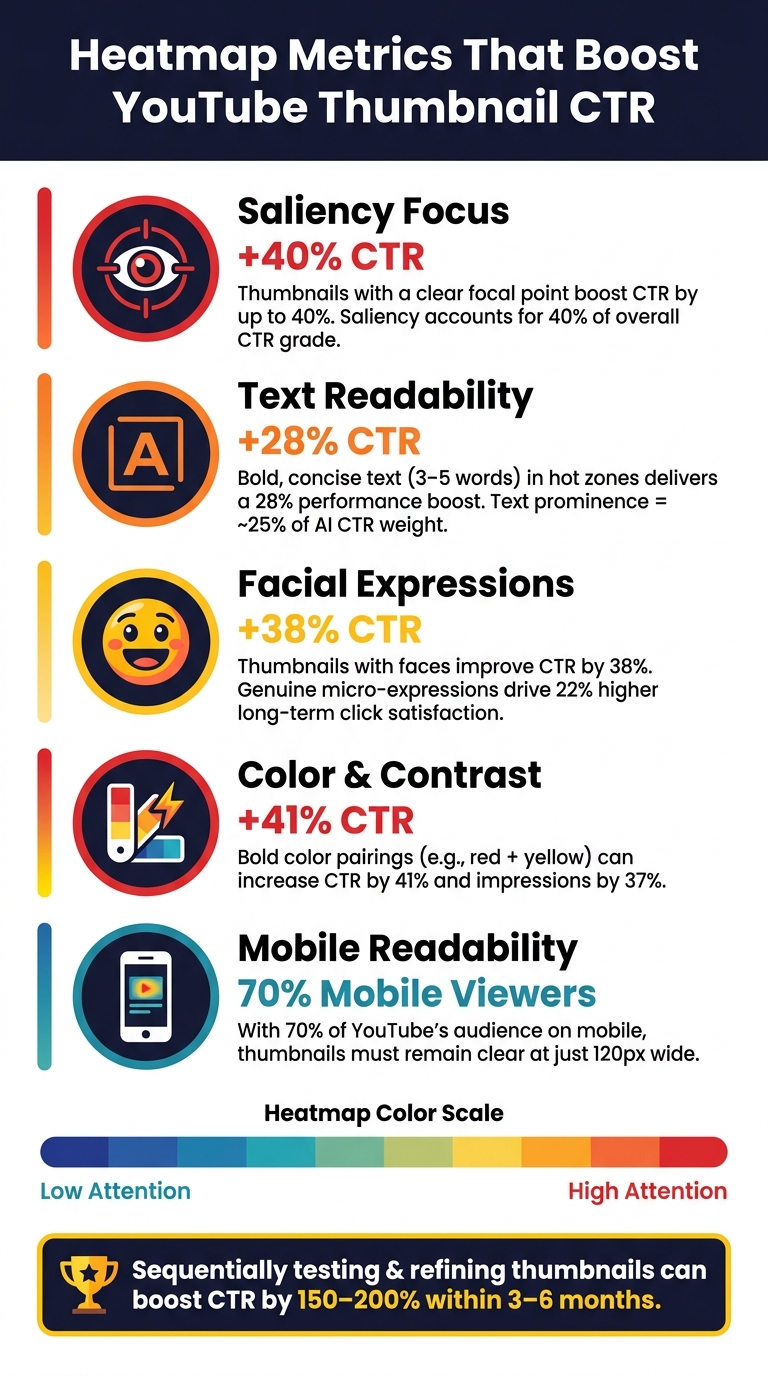
- Saliency Focus: Thumbnails with clear focal points can boost CTR by up to 40%. Heatmaps reveal if your subject stands out or if attention is scattered.
- Mobile Readability: With 70% of YouTube's audience on mobile, heatmaps ensure your mobile thumbnail design remains clear at 120px.
- Text Visibility: Bold, concise text (3–5 words) in hot zones increases CTR by 28%.
- Facial Expressions: Thumbnails featuring faces can improve CTR by 38%, especially with expressive emotions.
Heatmap Metrics That Boost YouTube Thumbnail CTR
Understanding Heatmap Metrics for YouTube Thumbnails
What Are Heatmap Metrics?
Heatmaps provide a visual breakdown of your thumbnail's performance by overlaying it with a color-coded map. These maps use AI vision models to simulate how a viewer's eyes scan the design during the critical first two seconds of attention. High-attention areas appear in red, while low-attention zones are marked in blue or green. This brief window is crucial to determine if your thumbnail's message is clear enough to stop a viewer from scrolling past.
Heatmaps also measure cognitive load, which reflects how easily viewers can process your design. Even if a thumbnail has high visual appeal, excessive clutter can overwhelm the viewer, leading to a lower click-through rate (CTR).
This data is invaluable for refining thumbnails to maximize CTR.
How Heatmaps Connect to CTR
The connection between heatmap data and CTR boils down to focal point clarity. If the viewer's attention is drawn to your intended subject right away, they’re more likely to recognize your video’s value and click. But if their gaze drifts to less relevant areas, the visual hierarchy breaks down - and so does your chance of earning that click.
Saliency focus, which measures how concentrated attention is on the key subject, plays a major role here. In fact, it’s estimated to account for 40% of a thumbnail’s CTR grade. That’s why heatmaps are not just a helpful extra - they’re a critical tool for diagnosing and improving thumbnail performance.
"A thumbnail that fails a saliency test will almost always underperform in the feed." - Denzil, YTGrowth
Key Types of Heatmaps for Thumbnails
Now that you understand the importance of heatmaps and their link to CTR, let’s look at the specific types of heatmaps and what they reveal about your thumbnail design:
| Heatmap Type | What It Measures | Why It Matters |
|---|---|---|
| Attention/Saliency Map | Predicted areas of immediate visual interest | Confirms if your subject is the main focal point |
| Scanpath/Gaze-Scan | The sequence of predicted eye fixations | Shows whether viewers notice your "hook" before scrolling away |
| Face Map | Skin-tone centroid detection | Ensures facial expressions are prominent enough to grab attention |
| Text Map | Edge density in text regions | Verifies if your text stands out as a clear visual anchor |
| Mobile Preview Heatmap | Saliency at ~120px width | Identifies elements that become unreadable on mobile screens |
The mobile preview heatmap deserves special attention. With 70% of YouTube's audience viewing on mobile devices, thumbnails often shrink to around 120 pixels wide. A design that looks sharp on a desktop might lose critical details at this smaller size, making mobile-first vs desktop-first testing an essential step in creating effective thumbnails.
sbb-itb-b59debf
Key Heatmap Metrics That Affect Thumbnail CTR
Attention on Key Focal Points
Saliency focus measures how effectively your main subject - be it a face, product, or bold visual detail - grabs attention. Strong thumbnails show a concentrated red cluster on this focal point rather than scattered heat across the image. In predictive CTR models, saliency focus accounts for up to 40% of overall performance, making it the most impactful metric. A scattered heatmap indicates a weak focal point, which makes it harder to capture attention. A strong focus ensures viewers' eyes land where you want them to, setting the stage for advanced thumbnail optimization and a better visual journey.
First Fixation and Gaze Flow
The first fixation happens incredibly fast - within 50 milliseconds. If this initial glance lands on an unimportant detail, your thumbnail's visual hierarchy isn't working. The scanpath, which predicts the sequence of eye movements, should highlight your key element within the first two stops. If it doesn’t, viewers might scroll past before even noticing your text or main message.
"If your title text isn't in the top two visual anchors, your message is getting lost." - ThumbHD
Contrast and Color Zones
Contrast and color are powerful tools for drawing attention. Gradient analysis identifies high-contrast edges that naturally pull the eye. Pairing bold colors like red and yellow can increase CTR by 41% and improve overall impressions by 37%. These visual "pops" ensure your thumbnail stands out in a crowded feed.
Text Readability and Engagement
Heatmaps also evaluate whether your text grabs attention. If your text falls into cold zones (blue or green areas), it risks being ignored, which can hurt CTR. Techniques like increasing font weight, adding a dark stroke, or using drop shadows can push text into hot zones. Keeping text concise - 3–5 words - delivers a 28% performance boost compared to longer phrases. Additionally, one large, high-contrast word often outperforms several smaller ones in saliency maps. Text prominence contributes about 25% of the total weight in AI-driven CTR predictions.
Faces and Emotional Expressions
Faces are natural attention magnets, offering a 38% CTR boost. Heatmaps track how prominently a face appears in the gaze pattern. But it’s not just about having a face; the expression matters, too. Genuine micro-expressions - like surprise, curiosity, or excitement - lead to 22% higher long-term click satisfaction compared to neutral or overly polished looks. If the heatmap shows the face in a cold zone, it might be too small, poorly lit, or positioned awkwardly. Adjusting these factors based on heatmap insights can significantly improve results.
Using Competitor Heatmaps to Sharpen Your Thumbnail Strategy
Competitor heatmap simulations offer a window into how top creators design thumbnails that effectively guide viewer attention. By analyzing elements like facial expressions, text placement, and contrast, you can reverse-engineer their strategies to refine your own designs. This approach helps identify patterns that drive high click-through rates (CTR), spot underperforming areas, and improve your visual hierarchy for better engagement.
Spotting Common High-CTR Patterns
Each niche has its own visual language. For instance, gaming thumbnails often feature bold, saturated colors and exaggerated facial expressions to evoke excitement, while finance and tech thumbnails stick to clean layouts and minimalistic text to project professionalism. Using a heatmap simulator to study top-performing thumbnails in your niche can reveal consistent trends. You might notice recurring text placement, subject sizes, or color combinations that repeatedly attract attention. These patterns can act as a blueprint for creating designs that resonate with your audience.
Recognizing Low-Attention Cold Zones
Cold zones on thumbnails are just as important to understand as the areas that grab attention. The bottom right corner, for example, is often obscured by YouTube's timestamp badge, making it a poor spot for placing critical details. Similarly, cluttered backgrounds can scatter viewer focus, resulting in low-intensity heat and reduced engagement.
"A thumbnail can pass every saliency test and still underperform because it is too visually complex for a scrolling viewer to decode in two seconds." - YTGrowth Blog
To test how well your thumbnail holds up, view it on a mobile screen at around 120 pixels wide. At this size, intricate details can blur or disappear, turning previously attention-grabbing areas into cold zones. Shrinking your design to about 10% of its original size is a quick way to check which elements remain clear and engaging.
Evaluating Visual Hierarchy
Successful thumbnails often follow a clear "1-2-3" scanpath, where the viewer's eyes naturally move from the main focal point to secondary elements and then to supporting details. For example, if a competitor's title text consistently ranks as a top visual anchor, it's likely an intentional choice worth emulating.
"If the brightest patch is your background instead of your subject, the composition is probably working against you." - CreatiCalc
You can compare hierarchy patterns across niches to see how creators prioritize visual elements. Here's an example breakdown:
| Niche | Primary Focal Point | Secondary Element |
|---|---|---|
| Gaming | Large, expressive face | Bold, high-contrast text |
| Finance/Tech | Clear product shot or text | Creator face as a supporting anchor |
| Lifestyle | Face as the main element | Text reinforcing emotional appeal |
The most effective thumbnails concentrate attention on a single subject with minimal distractions, setting a clear standard for improving your designs.
Turning Heatmap Insights Into Thumbnail Changes
After analyzing heatmaps for focal points and distractions, you can make specific design tweaks aimed at increasing click-through rates (CTR). By using these insights strategically, you can craft thumbnails that draw viewers in more effectively.
Repositioning Key Elements
Heatmaps provide a visual representation of where viewers' eyes naturally land, often following a 1-2-3-4 sequence. If your main subject or text hook isn't grabbing attention within the first two fixation points, it’s time to reposition them. For example, if the brightest area on the heatmap is in the background instead of on your subject, the composition is likely misaligned with viewer focus.
This adjustment is even more critical for mobile viewers. Thumbnails on mobile devices typically display at about 120 pixels wide, so placing your key subject near the center and boosting color contrast ensures it remains clear even at smaller sizes. Once you’ve repositioned key elements, streamline the design by removing any distractions.
Simplifying and Removing Clutter
Cold zones in a heatmap - areas receiving little to no attention - often highlight where clutter is diluting the impact of your focal point. If heatmaps reveal scattered attention across multiple areas, your design may be competing with itself.
"Clutter loses every time. Most viewers decide whether to click in less than a second, and most of them are seeing your thumbnail at about an inch wide on a phone." - CreatiCalc
To address this, reduce the amount of text and strip away unnecessary elements that don’t directly support your message. After making these changes, run another heatmap analysis to confirm that the focal point now stands out.
Refining Text and Color Choices
Text and color are powerful tools for grabbing attention. People are naturally drawn to bold text, high-contrast edges, and expressive faces. If your text falls into a cold zone, try increasing its font weight, adding a contrasting outline, or changing the background color behind it.
Avoid using white or light gray backgrounds, as these can reduce visibility in both YouTube's light and dark modes, making your thumbnail appear dull. If the heatmap shows that your text blends into the background, a simple fix like adjusting luminance or adding a solid color block can make a big difference. These tweaks create a strong foundation for rapid design iterations.
Using AI Tools to Apply Changes Faster
Manually adjusting thumbnail designs based on heatmap feedback can be a slow process. Tools like ThumbnailCreator simplify this by allowing you to quickly generate multiple design variations. Whether you need to enlarge the subject, boost background contrast, or increase text visibility, you can make these changes instantly from a single base image.
This speed is especially critical in the first 24 hours after a video is published, a period when CTR data is most impactful for algorithmic reach. Running a heatmap check with an AI tool before publishing acts as a safeguard, helping you catch weak points early and optimize your thumbnail for maximum impressions.
Testing and Improving Thumbnails With Heatmap and CTR Data
Making changes based on heatmap insights is just the beginning. The real challenge lies in creating a feedback loop to determine if those changes made an impact - and figuring out what to tweak next.
Setting Baseline Metrics
Before diving into tests, you need a clear starting point. Upload your thumbnail to a heatmap tool and check if the brightest areas align with your subject or text. If the heatmap highlights your background instead of the main subject, that’s a foundational issue to address.
"Treat the heatmap as a sanity check on focal-point clarity, not a click prediction. If the brightest patch is your background instead of your subject, the composition is probably working against you." - CreatiCalc
Make sure the heatmap’s hot zones emphasize your intended hook and that the design remains readable at a size of 120 pixels. Keep in mind that what works varies by niche. Gaming thumbnails often rely on bold colors and exaggerated expressions, while finance thumbnails tend to perform better with clean layouts and minimal text. These insights give you a strong foundation for experimenting.
Running A/B Tests
Once you’ve nailed down your baseline, it’s time to test your design changes. YouTube’s "Test & Compare" feature allows you to A/B test thumbnails by comparing up to three variations at once. It distributes these across audience segments and identifies the version with the highest watch-time share. This distinction is critical because YouTube’s Satisfaction-Weighted Discovery algorithm penalizes misleading thumbnails, potentially reducing your reach by as much as 30%.
For accurate results, test one element at a time. For instance, change the facial expression but keep the text identical, or test two different background colors while holding everything else constant. This approach makes it easier to pinpoint what’s driving the results. Run each test for at least 7 days to account for weekday and weekend viewing patterns. Only declare a winner if the CTR difference is at least 15–20%; smaller gaps are often just statistical noise.
Refining Based on Test Results
Once you’ve identified a winning design, double-check with a heatmap to ensure viewer attention aligns with your focal point - not just that it performed better than the alternative. Next, focus on videos with high impressions but low CTR. These represent the best opportunities for improvement with minimal extra effort.
Stick to 3–5 words of text, ensure there’s one clear focal point, and always run the "stamp test" - shrink the thumbnail to 120 pixels to confirm that faces and text remain clear. Tools like ThumbnailCreator can help you quickly generate new variations based on your findings, making it easier to iterate and improve your designs. This process of testing and refining ensures your thumbnails consistently grab attention and improve visual hierarchy.
Conclusion: Better CTR Through Heatmap-Driven Thumbnail Design
Using heatmap analysis, you can make informed changes to thumbnail designs that directly improve click-through rates (CTR). Instead of relying on intuition, heatmaps provide a clear visual roadmap of where viewers focus their attention. This helps you address common issues like cluttered backgrounds, unreadable text, and lackluster visual elements.
The numbers back this up. Thumbnails featuring faces, for example, average 921,000 more views compared to those without. Sequentially testing and refining thumbnail elements can boost CTR by 150–200% within three to six months. Over time, these improvements snowball, giving you a solid understanding of what clicks - literally - with your audience.
Refining thumbnails is an ongoing effort. Heatmaps allow you to continually test and fine-tune your designs for better results. Focus on verifying clear focal points, testing one element at a time, and keeping a record of your updates and their outcomes. This growing dataset becomes a valuable tool for crafting thumbnails that perform.
For quicker iterations, tools like ThumbnailCreator help you create and adjust thumbnail variations efficiently, letting you act on data insights without delay.
"Readability at thumbnail size beats everything else. One clear subject (usually a face with strong emotion), bold color contrast, a few large words at most. Clutter loses every time." - CreatiCalc
To boost your CTR, keep your designs simple and effective, ensuring they remain eye-catching even at just 120 pixels wide. Stick to these principles, and you'll see consistent improvements in your results.
FAQs
Which heatmap metric matters most for thumbnail CTR?
The most important heatmap metric to watch for thumbnail click-through rate (CTR) is saliency. Saliency pinpoints the areas of a thumbnail that grab attention immediately. This ensures the main focal points of your thumbnail are both noticeable and engaging.
That said, saliency should only serve as a sanity check - a way to confirm your thumbnail's visual clarity. It’s not a guaranteed indicator of how many clicks it will earn.
How do I know if my thumbnail works on mobile?
To make sure your thumbnail is effective on mobile devices, check that it remains clear and easy to read at smaller sizes, such as 360×640 pixels. Use high-contrast colors, bold text with no more than 3–4 words, and include prominent faces or subjects to grab attention. Preview the thumbnail on a mobile device or use tools like heatmap analysis to evaluate its legibility and key focal points.
What should I A/B test first to raise CTR?
Start by experimenting with A/B testing on elements like color schemes, text placement, and imagery. To get clear results, focus on testing one element at a time over a period of 7–14 days. Make sure your test reaches at least 1,000 impressions to gather enough data for accurate insights. This approach allows you to pinpoint which changes lead to better click-through rates (CTR) and higher engagement.