

Roundup: Best Practices for Heatmap Thumbnail Analysis
A heatmap can help me spot layout problems before I upload, but it cannot tell me if people will click. For that, I have to check CTR, impressions, retention, and traffic source in YouTube Studio. That matters because a weak CTR can cut total views by 50–70% even if the video and title stay the same.
Here’s the short version:
- Use heatmaps before publish to check where attention lands first
- Use YouTube Studio after publish to see if attention turned into clicks
- Review high-impression, low-CTR videos first
- Make 2–3 versions and change one main element at a time
- Keep key text, faces, and objects out of the lower-right corner
- Check mobile, desktop, Browse, Suggested, and Search separately
- Pick winners with CTR, then confirm with retention and AVD
In other words: I use heatmaps to form a test idea. Then I use live data to see if that idea worked.
A simple way to think about it is this:
| Tool | What it tells me | What it does not tell me |
|---|---|---|
| Thumbnail heatmap | Where attention may land first | Whether viewers will click |
| YouTube Studio data | CTR, impressions, AVD, retention, traffic source | Why the layout pulled attention the way it did |
The main takeaway is simple: heatmaps guide placement; CTR and retention decide the winner.
Set up a solid workflow before reading the heatmap
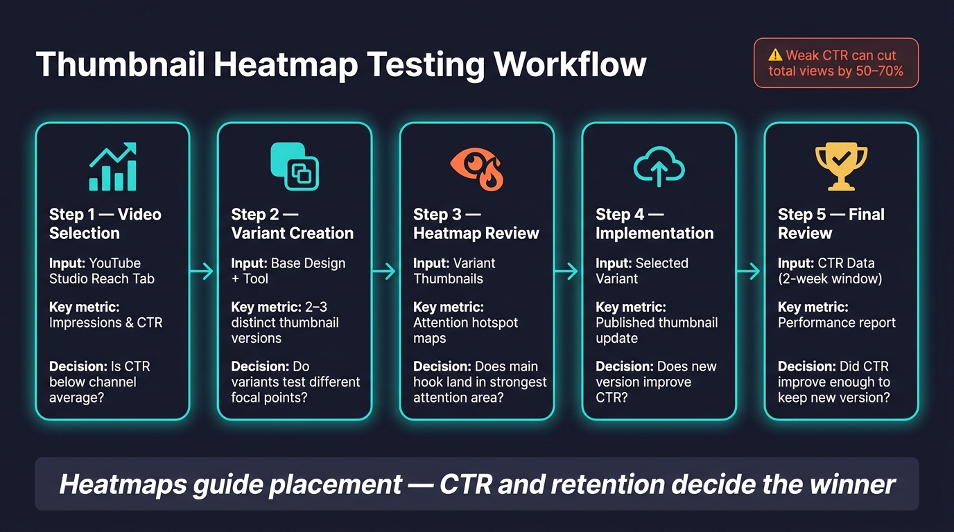
Thumbnail Heatmap Testing Workflow: From Draft to Data-Driven Winner
Before you read any heatmap, make sure you're looking at thumbnails with enough impressions to tell you something useful. If the sample is too small, the read can send you in the wrong direction.
Once the heatmap shows where people look first, you need a simple way to decide which thumbnails are worth testing and what to do next.
Use YouTube Studio to pick thumbnails worth reviewing
Start in YouTube Studio > Analytics > Content > Reach tab. Sort by impressions, then look for videos with high impressions but a CTR that's well below your channel average.
Also check where the traffic comes from. Put Browse-heavy videos at the top of the pile first. Search traffic leans more on keywords, so thumbnail changes may have less impact there.
Then look at device split. If a video's traffic is mostly mobile, be careful with the bottom-right area of the thumbnail. On mobile, the timestamp overlay can sit there and cover key visual elements.
Make testable thumbnail versions fast
After you spot a high-impression, low-CTR video, build a few versions you can test.
ThumbnailCreator helps you make 2–3 distinct thumbnail variants fast by swapping faces, text, and objects without rebuilding the whole design. That saves time, but more than that, it keeps your test clean.
A good rule here: change one major element at a time. If you change everything at once, the heatmap may shift, but you won't know why. If you swap just one main part, it's much easier to see what pulled attention in a new direction.
Track each step from draft to review
Without a simple tracking system, things get messy fast. It's easy to forget which version you reviewed, which one went live, and what happened to CTR before and after the change.
Use a version label like V1, V2, V3 on each file. Then give each test a 2-week review window. That gives you a cleaner before-and-after view and helps smooth out normal weekly traffic swings.
Here’s a quick reference you can use while moving from selection to review to performance tracking:
| Workflow Step | Input | Output | Decision Point |
|---|---|---|---|
| Video Selection | YouTube Studio Reach Tab (Impressions & CTR) | High-impression/low-CTR video list | Is CTR below the channel average? |
| Variant Creation | Base design + ThumbnailCreator | 2–3 distinct thumbnail versions | Do variants test different focal points? |
| Heatmap Review | Variant thumbnails | Attention hotspot maps | Does the main hook land in the strongest attention area? |
| Implementation | Selected variant | Published thumbnail update | Does the new version improve CTR? |
| Final Review | CTR data (2-week window) | Performance report | Did CTR improve enough to keep the new version? |
Use this table as a quick reference, not a rigid checklist. The point is to keep your heatmap reads tied to live CTR data, not just design opinions.
Use the heatmap to improve visual order
Use the heatmap for two things: where attention hits first and where it fades. That gives you a simple read on visual order. Once you spot the hotspot, shift your main hook into that area. Heatmaps are for diagnosing thumbnail layout, not rating the video itself.
Put the main hook in the strongest attention area
When the heatmap loads, look at your main hook first. That could be a face, a product, or a short text headline. If it’s not inside the warmest zone, attention is landing somewhere else.
Gaze direction matters more than a lot of people think. Where the subject looks often guides where the viewer looks next. As Aleric Heck, Founder & CEO of ThumbnailCreator.com, puts it:
"Eyes pointed at the text or at the key object in the frame pull the viewer's attention where you want it. Eyes pointed off frame push attention away."
If the subject is looking away, attention tends to drift away with it. Stick with one focal point. If you create two or three hotspots, the layout starts fighting itself.
Fix layout problems that weaken attention
Cold zones on a heatmap often point to the same few issues: text that’s too small, a cluttered background, or a key element sitting in the lower-right corner.
That lower-right corner is a trouble spot. YouTube puts the duration stamp there, and on mobile the space gets crowded fast. Heck says it plainly:
"The lower-right corner is the worst real estate on your thumbnail. That's where YouTube stamps the video duration, and on mobile that area gets crowded fast. Anything important there gets buried."
So if your face, product, or key text sits there and the heatmap stays cold, move it left or center. For text, keep overlays short. A few high-contrast words usually work better than a wall of copy.
Compare strong and weak attention patterns
The same layout issue can show up in different ways on a heatmap, so compare patterns before you change the design.
| Layout Scenario | Heatmap Read | CTR Signal | Recommended Fix |
|---|---|---|---|
| Key detail in lower-right corner | Cold zone (obscured by UI overlay) | Low | Move element to the left or center |
| Subject eyes looking off-frame | Attention pushed away from center | Low to average | Mirror the image or reorient gaze toward the hook |
| Subject eyes looking at text | Strong hotspot on the headline | Strong | Keep text short and high-contrast |
| Heavy text overlays in vlog content | Scattered or weak attention | Low | Reduce to one or two words |
| Face placed in center or left | Strong, clear focal point | Strong | Keep the background clean and uncluttered |
Start with the weakest pattern as your first test idea, then check the change against CTR.
sbb-itb-b59debf
Break down results by device, audience, and traffic source
Once you've checked visual order, split the result by device and traffic source. That's how you find where the same thumbnail starts to fall apart.
Look at heatmap reads by device, traffic source, and audience segment. One top-line result can look fine while weak pockets stay hidden underneath it. A heatmap only helps if you know who saw it and where they saw it.
Review mobile and desktop separately
Check whether the main hook still reads clearly on mobile. Small screens are less forgiving, so pay close attention to the lower-right corner on mobile.
A few things usually help:
- Larger focal points
- Shorter text
- Higher contrast
Device context shows how the thumbnail is read. Traffic source shows what it's competing with.
Compare heatmap reads by Search, Suggested, and Browse
A thumbnail can work one way in Search and a different way in Browse or Suggested. So don't judge the heatmap in a vacuum. Judge it against the source that drove the impressions.
Compare heatmap patterns within each traffic source. If a thumbnail gets strong attention but CTR stays low from Suggested videos, the layout may not stand out enough in that feed.
Benchmark within your niche and audience segment
Niche norms matter more than broad rules. Benchmark against top videos in your niche, not against generic averages.
As one source puts it, “Studying the top 20 performing videos in your specific niche gives you a much better baseline than any universal rule”.
Use these splits to decide what thumbnail to test next.
Use heatmaps in a thumbnail testing loop
Once you know where attention falls apart, turn that pattern into a test. If a heatmap shows attention landing in the wrong spot, change one variable at a time. For example, move a face or main object into the high-attention area while keeping the rest of the thumbnail the same.
Turn heatmap findings into A/B test ideas
Treat each heatmap miss as a single test idea. Start by reviewing your best and worst thumbnails from the last six months side by side.
Then test one element at a time:
- Face placement: Try the subject's face on the left, center, and right to see which spot lines up best with viewer attention.
- Gaze direction: Point the subject's gaze toward the text or hook.
- Background complexity: Cut background clutter so attention stays on the hook.
Each version should answer one clear heatmap question.
Measure results with CTR and retention metrics
A test means nothing unless the numbers back it up. Use CTR as your main signal, then check retention for tradeoffs. Pick the winner by CTR, but throw out any version that hurts retention.
Track CTR, impressions, average view duration (AVD), and traffic source together for every test version. Give the test enough impressions before you call a winner.
Log each test with the thumbnail version, impressions, CTR, AVD, and traffic source. Over time, that log turns into a private playbook for what works with your audience.
Conclusion: Best practices to keep using
ThumbnailCreator can speed up variant creation, which makes it easier to build A/B testing into your regular workflow.
Heatmaps give you the hypothesis. CTR and retention pick the winner.
FAQs
How many impressions are enough to judge a thumbnail test?
Aim for at least 1,000 impressions per variant. That gives you enough data to spot patterns without jumping at every small swing.
A lot of creators prefer 1,000 to 2,000 impressions per variant because the results tend to feel more steady. And if you can get to 10,000+ total impressions, your read on the test will be much more reliable.
Let the test run for 7 to 14 days so you pick up both weekday and weekend viewing behavior. People don’t watch the same way on a Tuesday afternoon as they do on a Saturday night, and that difference can skew your numbers if you end the test too early.
Also, test one element at a time. Change the title or the thumbnail, not both at once. Otherwise, you won’t know what actually moved the click-through rate.
Why can CTR rise while retention drops?
A high CTR paired with dropping retention usually points to a mismatch between your thumbnail and your video. In plain English: the thumbnail wins the click, but the video doesn’t deliver what the viewer expected.
When that happens, people bounce fast. And when viewers leave early, retention drops. On YouTube, watch time matters more than clicks alone, so that disconnect can hurt your reach over time.
Which thumbnail elements should I test first?
Start with a simple baseline. Make sure your main subject and text line up with the brightest parts of the heatmap. Then shrink the thumbnail to 120 pixels and check if it still reads clearly.
Test one major variable at a time. Focus on:
- facial expression
- text overlay
- color and contrast
- composition