

Checklist for Creating Click-Worthy Thumbnails
Thumbnails are the first impression your video makes. They influence whether someone clicks - or scrolls past. Here’s why they matter: 90% of top YouTube videos use custom thumbnails, and these can boost click-through rates (CTR) by 60–70%. A higher CTR not only attracts viewers but also improves your video’s visibility in YouTube’s algorithm.
Here’s how to create thumbnails that drive clicks:
- Understand Your Audience: Tailor thumbnails for new viewers, subscribers, or search-driven users. Use YouTube Analytics to refine your approach.
- Evoke Emotion: Use visuals that spark curiosity, urgency, or surprise. Pair this with a title for maximum impact.
- Optimize Visuals: Stick to YouTube’s specs - 1280x720 pixels, 16:9 ratio, under 2MB. Test clarity at smaller sizes (e.g., 168x94 pixels for mobile).
- Focus the Design: Keep it simple. Highlight one focal point using the Rule of Thirds and avoid clutter.
- Use Faces and Contrast: Thumbnails with faces can boost CTR by 20–30%. Pair expressive faces with strong color contrasts for better visibility.
- Test and Track: Use YouTube’s tools to test thumbnail variations. Aim for a CTR of 4–8% and monitor watch time per impression.
A great thumbnail isn’t just about looking good - it’s about grabbing attention in less than a second and driving clicks. Follow this checklist to make your thumbnails stand out and boost your channel’s performance.
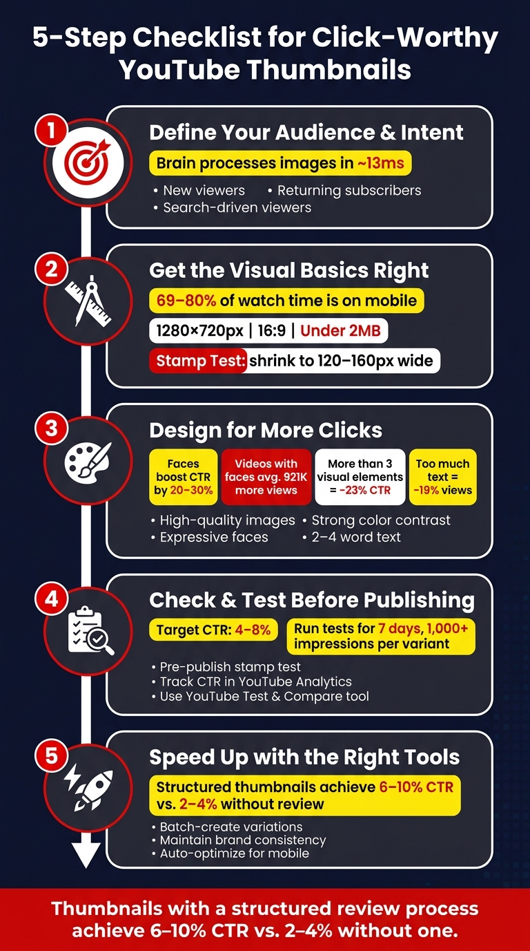
5-Step Checklist for Creating Click-Worthy YouTube Thumbnails
How to Make Thumbnails That Get Views (NO EXPERIENCE NEEDED)
Step 1: Define Your Audience and Video Intent
Before jumping into design, it’s crucial to pinpoint your target audience and the reason they’d want to click on your video. This single step lays the foundation for all your design choices.
Identify Your Audience
Not all viewers interact with your video the same way. New viewers need something bold and eye-catching to grab their attention as they scroll. Returning subscribers, on the other hand, are already familiar with your style and are more likely to click based on recognition. Meanwhile, search-driven viewers are looking for specific answers, so clarity in your visuals is key.
To figure out which group you’re targeting, dive into YouTube Analytics. Compare the click-through rates (CTR) of individual videos to your channel average. This will help you refine your approach and better cater to your primary audience.
Match Thumbnail to Viewer Emotions
Here’s the thing: your thumbnail speaks to viewers before your title even has a chance. The brain processes images in about 13 milliseconds, meaning the emotional reaction is almost instantaneous. A good thumbnail doesn’t just summarize content - it sparks curiosity.
"A thumbnail that tells you everything gets no click. A thumbnail that raises a question gets the click." - Rahaman Bin Ujit, Founder, Artiphik
Emotions like curiosity, urgency, and surprise are proven to drive clicks. Choose the emotion that aligns with your video’s main hook, and design your thumbnail to evoke that feeling. But remember, while emotion should guide your design, it’s equally important that your thumbnail reflects the actual content of your video.
Align Thumbnail with Content and Title
Once you’ve nailed the emotional angle, it’s time to make sure your thumbnail works in harmony with your title and content. Think of your thumbnail and title as a two-part hook: the title provides context and specifics, while the thumbnail adds emotion or intrigue that the title can’t fully convey. Avoid redundancy - if your thumbnail text simply repeats the title, you’re wasting valuable space.
Accuracy is just as important as appeal. Misleading thumbnails may get clicks initially, but they’ll backfire when viewers feel tricked and leave early. This hurts your watch time and, ultimately, how YouTube ranks your video. A quick test: show your thumbnail to someone who hasn’t seen the title. If their guess about the video’s topic doesn’t match what it’s actually about, your thumbnail might be sending the wrong message.
When done right, your thumbnail and title work together to create a compelling invitation viewers can’t resist.
| Element | Job | Best Practice |
|---|---|---|
| Title | Specificity & context | Lead with the most important words; keep it accurate |
| Thumbnail | Emotion & tension | One clear focal point; create curiosity the title doesn’t close |
Step 2: Get the Visual Basics Right
Once you’ve nailed down your audience and intent, it’s time to focus on the technical details of your thumbnail. These details ensure your creative ideas from Step 1 translate well on YouTube. Even the most brilliant concept can flop if the thumbnail is blurry, poorly cropped, or unreadable on smaller screens.
Use the Right Dimensions and File Format
YouTube has specific recommendations for thumbnail specs: 1280x720 pixels, a 16:9 aspect ratio, and a JPG or PNG file under 2 MB. These aren’t just guidelines - they’re essential for ensuring your thumbnail looks sharp on all devices and placements. Be mindful of padding: leave at least 8% space from horizontal edges and 10% from vertical edges to avoid cropping issues. Also, keep the bottom-right corner free for the video duration stamp.
| Specification | Requirement |
|---|---|
| Ideal Resolution | 1280 x 720 pixels |
| Minimum Width | 640 pixels |
| Aspect Ratio | 16:9 |
| File Formats | JPG, PNG |
| Maximum File Size | 2 MB |
| Mobile Search Size | 168 x 94 pixels |
Check Clarity at Small Sizes
Did you know that 69% to 80% of YouTube watch time happens on mobile devices? In search results, your thumbnail shrinks to 168x94 pixels - a massive 87% reduction in size. That’s about as small as a postage stamp.
To make sure your thumbnail works at this size, try the Stamp Test: shrink your design to around 120–160 pixels wide. If the text becomes unreadable or the main subject looks unclear, it’s a sign the design is too complicated.
"If your thumbnail does not communicate clearly at stamp size, it fails for the majority of your audience." - ThumbMentor
For best results, at the full 1280x720 resolution, your headline text should be 150–200 pixels tall, with secondary text between 80–120 pixels tall. This ensures everything stays legible when scaled down.
Keep Composition Simple and Focused
Viewers make their decision to click in just 300 milliseconds after seeing a thumbnail. That’s barely enough time to glance at an image, let alone process a cluttered design. To grab attention instantly, your thumbnail needs one clear focal point.
The Rule of Thirds is a great tool to achieve balance. Picture your thumbnail divided into a 3x3 grid, and place your main subject along the grid lines or at their intersections. This creates a natural, pleasing composition. To further highlight your subject, use techniques like lighting contrasts, background blur, or color temperature contrasts (e.g., a warm-toned subject against a cool-toned background).
"Try not to make the design too complex. Dynamic use of color and composition can help catch the eye, but too much can overwhelm it." Keep in mind that having more than three visual elements can reduce click-through rates by 23%. When in doubt, simplify.
Nailing these visual basics will set you up for thumbnails that don’t just look good - they drive clicks.
Step 3: Design for More Clicks
Now that the foundation is in place, it’s time to fine-tune your thumbnail design to grab attention and encourage clicks. These design choices go beyond aesthetics - they directly impact whether someone pauses their scrolling to check out your video.
Use High-Quality Images
A sharp, clear, and intentional thumbnail is non-negotiable. Avoid blurry screenshots or random frames, as they can come across as lazy and fail to convey the essence of your content. Always design at a resolution that looks crisp on high-resolution devices like tablets and TVs. For maximum impact, ensure your main subject takes up 30–50% of the frame. To make the foreground pop, consider desaturating or slightly blurring the background.
Use Faces and Expressions
Thumbnails with faces and strong emotions are proven to boost engagement. In fact, research shows that thumbnails featuring faces can increase click-through rates by 20–30%, and videos with faces average 921,000 more views compared to those without. The key is to match the emotion on the face to the tone of your video’s title. For example, a frustrated expression works for a "why this fails" video, while excitement fits a major reveal.
Not all niches respond the same way to faces, though. For instance, finance and business videos see a 36% increase in views when faces are included, while gaming content tends to perform slightly worse with faces, as viewers often prefer gameplay visuals. If your video centers on discussion or interaction, featuring two faces can be even more effective.
"Multiple faces beat a single face every time - they create social proof and the feeling that 'something is happening here.'" - Viacheslav Vasipenok
Pick Colors with Strong Contrast
Pair expressive faces and sharp images with a smart color strategy. The goal isn’t to make your thumbnail overly vibrant but to ensure it stands out. Use contrasting colors to create depth and separation. For example, a warm-toned subject (reds or oranges) against a cool-toned background (blues or teals) naturally draws the eye. Stick to one dominant color and one accent color - more than three can overwhelm the viewer.
"Contrast is not about saturation or neon colors. It's about separation." - Rahaman Bin Ujit, Founder, Artiphik
Colors also evoke emotions. Red conveys urgency, yellow grabs attention, orange suggests energy, and blue signals authority. Choose colors that align with the mood and message of your video rather than simply aiming for visual appeal.
Write Short, Readable Text
Text on thumbnails should add to the story - not repeat your video title. Keep it short and snappy, ideally 2–4 words, with 5 being the absolute limit. Use bold, high-contrast fonts to ensure readability, and if the text overlaps a busy image, anchor it with a solid background or color block. Too much text can clutter the thumbnail and reduce views by up to 19%. Let your visuals - especially faces and expressions - do the heavy lifting.
Show the Viewer Benefit
Every element of your thumbnail should answer one critical question: "What’s in it for me?" The most effective thumbnails showcase outcomes or benefits at a glance. Whether it’s a transformation, a result, or a clear before-and-after comparison, make the value of your video instantly visible. A strong visual promise can stop viewers mid-scroll and drive clicks.
sbb-itb-b59debf
Step 4: Check and Test Before You Publish
With your design finalized, resist the urge to publish immediately. A thorough round of checks - and smart post-publish testing - can make all the difference between a thumbnail that grabs attention and one that fades into the background.
Run Pre-Publish Checks
Start by verifying your file specifications: the thumbnail should be 1280 x 720 resolution, under 2MB, and in JPG, PNG, or GIF format. Then, perform the stamp test - shrink your thumbnail down to 120–200 pixels to ensure it remains clear and readable. This is crucial since 87% of traffic comes from mobile users.
Pay attention to the placement of critical elements. Avoid placing important visuals or text in the bottom-right corner, as this area is often obscured by YouTube's time stamp. To ensure your thumbnail communicates effectively, test it with someone unfamiliar with the video. If they can't identify the video's topic without reading the title, your design may need adjustments. Once your thumbnail passes these checks, it's time to focus on post-launch analysis.
"The stamp test is not optional. It is the most important quality check you can do." - Thumbmentor
Track Performance with YouTube Analytics
After publishing, head to the Reach tab in YouTube Analytics to track your thumbnail's performance. Pay close attention to CTR (Click-Through Rate) and impressions during the first 24–48 hours. A high number of impressions paired with a low CTR often signals that your thumbnail isn't resonating with viewers. For reference, optimized channels typically achieve a CTR of 4–8%, compared to YouTube's overall range of 2–10%.
Segmenting by traffic source can provide deeper insights. CTR from Home and Suggested feeds is especially important, as it reflects how well your thumbnail performs with viewers who aren't already subscribed to your channel. If these numbers are underwhelming, consider making adjustments and testing alternatives.
Test Different Thumbnail Versions
YouTube's "Test and Compare" tool in Studio allows you to test up to three thumbnail variations simultaneously. Unlike manually swapping thumbnails, this tool shows different versions to different audience segments at the same time, eliminating potential biases like time-of-day effects.
When evaluating performance, look at both CTR and watch time per impression. YouTube prioritizes overall watch time as a key engagement metric:
"To help your video get high quality engagement, we optimize tests for overall watch time over other metrics, like click-through-rate." - YouTube Help Center
For reliable results, run the test for 7 days and aim for at least 1,000 impressions per variant. If your channel is still building its audience and impressions are low, a detailed self-review of your thumbnail design can often yield quicker, more actionable insights than waiting for inconclusive test data.
Step 5: Speed Up the Process with ThumbnailCreator
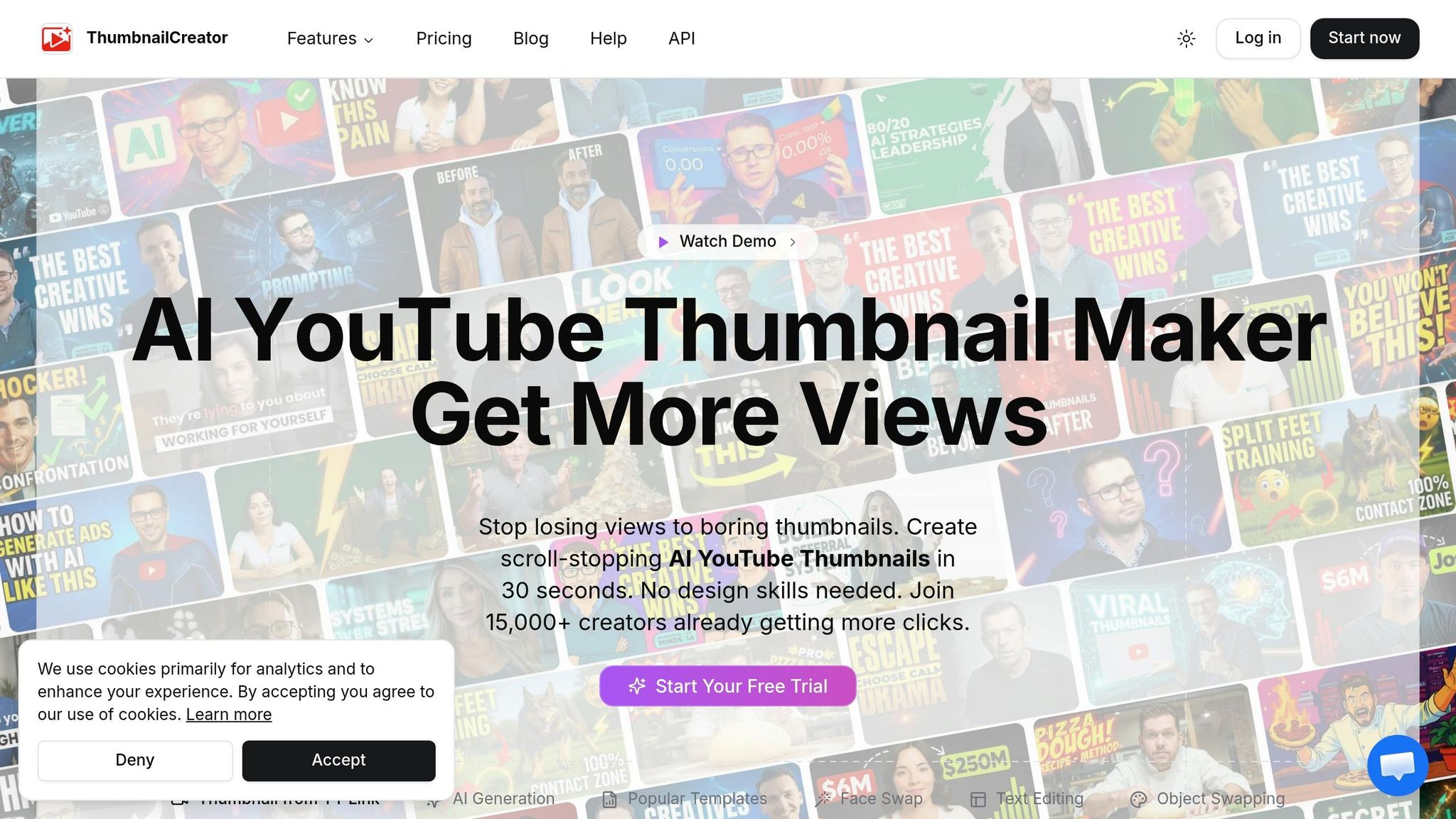
Producing great thumbnails quickly is essential for staying consistent with your channel's publishing schedule. Once you've refined your design and testing methods, the next step is optimizing production. Spending an hour on each thumbnail isn't practical when you're trying to scale. That’s where ThumbnailCreator steps in to help.
Save Time with AI-Powered Tools
Creating thumbnails manually in Photoshop can easily take 30–60 minutes per video, which can slow down your workflow. ThumbnailCreator slashes this time to just 5–10 minutes by using AI-powered automation.
With its AI generation feature, you simply describe your video concept in plain text - something like “finance tips video, serious face, bold red text, clean background” - and it generates multiple layout options instantly. The tool also includes automated face swapping, allowing you to insert your own face into designs with just a click. After a quick, one-time setup using 3–5 of your photos (about 15 minutes), you’re ready to go. Plus, you can generate up to 10 unique thumbnail variations from a single description. This makes it incredibly easy to create a batch of thumbnails for YouTube's "Test and Compare" tool in no time.
Customize Your Thumbnails with Ease
Consistency is key to building a recognizable channel. ThumbnailCreator’s Brand Kit helps by letting you save your logo, brand colors, and fonts. These elements are automatically applied whenever you start a new design. Reusable templates make updates simple - you can swap out the face, key objects, or text without starting from scratch.
The text editing tools are perfect for testing different hooks. For instance, you can quickly switch between phrases like "TOTAL RIPOFF?" and "WORTH IT?" while keeping bold, high-contrast styling intact. Another standout feature is Style Cloning: paste the URL of any YouTube video, and ThumbnailCreator will extract the thumbnail's color palette, lighting, and composition. You can then apply those same visual elements to your own designs. These tools make it easy to maintain a cohesive look across your channel.
Get Professional Results Without Design Experience
More than 15,000 YouTube creators trust ThumbnailCreator to produce professional-grade thumbnails. Its niche-specific templates follow YouTube’s proven best practices, including close-up faces, high contrast, and clear, readable text.
The Auto-Optimize tool ensures your thumbnail is ready for publishing by fine-tuning contrast, enhancing color vibrancy, and checking that no important details are obscured by YouTube’s timestamp or UI overlays. It even performs readability checks at mobile feed sizes, so you know exactly how your thumbnail will appear to viewers. For creators without a design background, this feature takes the guesswork out of creating thumbnails that drive clicks and boost engagement.
Conclusion: A Simple Checklist for Better Thumbnails
Creating thumbnails that grab attention in less than a second takes careful planning. As Rahaman Bin Ujit, Founder of Artiphik, says:
"Good thumbnails aren't designed. They're engineered."
This checklist breaks the process into straightforward steps. From crafting visuals that resonate emotionally with your audience to thoroughly testing before publishing, each step ensures your thumbnail is optimized to attract clicks.
The numbers back this up - thumbnails that undergo a structured review process achieve click-through rates of 6%–10%, compared to just 2%–4% without one. Over time, this small improvement can lead to noticeable growth in views, subscribers, and overall channel performance.
FAQs
How do I know what thumbnail emotion to use?
When picking the perfect thumbnail emotion, aim for expressive faces that clearly convey strong feelings like surprise, excitement, or disbelief. These types of emotions often grab attention and can improve click-through rates. Make sure the emotion aligns with your video's theme and audience, and don’t shy away from exaggerating it slightly - thumbnails are small, so bold expressions are more noticeable. You can also experiment with YouTube's A/B testing tools to see which emotions connect most effectively with your viewers.
What should I change if my CTR is low but impressions are high?
If your CTR is lagging despite high impressions, it’s time to revamp your thumbnails. Start by incorporating expressive faces that clearly convey emotions like surprise or excitement. Make sure these faces take up about 30–40% of the thumbnail space. Use bold, high-contrast colors to grab attention quickly.
To find what truly connects with your audience, run A/B tests. Test different thumbnail designs over 7–14 days, ensuring each variation gets at least 1,000 impressions. This approach will help you pinpoint the designs that drive better engagement.
Should I optimize for CTR or watch time per impression?
When designing thumbnails, aim to optimize for Watch Time Share instead of just focusing on CTR. While CTR reflects how often people click on your video, YouTube places more importance on Watch Time Share. This metric tracks the percentage of overall watch time your thumbnail contributes. By prioritizing this, you can attract viewers who are more likely to stay engaged, boosting your video's visibility and performance over time.