

Color Psychology in Long Video Thumbnails
I start with 2–3 main colors that match the video’s tone - not colors picked just to get clicks. My first check is simple: can you spot the subject and read the text at phone size?
Here’s the approach I use:
- Match color to content. I treat warm, cool, and muted palettes as mood cues, not fixed rules.
- Check light-dark contrast first. I preview in grayscale and use 4.5:1 as a readability check for normal text - not a promise of more clicks.
- Keep the workflow simple. I build the background, subject, text, and brand accents in that order, keeping faces and products true to their colors.
- Test one color change at a time. I keep the layout and wording fixed, then review CTR alongside watch time and retention.
- Save what works. I log palette choices and results, check accessibility, and verify YouTube’s upload limits before publishing.
My rule: <u>color should support the video’s promise</u>. This helps you avoid misleading clickbait and build long-term viewer trust. A thumbnail works best when it attracts viewers who want to keep watching.
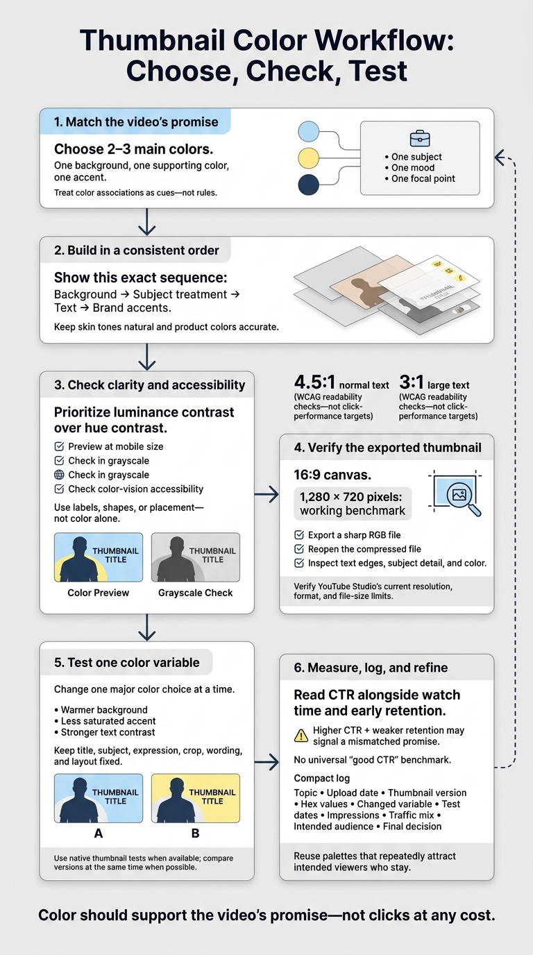
Thumbnail Color Workflow: Choose, Check, Test
Master Color Theory for YouTube Thumbnails
sbb-itb-b59debf
Choose Colors That Fit Your Video
Start with what your video promises, then pick colors to match. Put that promise into a few words: practical advice, discovery, relaxation, transformation, or entertainment. Color meanings change with context, so treat associations as cues - not rules. Let the video’s promise guide your palette.
Understand Hue, Saturation, Brightness, and Contrast
Hue is the basic color family, such as red, blue, or green. Saturation describes intensity: highly saturated colors look bold and prominent, while muted colors feel subdued. Brightness, or luminance, describes how light or dark a color appears. Contrast is the visual difference between elements, such as a bright subject against a dark background. Warm hues can suggest energy, and cool hues can suggest calm. Neither response is universal. For those just starting out, our YouTube thumbnail beginners guide covers these fundamentals in more detail.
Prioritize luminance contrast over hue contrast. Desaturate your thumbnail and view it at mobile size. Does the subject disappear? Fix the light-dark separation first. Use grayscale and color-vision checks, too. For text, use WCAG’s contrast ratios of 4.5:1 for normal text and 3:1 for large text as readability checks - not performance targets.
Match Color Associations to Video Categories
Use this table as a starting point, then check whether the whole thumbnail matches your video’s promise. Colors associated with trust won’t fix weak information. And dramatic colors shouldn’t promise something the video doesn’t deliver.
| Color | Possible associations | Long-form categories | Supporting colors | Main risk |
|---|---|---|---|---|
| Red | Intensity, urgency, competition | Gaming, challenges, investigations | Black, white, dark gray | Can feel alarmist |
| Orange | Warmth, action, friendliness | Vlogs, travel, hands-on projects | Navy, cream, charcoal | Can feel promotional |
| Yellow | Discovery, optimism, caution | Education, explainers | Black, navy, purple | Light tones lose contrast against white |
| Green | Nature, health, money | Wellness, finance, small-business explainers | Cream, navy, charcoal | Can suggest an unrelated topic about the environment or finances |
| Blue | Trust, calm, technology | Tech reviews, tutorials, business | White, orange, yellow | Can feel cold or generic |
| Purple | Mystery, artistic expression | Design, storytelling, music analysis | Yellow, lavender, black | Can distract from a practical subject |
| Black and white | Simplicity, seriousness, drama | Documentaries, minimalist explainers | One bold accent | Can look severe or hide detail |
Use Palettes That Separate Subject and Background
Give each color a job: one background, one supporting color, one accent. Then choose the palette structure that gives your subject the clearest light-dark separation.
| Palette approach | Effect | Suitable uses | Drawback |
|---|---|---|---|
| Monochromatic | Unified look; separation comes from lightness differences | Education series, business explainers | Similar values can merge |
| Complementary pairs such as blue-orange or yellow-purple | Strong hue separation and energy | Gaming, challenges, product reveals | Equally saturated colors can compete |
| Analogous: blue-teal-green | Harmonious, natural feel | Vlogs, wellness, calm tutorials | Neighboring hues may blend |
| Light-dark: cream-navy or white-charcoal | Clear text and subject edges | Instructional videos, documentaries | Needs careful emphasis to avoid looking flat |
Next, turn this palette into a repeatable thumbnail workflow for testing at scale.
Build a Color Workflow for Thumbnails
Treat your palette as part of the build process, not just a style choice. Start with the video’s promise and turn it into a thumbnail brief: one subject, one mood, one focal point.
Work in this order: background → subject treatment → text → brand accents. Keep each element editable so you can change one without affecting the rest. If the message feels unclear, simplify the layout before tweaking colors. Color won’t fix a confusing subject, clutter, or unreadable text.
Balance Backgrounds, Faces, Text, and Brand Colors
Tone down a busy background before adding effects to the subject. Darken it, lower its saturation, or shift it toward cooler colors. Keep skin tones natural and product colors accurate.
Use just a few specific words that add to the title rather than repeat it. If the text gets lost, place it on a clean backing shape. Work channel colors into a recurring text treatment, narrow border, or small highlight instead of tinting the entire image.
Add an arrow only if it points to a meaningful detail. Remove accents that don’t help viewers understand the thumbnail. With that visual hierarchy in place, you can test controlled color variations.
Create Color Variations With ThumbnailCreator
Start with AI generation or a template in ThumbnailCreator to set the layout, then adjust the text so it’s easy to read. Save that composition before creating variations.
Change one major color choice at a time. Keep the subject, crop, wording, and placement the same. Compare versions based on clarity and how well they match the video’s message - not an assumed CTR lift.
Use face or object swapping only when the result accurately represents the video. Before exporting, check readability and color accuracy.
Check Readability, Accessibility, and Export Settings
Before exporting, review the thumbnail’s emotional fit, accuracy, separation between elements, contrast, and readability on mobile. Check it in grayscale and assess contrast for viewers with color-vision differences. Use labels, shapes, or placement so color isn’t the only way to tell elements apart. Look for unnatural color shifts in faces and products, too.
Use a 16:9 canvas, with 1,280 × 720 pixels as a working benchmark. Export a sharp RGB file, then reopen the compressed file to inspect text edges, subject detail, and color. Check YouTube Studio for its current resolution, format, and file-size limits.
Measure Results and Refine Your Palettes
Once your thumbnail is live, use performance data to check whether its palette attracted your intended viewers. Judge color by who it attracts, not clicks alone. CTR reflects the thumbnail, title, topic, and audience together.
Test One Color Variable at a Time
Change just one color variable: a warmer background, a less saturated accent, or stronger text contrast. Keep the title, subject, expression, wording, and layout fixed. Use YouTube Studio’s native thumbnail tests when available, and test versions at the same time when possible. Swapping thumbnails later can skew comparisons as traffic changes.
Read CTR alongside watch time and early retention. Where reporting allows, check Browse, Suggested, and Search traffic separately, along with new versus returning viewers. Higher CTR paired with weaker retention may mean the thumbnail promises something the video doesn’t deliver. A few hundred impressions can suggest a direction, but they aren’t enough for a firm judgment. There’s no universal “good CTR” benchmark.
Log the results to build a palette history. That gives your next upload a starting point based on data rather than guesswork.
Keep a Record of Channel Palettes
Use a spreadsheet to record each video’s topic, upload date, thumbnail version, hex values, changed variable, test dates, impressions, traffic mix, intended audience, and final decision. Group results by topic, length, and audience. Reuse palettes that repeatedly attract intended viewers who stay, rather than banking on a single winner.
Review the record when your format or audience changes. Make your own channel history the baseline, and treat palettes from elsewhere as ideas you still need to test. Use that record to choose your next test.
Conclusion: Match Colors to Content and Test Results
Once you’ve built and tested the thumbnail, check that color supports the video’s promise - not clicks at any cost. Stick to two or three main colors, save the strongest accent for the focal point, and treat color associations as hypotheses rather than rules.
Start with luminance contrast, then check readability on mobile. Use WCAG’s 4.5:1 contrast ratio as a practical benchmark for text.
Follow the same checks each time: choose the palette, inspect mobile and grayscale previews, and review color accessibility. Make sure important text doesn’t rely on color alone. Before publishing, verify YouTube’s current upload specs, then inspect the uploaded image for blurred text or color shifts.
Let CTR, watch time, and retention guide your next thumbnail. This routine cuts rework and keeps expectations realistic: better color can help, but it can’t save a weak topic or a misleading promise. For long-form videos, judge the palette by whether it attracts the right viewers and keeps them watching.
FAQs
How do I choose colors for a mixed-topic video?
Put readability and visual hierarchy before color associations. Follow the 60-30-10 rule: use 60% for the background, 30% for the subject, and 10% for an accent color that highlights the main action or hook. Stick to 2–3 core colors across thumbnails to keep your brand identity consistent.
ThumbnailCreator can help you generate and test contrast-optimized designs, keeping text readable and visuals clear in YouTube’s light and dark modes.
Can I keep my brand colors if they clash with the mood?
Yes. Consistent brand colors help viewers recognize your channel, even when those colors don’t match a video’s mood. Channels that keep their branding consistent often see a 15–25% higher click-through rate from returning viewers.
Use a darker or muted version of your brand color for the background. Keep the original shade for supporting elements, then add a high-contrast accent that fits the mood. Test variations in ThumbnailCreator while keeping your core palette recognizable.
How long should I run a thumbnail color test?
Run your A/B test for at least 48 hours to collect initial data, or 7–14 days for more reliable results. If your channel receives fewer than 10,000 impressions per week, consider testing for a month to reach statistical significance.
Aim for 1,000–5,000 impressions per thumbnail version. Keep every other design element the same so you can measure the effect of color alone.