
Color Psychology in Thumbnails: A Cultural Guide
Colors in thumbnails can make or break your content's first impression. Here's why:
- Colors trigger emotions: Red excites, blue calms, and yellow energizes.
- Cultural meanings differ: White means purity in the U.S., but mourning in China.
- Contrast matters: Good contrast ensures text and images stand out, especially on mobile.
- Consistency builds trust: Stick to 2-3 bright vs dark color schemes for your brand identity.
Want clicks? Understand your audience's cultural context and test your designs. Tools like ThumbnailCreator can help refine your thumbnails for better engagement.
Core Principles of Thumbnail Color Design
Brand Consistency and Content Relevance
Stick to a few consistent color schemes rather than switching things up for every video. Aim for 2–3 palettes that match your channel’s vibe, such as high-energy, calm, or educational tones. This approach keeps your thumbnails recognizable while offering flexibility for different types of content.
Here’s a handy rule: 80% of your thumbnails should follow a consistent brand layout and color scheme, while the remaining 20% can break the mold for special occasions like collaborations or milestones. Channels with consistent thumbnail branding report 15–25% higher click-through rates (CTR) from returning viewers compared to those with inconsistent designs.
Using Contrast and Complementary Colors
The contrast in brightness is more important than the specific colors you choose. Your text and main subject need to pop, especially at smaller sizes on mobile. Without this, even the most vibrant palette will fall flat.
"The best colors for YouTube thumbnails are not universal magic colors. They are the colors that keep the subject, text, and emotional cue readable when the image is reduced inside the feed." - GrabThumbs Editorial Team
Follow the three-color rule: use a primary color to set the tone, a support color for key elements, and a restraint color to keep backgrounds subtle. Complementary colors - those opposite each other on the color wheel - create natural visual tension that grabs attention. Think blue with orange or purple with yellow.
Also, keep in mind YouTube’s interface colors: white (light mode), dark gray (dark mode), and red accents. If your thumbnail blends in too much, it might get overlooked. Adding a border or contrast element can help it stand out.
| Background Color | Recommended Accent/Subject Color | Best Use Case |
|---|---|---|
| Blue | Yellow or Orange | High energy and general readability |
| Teal or Green | Warm skin tones or Orange | Content featuring faces or people |
| Deep Purple or Navy | Bright neutral or Neon | Knowledge-heavy, mystery, or reviews |
Once you’ve nailed the contrast, the next step is ensuring your text is easy to read.
Keeping Text Readable Over Backgrounds
Text clarity can be a challenge, especially for mobile users. Since more than 60% of mobile viewers use dark mode, always preview your thumbnail on both light and dark backgrounds before finalizing it.
For strong contrast, yellow text with a thick black outline works wonders. For example, yellow on deep blue is much easier to read than yellow on white because of the greater brightness difference. On the flip side, avoid combinations like bright red text on a bright blue background, as they can make the text difficult to process.
A quick grayscale test can also help: if your text remains legible in black-and-white, your brightness contrast is solid. To confirm which variations perform best, you can A/B test your thumbnails. This is especially important for the 8% of men with some form of color vision deficiency.
"If every color is equally loud, nothing feels important." - GrabThumbs Editorial Team
sbb-itb-b59debf
How To Make a Thumbnail 'POP'? - Color Theory In Thumbnails
What Key Colors Mean Across Cultures
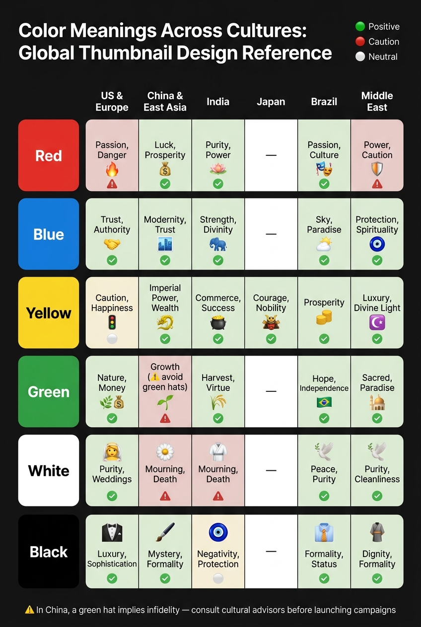
Color Meanings Across Cultures: Global Thumbnail Design Reference
When designing with cultural influences in mind, understanding the meanings of key colors across different regions can make a significant impact.
Red: Energy in Some Cultures, Mourning in Others
Red is a bold and attention-grabbing color in thumbnail design. In the U.S. and Western Europe, it often signals urgency, danger, or passion - qualities that naturally draw the eye. Meanwhile, in China and much of East Asia, red symbolizes luck, prosperity, and celebration. It's a prominent choice for weddings, festivals, and "hongbao" envelopes that convey good fortune. However, in South Africa and Ghana, red represents mourning and sacrifice, making its use more somber.
This duality means that the same red element in a thumbnail - like an arrow or background - could convey urgency and loss in Western contexts, or optimism and celebration in East Asian markets. Balancing these emotional triggers is key to finding the balance between clickbait and authenticity in your designs.
"The same red that energizes a Chinese New Year campaign could signal danger in a Western context." - Jim MacLeod
Blue: Trust or Grief?
Blue is widely associated with trust, calm, and stability. In Japan, it communicates dignity, while in India, it represents strength and divinity, often linked to Lord Krishna. However, blue can also lack excitement if used without creativity. Stuart Crawford, Creative Director at Inkbot Design, highlights this challenge:
"The only risk with blue is being 'boring.' It is the beige of the corporate world. To stand out, the shade (Cyan vs. Navy) is your differentiator."
In the Middle East, blue carries spiritual and protective themes, frequently tied to the Nazar (Evil Eye) talisman. When choosing blue for your design, subtle shifts in shade can help evoke the right emotional tone for your audience.
Yellow: Happiness or Cowardice?
Yellow is a bright, energetic color that conveys optimism and cheerfulness. In the U.S., it grabs attention and exudes positivity, while in China, it has historical ties to sacred imperial traditions. In Thailand, yellow is connected to Buddhism and royalty. However, its meanings vary widely - yellow is associated with mourning in Egypt and can imply cowardice in parts of the U.S.
Using yellow strategically as an accent color ensures it supports your message without unintentionally clashing with cultural interpretations.
Black and White: Power, Purity, or Death?
In Western cultures, black signifies sophistication, luxury, and authority, while white represents purity and cleanliness. However, in China, Korea, and parts of India, white is closely tied to mourning and death. Similarly, in Thailand and Vietnam, black can symbolize bad luck when used alone.
To navigate these contrasts, pair white with gold or red to evoke premium minimalism, or combine black with gold to suggest opulence in markets like Vietnam. Thoughtful color combinations ensure your design resonates with the intended audience.
Green, Orange, and Purple: Regional Differences
Other colors also carry distinct cultural meanings:
- Green: Often tied to nature and growth in the West, but seen as sacred in the Middle East.
- Orange: Universally associated with energy and friendliness, making it a broadly positive choice.
- Purple: Symbolizes royalty and luxury in the West and Japan but represents mourning in Brazil and Thailand.
Understanding these regional nuances helps you avoid unintended messages and align your design choices with audience expectations.
| Color | US/Western Meaning | Key Regional Contrast |
|---|---|---|
| Green | Nature, Growth, Financial Gain | Sacred/Religious (Middle East) |
| Orange | Energy, Enthusiasm | Broadly positive across most regions |
| Purple | Royalty, Luxury | Mourning/Death (Brazil, Thailand) |
How to Design Thumbnails with Cultural Awareness
Once you've grasped the basics of color psychology and cultural meanings, the next step is applying this knowledge to create thumbnails that resonate with specific audiences. It's not just about knowing what colors signify in different cultures - it’s about using that understanding thoughtfully before you hit publish.
Researching Your Audience Demographics
A good starting point is YouTube Analytics, which can show you exactly where your viewers are located. Once you know your top-performing regions, dive into the cultural specifics of those areas. For example, audiences in tropical regions may gravitate toward bright, vibrant colors, while viewers in Northern European countries like Germany or the UK often prefer subtler, cooler tones.
You can also learn from global brands that adapt visuals to local markets. Take McDonald’s, for instance. In India, they introduced a green "M" to reflect vegetarian-friendly options, aligning with local cultural and dietary expectations. This small but meaningful change led to an 18% boost in cultural acceptance and a 23% increase in purchase intent. Case studies like this can provide inspiration and help you avoid starting from scratch.
Testing Color Choices with Analytics
After identifying your audience's demographics, it’s important to test your choices. A/B testing thumbnails within specific regions is a great way to see how different color variations perform. Track metrics like Click-Through Rate (CTR) by country to determine what works best. If one color consistently outperforms another in a particular region, you’ve got actionable data to guide your design decisions.
Stuart Crawford, Creative Director at Inkbot Design, highlights the risks of ignoring cultural associations with color. For instance, if white has negative connotations in a target market, consider balancing it with accents like red or gold to shift its perception toward something more positive, like luxury or celebration.
Once you’ve validated your choices with data, you can move forward with confidence, incorporating cultural elements into your thumbnails.
Design Techniques for Culturally Aware Thumbnails
A practical approach for designing culturally sensitive thumbnails involves layering your design. Use three key layers:
- A core brand color for consistency
- Regional accents to reflect local preferences
- Seasonal enhancement colors for cultural events like Chinese New Year (red and gold, for example)
This "glocal" strategy - balancing global branding with local adaptation - keeps your identity intact while appealing to diverse audiences. Netflix is a prime example of this method. While maintaining its iconic red branding globally, the company tests regional thumbnail variations tailored to local tastes. This approach has helped Netflix achieve 89% brand recognition worldwide and improved user retention in culturally adapted markets by 28%.
Color Meanings by Culture: Reference Table
Here’s a quick reference to help you plan thumbnails for different regions. Remember, context is everything - a color’s meaning can shift depending on how and where it’s used.
| Color | US & Europe | China & East Asia | India | Japan | Brazil | Middle East |
|---|---|---|---|---|---|---|
| Red | Passion, Danger | Luck, Prosperity | Purity, Power | - | Passion, Culture | Power, Caution |
| Blue | Trust, Authority | Modernity, Trust | Strength, Divinity | - | Sky, Paradise | Protection, Spirituality |
| Yellow | Caution, Happiness | Imperial Power, Wealth | Commerce, Success | Courage, Nobility | Prosperity | Luxury, Divine Light |
| Green | Nature, Money | Growth (avoid green hats) | Harvest, Virtue | - | Hope, Independence | Sacred, Paradise |
| White | Purity, Weddings | Mourning, Death | Mourning, Death | - | Peace, Purity | Purity, Cleanliness |
| Black | Luxury, Sophistication | Mystery, Formality | Negativity, Protection | - | Formality, Status | Dignity, Formality |
One interesting detail: in China, while green is generally seen as positive, a green hat has a very specific and negative connotation - it implies infidelity. This kind of nuanced understanding highlights the importance of consulting native experts or cultural advisors before launching a major campaign. Small adjustments can make a big difference in how your content is received.
Using ThumbnailCreator to Design Better Thumbnails
ThumbnailCreator offers tools designed to help you create thumbnails that connect with your audience more effectively. By combining insights about color psychology and design trends, ThumbnailCreator makes it easier to craft attention-grabbing thumbnails - even if you don’t have advanced design skills.
AI-Powered Color and Layout Suggestions
ThumbnailCreator’s AI analyzes millions of successful thumbnails to uncover patterns that drive engagement. It identifies elements like harmonious color combinations and impactful facial expressions that are proven to boost click-through rates. Based on this data, the tool suggests color palettes and layouts tailored to your content’s purpose.
For example, if you’re creating educational content, the platform often recommends blue or green tones, as these are associated with trust and credibility. Thumbnails featuring these colors have been shown to achieve a 23% higher subscriber conversion rate compared to other options. Additionally, the AI offers tips for text placement to ensure readability, especially on mobile devices, where over 70% of video views occur. Since viewer preferences can change, these recommendations are updated daily to stay aligned with current trends.
This AI-driven approach simplifies the design process while keeping your thumbnails visually appealing and effective.
Templates You Can Adjust for Different Audiences
ThumbnailCreator also provides flexible templates that can be customized to suit different audiences. You can tweak elements like accent colors, text overlays, and layouts to reflect regional preferences while maintaining your brand identity. For instance, a U.S. audience might respond better to bold, high-contrast visuals, while other regions may favor subtler designs. This modular system allows you to balance consistency with local relevance.
Tracking Performance and Refining Designs
Creating effective thumbnails is an ongoing process. ThumbnailCreator integrates A/B testing with YouTube Analytics, giving you insights into which designs perform better. This data-driven approach can boost click-through rates by up to 38%. Over time, using optimized thumbnails has been shown to increase overall click-through rates by 30% to 154%.
Conclusion
Every thumbnail sends a message the moment someone sees it. The way we respond to thumbnail color psychology - shaped by biology and cultural context - plays a huge role in this first impression. Ignoring these subtle but powerful factors could hold back your channel's growth.
Color has a dual nature: it's universal in some ways but deeply rooted in cultural context. Across different regions, colors evoke varied emotions and associations. Even small design choices can make the difference between connecting with your audience or missing the mark entirely. Stuart Crawford, Creative Director at Inkbot Design, sums it up perfectly:
"When you ignore the cultural weight of your palette, you are essentially walking into a foreign room and shouting in a language nobody speaks. At best, they ignore you. At worst, you offend them."
Armed with this understanding, you can make smarter design decisions.
Stick to reliable design principles like the 60-30-10 rule and use consistent action colors to build trust and brand recognition. Also, preview your thumbnails in both light and dark modes to ensure they look great no matter how viewers engage with your content.
To make this process easier, tools like ThumbnailCreator can help. It uses AI to suggest colors based on actual performance data and offers templates tailored for different audiences. The idea isn’t to get it perfect right away but to create a system where every design choice is intentional, testable, and constantly improving. By applying these strategies, you’ll be better equipped to create thumbnails that truly resonate with your audience.
FAQs
How do I pick colors if my audience is worldwide?
When creating designs for a global audience, it's crucial to consider how different cultures interpret colors. For example, red might signal urgency or danger in Western countries, but in parts of Asia, it represents good fortune and celebration. To ensure your designs connect with diverse audiences, test your color choices in various markets instead of relying on universal assumptions. Developing a design system that can adapt to regional preferences - while staying true to your brand identity - can make your thumbnails more appealing worldwide and boost engagement.
What’s the quickest way to check thumbnail readability on mobile?
The quickest method to test how your thumbnail appears on mobile is by using a tool that mimics its look across various device layouts. For example, YouTube thumbnail preview simulators let you instantly see how your design fits within YouTube’s mobile feed. This helps you confirm that your thumbnail remains clear and visually appealing on smaller screens.
How can I A/B test thumbnail colors by country in YouTube Analytics?
YouTube's "Test & Compare" feature is a handy tool for testing thumbnail designs across different regions. By experimenting with thumbnail colors, you can see how they impact metrics like click-through rates (CTR) in specific countries. Here's how to do it:
- Create your test: Design thumbnails with different color schemes.
- Set audience targeting: Use audience settings to focus on specific countries.
- Run the test: Let the test run for 7–14 days to gather enough data.
- Analyze the results: Check which colors perform best in each region based on CTR and other metrics.
This approach helps you tailor your thumbnails to resonate better with audiences in different parts of the world.