

Checklist: Perfect Thumbnail Color Combinations
Most thumbnail color problems come down to 5 checks: use 3 colors, keep strong contrast, match the video mood, test in YouTube’s feed, and track CTR changes one color at a time.
If I want a thumbnail to hold up at 120–168 px wide, I need to make color do three jobs fast: keep text readable, fit the video’s tone, and stand out against nearby thumbnails. The article’s main numbers back that up: red + yellow can lift CTR by 41% for high-energy topics, and blue + white can lift CTR by 23% for education and tech content.
Here’s the short version:
- Use only 3 visible colors
- Follow a 60-30-10 split
- Keep accent color at about 5%–15%
- Use high-contrast text pairs, like white on navy or black on yellow
- Aim for 4.5:1 contrast for normal text and 3:1 for large bold text
- Keep text short: about 2–4 words
- Check the thumbnail on mobile, in both light mode and dark mode
- Test one color change at a time and log date, version, impressions, and CTR
A few color sets fit common video goals: (See more thumbnail use cases for specific niches.)
| Color combo | What it signals | Best for |
|---|---|---|
| Black + yellow + white | Bold, high contrast | Tutorials, how-tos, explainers |
| Red + white + black | Urgent, dramatic | Reactions, commentary, challenges |
| Blue + orange + white | Trust + energy | Tech, apps, business how-tos |
| Purple + yellow + white | Premium, standout | Design, art, music |
| Green + white / gold | Money, growth | Finance, side hustles, business |
| Black + neon green + white | Electric, intense | Gaming, music, reveals |
Bottom line: if I keep the palette tight, make the text easy to read, and test colors in the actual feed, I give the thumbnail a better shot at earning clicks.
👉 6 BEST THUMBNAIL COLORS For High Video Views And High Click Through Rate (CTR) on YouTube
sbb-itb-b59debf
Define Your Thumbnail Color Strategy Before You Start Designing
Figure out the thumbnail’s job, mood, and contrast rule before you open the editor.
Apply the 3-Color Rule and the 60-30-10 Layout
Stick with three visible colors:
- 60% for the background
- 30% for the subject
- 10% for the accent
Keep the accent below 15% so the design doesn’t start to look messy.
The 60-30-10 layout gives each color a clear role. On a standard 1,280×720 thumbnail, the main color sets the mood. The second color adds shape and order. The accent pulls the eye to the part that matters most. Once that accent starts taking up more than 15% of the frame, the thumbnail can feel crowded.
Pick Warm or Cool Colors Based on the Video Goal
After you set the palette, choose a color temperature that fits the video’s promise. People read color fast. Warm colors like red, orange, and yellow signal urgency, hype, and motion. Cool colors like blue, teal, and green suggest trust, calm, and focus.
A simple way to decide: write the video’s core promise in one sentence. If that promise feels urgent or high-energy, lean warm. If it feels credible or instructional, lean cool.
Red and yellow pairings outperform other combinations by 41%, while blue and white palettes lead to a 23% higher CTR in education and tech niches.
Balance Brand Colors vs CTR-Optimized Colors With Strong Contrast
Use your brand colors, but don’t let them hurt readability. Say your brand uses a mid-tone blue. Check how that blue looks in YouTube’s light and dark UI before you lock it in. A smart move is to use a darker version of the brand color for the background, keep the original shade as a support color, and add a high-contrast accent on top.
Complementary color pairs get 29% more clicks than monochromatic schemes.
Next, check if those colors still read clearly in the feed.
Check Contrast and Readability Before Publishing
Once your palette is set, check readability and typography before you publish. A color mix that looks sharp on a big monitor can fall apart fast at feed size, which is where most people first see your thumbnail.
Use Bright-on-Dark or Dark-on-Bright Color Pairs
The safest text pairings are white on navy, white on black, and black on yellow. They give you enough separation between the text and the background, so the words stay readable even on dim screens or lower-quality displays. If the colors blend together in grayscale, the values are too close for text.
Steer clear of pairings like red on orange or dark gray on black. Their luminance levels are too similar, so the text starts to blur as soon as the thumbnail gets smaller. If contrast is close but not quite there, don’t just push saturation harder. Put a semi-transparent neutral overlay behind the text instead. That helps pull the words away from busy backgrounds like faces or gameplay footage. Use a 40–60% black overlay or a 60–80% white overlay.
Preview Text at Small Size and Check Contrast
Export the thumbnail, then look at it on your phone at feed size. At that scale, you should be able to read the main word immediately.
For a measurable target, aim for a 4.5:1 contrast ratio for body text and 3:1 for large, bold text. Sample the text color and the pixels behind it, then check the ratio. You can use free thumbnail tools to quickly measure these values. If it misses the mark, darken or lighten the area behind the text, increase the font weight, or cut the copy down to 2–4 short, high-impact words. A 2–4 px dark stroke around light text is a small tweak, but it can do a lot for readability on busy backgrounds.
Quick-Reference Readability Table
| Text Color | Background Color | Readability Level | Recommendation |
|---|---|---|---|
| White | Navy / Dark Blue | Excellent | Use as a primary combo for titles |
| Black | Yellow | Excellent | Use for urgent or high-energy topics |
| White | Red | High | Use for emotional or urgent content; add a subtle stroke |
| Black | Light Cyan / Mint | High | Use when you want strong readability with a clean palette |
| White | Light Yellow | Medium | Use with caution; darken the background or add a stroke |
| Red | Orange | Poor | Avoid; values are too similar at small size |
| Dark Gray | Black | Low | Avoid; switch to white text or brighten the background |
Use the strongest readable pair as your starting point for the next color-combination check.
Proven Thumbnail Color Combinations for Common Video Types
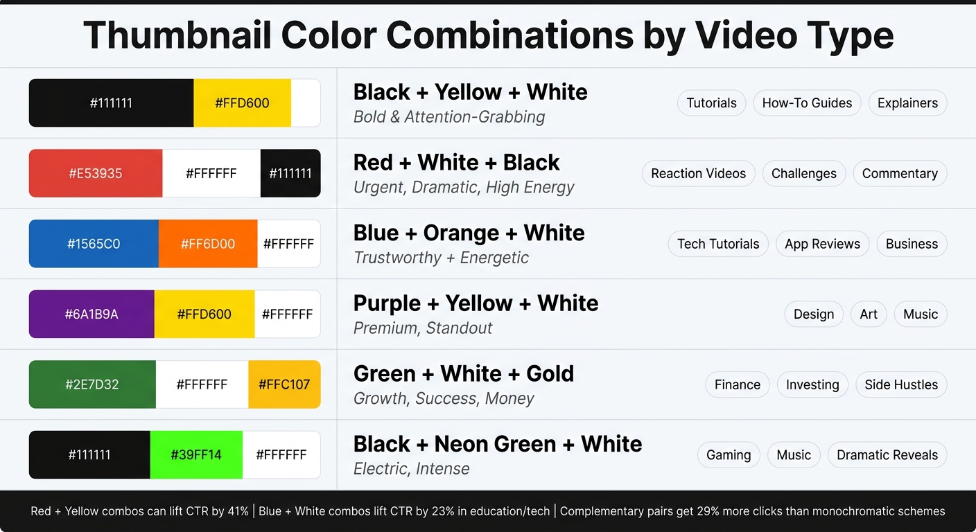
Thumbnail Color Combinations: Best Palettes by Video Type
Match Color Combinations to Content Goals
After you lock in contrast, the next step is simple: match your colors to the promise of the video. Color helps people read the mood in a split second and decide if it's for them.
Black + yellow + white tends to work well because yellow jumps off a dark background. It fits tutorials, how-to guides, productivity videos, and news-style explainers. Red + white + black gives off urgency and drama. That's a strong fit for reaction videos, challenges, commentary, and breaking news. Blue + orange + white blends trust with energy, which makes it a good choice for tech tutorials, app reviews, and business or workflow how-tos. Purple + yellow with white accents fits design tips, branding breakdowns, art, and music. Green + white or green + gold works for finance, investing, business growth, income reports, and side-hustle content.
A good rule: give each color one clear job. One color handles the background, one handles the text, and one handles the accent.
Limit Visible Colors to 3 to Reduce Noise
Extra color can be one of those thumbnail mistakes that hurt more than help. When a thumbnail has a busy background, rainbow text, loud clothing, and bright callouts all fighting for space, the eye bounces around with no clear focal point.
Keep it tight. Use three visible colors, and assign each one a role:
- one for the background
- one for text
- one for accents like arrows, highlight boxes, or one graphic element
Keep accent colors to about 5–15% of the thumbnail area so they work like a visual highlighter instead of adding clutter. If your subject is wearing multicolor clothing in front of a colorful background, add a neutral overlay to bring the palette back to three main colors.
Quick-Reference Color Combination Table
| Color Combination | Emotional Signal | Best-Fit Video Types |
|---|---|---|
| Black + yellow + white | Bold and attention-grabbing | Tutorials, how-to guides, productivity, news-style explainers |
| Red + white + black | Urgent, dramatic, high energy | Reaction videos, challenges, commentary, breaking news |
| Blue + orange + white | Trustworthy + energetic, tech-forward | Tech tutorials, app reviews, business and workflow how-tos |
| Purple + yellow (+ white) | Premium, standout | Design tips, branding breakdowns, art, music, aesthetics |
| Green + white or green + gold | Growth, success, money | Investing guides, income reports, business case studies, side hustles |
| Black + neon green + white | Premium, electric | Gaming, music, dramatic reveals |
Use the table to narrow down your palette, then test it in YouTube's feed. Pick one palette, give each color a role, and keep everything else neutral. After that, check how the thumbnail reads in YouTube's light mode and dark mode.
Test the Thumbnail in Context and Refine the Colors
Check the Thumbnail in YouTube's Light and Dark Modes
After readability checks, test the thumbnail in YouTube's actual feed.
A thumbnail can look sharp in your design tool and still fade into the background once it sits next to other videos on YouTube. That’s why it helps to check it twice: once in dark mode and once in light mode.
Look at whether it still stands out beside competing results. Make sure your main accent color still pops against the interface. Then compare it with nearby videos for your target keyword. If most results lean blue or gray, a warm orange or yellow palette can give your thumbnail a better shot at standing out.
The goal isn't louder color. It's clear contrast.
Test Small Color Variations and Track CTR Changes
Once the thumbnail passes the context check, test just one color change at a time.
You might switch the accent text from white to yellow. Or move the background from dark blue to teal. The key is simple: keep everything else the same so you can tell what changed the result.
Don’t judge the test from a one-day spike. Use a fixed time window instead. Then log each test in a spreadsheet with:
- Date
- Version
- Color change
- Impressions
- CTR
After a few rounds, you’ll start to see patterns. Some color choices will get more clicks from your audience, and some won’t.
Export a few versions fast so you can test one color shift at a time.
Conclusion: The Final Thumbnail Color Checklist to Review Every Time
Use this checklist before every upload and any time you revisit a thumbnail based on performance data:
- Palette and distribution: Picked a 3-color palette with one background, one main subject or brand color, and one accent; used the 60-30-10 rule
- Contrast and readability: Used bright-on-dark or dark-on-bright pairs; contrast ratio meets at least 4.5:1; previewed text at feed size in both light and dark modes
- Mood match: Checked that the warm or cool palette fits the video's mood and content type
- Context check: Compared the thumbnail with competing videos for the target keyword; the focal point still stands out
- Testing log: Recorded the color version, variable changed, date, impressions, CTR, and winner before moving to the next test
Run this checklist before every upload.
FAQs
How do I choose the right thumbnail colors for my niche?
Pick high-contrast color pairings that fit your content’s tone and goal. For fast-paced content like gaming or tutorials, bold combos such as yellow and black or red and white tend to work well.
For professional or educational niches, blue and white or blue and orange often feels like a better fit. ThumbnailCreator can help you build contrast-optimized designs that stand out on both desktop and mobile.
What if my brand colors make text hard to read?
Prioritize contrast so the text stays clear and easy to read. Aim for a contrast ratio of at least 4.5:1 against the background, or 3:1 for larger text.
If readability is still weak, add a bold outline or drop shadow. You can also place the text over a semi-transparent overlay or a solid color block. Test these changes in ThumbnailCreator to make sure the text stays sharp on any device.
How long should I test one color change before deciding?
Run an A/B test for at least 48 hours so you have enough data to work with. If you want a steadier read, let it run for 7 to 14 days.
While the test is live, aim for 1,000 to 5,000 impressions for each thumbnail version. And keep everything else the same so you can isolate the effect of the color change.