
Cool Colors in Thumbnails: When to Use Them
Cool colors like blue, green, and purple can boost your video thumbnail performance by increasing trust, professionalism, and click-through rates. These hues are ideal for educational, tech, business, and finance content, as they engage the logical part of the brain and create a sense of stability.
Key insights:
- Blue increases CTR by 14%, especially for tech and educational topics.
- Green boosts CTR by 12%, perfect for finance or growth-related content.
- Pairing cool tones with warm accents (e.g., yellow text on blue) can amplify CTR by up to 28%.
- Over 80% of mobile users prefer Dark Mode, making deep cool colors like navy even more effective.
For best results, balance contrast for readability, follow the 60-30-10 color rule, and use tools like ThumbnailCreator to simplify the design process.
Cool Colors and Their Psychological Effects
What Are Cool Colors?
Cool colors occupy the opposite end of the spectrum from warm tones like red and orange. These include blue, green, teal, and purple - shades that evoke images of water, sky, forests, and twilight. Unlike warm colors, which seem to move toward the viewer and create a sense of urgency, cool colors visually pull back, helping to emphasize elements in the foreground.
The emotional effects of cool colors are fascinating. While warm tones can stimulate the amygdala (the brain's fight-or-flight center), cool colors engage the brain's decision-making areas instead. This shift fosters a sense of calm rather than excitement. For instance, blue has been shown to lower heart rates and improve mental focus.
Each cool color carries its own unique message. Blue conveys trust, professionalism, and intellectual authority. Green symbolizes growth, health, and financial prosperity, often linked to the "green light" effect that signals safety and progress. Teal suggests modern stability and authority, while purple is often tied to mystery, imagination, and creative energy, making it especially popular in gaming-related contexts.
Next, let’s explore how these psychological cues shape audience behavior and engagement.
How Color Psychology Affects Viewer Behavior
The psychological qualities of cool colors play a big role in shaping how viewers perceive content. Even before reading a title, color choices influence their first impressions. As Ken Dawson from Vmake AI explains:
"Blue is associated with the prefrontal cortex - the logical, decision-making part of the brain. It signals stability and trust".
This subconscious reaction happens almost instantly - within just 0.13 seconds - as viewers decide whether to click or scroll.
Cool colors are particularly effective when your goal is to encourage viewers to pause and reflect rather than act on impulse. They’re ideal for educational videos, tech reviews, business analyses, or any content where credibility is essential. Matching the color to the tone of your content is key. For example, blue works well for a software tutorial to establish authority, while green is perfect for finance-related videos, tapping into its connection with wealth and growth.
Essentially, cool colors set the emotional tone of your thumbnail. They create a calming, trustworthy atmosphere that invites thoughtful engagement. When viewers see these hues, they’re more likely to associate the content with professionalism and reliability, steering clear of the flashy allure of clickbait.
sbb-itb-b59debf
Master Color Theory for YouTube Thumbnails
When to Use Each Cool Color in Your Thumbnails
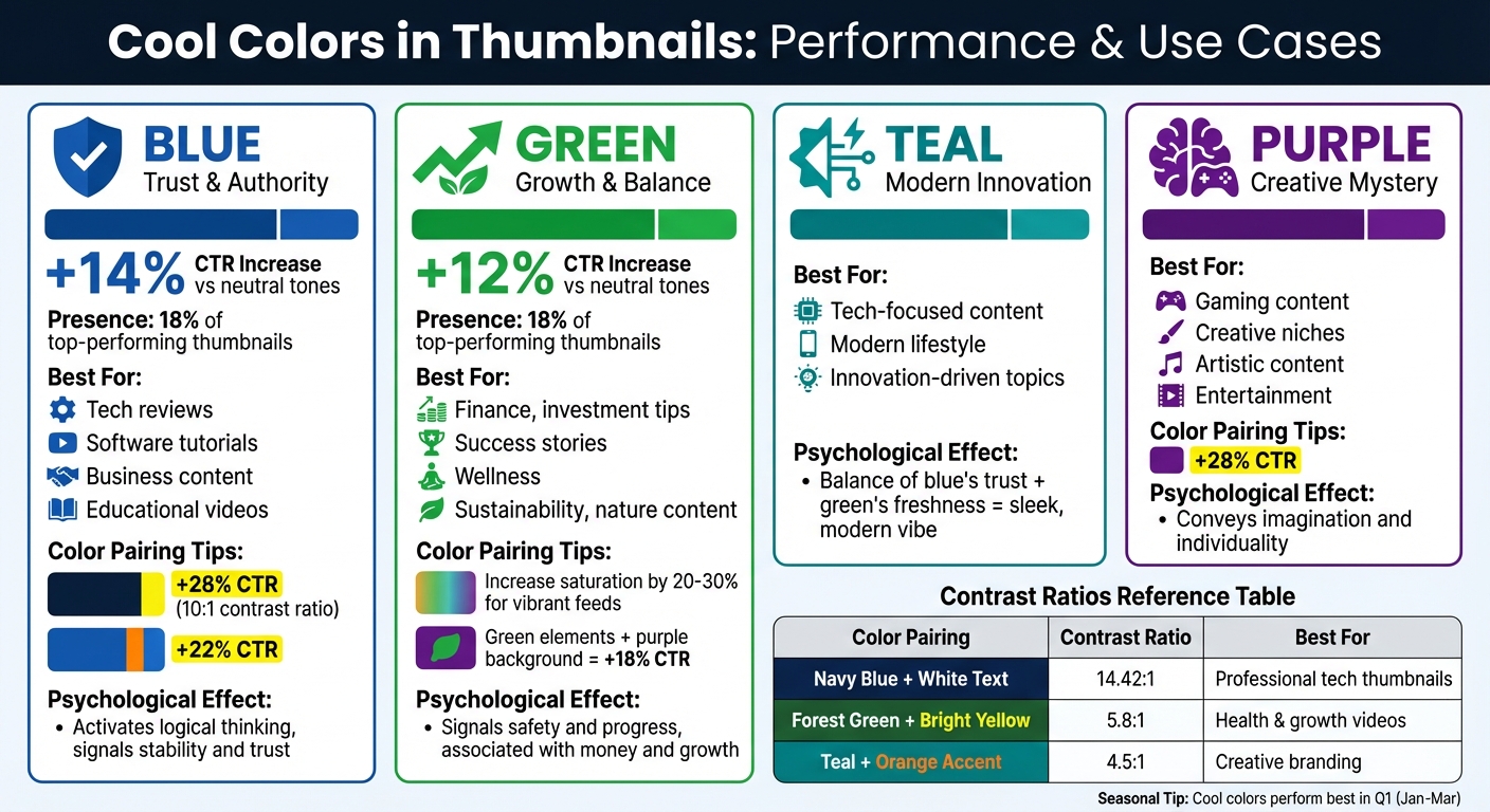
Cool Colors Performance Guide: CTR Impact and Best Use Cases for Video Thumbnails
Cool colors can influence how viewers perceive your content, making them a powerful tool for thumbnails. Here's a breakdown of when to use specific hues to maximize their impact.
Blue: Trust, Authority, and Professionalism
Blue is ideal for establishing reliability and expertise. This makes it perfect for tech reviews, software tutorials, business topics, and educational content - areas where credibility matters. Blue tends to activate logical thinking, which aligns well with complex or analytical subjects.
Interestingly, blue thumbnails see a 14% higher click-through rate (CTR) compared to neutral tones and appear in 18% of top-performing thumbnails. Darker shades of blue are particularly effective for corporate or financial content.
For added impact:
- Pair dark blue backgrounds with yellow text (maintaining a 10:1 contrast ratio) to boost CTR by 28%.
- Use orange accents alongside blue to increase CTR by 22%.
Green: Growth, Health, and Balance
Green is the go-to color for content about growth, wellness, finance, or sustainability. Its psychological effect signals safety and progress, making it especially effective for investment tips, success stories, and nature-focused videos.
Green thumbnails deliver a 12% higher CTR than neutral tones. Its association with money makes it a natural fit for finance-related content, while its fresh energy resonates with wellness and environmental themes.
To make green stand out:
- Increase saturation by 20–30% to keep it vibrant in bright, crowded feeds.
- Combine green elements with a purple background for a unique look that boosts CTR by 18% - a great choice for creative or standout content.
Teal and Purple: Specialized Uses
Teal strikes a balance between blue's trustworthiness and green's freshness, creating a sleek, modern vibe. It works well for tech-focused content, modern lifestyle topics, and anything innovation-driven. If you're aiming for a cutting-edge yet professional aesthetic, teal is a solid pick.
Purple, on the other hand, thrives in gaming and creative niches. It conveys imagination and individuality, making it a favorite for artistic or entertainment content. Pairing purple with yellow text on a dark purple background can boost CTR by 28%, offering a bold yet less corporate feel.
Seasonal Consideration
Cool colors tend to perform especially well in the first quarter of the year (January through March). This timing aligns with "new year" and "fresh start" themes, amplifying their psychological appeal and making them even more effective during this period.
Design Tips for Using Cool Colors
Balancing Contrast and Readability
Contrast is everything when working with cool colors. Your text needs to be crystal clear, especially since thumbnails are often viewed at a small size. A good rule of thumb? Pair light-colored text - like white or pale yellow - with dark cool backgrounds, such as navy blue or deep green. This creates a sharp contrast that ensures your message pops.
For accessibility, aim for a contrast ratio of at least 4.5:1, as recommended by WCAG guidelines. For example, a navy blue background (#001F3F) combined with white text (#FFFFFF) achieves a 14.42:1 ratio - well above the minimum and perfect for mobile viewing. Free tools like WebAIM Contrast Checker or Adobe Color can help you test your brand colors vs optimized colors by simply entering the hex codes.
Steer clear of common pitfalls like pairing medium blue with gray text, which results in a weak 2.1:1 contrast ratio that’s hard to read. If you’re using lighter cool tones, try adding a subtle glow or outline to your text for better visibility. Studies even suggest that improving contrast can increase click-through rates by 20-30% compared to designs with low contrast. Before publishing, preview your thumbnails at 25% zoom to see how they’ll look in YouTube’s interface.
Creating Effective Cool Color Palettes
A well-balanced palette keeps your thumbnails visually appealing without overwhelming the viewer. One proven method is the 60-30-10 rule: dedicate 60% of the design to a dominant cool color (like blue), 30% to a secondary cool color (such as green or teal), and 10% to a warm accent color for added emphasis. This approach creates a clear visual hierarchy while maintaining the soothing feel of cool tones.
For example, professional tech content shines with a palette of navy (#001F3F), sky blue (#87CEEB), and gold accents (#FFD700). Health and growth-focused designs often work well with mint green (#98FB98), teal (#20B2AA), and coral (#FF7F50). Keep accent colors limited to small elements - like a "Watch Now" button or a key graphic detail - so they grab attention without cluttering the design. You can use tools like Coolors to generate harmonious color schemes or try ThumbnailCreator’s AI-powered suggestions to ensure your cool color strategy stays on point.
| Cool Color Pairing | Contrast Ratio | Best For |
|---|---|---|
| Navy Blue + White Text | 14.42:1 | Professional tech thumbnails |
| Forest Green + Bright Yellow | 5.8:1 | Health & growth videos |
| Teal + Orange Accent | 4.5:1 | Creative branding |
How ThumbnailCreator Simplifies Color-Optimized Thumbnails
AI-Powered Tools for Easy Design
ThumbnailCreator makes designing eye-catching thumbnails a breeze with its AI Color Enhancer. This tool automatically selects the best cool color tones for your thumbnails, offering presets like "Cool Modern" and "Cinematic". Each preset is tailored to specific content types, ensuring a polished look. For example, Cool Modern applies blue-tinted grading for a sleek, tech-inspired vibe, while Cinematic pairs cyan and teal with complementary orange for that dramatic, movie-poster feel.
The AI optimizes your thumbnail for YouTube’s smallest size (160x90px), ensuring your colors remain vibrant even on mobile screens. You can tweak the intensity with three options - Subtle, Medium, or Strong - depending on how bold you want the colors to appear. Best of all, each enhancement uses just 1 credit, and the tool adjusts only the lighting and color grading, leaving your original composition intact.
Templates Built for Cool Color Strategies
In addition to its AI tools, ThumbnailCreator simplifies the design process with pre-made templates. Over 15,000 YouTube creators trust these templates to save time while still delivering professional results. These templates are specifically designed to work with cool color strategies, making it easy to create thumbnails that stand out.
Here’s how it works: upload your image, pick a preset like Cool Modern, select your intensity level (Medium is a great starting point for balanced results), and download your enhanced thumbnail. The "Compare" feature lets you see side-by-side views of the original and enhanced versions before finalizing. For best results, use the Background Remover first to make your subject pop against the cool-toned background. This step-by-step approach ensures professional-quality thumbnails without requiring design expertise.
ThumbnailCreator’s presets showcase how cool color strategies can elevate your thumbnails:
| Preset | Primary Cool Colors | Best For | Aesthetic Effect |
|---|---|---|---|
| Cool Modern | Blue tints | Tech reviews, gaming, science, tutorials | Sleek, tech-forward, with deep shadows |
| Cinematic | Teal (with Orange) | Film analysis, reviews, high-production vlogs | Dramatic, professional movie-poster vibe |
| High Contrast | Enhanced cool/dark tones | Any content needing maximum visibility | Bold and eye-catching, even at small sizes |
Conclusion
Cool colors do more than just look appealing - they play a key role in shaping how viewers perceive content before they even click. For instance, blue conveys trust, while green suggests growth and sincerity. Shades like deep forest green can hint at wealth, while sage green feels more personal and relatable.
Experts agree that these psychological signals can boost engagement. Ken Dawson puts it this way:
"In 2026, the battle for attention has moved beyond just 'being bright.' It's about strategic contrast, emotional resonance, and understanding how the human eye navigates a digital interface."
Audiences are increasingly turning away from loud neon hues, which often feel spammy, in favor of muted cool tones like deep navy, slate gray, and sage green. These colors not only suggest quality and thoughtfulness but are also easier on the eyes - especially in the age of Dark Mode.
To create visually balanced thumbnails, try the 60-30-10 rule: dedicate 60% of your background to a cool tone, use a complementary warm color for 30% of your subject, and reserve 10% for a bold accent in your text or hook. This method ensures a clean, professional design with a clear visual hierarchy.
Tools like ThumbnailCreator simplify this process with AI-powered presets such as Cool Modern and Cinematic. Features like Background Remover and AI Color Enhancer make it easier to separate subjects from backgrounds while maintaining a polished look. Whether you're aiming for a tech-savvy vibe with Cyber Blue or targeting finance enthusiasts with deep forest green, ThumbnailCreator helps you apply these principles effortlessly. By combining psychological insights with smart design tools, you can consistently craft thumbnails that catch the eye and drive clicks.
FAQs
Are cool colors better than warm colors for my niche?
When deciding between warm and cool colors, it all comes down to the emotional tone of your niche. Warm tones like red and yellow are great for sparking energy and urgency, while cool shades like blue and green are better for conveying calmness, trust, and professionalism. Your choice should align with the goals of your content and what your audience expects. If you’re unsure, tools like ThumbnailCreator can help you fine-tune your color palette to boost engagement.
How do I choose the right blue or green shade?
When choosing the perfect blue or green for your thumbnail, think about the emotions these colors evoke. Blue is associated with trust, professionalism, and calmness, making it a great choice for educational or authoritative content. On the other hand, green symbolizes stability and trust, often seen in industries like finance or health.
To find the best shade, experiment with tools like ThumbnailCreator. Also, focus on high-contrast combinations to ensure your colors stand out and grab attention. Lastly, make sure the colors align with your brand's identity and the niche you're targeting.
How can I test cool-color thumbnails for higher CTR?
To see if cool-color thumbnails can boost your CTR, try A/B testing with designs that use blue and green tones. Platforms like YouTube offer built-in testing tools that make this process easier. Here's how to approach it:
- Test different thumbnail variations over a period of 7–14 days.
- Make sure each version gets between 1,000 and 5,000 impressions for reliable insights.
- Experiment with high-contrast color pairings like blue and orange or green and white. These combinations can grab attention thanks to their visibility and the psychological impact of colors.
Tracking and comparing results will help you determine which design resonates most with your audience.