

How To Create Thumbnails For Multiple Platforms
You do not need to build a new thumbnail from scratch for every platform. I use one main design, keep the key parts inside the center 80%, and then crop it for YouTube (16:9), Instagram Feed (4:5 or 1:1), Reels/Stories (9:16), and Facebook placements.
Here’s the short version:
- I start with one main subject
- I keep text to 3–5 words
- I check the design at 120 × 90 px
- I move text away from YouTube’s bottom-right timestamp
- I keep faces, logos, and text centered for Instagram and Facebook crops
- I track CTR, reach, saves, and clicks to see what wins
A few data points matter here. The article notes that short, high-contrast text improved click-through rate by 11%–22% in search-led content. It also points out that face-based thumbnails often beat thumbnails without faces.
Bottom line: I build one thumbnail system, not random one-off files. That cuts repeat work, keeps the look consistent, and helps each version hold up across feeds, grids, and full-screen views.
How to Create MULTIPLE YouTube Thumbnails With AI Without Hiring Expensive Designers
sbb-itb-b59debf
Quick Comparison
| Platform | Main Format | Best Size | Main Risk |
|---|---|---|---|
| YouTube | 16:9 | 1280 × 720 px | Timestamp covers bottom-right |
| Instagram Feed | 4:5 or 1:1 | 1080 × 1350 px or 1080 × 1080 px | Feed/grid crops outer areas |
| Instagram Reels/Stories | 9:16 | 1080 × 1920 px | Top and bottom get trimmed or covered |
| Facebook Feed | 1:1, 4:5, or 16:9 | 1080 × 1080 px, 1080 × 1350 px, or 1280 × 720 px | Placement changes the crop |
| Facebook Reels/Stories | 9:16 | 1080 × 1920 px | UI can block top, bottom, and side areas |
If I had to sum up the whole article in one line, it would be this: make one strong thumbnail first, then resize, reposition, and test it for each platform.
Thumbnail Sizes, Aspect Ratios, and Placements Explained
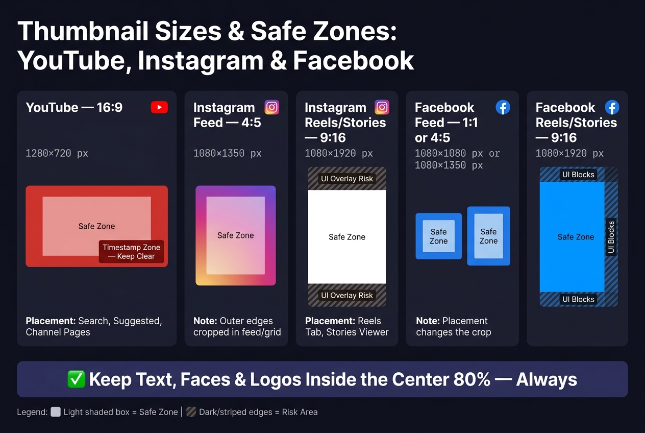
Thumbnail Sizes & Safe Zones for YouTube, Instagram & Facebook
Start with each platform’s canvas size so you can build one thumbnail concept and crop it for different placements without making a mess of it. The main aspect ratios to use are 16:9, 4:5, 1:1, and 9:16. Those cover the main thumbnail layouts across YouTube, Instagram, and Facebook.
Think of these sizes as the boundaries for the master thumbnail you’ll build next.
Recommended Dimensions for YouTube, Instagram, and Facebook
Treat aspect ratio as the shape and pixel dimensions as the resolution. Pick the ratio first, then set the size. Here’s a simple reference for the placements you’ll use most:
| Platform | Placement | Aspect Ratio | Recommended Size | Where It Appears |
|---|---|---|---|---|
| YouTube | Video thumbnail | 16:9 | 1280 × 720 px | Search results, suggested videos, channel pages, watch-page recommendations |
| Portrait feed post | 4:5 | 1080 × 1350 px | Home feed, Explore | |
| Square feed post | 1:1 | 1080 × 1080 px | Home feed, profile grid | |
| Reels / Stories cover | 9:16 | 1080 × 1920 px | Reels tab, Stories viewer, full-screen player | |
| Feed video | 1:1 or 4:5 | 1080 × 1080 px or 1080 × 1350 px | News Feed (mobile-optimized) | |
| In-stream / Watch video | 16:9 | 1280 × 720 px | Watch tab, shared video posts | |
| Stories / Reels | 9:16 | 1080 × 1920 px | Stories viewer, Reels feed |
How Thumbnails Get Cropped in Feeds and Grids
The same image almost never looks the same everywhere. On YouTube, a thumbnail stays in 16:9 across search, suggested videos, and the watch page. But on mobile, it can appear much smaller. That’s why text needs to be large, bold, and easy to read at a glance.
Instagram gets trickier. A Reels cover uploaded at 1080 × 1920 px (9:16) is center-cropped in the feed and in the profile grid. So if your headline, face, or product shot sits too close to the top or bottom, it may disappear in the spots people see first. Stories have another issue: interface elements near the top and bottom can cover parts of the image.
Facebook works in a similar way. Center your main subject so the thumbnail still makes sense in both feed previews and full-screen placements.
A simple rule helps here: keep text, faces, and logos inside the center 80% of the frame. Use that middle zone as the safe area for your reusable master thumbnail. This ensures your design remains effective even after advanced thumbnail optimization for different platforms.
How to Build a Master Thumbnail You Can Reuse Across Platforms
Start with one strong master thumbnail, then tweak it for each platform. That saves time and helps your brand look the same wherever the content appears.
Pick a Clear Subject, Bold Contrast, and Short Text
Build your master using the safest crop area from the size rules above. Keep the focus on one main subject, use bold contrast, and limit text to a few words.
There’s data behind this. Face thumbnails, especially ones with expressive faces, consistently beat thumbnails with no face at all. That makes sense. People notice people.
Contrast matters too. Your subject should stand apart from the background so the thumbnail doesn’t fade into a crowded feed. For text, stay in the 3–5 word range. Studies found that high-contrast text in that range improved CTR by 11%–22% in search-driven content.
Use a bold sans-serif font, then add a stroke, shadow, or a colored text box behind it. That extra separation helps the words stay readable on any screen.
Set Safe Zones Before Cropping for Other Formats
Put faces, logos, and headline text in the center area that still works after square and vertical crops. Think of the middle as your no-risk zone.
The outer edges can handle background textures or secondary graphics. If those parts get cut off, the thumbnail should still make sense at a glance.
Check Readability at Small Preview Sizes
Preview the thumbnail at 120 × 90 px. This is where common thumbnail mistakes usually fall apart.
If the subject looks too small or the text gets muddy, make a few simple fixes:
- Enlarge the subject
- Cut extra text
- Increase contrast
Once the master passes that test, build the platform-specific versions from it.
How to Adapt Your Master Thumbnail for YouTube, Instagram, and Facebook
Once you have a safe, readable master thumbnail, turn it into platform-specific versions in a simple order: change the aspect ratio first, then reposition the subject, then move the text. Add arrows and background shapes last. If those extras start crowding the text or covering a face, cut them.
YouTube: Format a 16:9 Layout with Space Around the Timestamp Area
For YouTube, keep key details away from the bottom-right corner. That’s where the duration timestamp badge shows up. Place the headline in the upper part of the frame, and keep faces or product shots centered or a little left. If you're just starting out, our YouTube thumbnail beginners guide covers the fundamentals of layout and design.
Instagram: Create Separate Versions for Feed Posts and Reels Covers
Instagram usually needs more resizing than YouTube. For feed posts, crop your center-safe master to 4:5 so it takes up more room in the feed. For Reels covers, make a 9:16 vertical version from the same master design.
For Reels covers, keep both the headline and the main subject inside the middle third of the frame. That matters because the profile grid trims the top and bottom.
Facebook: Match the Thumbnail to Video Orientation and Placement
On Facebook, the format should match the placement: 16:9 or 1:1 for Feed, and 9:16 for Reels and Stories. In vertical placements, keep the main subject and text centered so Facebook’s UI overlays don’t block them at the top, bottom, or right side.
| Platform | Aspect Ratio | Subject Placement | Text Placement | Key Watch-Out |
|---|---|---|---|---|
| YouTube | 16:9 | Centered or slightly left | Upper frame, away from bottom-right | Timestamp badge covers bottom-right corner |
| Instagram Feed | 4:5 | Centered | Upper-center | Outer edges can be trimmed in the feed |
| Instagram Reels | 9:16 | Center vertical strip | Middle third of frame | Profile grid crops the top and bottom |
| Facebook Feed Video | 16:9 or 1:1 | Centered | Upper or mid-frame | Match orientation to the video placement |
| Facebook Reels/Stories | 9:16 | Center vertical strip | Centered vertically | UI overlays cover top, bottom, and right side |
If you want to make these versions faster, the next section shows how ThumbnailCreator speeds up base creation, edits, and exports.
Use ThumbnailCreator to Speed Up Design, Exports, and Testing
Once your master thumbnail is ready, ThumbnailCreator helps you turn that one design into platform-ready versions fast. You can use it as one workspace to build a main thumbnail, then export JPG or PNG files in the right dimensions for each platform.
Create a Base Thumbnail from a Video Idea or YouTube Link
Start with a plain-English video idea or paste in a YouTube link. ThumbnailCreator then generates a starting concept with a subject, background, and short text.
That gives you a solid first draft before you make platform-specific changes.
Edit Platform Versions Without Rebuilding the Design
From there, you can tweak each version without starting from scratch. Edit the text, swap faces or objects, and apply brand colors or CTR-optimized presets so each thumbnail stays on-brand.
Then look at performance data and use it to fine-tune the versions you publish.
Check Performance and Improve Future Thumbnails
After publishing, track YouTube CTR, Instagram reach and saves, and Facebook clicks. Those numbers show what’s working and what needs a tweak. Then update the template that generated each version.
| Platform | Key Metric | Thumbnail Element Tested | Adjustment Made |
|---|---|---|---|
| YouTube | Click-Through Rate (CTR) | Facial expression | Swapped a neutral face for a more expressive face using face swap |
| Reach & Saves | Color scheme | Changed the background from dark gray to a bright blue/yellow mix for higher contrast | |
| Link Clicks | Color contrast | Increased contrast for better feed visibility |
Use those results to update your saved templates for the next round.
Conclusion: Keep One Concept, Then Resize and Refine for Each Platform
Start with one strong thumbnail idea, then resize and tune it for each platform. That gives you a clear base to work from instead of rebuilding the whole thing every time.
From there, protect the concept with a safe center zone. Put your main text, subject, and other key parts in the middle area so crops don't slice up the message. After the layout holds up under cropping, shrink it down and check its thumbnail composition at actual size.
A simple repeatable process works best: build one master thumbnail, crop it for each format, and test readability at small size before you publish. When a thumbnail style keeps winning, make it your default template. ThumbnailCreator makes that easier by helping you reuse layouts that already work, edit platform versions fast, and start each new thumbnail from a stronger base.
FAQs
How do I choose the best master thumbnail layout?
Start with a 1,280 × 720 px canvas in a 16:9 format. Use that as your main layout, then check how it holds up when cropped to 1:1, 4:5, and 9:16. The goal is simple: your main subject and any text should still be easy to see in every version.
Place your key elements inside the center 60% to 80% of the frame. Stay away from the bottom-right corner, and make sure there’s one clear focal point. A good rule of thumb is to have that focal point take up about 30% to 50% of the frame.
What should I do if my text is unreadable after cropping?
Keep the design focused on one clear subject and 3–5 words.
Use bold, sans-serif text that stands out hard against the background.
To make the text easier to read, add:
- a 2–4 px dark stroke
- a soft drop shadow
- or a semi-opaque color block behind the text
Keep the main parts inside the center 60%–80% of the frame.
Then preview it in ThumbnailCreator to make sure it still looks clear at small sizes.
How often should I test and update thumbnail designs?
Don’t wait for engagement to dip before you review your design. A regular review cycle makes it easier to spot small issues early and keep things consistent over time.
Use a simple schedule:
- Weekly: check for clarity and consistency
- Monthly: review visual patterns that are working well
- Quarterly: refresh your templates
- Twice a year: review performance across platforms
CTR can also give you a clear signal. If click-through rate falls between 2% and 5%, it’s time to update the design.
For testing, run A/B tests for at least 72 hours. If a video has lower traffic, let the test run for up to 7 days.