

How to Design Thumbnails for Affiliate Links
A thumbnail can lift clicks fast - but only if it makes one clear promise. I’d keep it simple: match the thumbnail to the offer, use one main visual, write 2–5 words of text, test one change at a time, and track both CTR and affiliate link clicks.
Here’s the short version:
- I start with one product benefit, like saving time, cutting costs, or getting a better result.
- I pick one concept for the image: a face, the product, or the result.
- I make the design easy to read on a phone by using:
- one main subject
- short text
- strong contrast
- a clean layout
- I use a 1,280 × 720 thumbnail size and check how it looks at 320 × 180.
- I track impressions CTR, views, affiliate clicks, and commissions together.
- I use a separate affiliate link for each video so I can see what drove clicks and sales.
A few numbers from the article matter most: people often decide to click in under 1.5 seconds, the main subject should take up about 40–60% of the frame, and text should stay short enough to scan in a feed. That’s the whole game: clear promise, fast read, clean test.
If I had to sum it up in one line, it would be this: the best affiliate thumbnail is not the loudest one - it’s the one that tells the right viewer what they’ll get, right away.
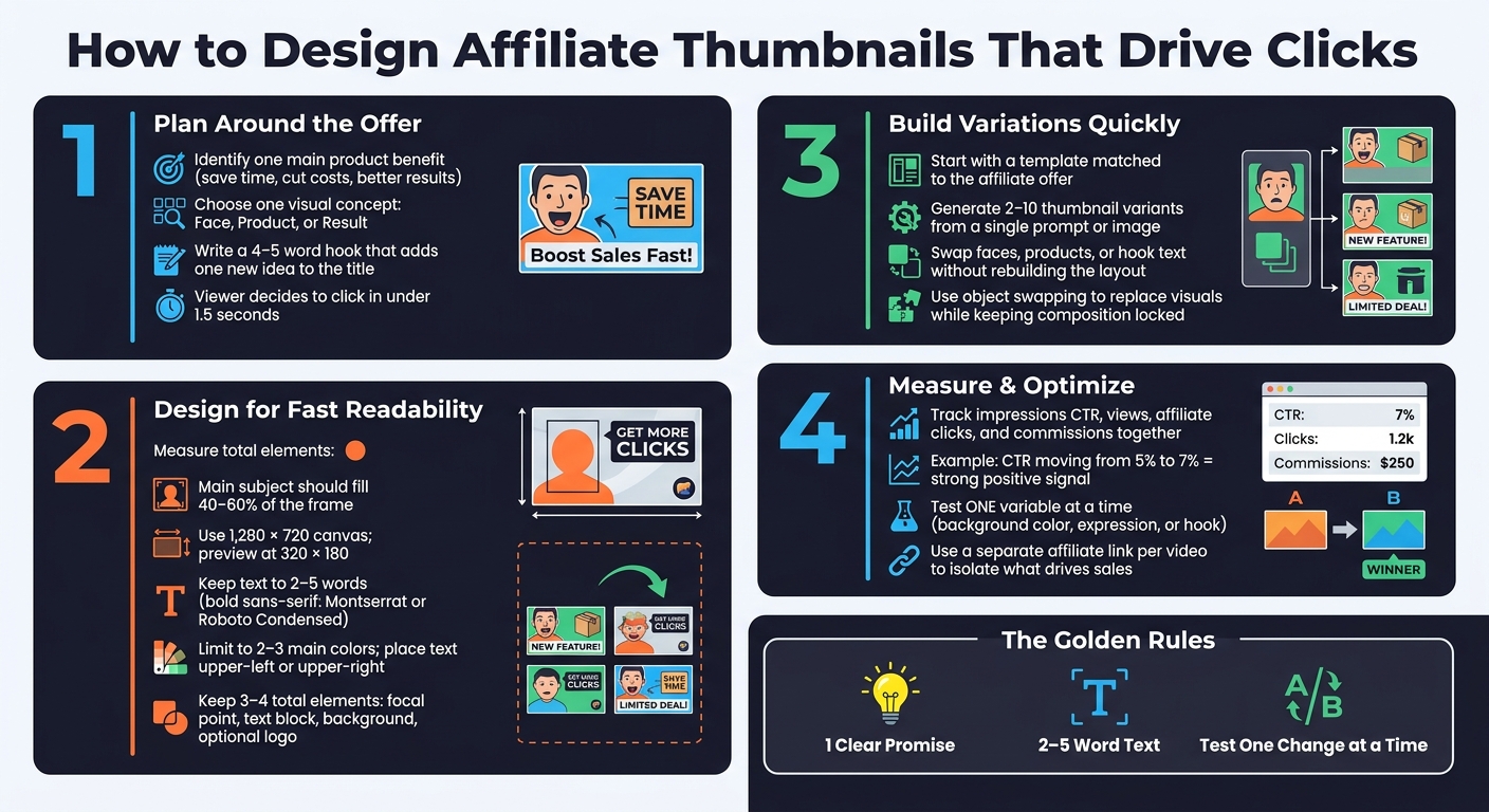
How to Design High-Converting Affiliate Thumbnails: 4-Step Process
How I design my thumbnails to get more potential buyers to click on my videos
sbb-itb-b59debf
Step 1: Plan the Thumbnail Around the Affiliate Offer
Start with the offer. Before you design anything, pin down three things: the product’s main benefit, the viewer’s problem, and the angle of the video. That core promise should drive the visual, the text, and the layout.
Turn the Product Benefit Into a Clear Thumbnail Promise
A strong affiliate thumbnail focuses on one main benefit. That might be saving money, saving time, getting better results, or avoiding a costly mistake. Pick the one that matters most to your audience right now, then turn it into a promise people can grasp at a glance.
A viewer decides whether to click in under 1.5 seconds, so vague claims usually fall flat. "Cut your bill in half" lands harder than a generic savings message. "Set up in 5 minutes" makes time savings feel concrete. "Double your views" gives the result a clear payoff. Just don’t stretch the truth. The thumbnail promise needs to match what the video actually delivers.
Once that promise is clear, choose the one image that gets it across the fastest.
Choose One Main Concept: Face, Product, or Result
Pick one visual direction: face, product, or result. If you cram in all three, the message gets muddy, especially on mobile.
| Concept | Best Use Case | Clarity | Trust | Click Potential |
|---|---|---|---|---|
| Face-driven | Personal reviews, reaction videos, or "I tried this" angles | Medium to High | High when expression matches the video's tone | High if the emotion is strong and relevant |
| Product-driven | Search-based reviews, unboxings, comparisons, or recognizable products | High when the product is well-known | Medium; trust leans on product or brand reputation | Medium to High for buyers already in market |
| Result-driven | Tutorials, case studies, and before-and-after transformations with clear metrics | Very High when the outcome is obvious | Medium to High if results are realistic and specific | Very High when the outcome looks desirable and real |
A video titled "Is [Product] Worth It in 2026?" works well with a product-driven concept. A video titled "My 30-Day Transformation Using [Fitness App]" fits a result-driven concept, because the outcome is what people care about most. In that case, show the result or the analytics graph, not just the tool.
Write a Short Hook That Works With the Title
Your title gives the context. The hook should add one new idea, not say the same thing again. Keep it to 4–5 words so it’s easy to read on mobile. A good hook can point to a direct benefit, create curiosity, or add urgency.
For example, if your title is "How to Set Up [Product] in 5 Minutes," the thumbnail hook could be "Done in 5 Minutes." If your title is "How I Saved $120/Month Using [Tool]," the hook "Cut My Bill in Half" makes the result more concrete and easier to scan.
The key is simple: the hook should support the product benefit you picked earlier, so the promise stays clear and honest.
Step 2: Design Images, Text, and Layout for Fast Readability
Once you know your hook and visual idea, the next step is simple: make sure the design delivers that promise fast on a phone screen and inside a crowded feed. Your thumbnail should be easy to understand in a split second.
Use One Main Subject and a Clear Visual Hierarchy
Build the thumbnail around the idea you picked in Step 1. That idea should drive the whole layout.
Your main focal point should take up about 40–60% of the frame. Everything else needs to play a supporting role. A blurred or simplified background helps the focal point stay sharp and easy to spot, even when the thumbnail is tiny. Try to keep the total number of major elements to three or four: one main focal point, one short text block, a clean background, and, if needed, a small logo or icon.
Use a 1,280 × 720 canvas and preview it at 320 × 180. If the offer isn’t clear at mobile size, strip the layout down.
Size and contrast should make the focal point obvious. The main subject needs to be the largest and sharpest thing in the image. Primary text comes next. Background details should stay soft and low-contrast so they don’t fight for attention.
Make Text Readable on Small Screens
Put the primary text in the upper-left or upper-right part of the frame. Avoid placing key text in the lower-right corner, since that’s where the duration badge shows up.
Use bold sans-serif fonts like Montserrat or Roboto Condensed. Keep text to 2–5 words that spell out the main benefit, such as Save $200, No Tech Skills, Free Template, or Earn $500/mo. Numbers and dollar amounts should be larger, because they’re easier to scan that way. Add a stroke or drop shadow around the letters so they stand out from busy backgrounds, and keep text at least 60–120 pixels away from the edges to avoid platform cropping.
Use Color and Composition to Reinforce the Offer
Color should support the feeling behind the offer, not just make the thumbnail look nice. Blue signals trust and fits software tools or financial services well. Red and orange add urgency, which works for limited-time deals or flash sales. Green points to savings or growth, so it fits cashback apps, investing tools, or money-saving content. Stick with two or three main colors plus neutrals like black, white, and gray to keep the design tight.
For composition, place the main focal point near a rule-of-thirds intersection instead of putting it dead center. If you’re using a face, place the text on the opposite side to keep things balanced. Gaze direction, product angle, or even the direction of a chart can guide the eye toward the benefit text.
| Layout | Clarity | Trust Signal |
|---|---|---|
| Face + Text | High when the background is simple and the text is short | Strong when the expression matches the offer |
| Product + Text | High for recognizable products; the benefit must be stated in text | Moderate to strong; clear product image builds transparency about what's being promoted |
| Result Screenshot + Text | High when the screenshot is simple (for example, an earnings graph) | Depends on realism; overly dramatic visuals reduce trust |
Pick the layout that explains the offer the fastest. After that, test a few variations.
Step 3: Build Thumbnail Variations Faster With ThumbnailCreator
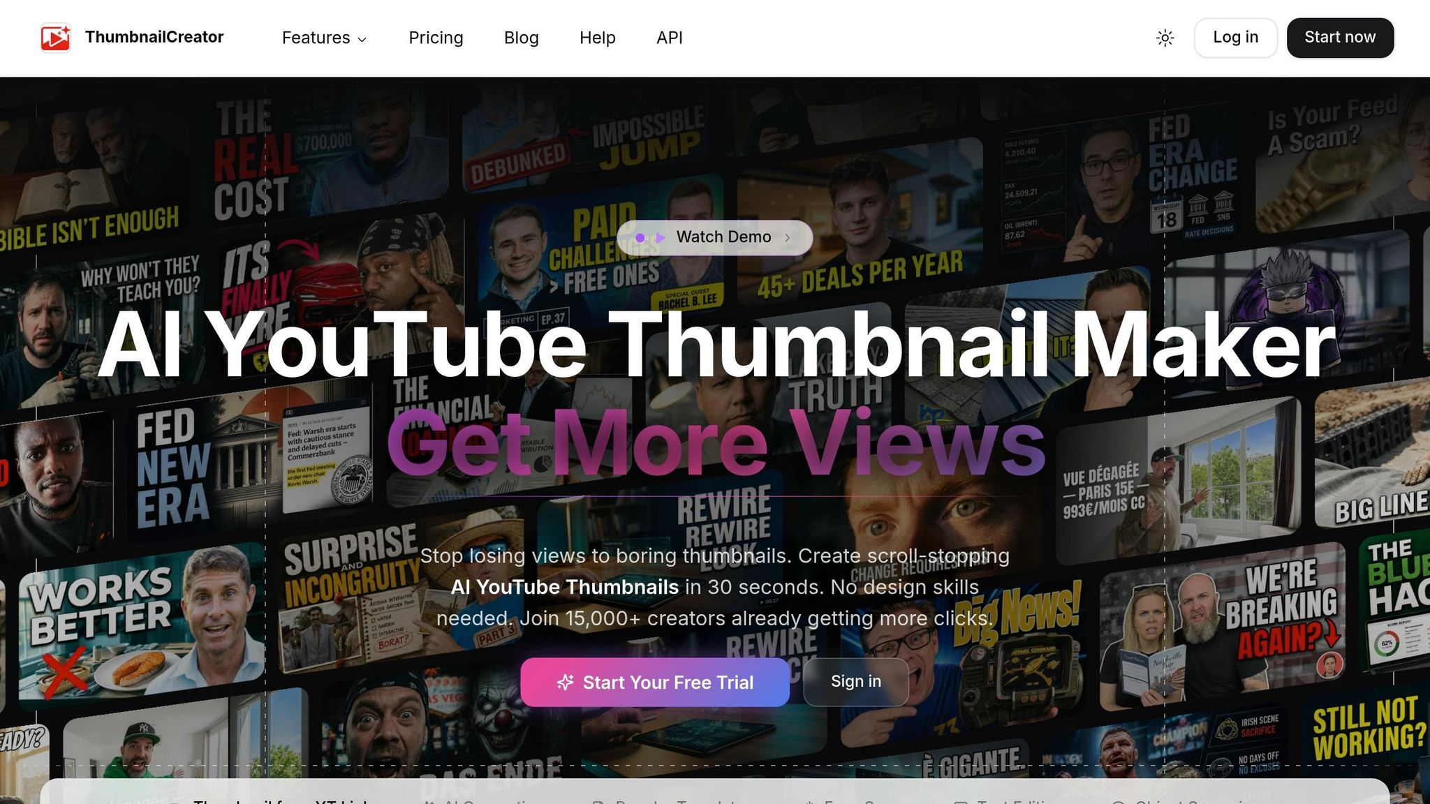
Once your layout rules are set, the next hurdle is speed. ThumbnailCreator helps you make thumbnail variants for affiliate videos fast, and you don't need advanced design skills to use it. The simplest move is to start with a template and test a few versions.
Pick a template that matches the affiliate offer, then use AI to make a few clear first drafts. ThumbnailCreator’s pre-built templates take care of the main layout choices up front. Text placement and image size stay consistent, so the structure already supports the offer. From there, the Variation Generator can produce 2–10 different thumbnail versions from a single prompt, base image, or YouTube URL. Let the AI spin up a few different angles, then choose the one that reads best at a glance. After that, tighten the strongest draft until the offer is clear at thumbnail size.
Once you have a first draft, you can test a new angle without starting over. Swap the face, product, or text and keep the layout intact. You can also swap faces, products, or icons without rebuilding the design. Object swapping works the same way: replace one visual with another while the composition stays in the exact same spot. You can update the hook copy too, using proper typography and placement, while the font, size, and placement stay locked, which keeps your layout steady across videos. Those fast variations make it easier to test which version gets more clicks. Then track which one leads to the most affiliate clicks.
Step 4: Measure What Improves Affiliate Clicks
Track CTR, Views, and Affiliate Link Clicks Together
Use YouTube Studio’s Reach tab to line up impressions, CTR, and views with your affiliate clicks and commissions. Then open your affiliate dashboard - Amazon Associates, for example - set the same date range, and check link clicks, conversions, and commissions in USD.
Here’s the point: raw views don’t tell the whole story. If a thumbnail update moves CTR from 5% to 7% and your daily commissions go up, that’s a strong sign the new version is doing its job. In affiliate content, affiliate clicks and commission per view mean more than view count alone.
Use those numbers to decide which thumbnail version to test next.
Test One Design Change at a Time
After the design goes live, change one thing at a time. That’s how you keep the test clean.
If you change too much at once, it gets messy fast. You won’t know what moved the result. So test a single variable, like:
- background color
- facial expression
- hook
Then compare each version using CTR, views, affiliate clicks, and commission.
Conclusion: Keep Thumbnails Simple, Accurate, and Measurable
The best affiliate thumbnails start with the actual offer. Using thumbnails that drive sales ensures your product visuals are optimized for conversion. They lead with one clear idea, use short, easy-to-read text, and set honest expectations. Keep the promise accurate, keep the design simple, and measure what leads to clicks and commissions.
FAQs
How do I choose the best thumbnail angle?
Place your main subject - whether that’s a face, product, or object - on one of the four intersections in the rule-of-thirds grid. That gives the image a clear visual hierarchy and pulls the viewer’s eye where you want it to go.
For portraits, crop tighter so the face takes up 30% to 50% of the frame. Small cues matter too. A gesture like pointing, or a gaze aimed toward text or a key object, can guide attention in a natural Z-pattern.
What should I test first in a thumbnail?
Test readability and clarity first at small sizes. Shrink the thumbnail to 120–168 pixels wide, since that’s close to how it can show up on mobile, then do a squint test. If the main message isn’t clear at a glance, fix the contrast, text size, or layout first.
If you’re trying to fix low click-through rates, change one high-impact element at a time - like the background color or facial expression.
How can I tell if a thumbnail drives sales?
Don’t stop at overall CTR. In YouTube Analytics, compare CTR by traffic source and audience segment, because viewers from search and browse often act differently.
If results dip, A/B test one change at a time. That could be a facial expression, headline text, or the main object in the thumbnail. It’s the easiest way to see what moved the needle.
Also, line up CTR with average view duration. If clicks are high but watch time is low, the thumbnail is usually making a promise the video doesn’t keep.