

Checklist: Designing Thumbnails Like Gaming Pros
I build gaming thumbnails around one clear promise, one main subject, and a moment the video delivers. My first check: can you recognize the subject at 120–160 pixels wide? If not, I cut clutter - not add more effects.
Here’s the checklist I follow:
- Plan the hook: Match the image to the footage. Add 3–4 words only when they help explain it.
- Make it readable: Use contrast, careful cropping, and space around the subject. Keep text clear of the duration badge.
- Choose fitting visuals: Use game objects or faces that support the hook. Learn from channel patterns without copying their branding.
- Build and review: Treat ThumbnailCreator output as a draft. Check asset permissions, fix AI errors, and compare variations.
- Export and test: Use a 1,280 × 720 canvas in 16:9, check YouTube’s rules, and test up to three versions when eligible.
My goal is <u>the right click</u>: a viewer who gets what they expected. That’s why I judge tests by watch-time share, not clicks alone.
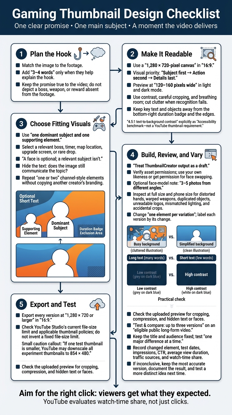
Gaming Thumbnail Design Checklist
Build a Clear, High-Contrast Layout
Once you have your hook, turn it into a thumbnail viewers can read at a glance. Start with a 1,280 × 720-pixel canvas in a 16:9 aspect ratio, YouTube’s recommended thumbnail format. Use size, brightness, saturation, and placement to draw attention to the subject first, the action second, and the details last.
Make the Main Subject Stand Out
Make the subject large enough that viewers can recognize its silhouette even at small sizes. Crop with care, keeping identifying features intact. To separate it from busy gameplay, use a darker or lighter background, blur, or a subtle outline. Keep enough scene detail to explain what’s happening. Too many effects can make the subject less clear.
Save the brightest accent or strongest glow for the main action or object. Dim supporting elements or lower their saturation. Character poses, gaze direction, and weapon angles can help lead the eye toward the focal point. Give that area some breathing room instead of filling every gap with sparks, icons, or arrows.
That visual order needs to hold up on a phone, too.
Check Readability on Mobile
Test your design at thumbnail size, not just full size. Add text only when it says something the image can’t show. Choose a bold font, and use a solid or translucent backing if the gameplay makes it hard to read. A 4.5:1 text-to-background contrast ratio is a useful accessibility benchmark - not a YouTube thumbnail requirement.
Preview the thumbnail at 120–160 pixels wide in both light and dark mode. If you have to zoom in to recognize the subject or read the text, make those elements larger and cut tiny details. Keep key text and objects away from the bottom-right duration badge and the edges. Then check YouTube’s actual preview after uploading.
sbb-itb-b59debf
Choose Gaming Visuals That Fit the Video
Once you’ve set the hook, choose visuals that make the video’s promise clear at a glance. Turn that promise into one cue viewers recognize instantly: motion, danger, rarity, competition, interface, reaction, or curiosity. Keep the cue true to the content.
Use Faces and Objects That Support the Hook
Include a face only when the expression adds information about the game subject. Otherwise, let the subject carry the hook. Use one dominant subject and one supporting element. Crop tightly enough for viewers to read the expression without losing the main subject. A face is optional; a relevant subject isn’t.
Use the boss, timer, map location, upgrade screen, or rare drop that matches the hook.
When comparing text-heavy vs minimal text thumbnails, hide the text and check whether the image still communicates the topic. If it doesn’t, choose a more specific subject instead of adding decoration.
Study Channel Patterns Without Copying
With your visual chosen, study what top channels repeat. Borrow the pattern, not their identity. Look at comparable gaming channels for contrast, emotional intensity, composition, and visual detail. Repeated patterns don’t prove that a design gets more clicks. Topic, title, audience, timing, and distribution also affect performance.
Choose one or two elements to repeat, such as an accent color, text style, or framing treatment. Vary the featured subject so viewers can tell each video apart. Use familiar gaming cues without copying a creator’s branded layout.
Create and Edit With ThumbnailCreator
Turn your checklist into a draft in ThumbnailCreator.
Generate and Check the First Draft
Start with a video URL, short description, or channel template. Build around the video’s hook: one background, one main subject that conveys the game’s hook, one supporting object, and optional text. For AI generation, specify the game, key moment, mood, and dominant element. Treat the result as a draft.
Edit the text to remove redundant words and leave space around the subject. Swap out any prop that doesn’t match the video. For face swapping, use your own likeness or get permission, then supply 3–5 photos from different angles to build the face model. Make sure you have permission to use every replacement asset and that it fits the hook.
Before exporting, check the draft at full size and in a phone-size preview. Watch for distorted hands, warped weapons, duplicated objects, unreadable logos, mismatched lighting, and accidental crops. If the subject blends into the background, adjust the background color or lighting. Regenerate or replace inaccurate details instead of covering them with text.
Compare Layouts and Make Variations
Save the strongest draft, then change one element per variation. Keep the video hook and channel style the same. Check each version for clutter, tiny text, weak contrast, awkward crops, and unreadable logos. Use the table to spot problems - not to pick a guaranteed winner.
| Comparison | Typical pattern | Practical check |
|---|---|---|
| Busy vs. simplified background | Gameplay detail can clutter the frame. | Dim or blur distractions while keeping needed context and readable logos. |
| Long vs. short text | Longer text can become tiny. | Cut words and check at phone size. |
| Low vs. high subject-background contrast | Strong contrast separates the subject but can look artificial. | Adjust outlines or lighting, then check subject edges and crops. |
Keep the original and label each variation by what changed so you can identify it later. These patterns aren’t universal rules. AI generation, templates, or a particular expression won’t guarantee clicks or growth. Audience, topic, title, traffic source, and timing also affect performance.
Check and Test the Finished Thumbnail
Once the draft looks right, check the export, policy compliance, and performance.
Check Export Settings and YouTube Policies
Export at 1,280 × 720 or larger in 16:9, and check YouTube Studio’s current file-size limit before publishing. Every test version should also be 1,280 × 720 or larger. If one is smaller, YouTube may downscale all experiment thumbnails to 854 × 480.
Make sure the image matches the video and follows YouTube’s thumbnail policies and Community Guidelines. Don’t show a boss, weapon, or reward that doesn’t appear in the video. Avoid graphic gore, sexualized imagery, and offensive text - even when they come from game art.
After uploading, check the thumbnail in YouTube Studio and on the watch page. Look for cropping, compression, or text and faces that get hidden.
Test Clearly Different Versions
After the thumbnail passes the compliance check, test your strongest variations. YouTube Studio’s Test & compare lets you test up to three versions on an eligible public long-form video.
Keep the title and audience fixed. Test one major difference at a time, such as which subject gets the most emphasis or how you style the text.
Record the changed element, test dates, impressions, CTR, average view duration, traffic sources, and watch time share. YouTube evaluates watch-time share, not just clicks. If the result is inconclusive, keep the most accurate version, document the outcome, and test a more distinct idea next time.
Conclusion: Reuse the Checklist
Use this final check on every upload to keep gaming thumbnails truthful, readable, and watch-time friendly. Save your brand assets and test notes, but tailor each thumbnail to its video.
FAQs
How do I choose a hook for my gaming thumbnail?
Choose your video’s biggest emotional payoff or high-stakes moment: a dramatic win, a near-death experience, or a rare item drop. Make it clear at a glance with one focal point.
Pair a reaction face that fills 30%–60% of the frame with a gameplay cue. Fine-tune both in ThumbnailCreator, and use high-contrast colors so they’re easy to see on mobile. If the image tells the story, skip the text. Otherwise, add a bold 1–4-word hook.
Can I use copyrighted game art in my thumbnails?
Yes - but not the game’s copyrighted art as-is. ThumbnailCreator’s gaming guidance recommends original thumbnail designs that use custom layouts, added design elements, and gameplay-derived visuals instead of raw screenshots.
If you include game characters, weapons, or icons, make the final thumbnail your own original graphic design, not a direct copy of copyrighted artwork.
Why might higher thumbnail CTR not improve watch time?
A high click-through rate (CTR) doesn’t guarantee better watch time. If your thumbnail promises something the video doesn’t deliver, viewers may feel tricked and leave early. That can hurt both watch time and video ranking.
For long-term performance, prioritize Watch Time Share over CTR. Use ThumbnailCreator to make clear, accurate thumbnails that show what your video offers. This helps attract viewers who are interested in your content - and more likely to keep watching.