

Checklist: Benchmarking Thumbnails Against Top Creators
Most thumbnail problems show up fast when I compare my last 10–20 uploads against 3–5 top channels in my niche. If I score each thumbnail on design, text, and visual hook, I can spot what is hurting clicks before CTR drops. That matters because thumbnails can shape up to 70% of the click decision, and custom thumbnails can lift CTR by up to 154%.
Here’s the short version:
- I compare only recent thumbnails from the last 60–90 days
- I benchmark against channels that rank for the same search terms
- I review thumbnails at 120–160 px to match mobile viewing
- I score each item with a simple pass/fail
- I fix the biggest issues first: clutter, weak contrast, too much text, and small subjects
- I make 2–3 new versions and score them again before publishing
This process works best when I keep the review narrow and consistent. I look at the same video format, the same niche, and the same date range. Then I check whether my thumbnails match the visual patterns that top channels use without copying them.
Quick comparison:
| Area | What I check | What usually wins |
|---|---|---|
| Design | Focal point, subject size, background, spacing, mobile readability | One main subject, simple background, clear layout |
| Text | Word count, font, contrast, message, title fit | 2–5 words, bold text, easy to read at a glance |
| Visual hook | Face, emotion, eye direction, object, color contrast, cues | Clear emotion, strong object, colors that stand out |
If I want a thumbnail audit that is fast and repeatable, this is the checklist I use.
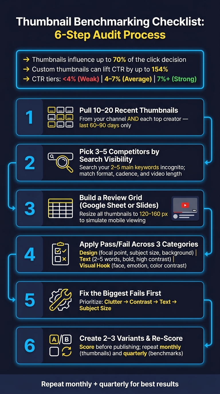
Thumbnail Benchmarking Checklist: 6-Step Audit Process
YouTube Thumbnail Design - 50% More Views With This Strategy!
sbb-itb-b59debf
Build a Fair Benchmark Set Before You Score Anything
Start with a controlled sample. Pull 10–20 recent thumbnails from your channel and 10–20 from each top creator. Stick to uploads from the last 60–90 days. And compare the same format only. Leave out Shorts, vlogs, and anything else that doesn't match. This gives you a clean baseline for your thumbnail audit.
Use that sample before you lock in your competitors. It keeps the review grounded in what you're making now, not what your channel looked like six months ago.
How to Choose the Right Top Creators
Pick competitors based on search visibility, not subscriber count.
Search your 2–5 main keywords in an incognito window and write down the channels that keep showing up. Then look at the "Suggested" and "Up Next" sections beside videos like yours. Those channels are fighting for the same clicks.
Keep the creators whose last 20–30 uploads stay mostly inside your main topic. It also helps to match:
- title style
- upload cadence
- video length
Aim for 3–5 creators whose format, audience intent, and publishing rhythm look close to yours.
How to Set Up a Side-by-Side Review Grid
Once you've gathered your sample, lay it out in a simple table. A Google Sheet or slide deck is enough. Put your thumbnails in one section and each competitor's in another. Resize them to 120–160 px so you're looking at them the way many viewers do on mobile, where most YouTube views happen.
Use the table below as a starting point:
| Column | What to Capture |
|---|---|
| Channel | Channel name (include your own as one row) |
| Thumbnail Sample Size | Number of thumbnails reviewed (target 10–20) |
| Niche Match | High / Medium / Low based on topic and audience overlap |
| Color and Style | e.g., bright primaries, dark minimal, pastel |
| Text Usage | Word count range and font style notes |
| Framing | Close-up face, mid-shot, product-only, text-only |
| Visual Hooks | Emotions, arrows, circles, numbers, before/after |
| Gaps | Patterns, standout strengths, obvious gaps |
Fill in the same fields for your own channel that you use for competitors. That one-to-one setup makes weak spots easier to spot. This helps you identify thumbnail mistakes to avoid that might be hurting your performance. Add a CTR tier for your own thumbnails - <4%, 4–7%, and 7%+ - so weak designs stand out fast.
With the benchmark set ready, you can score design, text, and visual elements side by side. Next, use the checklist to compare each row using those same three criteria.
Checklist: Compare Design, Text, and Visual Elements
Use the benchmark grid to score each row with the same Pass/Fail standard. Go thumbnail by thumbnail, row by row, and mark each one Pass or Fail.
Design and Composition Checks
Start with the squint test. If you can still spot the main subject and more or less read the text, the design is doing its job. If everything melts together, the focal point isn’t strong enough.
Then do a mobile-size check. Shrink the thumbnail to 120–160 px wide and see if the subject still stands out.
Top creators usually stick to a simple setup: one main subject, a plain or blurred background, and a subject that takes up most of the frame. If your subject looks too small or fights with a busy background, mark it as a fail.
| Benchmark Dimension | Top Creator Pattern | My Thumbnail | Pass/Fail |
|---|---|---|---|
| Focal Point | Single, clear subject with no clutter | ||
| Subject Size | Large enough to dominate the frame | ||
| Subject Placement | Center or intentional rule-of-thirds offset | ||
| Background | Simple, blurred, or gradient | ||
| Negative Space | Enough room for text and elements to breathe | ||
| Mobile Readability | Passes the squint test at small size |
Text and Message Checks
Thumbnail text should add curiosity or context that the image can’t show on its own. Top creators usually keep text to just a few words, use bold sans-serif fonts, and make the contrast strong. Think white or yellow text on a dark background, often with a stroke or drop shadow so it stays readable at small sizes.
A weak text setup is easy to spot. If the text disappears on mobile or takes more than a second to read, that’s an automatic fail.
| Text Attribute | Top Creator Pattern | My Thumbnail | Pass/Fail |
|---|---|---|---|
| Word Count | A few words at most | ||
| Font Clarity | Bold, sans-serif, high legibility | ||
| Contrast | High contrast (e.g., yellow or white on dark) | ||
| Text Effects | Stroke or shadow for depth and readability | ||
| Message Type | Adds context or curiosity - not a title repeat | ||
| Title Synergy | Complements the video title without duplicating it |
Visual Hook Checks
Use faces with clear emotion. Eye direction matters just as much. A face looking straight at the viewer creates an instant connection. A gaze pointed at the main object helps pull the viewer’s eye to the key part of the image.
Faces aren’t the whole story, though. Check for a clear main object too - something bright, high-contrast, and easy to recognize at a glance. Branding should be there, but lightly. A steady color palette or logo placement can help people spot your channel without taking over the hook.
| Visual Element | Top Creator Pattern | My Thumbnail | Pass/Fail |
|---|---|---|---|
| Face/Expression | High-emotion: shocked, intense, or joyful | ||
| Eye Direction | Looking at the viewer or at the main object | ||
| Main Object | Bright, high-contrast focal point | ||
| Color Contrast | Complementary colors that stand out in a row | ||
| Attention Cues | Arrows, circles, or numbers where relevant | ||
| Brand Consistency | Recognizable palette or style without overpowering the hook |
Once every row has a Pass or Fail, total the fails in each category. Start with the category that has the most fails.
Turn Audit Notes Into Better Thumbnail Versions
Once your pass/fail grid is done, take the weakest thumbnails and turn them into new versions that fix the biggest problems. Keep it simple: each fail should lead to one clear change you can test. Change one thing at a time, whether that's layout, contrast, or text.
Fix the Biggest Problems First
Not every fail matters the same amount. Start with the issues that most affect clicks: cluttered layout, weak contrast, too many subjects, and text people can't read.
Handle the main structure first. That usually means:
- one main subject
- clear separation between the foreground and background
- 2–5 words max
Leave the smaller stuff for later, like logo placement, border color, or tiny spacing changes. Those details matter, but only after the main structure works.
Once the core setup is in place, test the new version right away.
Use ThumbnailCreator to Speed Up Iteration
Use ThumbnailCreator to make testing faster with AI generation, templates, face swapping, text editing, and object swapping. If your audit showed a weak facial expression, face swapping lets you test a stronger one in seconds. If the layout feels cluttered, templates can give you a cleaner base that already follows the one-subject, high-contrast setup many top creators use.
Make 2–3 variants based on your best fixes. Then score each one against the same benchmark grid before publishing.
Conclusion: A Thumbnail Benchmarking Routine You Can Repeat
After you score the grid, turn those notes into a review loop you can use again and again. Run the same process after each audit: compare top creators, score the gaps, fix the weakest areas first, then retest.
The best thumbnails tend to repeat the same four basics across design, text, and visual hook: clarity, contrast, focused text, and one visual hook.
Key Points to Carry Into Your Next Thumbnail Review
When you use this checklist, keep the patterns that show up most often. That’s the stuff worth repeating. For each review, check for one clear focal point, 2–5 bold, high-contrast words, strong separation between the subject and background, and a visual hook that still reads well on mobile. Then score the grid before you change anything.
Two habits help keep this pass/fail system up to date:
- Do a monthly scan of your last 10–20 thumbnails
- Run a quarterly refresh with new benchmark thumbnails and update your checklist based on the patterns you see now
Use this checklist as your channel changes. And if your niche or format starts to shift, swap in new benchmark channels too.
FAQs
How do I pick the right channels to benchmark?
Search your main keywords on YouTube and pay attention to the channels that show up again and again. Those are your main competitors, no matter how many subscribers they have.
Then trim your list by looking at their most popular videos, with extra attention on videos that pulled unusually high view counts for that channel. After that, check the top 10 videos in your niche from the last three months so your research stays current.
What makes a thumbnail fail on mobile?
On mobile, thumbnails often fall apart for a simple reason: small screens are unforgiving. Clutter, tiny text, and low contrast get hard to read fast. And when the frame is packed with too much stuff, the main message can disappear.
A few things tend to cause the most trouble:
- Overcrowded frames
- Text longer than five words
- Busy backgrounds that bury the main subject
- Tight margins that make everything feel cramped
- Images under 1,280x720 pixels, which can look blurry
Placement matters too. If a key detail sits in the bottom-right corner, YouTube’s timestamp can cover it and make the thumbnail less clear.
How often should I repeat this thumbnail audit?
Repeat this on a steady schedule: do a thorough thumbnail audit every quarter and a quick check once a month. Performance can change, and so can what your audience responds to.
For A/B tests, run each thumbnail for at least 7–14 days. If your videos get fewer than 10,000 impressions per week, stretch the test to a full month so you have enough data.