
How To Analyze Competitor Thumbnails
Your YouTube thumbnail is your first impression. With 800+ hours of video uploaded every minute in 2026, standing out is harder than ever. Many creators struggle with click-through rates despite regular uploads, but analyzing competitor thumbnails can help. By studying successful designs in your niche, you can identify patterns that attract clicks and apply these insights to your own content.
Here’s a quick breakdown of how to analyze competitor thumbnails:
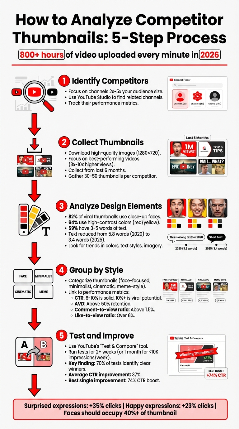
- Identify Competitors: Focus on channels in your niche with 2x-5x your audience size. Use tools like YouTube Studio to find related channels and track their performance.
- Collect Thumbnails: Download high-quality images from their best-performing videos, especially those with 3x-10x higher views than average.
- Analyze Design Elements: Look for trends in colors, text styles, and imagery. For example, close-up faces and bold colors often perform well.
- Group by Style: Categorize thumbnails (e.g., face-focused, minimalist) and link them to performance metrics like CTR and AVD.
- Test and Improve: Use tools like YouTube’s "Test & Compare" to A/B test thumbnails and refine your designs based on results.
5-Step Process to Analyze Competitor YouTube Thumbnails
How to Use the YouTube A/B Thumbnail Tool (Test & Compare)
sbb-itb-b59debf
Step 1: Find Your Main Competitors
To kick things off, you'll need to figure out which competitor thumbnails to analyze. Start by focusing on creators in your niche who attract a similar audience. These are your direct competitors - channels that share your target viewers and produce content in the same space.
Define Your Niche and Target Audience
First, get crystal clear on who you're creating content for. (See our YouTube thumbnail guides for niche-specific inspiration.) A great tool for this is YouTube Studio's Analytics. Check out features like "Your viewers' searches" and "Other channels your audience watches" to better understand your audience and their preferences.
"On YouTube, your competitors aren't enemies - they're market signals." - Vladimir Sivenkov, YouTube Consultant
Once you know your audience, you can identify channels that are successfully engaging them.
Find High-Performing Channels and compare thumbnail strategies
Next, pinpoint 5–10 channels that are direct competitors but slightly larger than yours (roughly 2x to 5x your size). Use Research panel keywords and pay attention to the "Suggested" sidebar on your top-performing videos. This will help you find algorithmically similar channels.
To assess their performance, look at metrics like the average views from their last 50 uploads. Pay close attention to outlier videos - those that perform 3x to 10x better than their average. These videos often have excellent engagement, which you can measure using ratios like:
- Comment-to-view ratio: Above 1.5% indicates strong interaction.
- Like-to-view ratio: Over 6% suggests the audience is highly engaged.
Also, scan their comment sections for "friction" - unanswered questions or topics their viewers want but aren't getting. These gaps are golden opportunities for you to create content that stands out.
Step 2: Gather and Organize Thumbnails
Once you've identified your competitors, it's time to systematically collect their thumbnails. Pay close attention to outlier videos - those that perform at least three times better than the channel's average view count. These are the videos with thumbnails that are likely driving the most engagement and are worth analyzing in detail.
Build a Thumbnail Collection
Start by downloading thumbnails from your competitors' top 30–50 videos. While you can right-click and save images directly, this often results in low-resolution versions. To get the highest quality (1280×720 pixels), use tools like 10015.io or YT-Analyze. High-definition images allow you to examine details like text clarity, color palettes, and overall composition.
Focus on videos published within the last six months, as these better reflect current audience preferences and algorithm trends compared to older content. Organize the thumbnails in a grid format to easily spot recurring patterns. Seeing them side-by-side helps highlight common design elements like color usage, text placement, and visual styles.
Record Performance Data
With your thumbnails organized, the next step is to pair each image with its performance metrics. Thumbnails alone only tell part of the story - understanding their effectiveness requires data. Create a spreadsheet to log each thumbnail's CTR (click-through rate), total views, and AVD (average view duration). A CTR between 6–10% is solid, while anything above 10% often signals viral potential. However, be cautious - if a high CTR is paired with low retention (less than 50% of the video watched), it could mean the thumbnail is misleading.
Also, track key visual trends. For example:
- Close-up faces appear in 82% of viral thumbnails.
- High-contrast colors like red and yellow are used in 64% of top-performing designs.
- Thumbnails with concise text (3–5 words) perform well in 59% of cases.
This combination of performance data and visual analysis will serve as your personalized guide for creating thumbnails that resonate with your audience and drive engagement in your niche.
Step 3: Study Visual Design Elements
Now it’s time to dig into the visual aspects that make thumbnails stand out. With your thumbnails and performance metrics organized, shift your focus to understanding the design elements that fuel engagement. The goal? Spot patterns - not just what looks appealing, but what actually drives clicks.
Review Colors and Text Styles
Start by analyzing the color schemes used by high-performing thumbnails in your niche. Many successful designs rely on complementary color combinations like blue/orange or purple/yellow to create strong contrast. In gaming and entertainment, for example, red and orange tones have been shown to increase click-through rates by 67%. Also, think about how these colors interact with YouTube's white background - designs that stand out against this backdrop tend to perform better.
When it comes to text, simplicity is key. The average word count in top-performing thumbnails has dropped significantly - from 5.8 words in 2020 to just 3.4 words by 2025, a reduction of 40%. Stick to bold, easy-to-read fonts, and use effects like strokes or drop shadows to enhance clarity. Here’s a quick test: shrink your thumbnail to 50% size or view it on a mobile device. If the text isn’t instantly readable, it’s time to tweak the design.
Finally, consider how colors and text interact with focal points like faces for maximum impact.
Identify Key Visual Components
Human faces are a game-changer for engagement. Thumbnails featuring faces with a "surprised" expression can see a 35% increase in clicks, while "happy" expressions boost engagement by 23%. To make the most of this, ensure faces occupy at least 40% of the thumbnail area.
"The most clicked thumbnails have one obvious subject. Not three things happening. Not a collage. One thing." - YouTube Tools Hub
Direct eye contact and strong emotional expressions like excitement, concern, or curiosity can make thumbnails more compelling. Pay close attention to composition as well - use the Rule of Thirds vs. centered layouts to position key elements at the intersections of a 3x3 grid for a more dynamic layout. Also, remember YouTube’s "safe zones." Avoid placing critical elements near the bottom corners, where timestamps and channel icons can obscure them.
By focusing on these visual principles, you’ll be able to identify recurring patterns that consistently drive performance.
Find High-Performing Patterns
The final step is to connect these visual elements with performance metrics to uncover what works best. Look for brand consistency - successful channels often stick to specific color palettes, fonts, or layout templates to build recognition over time. Check the contrast and hierarchy of your designs: if the key elements remain clear and visually distinct when viewed at a smaller size, the design is on the right track. These observations will help you apply proven design patterns to your own thumbnails, ensuring they stand out and resonate with viewers.
Step 4: Group and Compare Thumbnail Styles
After analyzing visual design elements, the next step is to group your findings to determine which styles consistently deliver results. Organizing these insights into clear categories helps identify patterns in design approaches and their effectiveness.
Sort Thumbnails by Design Type
Start by creating a swipe file of the top 20 thumbnails from your competitors, categorized by design techniques. Common categories might include:
- Minimalist designs: Clean layouts with simple text and neutral colors.
- Face-focused layouts: Thumbnails featuring close-ups of expressive faces.
- Cinematic styles: High-quality, dramatic visuals with a movie-like feel.
- Meme-style graphics: Bold, humorous designs aimed at grabbing quick attention.
In addition to design types, consider the strategic intent behind the thumbnails. For example:
- Authority-focused thumbnails: Use neutral tones and minimalist text to project professionalism.
- Engagement-driven thumbnails: Rely on bold colors and exaggerated facial expressions to capture attention.
- Community-oriented thumbnails: Feature group photos or friendly imagery to foster a sense of relatability and inclusiveness.
To keep this organized, use a spreadsheet to track design elements alongside performance metrics like click-through rate (CTR) and average view duration (AVD).
This structured approach sets the foundation for comparing these groups and identifying the most effective designs.
Compare Results Across Categories
Once you’ve categorized the thumbnails, link them to performance data. Focus on metrics like CTR and AVD to evaluate their actual impact. AVD is particularly important - pairing a high CTR with an AVD above 50% ensures the design isn’t just grabbing attention but also retaining viewers.
For example, a Tech Review channel with 287,000 subscribers ran a test from November 14–21, 2025, comparing two thumbnail styles for a smartphone review. One featured the creator’s surprised face, while the other showed only the product. The face-focused thumbnail achieved a 9.19% CTR - 25.5% higher than the product-only version - based on 28,000 impressions per test (p<0.0001). This highlights how face-focused designs can outperform more generic layouts when supported by data.
"The goal is understanding the underlying psychological principles that make certain thumbnails more clickable." - ViewsMachine
Finally, compare your thumbnails side-by-side with competitor categories. This analysis helps you determine whether your style aligns with successful trends or stands out in your niche. Identifying these gaps can reveal opportunities to refine your approach while still adhering to proven design principles.
Step 5: Use Your Findings to Create Better Thumbnails
Take what you've learned so far and use it to design thumbnails that truly connect with your audience. The idea here isn’t to replicate what others are doing but to understand the psychology behind their success and adapt it in a way that fits your brand and style.
Create Designs with ThumbnailCreator
Use the patterns you uncovered earlier to tailor your designs with the tools available in ThumbnailCreator. This platform's AI-driven features allow you to incorporate effective elements from your analysis, like specific color palettes, text placements, or emotional expressions.
For example, if your research shows that surprised facial expressions tend to attract more clicks in your niche, you can experiment with ThumbnailCreator’s face-swapping tools to test different levels of surprise. Since over 70% of YouTube watch time happens on mobile devices, keep text short - just 3–5 words - and ensure a minimum text height of 80px on a 1280x720 canvas for easy readability.
Focus on testing bold, impactful design choices. Instead of tweaking small details, compare completely different approaches - like using a face versus no face or bright versus dark color schemes. This is especially important since nearly 60% of US-based YouTube channels with 10,000 to 100,000 subscribers struggle to boost their click-through rates (CTR).
Once your thumbnails are ready, the next step is to evaluate their performance.
Test and Improve Your Designs
Use YouTube’s "Test & Compare" tool to see which thumbnail design performs best. This handy feature rotates up to three thumbnail options among different viewer groups and determines the winner based on watch time share, not just CTR. A study by the NoteLM Team in January 2026 analyzed 127 A/B tests across 15 YouTube channels (ranging from 5,000 to 500,000 subscribers) and found that 70% of tests identified a clear winner. On average, these winning thumbnails improved CTR by 37%, with the most dramatic single improvement being a 74% CTR boost from simply changing a facial expression.
"Great thumbnails don't just get viewers to click. They also help viewers understand what the video is about, so that they can make informed decisions about what to watch." - YouTube Studio
Run each test for at least two weeks to gather enough data for reliable results. For videos receiving fewer than 10,000 impressions per week, extend the testing period to a full month to ensure accuracy. Keep a log of every experiment, including screenshots, dates, impressions, CTR, and watch time metrics. This will serve as a valuable reference for understanding what resonates best with your audience.
Finally, double-check that your high-CTR thumbnails don’t negatively affect viewer retention. A drop of more than 5% in average view duration could mean the design is misleading viewers, which is one of several thumbnail mistakes to avoid.
Conclusion
Keeping an eye on competitor thumbnails is a must for staying relevant in YouTube's packed landscape in 2026. With over 800 hours of video uploaded every minute, having a solid strategy is what separates growing channels from those that plateau. The five steps outlined here - identifying competitors, collecting thumbnails, analyzing designs, categorizing styles, and applying your insights - offer a practical system to maintain your edge.
Consistency is key. Trends shift fast, so make it a habit to monitor YouTube thumbnail trends with full audits every quarter and quick reviews monthly to stay ahead of changes. Even after landing on a winning thumbnail style, check your designs every 8–10 videos to ensure they’re still effective and to avoid audience fatigue, also known as banner blindness. This is where tools like ThumbnailCreator can simplify the process, turning your analysis into actionable tweaks.
ThumbnailCreator also makes testing easier. Its mobile preview feature helps you ensure your designs are clear and engaging on smaller screens, where 70% of YouTube watch time happens.
FAQs
How many competitor thumbnails should I analyze?
When analyzing competitor thumbnails, aim to review 5 to 7 examples. This range strikes a balance - it’s enough to uncover recurring themes, popular trends, and effective design choices, but not so many that it becomes overwhelming. By focusing on this number, you can identify patterns and areas where your own thumbnails can stand out, giving you a clearer direction for improvement.
What if a thumbnail has high CTR but low retention?
A high click-through rate (CTR) paired with low viewer retention often means your thumbnail is enticing enough to draw clicks, but the video content doesn't fully deliver on what viewers expected. To tackle this, make sure your thumbnail accurately reflects the video's subject and tone. This helps set clear expectations right from the start.
You can also experiment with A/B testing for thumbnails and content approaches. This method allows you to pinpoint what resonates with your audience and keeps them watching beyond the first few seconds.
How often should I re-audit thumbnails in my niche?
To keep your thumbnails performing at their best, it’s important to review them regularly. For A/B testing, try to evaluate and test new designs every 7 to 14 days. This helps you pinpoint which designs drive the most engagement and boost click-through rates. Regular check-ins also let you stay on top of trends, understand what your audience prefers, and see how competitors are evolving - keeping your thumbnails effective and attention-grabbing.