

How to Test Thumbnail Readability on Devices
If your thumbnail fails on a phone, it fails the test. Most viewers size it up in under 1 second, and many mobile thumbnails appear at only about 110–150 pixels wide.
Here’s the short version: make 2–3 versions, change one thing at a time, shrink them to feed size, test them on a phone first, then check laptop and desktop. I’d keep text to 2–5 bold words, use high contrast, place key elements away from the edges, and treat mobile as the final gate.
What I’d check right away:
- Text: Can I read it instantly at small size?
- Subject: Can I tell what the image is in one glance?
- Speed: Can I get the idea in under 1 second?
- Contrast: Does the text stand out from the background? (High vs low contrast can make or break this).
- Placement: Is anything too close to the bottom-right time stamp area?
- Devices: Does it work on phone, laptop, and desktop?
A few numbers from the article matter most:
- YouTube’s design size: 1,280 × 720 px
- Common small-screen test size: 120–168 px wide
- Better text length: 1–5 words
- Contrast target: 4.5:1 for normal text
- Safer text/face area: keep key parts in the center 60%–80%
Here’s the main takeaway: don’t judge a thumbnail at full size on a big monitor. I’d judge it where viewers see it - small, fast, and often on a phone in bright light.
How to A/B Test YouTube Thumbnails (Step-by-Step)
sbb-itb-b59debf
Set Up a Consistent Readability Test
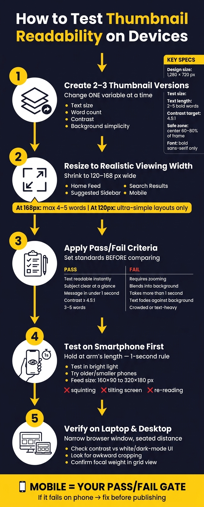
Thumbnail Readability Test: Step-by-Step Device Testing Process
Once you have your baseline thumbnail, test only the parts that change readability. The goal is simple: keep the viewing conditions the same so the only thing changing is the design.
Create 2 to 3 Thumbnail Versions with One Variable Changed
Keep the test tight. 2 to 3 versions is usually enough.
Two versions give you a clean A/B test. Three versions let you compare a baseline, one better option, and one more aggressive option. Go past three, and things can get messy fast if too many details shift at once.
The main rule: change just one element per version.
For example:
- Version A keeps the original text size
- Version B uses larger text
- Version C keeps the same text but adds stronger contrast
That makes the result much easier to read. If Version C wins, you can point to contrast as the reason instead of guessing whether several edits worked together.
The best first things to test are text size, word count, contrast, and background simplicity. These have a direct effect on whether someone can understand the thumbnail in a split second.
Resize Thumbnails to Realistic Viewing Widths
Check each version at actual thumbnail size, not full resolution. Aim for about 120 to 168 pixels wide. That gives you a much better sense of how the thumbnail will look in Home Feed, Search Results, Suggested Sidebar, and on mobile.
At 168 pixels wide, a bold, high-contrast font can usually handle about 4–5 words before legibility starts to fall apart. At around 120 pixels wide, only very simple layouts stay easy to read.
If the text needs zooming or even a second glance at that size, it needs more work before you publish. This is a simple reality check before moving to device testing.
Set Pass or Fail Criteria Before Reviewing
Set your standards before you compare versions side by side. If you don't, the review can slide into personal preference instead of readability.
A simple pass/fail checklist works well:
| Criteria | Pass | Fail |
|---|---|---|
| Text readability | Legible instantly, no zooming needed | Requires zooming or a second look |
| Subject recognition | Main subject is clear at a glance | Subject blends into the background |
| Time to understand | Message understood in under 1 second | Takes more than 1 second to understand |
| Contrast | Minimum 4.5:1 ratio between text and background | Text fades or disappears against background |
| Word count | 3–5 words | Crowded or text-heavy |
Score each version against the same standards. That keeps the review tied to readability, not which thumbnail seems nicer at first glance. It also makes the final choice much easier to explain and repeat on future thumbnails.
Test the Thumbnail on Actual Devices
Once you’ve done the resized preview check, put the top versions on actual devices. Design mockups help, sure. But they can miss the exact issues viewers will notice first.
Check Readability on a Smartphone at Normal Viewing Distance
Send the thumbnail to your phone and open it at full size. Then hold the phone at arm’s length and give yourself one second to recognize it. In that one second, you should be able to read the text, spot the subject, and get the message.
Why so strict? Because thumbnails in a feed can show up as small as 160 × 90 to 320 × 180 px on a phone screen. At that size, thin fonts, low-contrast gradients, and busy backgrounds can vanish fast. If you have to squint or tilt the screen, that’s a clear sign the design needs more work before it goes live.
It also helps to test in bright light or on an older, smaller phone. Those setups tend to expose legibility issues much faster. If the thumbnail fails there, pause and fix readability before you even look at desktop.
Check Readability on Laptop and Desktop Screens
Next, test the thumbnail in a narrow browser window and lean back like you normally would at a desk. Desktop often reveals the same problems mentioned earlier - tiny text, low contrast, and crowded backgrounds - but in a different setting.
On a larger screen, the trouble can show up as weak contrast against a white or dark-mode UI, awkward cropping, or a layout that loses contrast or focal weight once it’s reduced inside a grid. The version that breaks on both screens usually tells you exactly what to fix next.
Mobile vs Desktop Comparison Table
Use the same note-taking format for each device so the comparison stays objective.
| Test Condition | Mobile (Smartphone) | Desktop / Laptop |
|---|---|---|
| Display size | Smallest in sidebar; feed views are larger | Varies by layout; sidebar views are much smaller than the main feed |
| Viewing distance | Arm's length | Seated at desk distance |
| Common failure points | Tiny text, low contrast, cluttered background | Loses clarity in grid views; weak contrast against UI |
| Pass criteria | Text readable in under one second; subject instantly clear | Subject still clear in feed-like layouts; no zooming needed |
| UI risks | App overlays, timestamps, status bar | Sidebar truncation, hover-play previews |
If a version fails on mobile but passes on desktop, the layout is likely too detailed or the text is too small. If it passes on mobile but feels flat on desktop, contrast or visual weight is likely the problem. Use those failure points to decide whether to adjust text size, contrast, or layout.
Fix the Most Common Readability Problems
Once device tests show where a thumbnail starts to fall apart, the fixes usually land in three buckets: text clarity, contrast, and placement. Start with text. Then fix contrast. After that, adjust placement and composition.
Increase Text Clarity with Larger Fonts and Fewer Words
Cut words before you make the font smaller. If your headline goes past 5–6 words, trim it to the main idea. For example, "Beginner Budget Camera Guide" becomes "BEST BUDGET CAMERAS."
Use a bold sans-serif font with clean shapes that stay easy to read at small sizes. If you need a second line, make sure it's clearly smaller than the first, usually around a 2:1 or 3:1 size ratio. If the text still doesn't hold up, the next thing to fix is contrast.
Improve Contrast and Separate Text from Busy Backgrounds
If the words are fine but still get lost, contrast is usually the problem. White or yellow text on dark backgrounds, or dark text on light backgrounds, tends to stay readable across bright phone screens and different desktop monitors. Similar-tone color pairs, like red on medium blue, get muddy when the image shrinks.
When the background behind your text is busy, use one main treatment to separate it from the image:
- shadow
- outline
- translucent panel
Don't stack all three. A contrast ratio of 4.5:1 or higher is a solid benchmark for readability at small sizes.
Adjust Placement with Safe Zones and Clear Focal Points
If the text is readable and the contrast looks good, move to placement. Keep main text and faces inside a 10–15% margin from each edge. On YouTube, stay away from the bottom-right corner because that's where the duration badge appears.
For focus, keep it simple: one main subject and one text block. Shrink the thumbnail to 10%–15% of its full size and see what your eye notices first. If the face and text fight for attention, remove or blur the thing that's pulling focus away from the main hook.
Conclusion: Use a Repeatable Device Testing Checklist
After you finish testing and fixes, do one last pass with the checklist below. Keep the order the same every time: design, compare A/B testing vs gut feeling variants, resize, check on mobile, then verify on desktop.
Use mobile as the pass/fail gate. If it doesn’t read on a phone, it doesn’t pass.
Tools like ThumbnailCreator can speed up the variant stage. Its AI generation, text editing, and object swapping features help you make multiple controlled versions fast.
Use this as your final pre-publish gate.
The Final Pre-Publish Checklist
| Check | Pass Condition |
|---|---|
| One-second readability | Main message is clear in a single glance on mobile |
| Subject clarity | One large subject, instantly clear at about 120 px. |
| Text length | 2–5 bold words maximum; no full sentences or repeated video title |
| Font legibility | Bold sans-serif; text fills 20–30% of the thumbnail height. |
| Contrast | Text clearly separates from the background; at least 4.5:1 for normal text, or 3:1 for large text |
| Safe zones | Keep text and faces away from edges and the bottom-right corner. |
| Phone + desktop pass | Clear in a one-second glance on both. |
Make thumbnail review a fixed step before every upload.
FAQs
How often should I retest my thumbnails?
Retest thumbnails on a set schedule instead of waiting for performance to slip.
Check them weekly to make sure they still look clear and easy to read on both mobile and desktop. Then review performance patterns monthly, update fonts and templates quarterly, and run a full cross-platform review twice a year.
If retention drops hard in the first 30–60 seconds, retest the thumbnail right away. That kind of drop can mean the thumbnail is promising one thing, but the video starts with another.
What should I change first if a thumbnail fails on mobile?
First, simplify the design. Shrink the image to about 120–168 pixels wide so it feels closer to how people see it on mobile.
If the subject feels unclear or the text is tough to read, fix those issues fast:
- Use one clear focal point
- Keep text to 3–5 words
- Improve contrast with bold sans-serif text
- Add a 4–8 px dark stroke or shadow
That way, the image is easier to scan at a glance instead of turning into a cluttered blur.
How can I test readability without uploading the video?
You can check thumbnail readability before you upload your video with ThumbnailCreator’s YouTube Preview tool. It lets you see how your image will look in search results, the home feed, and on mobile.
You can also do a few fast manual checks:
- Resize it to about 168×94 pixels
- Try the squint test
- View it in grayscale