

How Small Screens Impact Thumbnail Design
Most people see your thumbnail on a phone, not a desktop. That means a 1,280×720 image may end up showing at only about 150–180 pixels wide. At that size, small text, busy game screens, and dark scenes fall apart fast.
If I want more clicks from mobile viewers, I keep the thumbnail simple and easy to read in under a second. That usually means:
- One main subject
- Two to five words of bold text
- High contrast between subject and background
- No key details in the bottom-right corner
- A phone-size check before publishing
Gaming thumbnails have a harder job than most. Screenshots often include HUDs, mini-maps, health bars, damage numbers, and crowded scenes. On a small screen, that stuff turns into noise.
Here’s the core idea in plain English:
- If the viewer has to figure out the thumbnail, I lose the click.
- If the subject fills about 40%–60% of the frame, it stands out better.
- If text is too small, thin, or long, it gets skipped.
- If contrast is weak, the hook blends into the feed.
- If I test the image at about 10% size, I can catch problems before I post.
A few details matter a lot on mobile. Text often needs about 16–20 pixels of cap height to stay readable at small size. Short hooks like “NEW BOSS”, “RARE DROP”, or “1 SHOT” work better than long labels or episode notes. Tight face crops can also help, with some tests showing 30%+ higher CTR than looser layouts.
In short, small screens push me toward bigger subjects, shorter text, less clutter, and stronger contrast. That’s the whole game.
The rest of the article explains how these screen limits hurt gaming thumbnails, what to fix, and how to test versions before I publish.
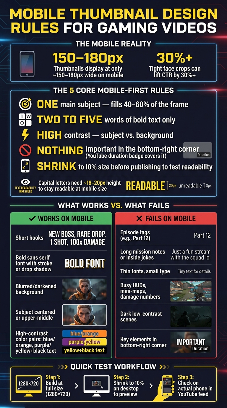
Mobile Thumbnail Design Rules for Gaming Videos
The Main Problems Small Screens Create for Gaming Thumbnails
On mobile, thumbnail problems show up almost at once. Text gets fuzzy, game UI crowds the frame, and weak contrast buries the main idea. For gaming videos, the same three issues keep popping up.
Text Becomes Unreadable at Small Sizes
Long lines of copy, episode tags, and stacked text are hard to process on a phone. People scroll fast. If they have to stop and figure out the thumbnail, you've probably lost them already. Thin fonts and small type make it worse because they blur together at mobile size.
At mobile thumbnail size, capital letters need about 16–20 pixels of height to stay readable. So text needs to take up actual space if you want it to work on a phone. Short labels like NO HUD, 1 SHOT, or NEW BOSS work because people get them right away. On the other hand, phrases like Part 12, long mission notes, or inside jokes that need setup are much weaker at small sizes.
Game UI and Background Detail Create Visual Clutter
On a phone, HUD elements fight with the main subject. Health bars, mini-maps, inventory icons, damage numbers, and busy backgrounds can turn the whole thumbnail into visual noise. When viewers can't tell what the video is about in a split second, they keep scrolling. Mobile feeds move fast, and there isn't much room for guesswork.
Low Contrast and Poor Element Placement Hide Key Details
Dark scenes and low-contrast subjects often blend together on small screens. A face, weapon, or enemy can flatten into the background, which wipes out the hook. What looked fine at full size can fall apart once it shrinks down.
Placement can also hurt you. The bottom-right corner is a bad place for anything important because that's where YouTube puts the video duration badge, which can cover text or icons you placed there. It's safer to keep key subjects and text closer to the center or upper-middle. The outer edges are easier to crop, and they don't hold attention as well on mobile.
That's why mobile gaming thumbnails usually work better when the layout is simpler, the contrast is stronger, and the text is shorter.
sbb-itb-b59debf
Design Fixes That Improve Readability and Clicks on Mobile
Fix mobile thumbnail issues with a simpler layout, shorter text, and stronger contrast.
Use One Focal Point and Fewer Visual Elements
Choose one clear idea for the thumbnail and build the whole image around it. That could be a boss, a loot drop, or a reaction face. Let that main subject take up about 40–60% of the thumbnail width, and keep the design to just three elements total: one subject, one short text hook, and one simple background or accent color.
Everything else should either go away or fade deep into the background. Working from a raw gameplay screenshot? Blur it or darken it so it stops fighting for attention. On a phone screen, clutter loses fast. Fewer elements make the thumbnail easier to recognize at a glance.
Keep Text Short, Bold, and Inside Safe Areas
Aim for two to five words. Phrases like "IMPOSSIBLE BOSS" or "RARE DROP" land fast. Keep text to two to five words.
Use a bold sans-serif font. Add a stroke or drop shadow so the text stands out from the background, especially over busy game environments.
Where you place that text matters just as much as what it says. Keep all key text and faces inside the center safe zone. Stay away from the bottom-right corner, where YouTube puts the duration badge. The outer edges can also get clipped a bit on mobile. Numbers are especially strong in short hooks, like "100x DAMAGE" or "LEVEL 99", because people can read them fast at almost any size.
Increase Contrast and Check at Phone Size Before Publishing
Strong contrast helps a thumbnail stand out on a bright phone screen. Darken or blur the background, brighten the main subject, and, if needed, put the text on a bold color block. A solid yellow or red banner with black or white lettering is hard to miss. Contrast pairs like blue/orange or purple/yellow also work well, leveraging thumbnail color psychology to grab attention.
Before publishing, shrink the thumbnail to about 10% of its original size on desktop. That gives you a close preview of how it may look in a mobile feed. At that size, the subject and text should be clear within one second. If they aren't, strip things back even more. Then check it on an actual phone in YouTube's home or search feed.
If you want to build and test layouts faster, ThumbnailCreator can speed up the first draft.
Using ThumbnailCreator to Build Mobile-Friendly Gaming Thumbnails
Generate Cleaner Layouts with Stronger Focal Points
Once you know what tends to fail on mobile, use ThumbnailCreator to build draft ideas faster and check them against those rules. Generate 2–3 layouts, then compare them at phone size. ThumbnailCreator's AI generator helps speed up that testing process.
For a stronger layout, put one main subject near the center of the frame. If the thumbnail still feels crowded, cut secondary elements until only the subject and the hook are left. That usually makes the image easier to read on a small screen.
Use Templates and Editing Tools to Protect Readability
Templates and editing tools make it much easier to apply mobile-first rules without starting from scratch. Begin with a gaming template, then use text editing, object swapping, and face swapping to clear out clutter and keep the design readable.
If the text starts fighting with the image, that's a red flag. Clean up the frame so the viewer can spot the subject and read the message in a split second.
Create Multiple Versions and Compare Mobile Clarity
After the first draft, compare versions side by side and keep the clearest one. Create 2–3 versions with different crops, contrast, or text placement, then choose the one that stays clearest at phone size.
A simple way to test this is to make a few focused variations:
- One face-heavy version
- One high-contrast version
- One text-light version
Pick the version where the subject and text are immediately clear without zooming in.
Conclusion: Design Thumbnails for the Screen Your Audience Actually Uses
Most YouTube viewing happens on mobile devices. That means most U.S. gaming viewers see your thumbnail on a small phone screen, not a big desktop monitor.
And that changes everything.
At phone size, small text disappears. Busy game scenes blur into noise. Low-contrast designs just melt into the feed.
So keep it simple. Use one clear focal point, short bold text, and a high-contrast layout with a plain background. Also, keep key parts away from the bottom-right corner, where the duration badge can cover them on mobile.
Tighter crops matter too. Faces and strong reactions tend to read much better at small sizes, and they can lift CTR by over 30% compared with wider compositions.
A mobile-first workflow pulls all of this into one process. Build the thumbnail at full size, then shrink it down and check it on your actual phone before you publish, following a YouTube thumbnail size guide to ensure clarity. If you can't tell what the image is about and read the text in a split second, trim it down until you can.
ThumbnailCreator helps speed that up. Make a few layout versions, compare thumbnail versions at phone size, and keep the clearest one. Over time, that simple habit helps you make thumbnails that match the mobile feeds your audience already scroll through.
FAQs
How do I know if my thumbnail is too cluttered for mobile?
Try a quick squint test or shrink the thumbnail to 10% to 15% of its original size, which is about 120 to 168 pixels wide.
If the text gets hard to read, the main subject isn’t clear, or the message takes more than a second to understand, the thumbnail is probably too cluttered.
A few simple rules help:
- Keep text to three to five words
- Use high-contrast colors
- Don’t place key elements in the bottom-right corner, where YouTube’s timestamp shows up
Should I use gameplay screenshots or custom thumbnail layouts?
Put custom thumbnail layouts ahead of plain gameplay screenshots. Research shows that raw gameplay thumbnails with no added design elements underperform by 44%.
For better engagement, give the thumbnail one clear focal point. A strong reaction face paired with a dramatic gameplay moment usually works well. ThumbnailCreator can help you build designs with clear hierarchy, contrast, and mobile readability, while also helping you avoid areas that often get covered by mobile UI overlays.
What’s the fastest way to test a thumbnail before publishing?
Use ThumbnailCreator’s YouTube Preview tool to get a fast look at how your thumbnail will appear in mobile search, Home, and suggested feeds before you publish.
You can also do a quick manual check. Shrink the image to 10%–20% of its original size, or about 168 x 94 pixels. If the text feels tough to read or the main subject gets lost, simplify the design and keep key elements away from the bottom-right corner.