

5 Tips for Gaming Thumbnails with Characters
Your thumbnail has about a second to win the click. If I want more people to notice a gaming video, I keep the design simple: one main character, one clear emotion, high contrast, short text, and a repeatable style.
Here’s the full idea in plain English:
- Use one main character so the image reads fast
- Make the face or pose easy to read at small size
- Separate the character from the background with contrast and outline
- Keep text short if I use it at all
- Stick to the same style across videos so people know it’s mine
A few numbers from the article back this up:
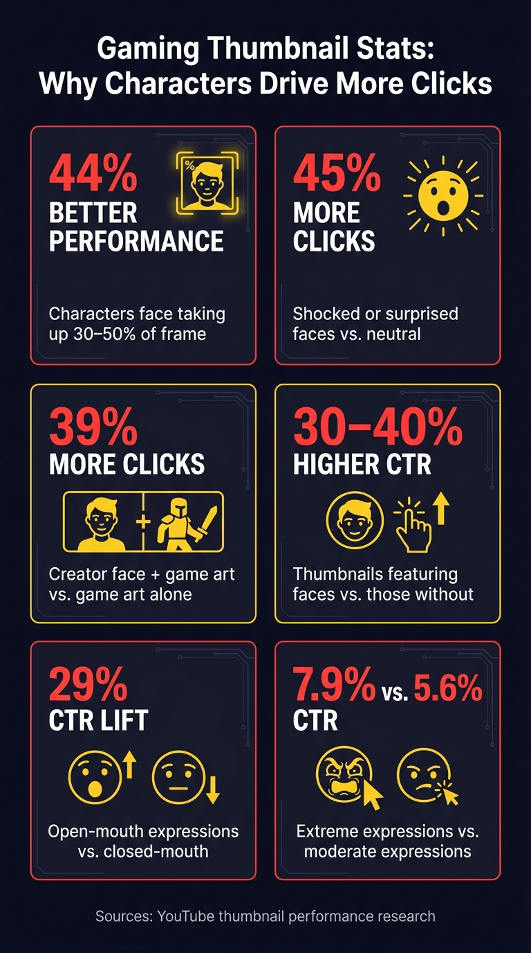
- Thumbnails with faces can get 30%–40% higher CTR
- Creator face + game art can get 39% more clicks than game art alone
- Bigger main faces can perform 44% better
- Shocked faces can drive 45% more clicks than neutral ones
Creating a Simple Character Based Gaming Thumbnail in GIMP - Tutorial
Quick Comparison
| Tip | Main goal | What I focus on |
|---|---|---|
| One dominant character | Fast recognition | One big face or figure |
| Strong emotion and pose | Instant feeling | Shock, fear, win, action |
| High contrast and outline | Clear subject | Dark/light separation, thick edge |
| Short supporting text | Extra context | 1–4 words max (see our typography guide) |
| Consistent style | Better channel recall | Same crop, colors, and layout |
If I had to sum up the whole article in one line, it would be this: make the character the first thing people see, and make everything else support that.
Why Characters Work So Well in Gaming Thumbnails
Gaming Thumbnail Stats: Why Characters Drive More Clicks
Characters and faces grab attention fast. Much faster than abstract shapes or text on their own. In a split-second scroll, a strong facial expression or odd pose gives people an instant emotional cue. And that's exactly what a busy feed demands. Character choice matters more than piling on extra visual clutter.
Different character types send different signals right away. Iconic heroes like Master Chief or Kratos tell viewers what kind of game world they're looking at. Villains and bosses make the moment feel bigger and more tense. And creator face-cam reactions bring in something game art can't always show: a human response. A shocked face suggests something wild just happened. A calm, confident look hints that what's coming is worth the click.
Characters don't just pull the eye. They set up a tiny story in a single frame. A villain towering next to a creator's worried face tells viewers a lot before they ever read the title. Repeated avatar styles or the same face-cam framing also help people spot your content faster in a crowded feed.
That's why one dominant character usually works best.
1. Use One Dominant Character as the Focal Point
Start by making one character the clear anchor of the thumbnail. Everything else - the background, text, and effects - should back that subject up, not fight for attention.
There’s a simple reason for that: thumbnails where the main character’s face takes up 30–50% of the thumbnail area perform 44% better than thumbnails with smaller subjects that are harder to read. When you pack in too many people, the image can turn into visual clutter fast. One big, sharp face is much easier to spot.
A good layout is simple. Use the rule of thirds or centered layouts to position the character on the left or right third of the frame and have them face inward. That leaves the other side open for short text or one supporting visual.
One dominant face also makes the emotion hit fast - shock, danger, or action. The viewer shouldn’t have to study the image to get the feeling. Once you’ve locked in the focal character, use expression and pose to add urgency.
There’s another upside here too. Over time, this kind of consistency helps shape your channel brand. If you use the same character at a similar scale and in a similar spot across videos, people start to recognize your thumbnails before they even read your channel name. Tools like ThumbnailCreator can help you build on that system as your workflow grows.
2. Show Strong Character Emotions and Action Poses
Once you’ve picked one main character, make that character feel alive right away. A neutral face, even on a well-placed subject, is still a missed chance.
The numbers make that pretty clear. Thumbnails with extreme expressions - jaw-drop, wide eyes, hand-over-mouth - get a 7.9% CTR, compared with 5.6% for moderate expressions. Shocked or surprised faces drive 45% more clicks than neutral ones, and open-mouth expressions lift CTR by 29%. So don’t stop at “good enough.” Push the emotion until it still reads at thumbnail size.
This matters even more on mobile. Expressions need to be exaggerated to stay clear when a thumbnail shrinks to 120–180 pixels on a phone. A good rule is to push the face about 30% more exaggerated than a natural pose. Wide eyes, raised brows, and an open mouth come through far better than subtle looks. If the emotion gets muddy at 10–15% zoom, make it stronger.
Body language works the same way. A character mid-jump, aiming a weapon, or reacting to a scare tells the viewer what kind of moment they’re about to watch in a split second. Keep the silhouette clean. Separate the limbs, show one key object, and turn the character slightly toward the camera. Then aim the gaze or motion toward the center of the thumbnail so the viewer’s eye lands where you want it.
The emotion should also match the type of content so the channel keeps a clear identity. Use jaw-drop shock for wild wins or glitches, a fear grimace for horror or survival moments, and a triumphant grin for completed challenges. One main emotion per thumbnail keeps the message sharp and steady across your channel. Once the expression and pose are clear, the next step is pulling the character away from the background.
3. Separate the Character with High Contrast and Bold Outlines
Thumbnails often show up at just 120–200 px wide, which means your character has to read fast. No second chances.
Start with contrast. Put the character on a background that has a clear difference in brightness or hue. Bright characters tend to stand out best on darker, muted backgrounds. Darker characters usually pop more on lighter or more saturated ones. In gaming thumbnails, this matters a lot because busy scenes, explosions, and HUD elements can steal attention from the main subject in a split second. Some gaming research even suggests that dark backgrounds get 34% more clicks than light ones. Aim for at least a 4.5:1 contrast ratio, and push closer to 7:1 for small details like eyes or weapon edges.
Then add bold outlines. They give the character a clean edge and help it hold up on small screens. A good range is about 5–15 px thick at 1280×720. Black usually works well around bright characters. White, yellow, or neon outlines can help darker characters stand apart from the background. Red is also a common accent color in high-performing gaming thumbnails. Thin outlines sound nice in theory, but on mobile, they disappear.
Once contrast and outlines are doing the hard work, stick with a repeatable look. Use the same outline style, palette, and background treatment so the character stays easy to read and your thumbnails become easy to spot. Screenshot vs custom graphic thumbnails show a clear performance gap, as raw gameplay without extra design elements underperforms by 44%. That’s a big gap.
A soft gradient, a blurred environment, or a simple color block can keep the focus on the character without making the frame feel empty. Try to limit the palette to 3–4 colors so the character stays in charge. And once the character reads clearly, keep text secondary. For faster results, you can use a gaming thumbnail generator to automate these contrast and outline settings.
sbb-itb-b59debf
4. Pair the Character with Minimal Supporting Text
Once the character is clear, the text should add speed, not clutter. Think of it as backup, not the star of the show. Stick to 1–4 words that sharpen the emotion or action the character already shows. Lines like "IMPOSSIBLE WIN" or "LAST LIFE" work because they fit the reaction on screen. The character should carry the main message on its own.
Place the character first, then put the text in a secondary area: on the opposite side of the frame or over a part of the background with low detail. Don’t cover the face or the key action. Text overlays show up in about 64% of high-performing gaming thumbnails , a common tactic used when creating gaming news thumbnails, but the strongest ones keep the wording short and easy to read on mobile.
Use bold, sans-serif typefaces with strong contrast. White or yellow text with a dark outline usually works well. If the background is busy, add a light banner behind the words.
Then run the mobile shrink test. Scale the thumbnail down to 160×90 px. If the character’s expression disappears, or the main word gets lost, move it or make it bigger. When the text still reads at that size, the character stays in charge. ThumbnailCreator can make this part easier with editable text layers, small-size previews, and gaming YouTube thumbnail templates that keep the character area and text block apart.
5. Build a Consistent Character Style Using AI-Assisted Workflows
After you’ve locked in the character, emotion, contrast, and text, turn those choices into a system you can use again and again. Once the character look is set, keep it fixed. If your thumbnails jump around from one style to another, people have a harder time spotting your content right away. A repeatable AI-assisted workflow helps keep that from happening.
Build 2–3 master templates using the same crop, angle, lighting, and color palette. Then swap only the pose, expression, or background. That gives you room to match each video while keeping the main character look the same. From there, make emotion-based versions without changing the core character design.
Keep the emotion set small:
- shock
- rage
- excitement
- confusion
- satisfaction
That way, each thumbnail can match the hook without drifting away from the character people know. It also helps to standardize your outlines, text, and backgrounds in one brand kit. You can upload a strong existing thumbnail as a style reference so AI can match the composition, colors, and mood. That’s what makes the whole set feel instantly recognizable.
Once the system is in place, use AI to update each thumbnail with less manual work. ThumbnailCreator can help speed things up with templates, face swapping, text editing, and object swapping, so each new upload becomes more like a fast template refresh than a full redesign.
Thumbnail Specs and Layout Checks
Before you hit publish, avoid common thumbnail mistakes by doing one last pass on size, safe areas, and mobile readability. YouTube recommends 1,280 x 720 pixels with a 16:9 aspect ratio, and the file needs to stay under 2 MB. For format, use JPG/JPEG or PNG. In most cases, JPG at 80–90% quality is the better pick because it keeps file size down. If your thumbnail depends on clean outlines or anime-style characters, PNG helps keep edges sharp.
Layout matters just as much as file specs. Put the character’s eyes in the upper half of the frame, and keep anything important out of the bottom-right corner. That’s where YouTube’s video length timestamp can sit on top of your design. It also helps to keep your main subject, emotion, and text inside the inner 70–80% of the canvas so nothing gets cropped or covered.
Here’s the quick check:
| Spec | Requirement | Notes |
|---|---|---|
| Dimensions | 1,280 x 720 px | Minimum width: 640 px |
| Aspect Ratio | 16:9 | Standard YouTube ratio |
| File Size | Under 2 MB | YouTube limit |
| Format | JPG/JPEG or PNG | JPG = smaller; PNG = sharper edges |
| Character Face Size | 30%+ of frame | Helps mobile readability |
| Safe Area Margin | Inner 70–80% of canvas | Keeps content clear of crop/overlay zones |
| Text Length | 1–4 words max | Readable at ~10% zoom |
ThumbnailCreator's templates and preview tools can speed this up.
Quick Comparison Tables for Character Thumbnail Best Practices
After the layout checks, use these quick comparisons to make the last call on character, text, and workflow. The main rule stays the same: one dominant character, a clear emotion, and as little clutter as possible.
Single Character vs. Crowded Scene
| Factor | Single Dominant Character | Crowded Scene (3+ Characters) |
|---|---|---|
| Clarity at small sizes | High; one face reads instantly | Lower; multiple faces can blur together in small previews |
| Speed of recognition | Fast; the viewer spots one clear subject right away | Slower; the viewer has to search for a focal point |
| Emotional impact | Strong; one expression carries the frame | Weaker; attention gets split across multiple characters |
| Click potential | Often stronger; one face often outperforms groups | Less consistent in fast-scroll feeds |
| Best for | Solo challenges, story episodes, speedruns | Large collabs or "Every Skin Ranked" videos |
In plain English, a single face usually wins because it reads fast. When someone is scrolling, they don't study your thumbnail. They glance at it. One strong character gives them something to lock onto at once.
Default to one dominant character unless the video is built around a duo.
Once you've picked the focal character, the next step is simple: decide whether text adds context or just gets in the way.
No Text vs. Too Much Text vs. a 2–4 Word Hook
| Text Approach | Mobile Readability | Instant clarity | Works Best When |
|---|---|---|---|
| No text | High; nothing has to be read | Lower; it relies entirely on visual storytelling | The character pose and scene already make the video clear |
| 2–4 word hook (e.g., "NO HIT RUN", "1 HP LEFT") | High; the text stays bold and readable | High; the face shows the feeling, and the words tell the premise | You need to clarify a challenge, stakes, or twist |
| Too much text | Low; the design becomes hard to read on phones | Low; the text competes with the character | Avoid - let the video title handle the details |
A short hook can do a lot of work. It gives the viewer the missing piece without taking over the frame. Short text hooks under 4 words are associated with roughly a 30% CTR increase compared with longer text. That’s why a 2–4 word hook makes sense only when the image alone doesn't tell the full story.
If the face and pose already explain the idea, skip the text. If the setup needs a little help, add a few words and stop there.
If your layouts still look different from one upload to the next, don't wing it. Use a repeatable process.
Manual Workflow vs. AI-Assisted Workflow
| Factor | Manual Workflow | AI-Assisted Workflow (e.g., ThumbnailCreator) |
|---|---|---|
| Time per thumbnail | ~30–60 minutes for a skilled editor | ~10–20 minutes |
| Skill barrier | High; masking, lighting, and layout knowledge are needed | Lower; no design background needed |
| Series consistency | Harder to maintain; small drift can build up over time | Easier to keep consistent with reusable templates and recurring character styles |
| Scalability to frequent uploads | Time-intensive as volume grows | Better for frequent uploads and recurring thumbnail work |
| Best for | Creators who want pixel-level control | Beginners and growing channels that want faster production |
Manual editing gives you tight control, but it also eats time. And once you're posting often, those extra minutes stack up fast.
If a thumbnail takes more than 30 minutes, use ThumbnailCreator to speed up cutouts, face swaps, object swaps, text edits, and layout consistency.
Conclusion
Strong gaming thumbnails usually follow the same simple playbook: one clear character, easy-to-read emotion, high contrast, very little text, and a look people can recognize as yours.
Before each upload, run a quick check:
- Can someone spot the main character in 1 second?
- Is the emotion easy to read?
- Does the character stand out from the background?
- Is the text readable on mobile screens?
- Does the design fit your channel?
If the answer to any of those is no, start there first.
ThumbnailCreator helps speed up character-led thumbnails with AI generation, templates, face swapping, text editing, and object swapping. (See our AI thumbnail generation guide for more details.)
Use these tips as a starting point. Test a few versions, keep the character-first setup, and refine based on what the results show.
FAQs
How do I choose the best character for a thumbnail?
Put emotion and clarity first. Use one expressive face that shows shock, excitement, or intensity, since faces tend to pull attention before anything else. For the best result, let the character take up 30% to 50% of the frame.
If the video is about conflict or teamwork, two characters can work. Just make sure one stays the main focal point. ThumbnailCreator can help speed this up with AI-powered face swapping and object placement.
When should I use text on a gaming thumbnail?
Use text only when it makes the hook sharper or adds context the image can’t show on its own. If the character’s expression or gameplay moment already sells the feeling, the text should back up the thumbnail, not take over.
Keep it to 1 to 5 words so it’s easy to read on mobile. ThumbnailCreator can help you test layouts and check that your text is clear, high-contrast, and placed well.
How can I test if my thumbnail works on mobile?
Test your thumbnail at a smaller size to see if it still reads well. A simple way to do that is the squint test: shrink it to about 10% to 20% of its original size, or roughly 120 x 68 pixels. If the main subject or text gets hard to make out, the design is too busy.
It also helps to preview the thumbnail on actual mobile devices. And keep key elements out of the bottom-right corner, since that’s where YouTube places the timestamp.