
5 Thumbnail Tips for FIFA Videos
FIFA videos on YouTube compete in a crowded space, so your thumbnails need to grab attention fast. Here’s how you can improve your gaming thumbnails to increase clicks and grow your channel:
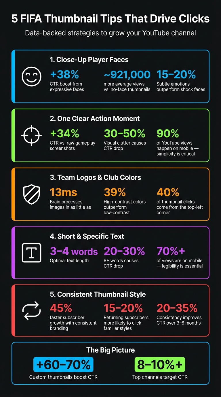
- Use Close-Up Player Faces: Emotional expressions from famous players like Mbappé boost clicks by 38%. Keep faces large and clear for mobile viewers.
- Highlight One Key Action: Avoid clutter. Focus on a single moment, like a decisive goal or rare FUT card, to make your thumbnail stand out.
- Show Team Logos and Colors: Fans connect with recognizable team branding. Enhance colors and visibility of logos to appeal to club supporters.
- Keep Text Short and Clear: Limit text to 3–4 words like "99 RATED!" or "WL FINALS" to provide context without overwhelming the image.
- Maintain Consistency: Use the same fonts, colors, and layout across thumbnails to build a recognizable style for your channel.
Custom thumbnails can increase click-through rates by 60–70%, and consistent branding can grow your subscriber base 45% faster. Focus on these tips to make your FIFA content stand out.
5 FIFA Thumbnail Tips: Stats That Prove What Works
How To Make A EA Sports FC 25 Thumbnail 2024 (EA Sports FC 25 Thumbnail Template Tutorial 2024)
sbb-itb-b59debf
1. Use Close-Up Player Faces With Strong Emotions
Your thumbnail has about 1.2 seconds to grab attention before someone scrolls past it. In a crowded FIFA feed, a close-up of a well-known player's face showing a strong emotion can instantly stand out. Why? Our brains are wired to recognize faces, sparking an emotional reaction even before we process the video title.
Thumbnails with expressive faces have been shown to boost click-through rates by 38% compared to those without. On top of that, videos featuring human faces in their thumbnails average nearly 921,000 more views than those without. In the gaming niche, especially FIFA content, emotional expressions - whether it's shock, excitement, or frustration - are three times more common than in other categories.
It’s important to match the emotion to the content. For instance, a surprised face works great for pack openings or jaw-dropping goals, while a determined look is perfect for FUT Champions or tutorials. Dan Kim from Hooksnap highlights this point:
"Specific, authentic emotional expressions tend to outperform the generic shocked face."
This is particularly relevant in 2026, where audiences are less impressed by over-the-top reactions. Subtle, genuine emotions - like an intense, focused look - are now outperforming exaggerated wide-mouth shock faces by 15% to 20%.
From a technical perspective, keep in mind that FIFA thumbnails are often viewed on mobile devices, where they appear at around 150×83 pixels. To make the face pop, position it to cover about 40%-60% of the thumbnail's width, with the top of the head near the frame's edge. Adding bright rim lighting around the face can make it stand out even more.
For an easy solution, tools like ThumbnailCreator can automatically create character cutouts with dramatic lighting, ensuring the face remains the focal point.
2. Feature One Clear In-Game Action Moment
Thumbnails overloaded with too many details can easily get ignored. When you try to cram multiple scenes or actions into one image, it becomes harder for viewers to understand what’s happening, and they’ll just scroll past. Dan Kim from Hooksnap puts it well:
"The most common mistake in gaming thumbnails is visual density - too many elements competing for attention."
The solution? Highlight a single, decisive action moment.
Why focus on one key moment? A clear, defining action captures attention instantly - before the viewer even glances at the title. Thumbnails cluttered with too many elements can lead to a 30% to 50% drop in click-through rates (CTR). On the flip side, a thumbnail featuring a single, dynamic subject can boost CTR by 34% compared to raw gameplay screenshots. Raw screenshots often include unnecessary HUD details, mini-maps, and other UI elements that distract rather than add value.
Keep mobile users in mind. With 90% of YouTube views happening on mobile, the need for simplicity becomes even more critical. A single, well-framed action moment remains easy to recognize on smaller screens, while thumbnails with too many details can blur together. Here’s a quick test: check your thumbnail on your phone from a distance. If the action isn’t immediately clear, it’s time to simplify.
How to simplify your thumbnails: Use an isolated render or cutout of the key action moment and place it against a dark or blurred background. This eliminates distractions and draws the viewer’s eye directly to the subject. Tools like ThumbnailCreator make this process simple, offering features like object isolation and background editing - even for those without design skills.
3. Make Team Logos and Club Colors Easy to Spot
Once you've got strong facial expressions and action shots, the next step is making sure your team branding grabs attention. Picture this: a Real Madrid fan instantly recognizing their team just by spotting the iconic white kit and crest on a thumbnail. That’s the power of clear branding. The human brain can process and categorize an image in as little as 13 milliseconds. This means your thumbnail has to scream, "This is your team!" almost immediately. To achieve that, enhancing the visibility of logos and colors is key.
"Color is the first element processed by viewers, prompting a snap judgment." - Dan Kim, Hooksnap
Here’s the practical takeaway: boost your club colors so they stand out more than they do in gameplay footage. The green of the pitch often dulls the vibrancy of team kits and logos, making them less noticeable. Increase the saturation and contrast of these elements to make them pop against YouTube’s dark gray background. High-contrast, saturated colors have been shown to outperform low-contrast designs by 39% and remain sharp even after YouTube’s JPEG compression.
For videos featuring two teams, use a split layout. Color-code each side with the respective team’s primary colors. Make sure the most important visuals - like logos or key imagery - are placed in the top-left corner. Why? Roughly 40% of thumbnail clicks come from this area. Also, avoid placing critical elements in the bottom-right corner, as the video timestamp will obscure them. Tools like ThumbnailCreator can simplify this process with drag-and-drop features, helping you position everything perfectly without guesswork. Thoughtful placement and vibrant colors not only grab attention but also tie everything together visually for a polished thumbnail.
4. Keep Text Short and Specific to the FIFA Content
When it comes to thumbnails, less is more. Thumbnails with 8 or more words can see a 20–30% drop in CTR, while the optimal range is just 3–4 words. This amount is enough to provide context without overwhelming the image.
"The sweet spot is 3–4 words. Enough to add context that the visual alone cannot convey, but not enough to create reading friction at mobile thumbnail size." - ThumbMentor
The goal is to complement your visuals, not compete with them. Your text should immediately convey what’s happening in the video - specificity is key. Instead of something generic like "Amazing Match", use phrases like "100-0 RUN" or "WL FINALS" to clearly describe the content. Including specific terms such as "99 RATED", "SBC FIX", or "500K PROFIT" builds trust and resonates with FIFA fans.
One more tip: don’t duplicate the video title. According to Dan Kim from Hooksnap:
"If your title says 'I Tried This Impossible Build for 24 Hours,' a thumbnail with the text 'IMPOSSIBLE BUILD' adds nothing. Use the thumbnail space for visual information." - Dan Kim, Hooksnap
To ensure clarity, use bold sans-serif fonts with high-contrast strokes (e.g., white text on a dark background). Since over 70% of YouTube views come from mobile devices, your text must remain legible at small sizes, roughly 168×94 pixels.
Here’s how FIFA-specific text works across different content types:
| Content Type | FIFA-Specific Text Example | Why It Works |
|---|---|---|
| Pack Openings | "99 RATED!", "1M PACK" | Highlights rare, high-value moments |
| Match Highlights | "FINALLY!", "100-0 RUN" | Instantly conveys stakes and outcomes |
| Player Reviews | "WORTH IT?", "BROKEN" | Sparks curiosity with quick verdicts |
| Challenges | "IMPOSSIBLE", "NO LOSSES" | Builds excitement by raising the stakes |
For an easy way to test and refine your text, tools like ThumbnailCreator let you adjust font size, style, and placement without starting from scratch. This can save you time while ensuring your thumbnails are optimized for maximum impact.
5. Build a Consistent Thumbnail Style Across Your Channel
A consistent thumbnail style is key to reinforcing your channel's identity. It helps your audience instantly recognize your content, which is crucial for both returning subscribers and new viewers. Without this consistency, visuals can feel disjointed, leaving your audience unsure about your brand.
Here's an eye-opening stat: channels with consistent thumbnail branding see their subscriber base grow 45% faster than those without it. On top of that, returning subscribers are 15–20% more likely to click when they can quickly identify a creator's style. As Hooksnap explains:
"Recognition breeds trust, and trust breeds clicks." - Hooksnap
Consistency doesn’t mean every thumbnail has to look identical - it’s about using a set of core elements repeatedly. For example, stick to two fonts max, select 2–3 signature colors, and decide on a layout for key elements. Maybe the player's face always goes on the left, and text on the right. If you use graphic elements like arrows or highlight circles, keep their style and color consistent across all thumbnails.
Dan Kim from Hooksnap recommends the 20-Video Rule for building a recognizable thumbnail brand:
"The fastest path to a recognizable thumbnail brand is not designing something unique - it is picking one of the six styles above and executing it consistently for 20–30 videos." - Dan Kim, Hooksnap
Once you’ve chosen a style, test its effectiveness with the Squint Test. Shrink your thumbnail until it’s blurry - if the main subject is still clear, your design works. If it just looks messy, simplify. Tools like ThumbnailCreator can help by letting you save and reuse layouts, so you don’t have to start from scratch every time.
Conclusion
These five tips work together to form an effective strategy: close-up faces grab attention instantly, a single clear action moment sets the tone, and bold team colors paired with concise text drive your message home. Sticking to a unified style across your channel creates the kind of recognition that keeps viewers coming back for more.
The numbers back this up. Custom thumbnails can boost click-through rates (CTR) by 60–70%, and consistent branding improves CTR by 20–35% over a span of 3–6 months. Leading channels aim for CTR of 8–10% or higher. These stats highlight just how important every element of your thumbnail strategy is for engaging your audience.
One common pitfall among FIFA creators is treating thumbnails as an afterthought. As one expert succinctly put it:
"Your thumbnail is not decoration. It is the single biggest factor determining whether anyone clicks your video." - ThumbMentor
Take these tips to heart, and you’ll likely see your viewer engagement grow. Tools like ThumbnailCreator can help streamline the process with features like AI-driven face swapping and pre-made templates. By cutting production time by up to 60%, you can focus on what matters most: making your FIFA content stand out.
FAQs
How do I pick the best emotion for a player face?
Pick an emotion that fits the vibe of your video. For instance, use excitement to highlight big wins, show determination to tackle challenges, or express frustration during tough gameplay moments. The key here? Dial it up by about 50%. Subtle expressions can easily get overlooked, especially on smaller screens like phones.
Want to try out different emotions? Tools like ThumbnailCreator's face-swapping feature can help you experiment and find the expression that clicks best with your audience.
What’s the easiest way to remove HUD clutter from gameplay shots?
While the article doesn’t directly discuss removing HUD clutter, it highlights key design principles that can help you create better thumbnails. Focus on visual hierarchy, keeping the design simple, and ensuring the UI doesn’t obstruct important elements - especially in the bottom-right corner, which is often a critical area.
Using tools like ThumbnailCreator can make this process easier. Features such as text editing and object swapping allow you to refine your thumbnails, ensuring they look clean and grab attention without overwhelming the viewer.
How can I keep thumbnails consistent without making them look identical?
To create a cohesive and recognizable thumbnail style, start by using a unified framework. Stick to a consistent color palette, font choice, and layout design to establish your brand identity. Within this framework, you can add variety by incorporating different gameplay moments, player reactions, or unique text overlays. This approach ensures your thumbnails remain visually engaging while staying aligned with the specific content of your FIFA videos.