

10 Gaming Thumbnail Trends for 2026
Gaming thumbnails win or lose clicks in a split second. My main takeaway is simple: if your thumbnail is easy to read on a phone, shows one clear emotion or payoff, and uses strong contrast, it has a better shot at beating the average 6.2% CTR.
Here’s the article in plain English:
- I focus on 10 trends that fit small screens and crowded YouTube feeds
- The core rules stay the same: readability, emotion, game recognition, and contrast
- The strongest thumbnail styles in 2026 use:
- AI-assisted workflows
- neon-on-dark color setups
- large faces or close-up characters
- short text
- one clear gameplay moment
- blur for depth
- mobile-first layouts
- game UI cues
- two-character story layouts
- testing and style consistency
- The biggest problems are also simple:
- too much stuff in one frame
- text that breaks on mobile
- effects that hide the subject
- mixed signals between thumbnail and video
The article’s main point is not to chase every trend at once. I’d treat these as test ideas, keep one clear visual style, and let CTR decide what stays.
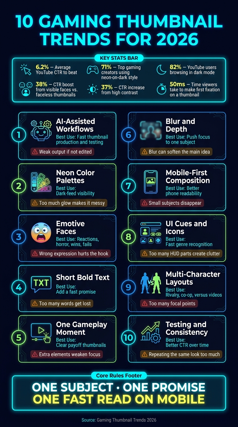
10 Gaming Thumbnail Trends for 2026: Quick Comparison Guide
Gaming Thumbnail TRENDS Of 2026 #photoshop #thumbnail #youtubethumbnail #creator
Quick Comparison
| Trend | Best Use | Main Risk |
|---|---|---|
| AI-assisted workflows | Fast thumbnail production and testing | Weak output if I don’t edit |
| Neon color palettes | Dark-feed visibility | Too much glow makes it messy |
| Emotive faces | Reactions, horror, wins, fails | Wrong expression hurts the hook |
| Short bold text | Add a fast promise | Too many words get lost |
| One gameplay moment | Clear payoff thumbnails | Extra elements weaken focus |
| Blur and depth | Push focus to one subject | Blur can soften the main idea |
| Mobile-first composition | Better phone readability | Small subjects disappear |
| UI cues and icons | Fast genre recognition | Too many HUD parts create clutter |
| Multi-character layouts | Rivalry, co-op, versus videos | Too many focal points |
| Testing and consistency | Better CTR over time | Repeating the same look too much |
If I had to boil the whole article down to one rule, it would be this: one strong subject, one clear promise, and one fast read on mobile.
What Makes a Gaming Thumbnail Work in 2026
In 2026, a gaming thumbnail needs to do four things fast: read well on a small screen, hit an emotion right away, show the game at a glance, and keep one clear focal point. Those are the filters for every trend that follows.
Fast Readability on Small Screens
A thumbnail can look great at full size and still fall apart on mobile. That's where a lot of designs lose people.
The fix is simple: one large subject, very little text, and a clean layout. A good rule of thumb is to shrink the thumbnail to its actual published size before you post it. If the main subject gets lost, the design is too crowded.
Emotional Signals That Read Instantly
People don't study thumbnails. They react to them.
A shocked face, a tense face-off, or a near-death moment in a battle royale tells the story before anyone reads the title. Expressions like surprise, fear, hype, victory, and near-failure all help create that instant emotional read. The key is simple: the feeling should come through without text doing the work.
Clear Game Recognition and Genre Fit
A viewer should know the game - or at least the type of game - within a second.
That usually comes from character art, signature weapons, familiar maps or settings, and game-specific UI cues. A battle royale thumbnail might show a storm circle or loot crate. An RPG thumbnail might lean on spell effects or reward screens. When the visual language fits the genre, the right viewers sort themselves in before they click.
Strong Contrast and One Clear Focal Point
Contrast helps the main subject stand out in a crowded feed. That contrast can come from color, lighting, or scale - like a bright character on a dark background, a neon edge around a player's face, or a sharp subject in front of a blurred scene.
High contrast increases impressions by 37%. But contrast alone isn't enough. You also need one clear focal point. If every part of the thumbnail is shouting for attention, nothing stands out. And once that happens, the image gets harder to read and loses click potential fast.
These four rules are the baseline for the trends below.
1. AI-Assisted Thumbnail Workflows with ThumbnailCreator
AI-assisted workflows make the thumbnail rules above much easier to put into practice. ThumbnailCreator can turn a video URL or a prompt into a ready-to-use 1280×720 thumbnail in seconds, cutting production time from minutes to moments.
The process is simple: paste a link, pick a template, generate a few options, and export. Everything happens in one place, which keeps the job moving.
What matters most, though, isn’t the workflow on its own. It’s how that workflow fixes the design issues gaming thumbnails struggle with most often. Face swapping, object swapping, and text editing help solve the three biggest thumbnail problems: weak emotion, clutter, and hard-to-read copy.
If you publish often or batch-record a series, templates and reusable styles help keep each upload visually consistent. A brand kit keeps your logo and colors aligned across videos, which is especially helpful if you cover more than one game but still want a unified channel page. That speed also gives you more room to test different styles, color schemes, and layouts on future uploads.
2. High-Contrast Neon Color Palettes
Once the layout is locked in, color does the heavy lifting. It’s the fastest way to make a thumbnail stand out. Neon works best when it helps people see the subject fast - and 71% of top-performing gaming creators now use a neon-on-dark color style, while 82% of YouTube users browse in dark mode.
The simplest setup is usually the best: pick one bright accent color like cyan, green, or blue, then place it against black or deep navy. Add a glow outline to one main subject and let the rest of the frame stay dark. That contrast helps the eye land in the right spot right away. To keep the focal point clear, stick to 2–3 colors max.
This look fits shooters, battle royale, cyberpunk, and racing thumbnails especially well. If the game has a muted, realistic, or clean visual style, though, neon can feel out of place.
The most common mistake is going too far with it. Neon should act like an accent, not the whole paint job. Use it around one thing - a face, a character, or a weapon - instead of spreading it across the full frame. Then check the thumbnail at small size. If the glow muddies the face or makes the text harder to read, dial it back.
With color in place, the next step is making the subject readable at a glance.
3. Emotive Faces and Character Close-Ups
After color, faces grab attention fast. They’re one of the strongest click signals in a thumbnail. In an analysis of 1,000 top YouTube videos, thumbnails with clear, easy-to-see faces beat faceless thumbnails by 38% overall and by 17% in gaming.
But visibility alone isn’t enough. Expression matters just as much. This tends to work best in reaction-heavy videos like horror clips, boss fights, reveals, challenge runs, and big wins or losses. Why? Because those formats already carry strong emotion. The thumbnail can hint at the exact feeling the viewer is about to get. For tutorials or strategy breakdowns, a face helps only when the expression backs up the promise of fixing a problem or getting through a tough moment.
A lot of thumbnails miss the mark on framing. Keep the face large enough to read at a glance. A good rule: let it take up about 30–50% of the frame, crop to the head and shoulders, and make sure the expression still reads clearly on mobile. If the face sits behind busy UI, thick text, or flashy background effects, the message gets muddy fast.
The emotion also needs to fit the genre. Horror thumbnails usually do best with fear, panic, or shock. Competitive shooters and battle royale videos often land better with intensity, triumph, or that split-second I might lose this tension. A calm face on a horror thumbnail - or the wrong expression on a high-stakes gaming video - can throw viewers off and hurt trust.
A simple way to build the thumbnail: use one main face and pair it with one gameplay cue. That cue might be a boss, a fail state, a rare item, or a victory screen. The face shows the reaction. The gameplay element shows the cause. Together, they tell the story in a split second.
4. Minimal Text with Bold Typography
When the image already shows the emotion or the gameplay moment, the text should do one job: sharpen the hook. In about 64% of successful gaming thumbnails, text shows up as part of the design. But more text doesn’t mean better text. Stick to 3–5 words max and lead with one clear promise.
The thumbnail should sell the payoff. The title can handle the rest. If the face, reaction, or gameplay frame already gives off the emotional signal, text becomes a supporting player, not the star.
Font choice matters a lot here. White or yellow text tends to work best on dark backgrounds. Keep it to no more than two font styles, and add a stroke or shadow so the words still hold up on mobile. Bold fonts stay readable when the thumbnail shrinks down. Thin or decorative fonts tend to disappear.
Your game genre should shape the type style too. Common approaches include:
- Beast mode text for challenge runs
- Shock-focused text for glitches or reveals
- Question hooks for tutorials
- Big numbers for milestone videos
Before you publish, shrink the thumbnail to phone size and read the text. If you have to squint, it’s too small or too packed. That leads straight into the next trend: one gameplay moment doing most of the work
5. One Clear Gameplay Moment
When a thumbnail has one job, it should show one payoff. If the text is light, the image has to do the heavy lifting. That usually means showing the moment people care about most: the huge explosion, the rare loot drop, or the glitch that breaks the whole game.
The pattern is pretty simple. A single payoff image gives viewers one place to look. That kind of clarity helps drive clicks. Viewers make their first fixation on a thumbnail in just 50ms, which makes one strong moment a solid click driver in 2026.
Recent uploads point to the same thing: one readable gameplay payoff can beat busier thumbnails. In July 2026, This Game Has CRAZY Physics reached 1,705,646 views with a thumbnail built around a single gameplay moment, with 0% text and 0% faces. That’s the gap between a thumbnail that explains and one that sells.
The genre changes the kind of moment you choose. A sandbox game might lean on a finished mega-base. A horror game might center on a terrifying entity. A battle royale video might use a win screen. But the rule doesn’t change: one payoff, one frame.
Check the thumbnail at mobile size. If the main action fades out or gets hard to read, crop in tighter. Cut anything that fights for attention with the payoff. That tight focus opens the door for the next trend: depth without clutter.
sbb-itb-b59debf
6. Cinematic Blur and Depth Effects
Once you have one clear gameplay moment, blur can add depth without making the image feel busy. It works best when one subject stays sharp and the rest of the frame steps back a bit. That matters more than it might seem: raw gameplay screenshots underperform designed thumbnails by an average of 44%. Part of the reason is simple. A raw screenshot gives the eye too many places to go, while blur tells the viewer where to look right away.
Use blur with restraint. In survival and 100 Days content, keep the character or the main achievement crisp. In glitch content, keep the bug or the UI cue sharp so the thumbnail still shows the hook at a glance.
Blur falls apart when it softens the subject or hides the main idea. If it makes the focal point look fuzzy, or if text sits in low contrast, the thumbnail breaks down on a phone screen.
Here’s the fix:
- Preview the thumbnail at phone size.
- If the subject starts to fade, reduce the blur or increase foreground contrast.
- Keep text overlays to 3–5 words.
- Place text over the blurred area so it stays readable on mobile.
That phone-size check sets up the next trend: mobile-first composition.
7. Mobile-First Composition
Mobile is the first test. Gaming thumbnails often show up so small in the feed that people can only process them in a split second. That’s why composition matters more than tiny details.
A mobile-first layout helps protect the four core principles: readability, emotion, recognition, and contrast. The basic idea is simple: use one large subject, very little text, and a clean background. For gaming thumbnails, that usually means a tight face or character close-up that fills 40–70% of the frame height, with the background blurred or darkened. Face size in high-performing thumbnails has grown 35% since 2020. Full-body shots and crowded HUDs tend to fall apart fast on small screens.
Once the subject is big enough, text becomes the next limit. The image should beat the label every time. Put text in an open corner, and keep it off the face and the main action. High-contrast color pairings - white or yellow on dark backgrounds, plus a stroke or drop shadow - help text stay readable on smaller screens. Also, keep key elements away from the bottom-right corner, where YouTube’s timestamp overlay sits.
Test the thumbnail at 120–180 px wide. Can you still tell who or what the subject is? Can you read the text without squinting? If not, strip it down. Make the subject bigger or push the contrast harder. 64% of winning gaming thumbnail patterns in 2026 use bold text overlays designed for mobile readability.
With the layout set for mobile, the next step is matching it to game-specific cues.
8. Genre-Specific Icons and UI Cues
Once you've handled mobile-first composition, add one UI cue that tells viewers what kind of game they're looking at. This needs to happen fast. Viewers make their first fixation on a thumbnail within 50ms, so the icon or HUD element has to make sense at a glance.
A crosshair, mini-map, health bar, loot indicator, or card overlay can do that job right away. The best picks tie straight to the video's payoff, whether that's a rare drop, a clutch win, or a big reward. One cue is enough. Add more than that, and the hook starts to get muddy.
The most common mistake is stuffing the thumbnail with too many signals. A mini-map, ammo count, and rank badge all in one frame can make the whole design break down on small screens. A better move is to choose one main UI element and let everything else stay in the background.
Placement matters too. Put the cue where it helps the main subject instead of fighting with it. High-contrast accents like cyan or neon green can help overlays stand out against dark game footage, and dark backgrounds have a +31% CTR advantage. If the icon is there to support the main subject, place it in the top-left, where information gets a +34% readability advantage.
9. Story-Driven Multi-Character Layouts
When one cue doesn't do the job, use characters to tell the story. And when one subject feels too thin, bring in a second character to show the relationship right away: conflict, teamwork, rivalry, or betrayal.
This kind of setup works. Two-character layouts deliver a +12% boost in co-op and competitive videos, and split-screen "versus" compositions have grown 45% in usage. A good example came in June 2026, when the "OpTic TEXAS VS G2 MINNESOTA" CDL Paris Major thumbnail used a clear hero/enemy VS layout and pulled 432,736 views.
That said, the thumbnail still needs to read fast on mobile. One character should lead. Make that figure larger, sharper, and closer to the camera. The second character should support the story, not fight for attention. If you want conflict, turn them toward each other. If you want teamwork, point them in the same direction. Neutral faces tend to look empty at thumbnail size.
The background should stay blurred or desaturated so the characters remain the focus. Keep the frame to two focal points maximum - hero and enemy, or hero and teammate. A simple test helps here: scale the thumbnail down to around 10%–15% of its original size. If you can't tell right away who's against whom - or who's on the same side - the layout is doing too much. Cut the extra noise until the story lands in under a second.
10. Data-Informed Iteration and Channel Style Consistency
After layout and visual cues, the last edge comes from testing. Great thumbnails are revised, not guessed. For every major upload, test at least one alternate thumbnail and keep the version with the highest CTR. A small framing change can make the payoff easier to read at a glance. If a thumbnail underperforms, check the focal point first. When the subject isn’t obvious right away, simplify that before you change anything else.
The data point is simple: sell the payoff. Let the thumbnail sell the payoff, and let the title handle the setup.
Your base style should stay steady, but the hook and payoff should shift from video to video so each upload feels new. Consistent framing, font weight, and brand color help people spot your content fast. But there’s a catch. If every upload uses the same overlay and you only swap the title, the videos start to blur together.
Side-by-side tests make this much easier to judge. They help you separate the parts that should stay fixed from the parts that should change.
| Element | Keep | Change Per Video |
|---|---|---|
| Color | Brand accent color | Background art matching the map or level |
| Typography | Font weight and style | Specific hook (under 4–5 words) |
| Framing | Layout style (e.g., "Versus" or "Challenge") | Game-specific icons and UI cues |
Keep the brand stable, and keep the video promise new. That balance is a lot easier to spot when you compare versions side by side.
Quick Visual Comparisons for Creators
When two thumbnail ideas both seem solid, go with the one that reads fastest on mobile. These side-by-side tables make that choice easier by looking at mobile readability, production speed, and genre fit.
Start with the option that lines up best with the game, the hook, and how often you upload.
Neon vs Muted Color Palettes
Use neon when you want the thumbnail to pop fast. Use muted palettes when mood matters more. The catch with muted looks is simple: if the composition is loose and contrast is weak, the thumbnail can fall flat on mobile.
| Neon Palettes | Muted Palettes | |
|---|---|---|
| Readability | High; cuts through dark-mode feeds fast | Lower; depends on careful lighting and contrast |
| Mood | Energetic, competitive, high-action | Atmospheric, cinematic, tense |
| Genre Fit | FPS, battle royale, arcade, cyberpunk | Horror, RPG, survival, story-driven |
| Overuse Risk | High; 71% of top-performing gaming thumbnails use this style | Low; can feel different in a crowded feed |
No Text vs Short Text vs 3–5 Words
Skip text when the image tells the story on its own. Use 1–3 words when the viewer needs a quick cue. Save 3–5 words for cases where the idea needs a bit more setup.
| No Text | Short Text (1–3 Words) | 3–5 Words | |
|---|---|---|---|
| Clarity | Visual-only; relies on face or action | Immediate context cue | Explains a specific promise |
| Mobile Readability | Excellent | Optimal | Fair; needs bold, outlined type |
| CTR Performance | Best for cinematic or story content | Strong for challenges and high-action | Sweet spot; +28% CTR advantage |
| Best Use Case | Recognizable franchises | Challenges, high-action | Tutorials, news |
Manual Design vs AI-Assisted Workflows
Manual design gives you the most control, but it takes time. ThumbnailCreator helps you turn out more variants in minutes and keep your look steady from upload to upload. Full AI generation, on the other hand, tends to miss unless you step in and clean it up.
| Manual Design | AI-Assisted (ThumbnailCreator) | Full AI Generation | |
|---|---|---|---|
| Speed | Slow; 1–2 hours per design | Fast; multiple variants in minutes | Instant |
| Consistency | Hard to maintain at scale | High; templates and saved styles help | Low; output can be unpredictable |
| Customization | Highest control | High; AI plus manual tweaks | Limited |
| Performance | Baseline | Strong; AI-assisted backgrounds used in 68% of winning thumbnails | –12% penalty |
| Best Fit | Low-frequency, high-budget productions | Solo creators and high-frequency schedules | Not recommended for 2026 |
Common Mistakes That Make Gaming Thumbnails Underperform
Once you've applied the trends above, do one last cleanup pass. This is where a lot of thumbnails fall apart. Clutter creeps in, text gets hard to read, effects start taking over, and the image sends two different messages at once. That’s how 2026 thumbnail trends go wrong: neon turns into noise, text shrinks into mush, effects bury the subject, and mixed signals weaken the click.
Too Many Elements in One Frame
When a thumbnail starts feeling busy, cut it down fast. Trying to cram in everything at once - multiple characters, weapons, logos, UI elements, and long text - usually leads to a frame that no one can read at a glance. And that glance is all you get.
If the hook needs more than a second to explain, the thumbnail is too crowded. Strip out anything that doesn’t support the main idea.
Text That Fails at Mobile Size
Long phrases and low-contrast text kill clicks on mobile. Keep it tight: 3–5 bold words is usually enough. Add a stroke or shadow so the text holds up on a small screen.
There’s a good reason for that. Using outlined text alone can increase readability by 40%.
Effects That Overpower the Subject
Effects should help the subject stand out, not bury it. If everything glows and every color is pushed to the limit, then nothing stands out. It’s like turning every knob to max and hoping the image sorts itself out. It won’t.
A simple fix: turn off each effect layer one by one. Keep only the ones that make the focal point easier to read.
Weak Focal Points and Mixed Visual Signals
The last check is simple: does one element clearly dominate the frame? If not, the viewer’s eye has nowhere to land. That usually means lower CTR and a weaker first impression.
Your thumbnail also needs to match the video itself. Expression, color palette, and genre cues should line up with what the viewer is about to watch. If the image promises one thing and the video delivers another, both CTR and trust take a hit.
Before you publish, check the four core rules one more time: readability, emotion, recognition, and contrast.
| Mistake | Quick Fix |
|---|---|
| Too many elements | One subject, one cue, one line |
| Unreadable text | Bold text, strong outline |
| Over-processed effects | Keep only effects that clarify the focal point |
| Weak or mismatched focal point | Match emotion and genre to the video |
Conclusion
The main point is simple: the best gaming thumbnails in 2026 stop the scroll and make sense at a glance.
That said, those rules don't play out the same way in every genre. A horror thumbnail, for example, won't work like a Minecraft build video or a competitive FPS clip. So the next move is to test the trends that match your audience instead of treating every trend like law.
Use each trend as a test, not a fixed rule. Pick 1–2 trends that fit your content, try them, and let CTR tell you what works.
At the same time, keep your signature look in place. Stick with the same font, color treatment, and layout, then use new trends as small, controlled changes.
Once your core style is locked in, faster iteration becomes your edge. If you want to move faster, ThumbnailCreator can generate quick thumbnail variations for side-by-side comparison.
Change one thing at a time, then build on what the data shows.
FAQs
Which thumbnail trend should I test first?
Start with background color and overall image brightness. These usually have the biggest effect on click-through rates, often moving them by 18% to 25%.
Then test facial expressions (12% to 18%) and major text hook changes.
Save small layout tweaks for later. They often shift results by less than 3%.
Also, test one variable at a time and track performance for 48 hours to 14 days.
How can I tell if my thumbnail works on mobile?
Keep it simple, and make sure it still reads well at small sizes. A quick way to test this is the squint test: shrink the image to about 10% to 20% of its original size, or look at it at around 168 x 94 pixels.
If the text or main focal point gets hard to see, the design is too busy. Strip it back so the key thing stands out fast.
Also, keep faces and text away from the bottom-right corner. That’s where YouTube’s timestamp shows up, and it can cover part of your thumbnail.
How often should I change my thumbnail style?
Review your thumbnails on a regular schedule and test small tweaks as 2026 trends shift. Instead of overhauling your whole look, stick with a base design and change just one thing at a time, like the background color or the facial expression.
Run A/B tests for 3 to 14 days until you hit statistical significance with at least 1,000 impressions. ThumbnailCreator can help you make variations fast while keeping your branding consistent.