
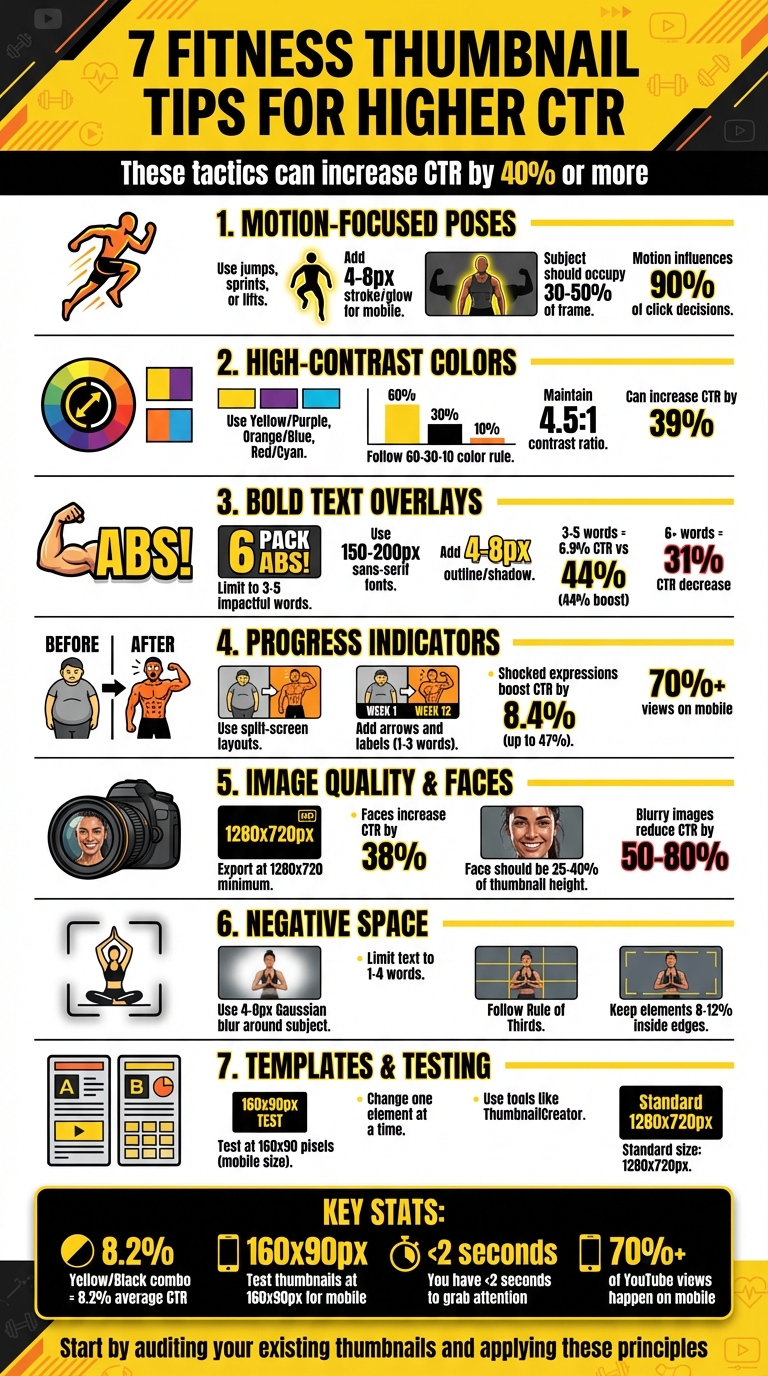
7 Fitness Thumbnail Tips for Higher CTR
Your fitness thumbnail is the first thing viewers notice. To boost clicks, focus on these 7 key strategies:
- Motion-Focused Poses: Use dynamic actions like jumps or sprints to convey energy. Highlight the subject with strokes or blurs to stand out on mobile.
- High-Contrast Colors: Pair bold colors (e.g., Yellow/Black) for visibility. Follow the 60-30-10 rule for balance and avoid overly bright reds or whites.
- Bold Text Overlays: Limit text to 3–5 impactful words. Use sans-serif fonts with outlines for readability on small screens.
- Progress Indicators: Showcase clear before-and-after transformations with split screens, arrows, and concise labels.
- Image Quality and Faces: Use high-resolution images and expressive faces. Faces should occupy 25–40% of the frame for maximum impact.
- Negative Space: Simplify designs with clean backgrounds and proper spacing to guide focus on key elements.
- Templates and Testing: Use tools like ThumbnailCreator for quick edits. Test thumbnails at small sizes (160×90 pixels) to ensure clarity.
These tactics can significantly increase your click-through rate (CTR) - sometimes by 40% or more. Start by auditing your existing thumbnails and applying these principles to improve performance.
7 Fitness Thumbnail Design Tips to Boost Click-Through Rate
How i design viral fitness and workout thumbnails
sbb-itb-b59debf
1. Use Motion-Focused Poses
Action-packed poses bring energy to your thumbnails, breaking the monotony of static, lifeless images that dominate most feeds. Picture this: someone scrolling through countless photos of people just standing around. Now imagine a thumbnail featuring someone mid-jump, mid-sprint, or mid-lift. That burst of energy grabs attention and makes them pause - exactly what you want.
Motion adds life to your visuals. It communicates energy, urgency, and a sense of excitement - qualities that resonate with fitness enthusiasts. For example, a running shot with a hint of motion blur screams speed and intensity. A mid-air jump captures raw excitement, while a victory pose with arms raised shouts triumph and transformation. These dynamic visuals don’t just show the workout - they make viewers feel it.
When designing for mobile screens (often 160×90 pixels), it’s crucial to highlight the subject effectively. Use a 4–8 pixel stroke or glow to make the subject pop, blur the background with a similar radius, and position the subject along the vertical thirds to take up 30–50% of the frame. Always test your design at this size to ensure it’s instantly recognizable. If it feels cluttered or unclear, simplify it.
For mobile, exaggerate poses and expressions by 20–30%. While this might look excessive on a larger screen, it translates perfectly on a smartphone, where subtle details can get lost. Considering that fitness thumbnails influence 90% of click decisions, ensuring your motion-focused pose stands out on mobile is absolutely essential.
2. Apply High-Contrast Colors
Using bold color combinations can make your thumbnail stand out, especially on smaller screens like 320x180 pixels. At that size, your subject and text need to remain sharp and easy to read, even at a glance.
Some effective color pairings are Yellow/Purple, Orange/Blue, Red/Cyan, and Green/Magenta. These combinations naturally draw the eye to key parts of your thumbnail. To keep your design visually appealing and balanced, follow the 60-30-10 rule: dedicate 60% to a dominant color, 30% to a secondary color, and 10% to an accent color.
Colors also carry emotional weight, which can influence your click-through rate (CTR), especially for fitness-related content. For example:
- Red and Orange: These colors suggest energy, urgency, and excitement - perfect for high-intensity workout or weight-loss videos.
- Green: Often associated with health and wellness, it's ideal for nutrition or recovery content.
- Yellow: Bright and optimistic, it works well for beginner-friendly guides.
That said, your colors should support your video's message rather than just being flashy for attention.
Technical Tips for Color and Readability
To avoid issues with YouTube's compression, steer clear of pure red (#FF0000) and pure white (#FFFFFF), as these colors can appear washed out. Instead, use slightly muted versions like darker reds or off-whites. Test your thumbnail in grayscale to confirm that the key elements remain clear and distinguishable.
For text readability on mobile, add 8–12px outlines (strokes) to separate text from vibrant backgrounds. Also, maintain a contrast ratio of at least 4.5:1 between your text and background to ensure the message is instantly readable. Lastly, avoid placing critical elements in the bottom-right corner since YouTube's timestamp overlay can obscure them.
3. Limit Text to Bold Overlays
When viewers glance at thumbnails, they make split-second decisions - so bold text is your best friend for grabbing attention. The idea is to make your video's value immediately obvious without requiring extra effort from the viewer.
On mobile, thumbnails can shrink down to just 168x94 pixels. To ensure clarity, stick to 3–5 impactful words that highlight the result, like "ABS FAST!" or "FAT LOSS", instead of longer, process-focused phrases like "How to Lose Weight". Research shows that thumbnails with bold, concise text (3–5 words) achieve an average CTR of 6.9%, compared to 4.8% for those without text - a 44% improvement. On the flip side, including 6 or more words decreases CTR by 31% because the text becomes unreadable on smaller screens.
For design, use bold, sans-serif fonts like Montserrat Extra Bold, Impact, or Bebas Neue at a size of 150–200px on a 1280x720 canvas. Add a 4–8px contrasting outline or drop shadow to make the text pop against busy backgrounds, such as gym scenes - this simple tweak can increase CTR by 23%. Always test your thumbnail at 160x90 pixels; if the text isn’t crystal clear, adjust the font size or reduce the word count.
Finally, avoid placing text in the bottom-right corner of your thumbnail, as YouTube’s timestamp overlay will obscure it. By keeping your text clean, bold, and strategically placed, you’ll ensure that every element of your thumbnail works toward boosting your CTR.
4. Feature Progress Indicators
Dramatic before-and-after visuals can spark curiosity and drive clicks. By showcasing clear progress, you not only grab attention but also build trust with your audience. It's all about creating a visual story that’s easy to understand at a glance.
To make an impact, design your thumbnail to highlight the transformation clearly. A split-screen layout works well - use a vertical divider to separate "before" and "after" images. Keep the lighting and camera angles consistent to maintain credibility. Enhance the "after" side with bold red or yellow arrows and a simple, focused label like "TRANSFORMED." This approach ensures your message is clear, even on smaller mobile screens.
Since more than 70% of views happen on mobile devices, it’s crucial to use bold, legible fonts for your labels. Stick to 1–3 impactful words, such as "30 DAYS" or "RESULTS", because thumbnails shrink to as small as 168×94 pixels on mobile.
"The goal is zero cognitive load; the viewer should absorb the text's meaning in a fraction of a second".
To make your subject stand out, add a 4–8 pixel stroke or outer glow around the person in the "after" shot. Pair this with high-contrast colors for text overlays, and, if possible, include an expressive face. A surprised or shocked expression can significantly boost click-through rates - studies show shocked expressions alone can lead to an average CTR increase of 8.4%, with boosts of up to 47% in some cases.
Finally, always test your thumbnail by shrinking it to 160×90 pixels to ensure all critical elements remain visible. Avoid placing essential details in the bottom-right corner, as the timestamp may obscure them.
5. Optimize Image Quality and Faces
High-resolution images are a must if you want your thumbnails to look polished and professional. Blurry visuals can slash your click-through rate (CTR) by 50%–80%, as they often come across as unprofessional or even spammy. To ensure clarity, start with a source resolution of at least 1920x1080 and export at 1280x720. Thanks to YouTube's October 2025 update, file size limits have jumped from 2MB to 50MB, allowing for sharper visuals across all devices, from smartphones to TVs and retina displays.
But technical quality isn't the only factor - emotions play a huge role. Thumbnails with clear, expressive faces can increase CTR by 38%. Faces grab attention because they convey emotion instantly, giving viewers a sense of what to expect before they even read the title.
"Faces stop the scroll faster than anything else. Your brain is trained to read expressions, and emotion pre-sells the result before anyone reads a word."
For fitness-related thumbnails, aim to have the face take up 25%–40% of the thumbnail's height. To make muscles pop, use side lighting - it creates sharp shadows that define the physique far better than soft overhead lighting.
Before hitting publish, test your thumbnail at a reduced size of 160×90 pixels. If important details aren’t clear, consider enlarging your subject or simplifying the background using a 4–8 pixel Gaussian blur.
"Exaggeration beats realism. A natural smile won't cut it."
6. Incorporate Negative Space
When paired with bold colors and dynamic text, smart use of negative space can guide the viewer's focus effectively.
Negative space refers to the empty area surrounding your subject. It helps to isolate the main subject, making the overall design clearer and more impactful. Overcrowding visuals with too many elements can confuse viewers and even reduce click-through rates (CTR).
"Whitespace is to be regarded as an active element, not a passive background." – Jan Tschichold
The idea is to give your design some "breathing room", drawing attention to a clear focal point - such as an athlete or a specific muscle group in fitness thumbnails. Adding a 4–8 pixel Gaussian blur around the subject can help separate it from the background. This technique not only enhances clarity but also ensures the design remains readable on smaller mobile screens.
For text overlays, stick to just 1–4 impactful words and limit additional graphics to one or two simple elements, like an arrow or icon. Position the main subject along the left or right third of the frame, following the Rule of Thirds, and leave the opposite side as a text-safe area.
"If everything yells for your viewer's attention, nothing is heard." – Aarron Walter
To ensure your design works across platforms, test it at a reduced size of 160×90 pixels to confirm all elements remain clear. Also, keep crucial design elements at least 8–12% inside the edges to avoid accidental cropping.
7. Test with Templates and Swaps
When it comes to creating eye-catching visuals, pre-made templates and strategic element swaps can take your designs to the next level. Using templates not only ensures consistency but also simplifies the process of testing elements that drive clicks. Create master files in tools like Photoshop, Canva, or Figma, embedding your brand essentials - logo, color scheme, and fonts - while leaving designated areas for swapping in fresh images or text. This method keeps your production process efficient while reinforcing a recognizable visual identity. Plus, it sets the stage for testing tweaks that can fine-tune your thumbnails for maximum impact.
Systematic testing is where the magic happens. By changing only one element at a time - like swapping a neutral facial expression for a surprised one, or switching to a bold, high-contrast background - you can pinpoint what truly resonates with your audience.
Once your templates are ready, it’s crucial to test how these changes look on mobile devices. With over 70% of YouTube views happening on mobile, reducing your thumbnail to about 160×90 pixels helps ensure that key details - like facial expressions, muscle definition, or progress indicators - stay clear and legible.
To make this process even smoother, tools like ThumbnailCreator come with built-in features for face and object swapping. These templates are designed for the standard 1280×720 pixel size, allowing you to tweak elements while keeping your brand consistent across your fitness content.
When swapping faces, choose expressions that genuinely match your video’s tone. For example, shocked expressions tend to deliver an average 8.4% click-through rate (CTR), but they should align with the actual content of your video. To make your subjects stand out, apply a subtle 4–8 pixel stroke or glow effect. For text, stick to 1–2 bold, sans-serif fonts like Montserrat or Impact, ensuring your message is easy to read even at smaller sizes.
Conclusion
Creating effective fitness thumbnails is all about mastering design choices that grab attention in less than two seconds - the time you have to convince someone to click on your video. Every element, from dynamic poses to bold text, plays a role in drawing viewers in.
Research shows that small changes can make a big impact. For example, clear facial expressions can boost click-through rates (CTR) by up to 47%, while limiting text to 3–5 words can improve CTR by 44%. Even something as simple as using high-contrast colors can increase CTR by 39%. Combining these strategies - like action shots that show effort and high-contrast color schemes (yellow and black, for instance, averages an 8.2% CTR) - can transform underperforming videos into hits.
To save time, tools like ThumbnailCreator simplify the process. With features like AI-powered thumbnail creation, face swapping, and ready-to-use templates optimized for YouTube’s 1280×720 resolution, you can quickly test designs and find what works. Instead of hours spent in complex design software, this platform helps you iterate efficiently, tweaking expressions or elements without starting over.
Ready to take action? Start by auditing your current thumbnails. Use YouTube Analytics to find videos with below-average CTR. Then, apply the "shrink test": scale thumbnails down to 160×90 pixels and check if the subject, expression, and text are still clear. If they’re not, make updates immediately. Simplify the design, increase contrast, and test new versions. Regular testing ensures your thumbnails stay optimized for both mobile and desktop users.
As YouTube growth strategist Daniel Whitmore explains:
"YouTube's algorithm tests your video by showing the thumbnail to a small group of viewers first. If people click, YouTube pushes it to more people. If they don't, your video dies quietly".
Every thumbnail is a chance to boost your video’s performance - don’t let it go to waste.
FAQs
What makes a fitness thumbnail “mobile-friendly”?
A fitness thumbnail is considered mobile-friendly when it remains clear and easy to read, even at smaller sizes like 120×90 pixels. To achieve this, use bold fonts, high-contrast colors, and sharp visuals. These elements help your thumbnail grab attention on mobile devices, which account for over 70% of YouTube views.
How do I pick colors that stay clear after YouTube compression?
To maintain clear colors after YouTube compression, stick to high-contrast combinations such as yellow and black, red and white, or blue and orange. These pairings enhance visibility, even on smaller screens. Bright, warm tones like red, orange, and yellow are great for catching attention, but pairing them with enough contrast is key for clarity. To ensure your thumbnails perform well across devices, consider testing your color schemes using A/B testing or specialized tools.
What’s the easiest way to A/B test thumbnails without redesigning from scratch?
The simplest method is to use YouTube Studio's Test & Compare feature. This tool allows you to upload up to three different thumbnail variations, and YouTube automatically tests them by showing each version to different viewers. You can then analyze performance metrics like clicks and watch time. The best part? You don’t need to create brand-new designs - just tweak your current thumbnails slightly and let YouTube do the heavy lifting.