
How Frames Boost Thumbnail Visibility
If people can’t spot your thumbnail in about 1.5 seconds, your video may miss an impression. That’s why I use frames to make the main subject stand out fast, hold text together, and keep the layout clear on small mobile screens.
Here’s the short version:
- Frames help guide the eye to one main subject
- High contrast matters more than fancy color choices
- Thick borders and text strokes hold up better on mobile
- Simple layouts with up to three focal points tend to get more clicks
- Small-size preview checks at 120–150 px wide can catch weak thumbnails before I publish
- Channel-wide frame rules can help with repeat recognition
- A/B testing one frame change at a time shows what gets more clicks and watch time
A few numbers stand out:
- YouTube counts an impression only after a thumbnail is on screen for at least 1.5 seconds
- Thumbnails built around three main focal points have shown 25%–35% CTR gains in tests
- Channels with steady thumbnail branding can see 15%–25% higher CTR from returning viewers
- Creators who test thumbnails often have seen about 31% more total views
What I take from all of this is simple: a frame should help the eye, not add clutter. If the subject, text, and edge treatment still read well at a small size, the thumbnail is in much better shape to earn the click.
5 YouTube Thumbnail Rules to Boost Click-Through Rate (CTR)
sbb-itb-b59debf
Choose the Right Frame Style for Your Video
YouTube Thumbnail Frame Styles Compared: Visibility, Branding & Best Use Cases
Pick a Frame Based on What Needs Attention
Once you know what a frame does, the next move is simple: pick the style that pulls the eye to ONE focal point.
Your frame should support the main subject in the thumbnail, whether that's a face, product, or text hook. If you're using a face, let the frame separate it from the background so it stands out fast. If the focus is a product or a text hook, a color block behind it can do that same job with less visual noise.
Frame color matters too. Match it to the tone of the video:
- Blue for trust
- Red for urgency
- Yellow for high-energy content
Use Color, Thickness, and Placement That Hold Up on Mobile
Go with thick frames. Thin decorative borders tend to disappear at feed size.
High contrast vs low contrast is non-negotiable here. Make sure your text and frame colors stand apart, keep key details away from the edges, and avoid the bottom-right corner, where the duration badge can cover part of the thumbnail.
A quick gut check helps: preview the thumbnail at 120 to 150 pixels wide. If the frame or text falls apart at that size, it won't hold up in the feed.
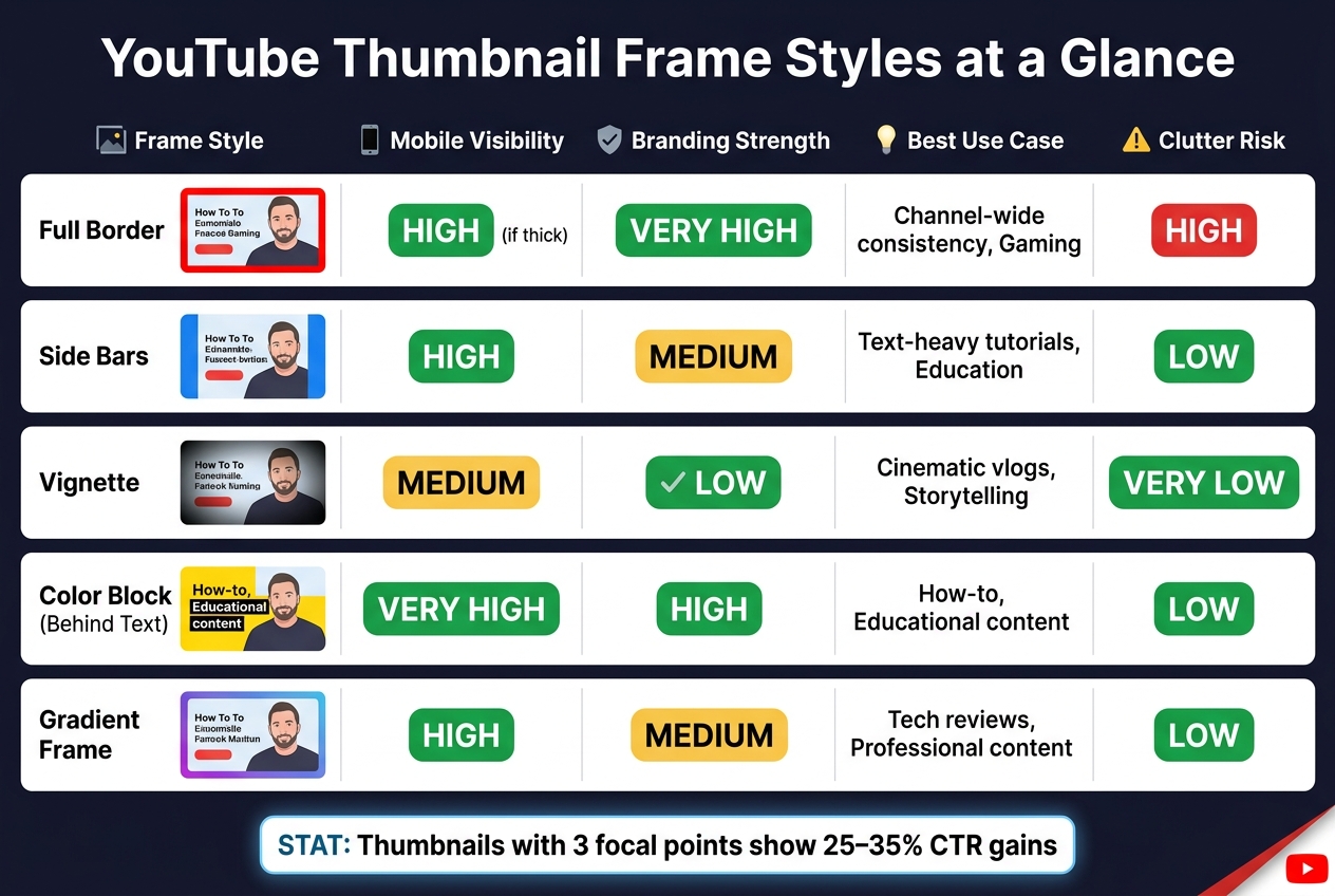
Compare Common Frame Styles Before You Build
Use this table to match the frame style to your content type.
| Frame Style | Mobile Visibility | Branding Strength | Best Use Case | Clutter Risk |
|---|---|---|---|---|
| Full Border | High (if thick) | Very High | Channel-wide consistency, Gaming | High |
| Side Bars | High | Medium | Text-heavy tutorials, Education | Low |
| Vignette | Medium | Low | Cinematic vlogs, Storytelling | Very Low |
| Color Block (Behind Text) | Very High | High | How-to, Educational content | Low |
| Gradient Frame | High | Medium | Tech reviews, Professional content | Low |
Start with the simplest frame that fits the content, then build the rest of the thumbnail around it in the next step.
Build a Thumbnail With Frames Step by Step
Once you've picked a frame style, build the thumbnail in this order.
Start With One Clear Focal Image
First, lock in one main subject. Don't split attention across too many elements.
Your focal image should fill enough space to stay clear on mobile. Strong thumbnails usually use high luminance contrast. A bright subject on a dark background, or a dark subject on a bright background, is much easier to spot at a glance. That contrast also gives the frame a clean edge to work with.
Use a natural expression that fits the video. If you are just starting out, follow a YouTube thumbnail beginners guide to master the basics.
Once the subject is set, place the frame around it, not the other way around.
Add the Frame and Place Text for Readability
Build the subject first so the frame and text back it up instead of fighting for attention.
Add:
- a 3–5 px outline around the subject
- a 2–4 px stroke on the text
- a 5–10 px border around the canvas
Use black on light text or white on dark text so everything stays readable on mobile.
Preview the Thumbnail at Small Sizes Before Publishing
Check the thumbnail at feed size. That's where frame clarity matters most.
Scale the thumbnail to about 150 px wide. Then look at it from arm's length and check three things: readable text, a clear subject, and one focal point.
If any of those answers is no, tweak the frame thickness, text size, or subject contrast.
A solid edge frame reads faster at small sizes because it gives the thumbnail a clear boundary.
If the thumbnail still reads well at that size, use that layout as your channel's default frame pattern.
Build a Consistent Frame System and Test It
After a frame clears the feed-size check, use it across your channel.
Create a Repeatable Frame System for Your Channel
Once a thumbnail works at feed size, turn it into a system. Pick 2–3 signature colors, 1–2 fonts, and one frame treatment you can repeat on most uploads. Then lock those choices in. Write down the hex codes, font weights, and subject placement in a simple brand kit so each thumbnail starts from the same base.
That kind of visual consistency matters. Channels with steady thumbnail branding see a 15–25% higher click-through rate (CTR) from returning viewers than channels that keep changing their look.
Here’s the simple rule: change the subject and the hook, but keep the frame. Use the same frame on most videos, and save exceptions for milestone uploads or collaborations. Every 6 months, review your last 20 thumbnails and check for drift in color or layout. If someone can’t spot the pattern at a glance, the system probably needs tightening before recognition starts to slip.
Once that setup is in place, the next step is testing which version of the frame gets the most clicks.
Use YouTube Analytics to Refine Your Frame Choices
Use YouTube Analytics to check whether your frame is driving clicks, not just making things look orderly. In YouTube Studio, the "Test & Compare" tool lets you test up to three thumbnail versions at the same time, moving beyond A/B testing vs gut feeling to find what works. YouTube rotates them across viewers and picks a winner based on watch-time share.
The big rule here is simple: test one variable at a time. For example, change the frame color but keep the subject and text exactly the same. That makes the result easier to trust. Creators who A/B test every upload see an average 31% increase in total views compared with creators who stick with one thumbnail.
In YouTube Analytics, compare Returning Viewer CTR with New Viewer CTR. Also compare framed thumbnails with unframed ones to see whether the system is helping drive repeat clicks. If CTR goes up but watch time drops, the frame is getting the click but not matching the promise of the video. In that case, tweak the color, thickness, or placement.
Common Frame Mistakes and Final Takeaways
Mistakes That Reduce Thumbnail Visibility
Once you've built and tested the frame, the next step is simple: cut the stuff that hurts visibility first.
The biggest problem is usually too much going on at once. Extra layers, weak contrast, and busy edges all make it harder for the eye to lock onto the main subject. When that happens, the thumbnail loses its punch fast.
Low contrast can do just as much damage. If the subject, frame, and text all sit in a similar tonal range, they start to melt into the background and become harder to spot in the feed.
Edge placement trips people up too. Put faces, text, or frame details too close to the corners, and YouTube's UI can cover them up. That includes the video duration badge.
| Frame Mistake | Impact on Visibility | Simple Fix |
|---|---|---|
| Too many layers | Eye can't find a focal point | Remove elements until only one clear subject remains |
| Low-contrast colors | Subject and frame blend into the background | Use high-contrast pairings, like yellow text on a dark background, and apply thumbnail color psychology |
| Elements too close to the edges | UI overlays block faces or text | Move key elements into the safe zone, especially center-left |
| Thin lines or small text | Details disappear on mobile screens | Use bold borders and heavy-weight fonts |
| Branding overload | Logos and color bars crowd out the visual hook | Shrink or remove branding so the subject leads |
Fix these issues before you try adding anything new. In most cases, they matter more than one more graphic, badge, or design trick.
Before you publish, do one last small-size check. If the focal point or frame doesn't stand out right away, it probably won't survive on mobile.
Conclusion: Use Frames to Guide Attention, Not Add Noise
A frame works only when it directs the viewer to one clear thing.
Use one focal image. Add a high-contrast border that still shows up at small sizes. Keep text to five words or fewer. Place all key elements inside the safe zone. Then test the thumbnail small before it goes live.
It also helps to build a steady frame system with the same colors, line weight, and placement. From there, use YouTube Analytics to see what actually earns clicks. The goal is simple: point attention at one subject, then cut anything that adds clutter or weakens contrast.
FAQs
What frame style works best for my videos?
The best frame style is the one that helps your thumbnail break the visual grid and make the subject stand out fast. Skip the usual boxed look when you can. A subject that reaches the edges, leans into a diagonal layout, or fills the shot with an extreme close-up often has more punch.
For visibility, keep your main subject at 40% to 60% of the frame. Also, avoid putting key details in the bottom-right corner, since the YouTube duration badge can cover them.
How can I tell if my thumbnail frame is too cluttered?
Try the squint test. Shrink your thumbnail to about 120 × 90 pixels, then squint at it.
If the main subject doesn’t stand out right away, or your eye doesn’t move from the subject to the text in a natural way, the frame is probably too busy.
You can also use ThumbnailCreator to check clutter by looking at visual balance, text length, and negative space.
A simple target is the Rule of 3:
- one main subject
- one short text element
- one supporting graphic
Should I use the same frame on every thumbnail?
No. Using the same frame on every thumbnail can wear people out and make your videos look too similar in recommendations.
It’s better to keep a clear brand style through your colors or typography, while changing the frame enough so each video has its own look. That way, your channel still feels connected, but individual videos don’t blur together.
ThumbnailCreator can help you test different frame styles without losing that overall brand look.