

How AI Tools Improve Thumbnail Tweets on Twitter
If your thumbnail does not stop the scroll, your tweet will likely miss the click. For YouTube creators posting on X, AI tools can cut thumbnail work from 30–90 minutes down to a few minutes, while making images easier to read on mobile and easier to test. That matters because image posts often get more likes, reposts, and clicks than text-only tweets, and small design fixes can lead to 10%–20% more link clicks over time.
Here’s the short version:
- Manual thumbnails often fail on X because text gets too small, layouts feel busy, and YouTube-first designs do not always fit the feed.
- AI tools help fix that by tightening the crop, improving contrast, cleaning up the background, and shortening text.
- The best thumbnail tweets are simple: one subject, one idea, and 3–5 words people can read fast.
- Testing gets easier with AI because you can make multiple versions fast and compare impressions, engagement rate, and link clicks.
- A solid export setup matters too: 1,200 × 675 pixels, under 5 MB, with PNG for text-heavy images and JPG for photo-heavy ones.
- Results should be measured, not guessed. If AI thumbnails keep beating manual ones across several posts, keep that style as your default.
Here’s a quick side-by-side view:
| Area | Manual workflow | AI workflow |
|---|---|---|
| Time per thumbnail tweet | 30–90 minutes | Often just a few minutes |
| Readability on X | Can shrink or blur | Built for fast mobile viewing |
| Version testing | Slow to make variants | Easy to make 2–3 options |
| Brand consistency | Can drift post to post | Easier to keep a set look |
| Main goal | Get a usable image out | Get more clicks with less work |
I see the main takeaway like this: if you want more traffic from X to YouTube, the thumbnail is not a small detail. It is the first test your post has to pass.
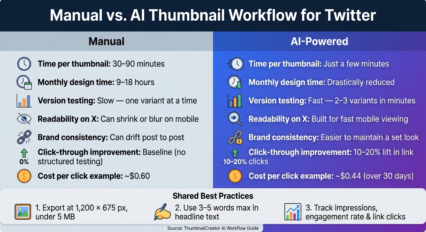
Manual vs AI Thumbnail Workflow for Twitter: Key Stats & Outcomes
Create AI Thumbnails That Actually Get High CTR [Here's My Prompt System]
sbb-itb-b59debf
The Problem: Why Manual Thumbnail Tweets Often Underperform
Manual thumbnail tweets tend to flop for one simple reason: the image doesn't win that first click. You can have a strong video and solid tweet copy, but if the thumbnail doesn't stop the scroll, the post still loses.
Design issues that reduce tweet engagement
Twitter moves fast. In that kind of feed, a thumbnail needs to get across one clear idea almost instantly. Manual thumbnails often miss because they lean on tiny text, low contrast, or too many elements fighting for attention.
That clutter adds up fast. A face, a busy background, title text, and extra graphics might look fine in a design file, but in the feed, it can turn into a blur. On the other hand, thumbnails built with clean, high-contrast design can lift click-through rates by 40% or more, while common thumbnail mistakes like low-contrast or cluttered layouts usually do worse.
A thumbnail can look fine on YouTube and still fall flat on Twitter.
Why YouTube thumbnails do not always work on Twitter
YouTube thumbnails are made for a different setting. On Twitter, that same image shows up on its own and has to make sense without extra context.
That's a big deal. If a thumbnail depends on surrounding context, it can become hard to read on Twitter, where instant clarity and emotional pull matter more. Reusing the same image by hand often skips over that platform gap.
The time and consistency costs of manual thumbnail work
Making a thumbnail fit Twitter usually means going back into the file, adjusting the layout, and exporting a new version. That process can take 45–90 minutes per post, which can add up to 9–18 hours of design work per month.
A lot of creators don't bother. They just repost the YouTube thumbnail as-is. The problem is that manual edits also lead to inconsistent branding, which makes it harder for followers to recognize a creator's content at a glance. And when the image underperforms, impressions stop turning into clicks.
That's why creators need a faster way to adapt thumbnails for Twitter without slowing down publishing.
The Solution: How AI Tools Improve Thumbnail Tweets
AI thumbnail tools solve two problems at the same time: weak visuals in the feed and slow production. They can generate clean, platform-ready images in minutes. That’s the big win here. You’re not just getting a better-looking thumbnail. You’re also cutting down the time it takes to make one.
AI features that help thumbnails stand out in the feed
The biggest gains come from three capabilities tied directly to mobile feed visibility. AI can crop to the main subject, boost contrast, clean up the background, and simplify the layout for fast-scrolling feeds. In plain English, it helps strip away the clutter so one subject and one short text block stand out.
Text treatment matters just as much. AI tools can spot when an overlay is too long or too thin, then suggest bolder fonts, stronger outlines, and high-contrast color pairings. The goal is simple: keep the message readable at a glance, ideally in 3 to 5 words that show a clear outcome. That kind of instant clarity can help a tweet earn the click.
How AI cuts production time and supports faster testing
AI also makes iteration much faster. Instead of reworking one thumbnail by hand, creators can generate several finished versions in minutes by entering a video title or key topic and picking a style.
A simple way to A/B test thumbnails is:
- Post two or three versions at similar times
- Try different angles, like one with a close-up face and one that highlights a result
- Compare impressions and link clicks over a few days with Twitter analytics
That makes it easier to see what actually drives clicks on Twitter.
Faster production and testing turn thumbnail design into a process you can repeat without a lot of manual work.
Next, these same AI advantages become practical inside ThumbnailCreator.
Using ThumbnailCreator to Build Better Thumbnail Tweets
ThumbnailCreator puts those AI gains into a simple workflow for Twitter promotion. The idea is straightforward: make a stronger thumbnail fast, then use that image in your tweet with the video link.
For Twitter, the big win is speed. You can build a promo image that looks sharper and reads better without spending extra time fixing it later.
ThumbnailCreator features that support Twitter-ready visuals
ThumbnailCreator includes AI generation, templates, face swapping, text editing, and object swapping. Those tools make it easier to build one clear focal point with bold, readable text.
That matters on Twitter. People scroll fast, so your image needs to land in a split second. A clean subject and a short headline based on current thumbnail trends give you a better shot at stopping the scroll without doing a bunch of extra rework.
How to adapt a ThumbnailCreator design for Twitter posts
Set the subject and headline in the center, export at 1,200 × 675 pixels, keep the file under 5 MB, and use PNG for text-heavy designs or JPG for photo-based visuals.
Centering helps the image stay readable on Twitter, where previews can crop or shrink the design. If you want to try the workflow first, the free plan gives creators a way to test it before moving to a paid tier.
Pricing and accessibility for creators
ThumbnailCreator offers a Free Plan at $0 for basic use and limited AI credits. If you need more output, the Pro and Agency plans are built for creators and teams. And the pricing model is simple: 1 credit equals 1 AI thumbnail.
Measuring Results: What Changes After Switching to AI
How to compare manual and AI-enhanced thumbnail tweets
Once your thumbnail is live, the next step is simple: check whether the AI version gets more clicks.
Track the same numbers for every post, then review them each week. In X Analytics, pay close attention to impressions, engagement rate (total engagements ÷ impressions), and link clicks to your YouTube video. Out of those, link clicks matter most because they show whether the thumbnail got people to act.
A clean way to test this is to pick one video and make two thumbnail tweet versions: one manual and one built with AI. Post them at similar times, and keep the tweet copy and hashtags exactly the same. That way, the thumbnail is the only thing changing.
Run the test for 7–10 days, then compare each post side by side. If you keep seeing a 10%–20% lift in link clicks across several posts, the AI workflow is doing better.
Use the same post copy so the thumbnail is the variable.
| Aspect | Manual Workflow | AI-Enhanced Workflow |
|---|---|---|
| Visual clarity | Depends on design skill | Better layouts, bold text, strong focal points |
| Engagement outcomes | Baseline; harder to improve fast | More room for higher link clicks through faster testing |
It also helps to watch the softer signals around the post. Look at replies that mention the thumbnail, quote reposts, and average watch time in YouTube Analytics. Those clues can tell you whether the image drew in the right viewers, not just more viewers.
If you're running paid promotion, CPC gives you another clear benchmark. For example, if cost per click drops from $0.60 to $0.44 over a 30-day period, that's a direct sign that the visuals are sending traffic more efficiently.
Key takeaways for creators who want more clicks from Twitter
Thumbnail tweets tend to work best when the image is simple, bold, and easy to read in a fast-scrolling feed. One clear subject, short headline text, and strong contrast usually beat a busy design. That's where manual workflows can start to drag. If you're posting multiple videos each week, the time needed to make, test, and revise thumbnails adds up fast.
Use the top style as your default for future posts. AI tools make this easier by helping you put together polished thumbnails fast and test several versions in a structured way. For creators who want a repeatable system - design in ThumbnailCreator, post to Twitter, track impressions and link clicks, and adjust based on what wins - that process turns thumbnail design into a steady traffic channel from X to YouTube.
FAQs
How often should I test new thumbnail versions on X?
Test new thumbnail versions on X with a structured approach instead of winging it. Let each test run for 7 to 14 days so you can see both weekday and weekend patterns, and try to get 1,000 to 5,000 impressions for each version.
For clean results, change only the thumbnail during the test. If you swap the title or tweak other elements at the same time, it gets a lot harder to tell what actually made the difference. ThumbnailCreator can help you make multiple versions faster, which makes A/B testing more consistent.
What makes a thumbnail readable on mobile?
Keep the design clean and uncluttered with one clear subject.
Limit text to 3 to 5 bold, sans-serif words. Use fonts at 200 pt or larger, and pick high-contrast colors so the text stands out right away.
Leave the lower-right corner empty so the YouTube timestamp doesn’t cover anything important.
Then do a squint test or scale the image to 120 pixels wide. If the text and main focal point are still easy to spot, you’re in good shape.
When should I use PNG instead of JPG?
The available search results don’t say when to use PNG instead of JPG.
So this question can’t be answered from the source material provided.