

How Colors Impact Thumbnails for Course Promotion
Thumbnail color can change clicks and course sales before anyone reads your title. If your text is hard to read, your color mood feels off, or your thumbnail blends into YouTube, people skip it.
Here’s the short version:
- Use strong contrast first. Low-contrast thumbnails often fail on mobile, and 82% of YouTube mobile users use dark mode.
- Match color to the course topic. Blue fits trust and skills, green fits money and progress, and warm colors fit launch urgency.
- Keep the palette simple. One main color, one accent, and one clean text area usually work better than a busy mix.
- Test background color first. A background change alone can shift CTR by 18% to 25%.
- Judge results by business numbers. I’d track CTR, watch time, and revenue, not clicks alone.
A few pairings often stand out in the feed:
- Yellow + black
- Orange + navy
- Cyan + charcoal
I’d also keep one color system across the full launch series. That makes each thumbnail easier to spot and helps the course line feel more polished.
| What to check | What to do |
|---|---|
| Text is hard to read | Add more contrast, use white text, add a dark overlay |
| Thumbnail blends into YouTube | Change the background and add one strong accent |
| Color feels wrong for the topic | Switch to a color that fits the offer |
| Too many colors compete | Cut it down to one main color and one accent |
If I had to sum it up in one line: pick colors for performance, not personal taste.
Master Color Theory for YouTube Thumbnails
sbb-itb-b59debf
Where course thumbnails go wrong with color
Most thumbnail color mistakes come down to three things: text that’s hard to read, colors that send the wrong signal, and palettes that feel too busy. None of these problems scream for attention. They just chip away at clicks before someone even thinks about the course.
The fix is pretty simple: use stronger contrast, pick colors that fit the topic, and keep the palette tight.
Low contrast makes titles, promises, and prices hard to read
Weak contrast is one of the most common mistakes. A pale background with light text might look neat on a desktop screen, but at mobile size it can turn into a blur.
That matters more than a lot of people think. 82% of YouTube mobile users use dark mode, so low-contrast or medium-gray thumbnails can fade into the interface. And midtone backgrounds underperform high-contrast designs by 22%.
If people can’t read the promise or the price in a split second, the offer is easy to miss. The answer is direct: create more separation between the text and the background.
The color mood does not match the course topic
Color sets the tone fast. The palette should match what the course is offering, balancing brand colors vs. optimized colors: red for urgency, blue for trust, green for growth.
So yes, bold reds can work well for deadline-based promos. But on a calm coaching or mindfulness course, that same red can feel harsh or even alarming. On the flip side, flat gray or washed-out midtones on a premium business course can make the offer seem generic instead of worth the price.
When the colors line up with the topic, the thumbnail feels more believable and more relevant.
Too many accent colors slow down viewer decisions
A thumbnail packed with accent colors makes the eye work harder than it should. Viewers lock onto the highest-contrast point in about 50 milliseconds, so a setup with one main color, one accent, and one clean text area will usually beat a busier palette.
When several colors compete at once, the path to the click gets slower. And that’s where these color mistakes start to cost you.
Color rules that improve clicks for paid course promotion
Use these rules to turn the fixes above into a palette that fits the offer and reads fast. The idea is simple: match the course promise, keep contrast high, and make sure the thumbnail stands apart in the feed.
Match color meaning to the course category
Color sends a signal before anyone reads a single word. If that signal matches what the course is selling, the offer feels easier to trust and click.
| Color | Meaning | Best Fit | Risk |
|---|---|---|---|
| Blue / navy | Trust, expertise, stability | Technical, professional skills, coaching, certifications | Can blend into YouTube's interface if too muted |
| Green | Growth, money, progress | Finance, investing, business, productivity | Can look generic or "eco" if the shade is too soft |
| Purple / gold | Premium, exclusive, creative | High-ticket programs, certifications, luxury positioning | Can feel flashy or insincere if too saturated |
| Orange / yellow | Energy, urgency, attention | Beginner offers, launches, limited-time enrollment | Can feel harsh or reduce perceived sophistication if overused |
A blue or navy thumbnail, for example, tends to fit courses tied to skills, training, or credentials. Green often works for money and growth topics. Purple or gold can push a higher-end feel. Orange and yellow grab attention fast, which makes them useful for launches and beginner offers.
Prioritize contrast over finding the perfect hue
Contrast matters more than the exact shade. If the thumbnail fails at mobile size, the specific color choice won't save it.
Check the thumbnail small. If the promise, instructor face, and offer cue aren't instantly readable, increase contrast. In many cases, that means the background needs to work harder.
Changing the background color alone produces an average CTR shift of 18–25% (well above standard CTR benchmarks), which makes it the first thing worth testing with an A/B test.
Pick colors that stand out in YouTube's interface
After contrast, look at the feed itself. The next question is blunt: does the thumbnail still separate from everything around it?
Use pairings that break from the feed, like:
- Yellow-black
- Orange-navy
- Cyan-charcoal
For business and finance topics, orange-navy can signal professionalism with urgency. For creative courses, cyan-charcoal feels modern and distinct. The goal isn't loud color. It's instant separation from nearby thumbnails.
Color systems to fix underperforming course thumbnails
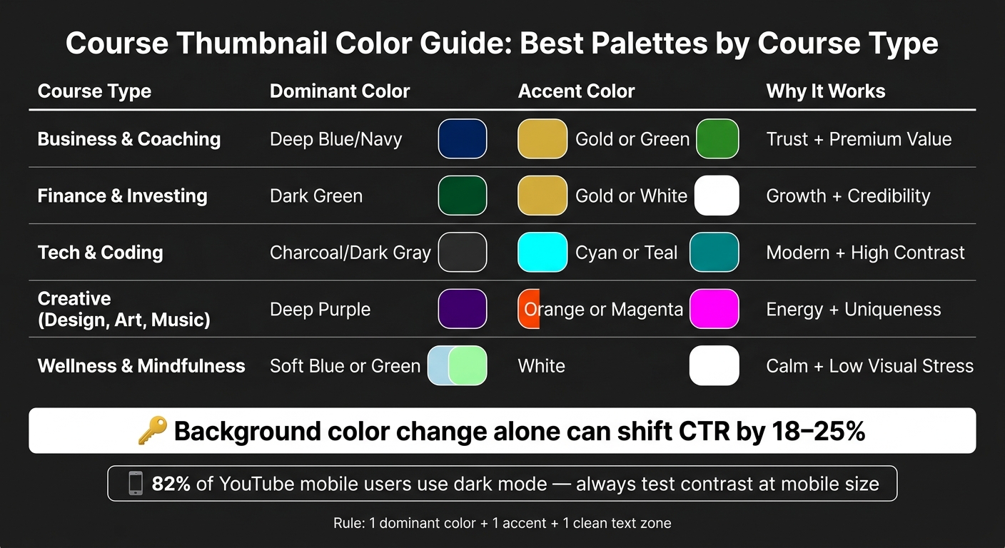
Course Thumbnail Color Guide: Best Palettes by Course Type
You can turn those color rules into a system you use across an entire launch. The point isn't to make random color picks for each thumbnail. It's to set a default look that fits the course topic and helps people understand the offer at a glance.
Recommended color palettes by course type
Start with a default palette based on the kind of course you're selling. This lines up with what viewers already expect to see.
| Course Type | Dominant Color | Accent Color | Text Zone | Why It Works |
|---|---|---|---|---|
| Business & coaching | Deep blue or navy | Gold or green | White | Trust, premium value |
| Finance & investing | Dark green | Gold or white | White | Growth, credibility |
| Tech & coding | Charcoal or dark gray | Cyan or teal | White | Modern, high contrast |
| Creative (design, art, music) | Deep purple | Orange or magenta | White | Energy, uniqueness |
| Wellness & mindfulness | Soft blue or green | White | Dark charcoal | Calm, low visual stress |
These work well as default starting points because they match viewer expectations.
A simple layout rule: one dominant color, one accent, one clear text zone
Keep the layout simple: use one dominant color, one accent, and one protected text zone. Nothing else should crowd that text area.
That gives the main promise room to stand out. And that's the whole job of the thumbnail: help viewers read the core message in under a second.
Common thumbnail color problems and direct fixes
If a thumbnail still isn't pulling its weight, look at the symptom first. Then fix the part that's most likely causing the problem.
| Problem | Likely Cause | Recommended Fix |
|---|---|---|
| Text unreadable on mobile | Low contrast between text and background | Add a solid dark overlay behind text; switch to white font with a stroke |
| Thumbnail blends into the feed | Medium-brightness background with no strong accent; or flat CTR after small edits | Switch to a high-contrast light or dark background; add one vivid accent color; if edits have been minor, radically change the background color - it is the highest-impact variable |
| Feels generic or low-value | No clear dominant color or palette discipline | Apply a category-appropriate palette, like navy with gold for coaching - makes the offer look more credible |
| Wrong emotional tone | Color mood contradicts the course topic | Swap the base color to compare warm vs cool color thumbnails and better match the course promise |
Once you lock in the palette, it gets much easier to make new versions and test them fast.
How to apply and test these color choices with ThumbnailCreator
Build high-contrast course thumbnails faster with AI and templates
Once you’ve picked your palette, ThumbnailCreator helps you put it to work fast. You can turn that color system into a thumbnail template with clear zones for the background, subject, and text.
For example, you might type a prompt like: "dark blue background, bright yellow accents, bold readable text for a marketing course," and the AI will generate a starting point with those contrast rules built in. That gives you a solid first draft without starting from scratch.
Use AI generation, face swapping, and object swapping to support contrast - not to clutter the design. The main goal is simple: keep the text area clean and easy to read. Put the instructor photo in the background zone so it doesn’t compete with the headline. And keep text contrast at 4.5:1 or higher.
Keep brand colors consistent across a course launch series
When the first thumbnail works, stick with that same system across the full launch series. A consistent look helps people spot related videos right away. It can also strengthen trust and make the course feel more polished.
ThumbnailCreator makes this easy with reusable templates. Duplicate one master template, then change only the title or face while keeping the palette, font, and layout the same. You can also store exact hex codes in the editor, so your brand blue or brand gold stays the same across every thumbnail.
A simple way to handle it:
- Create one master template for the series
- Save exact hex codes in the editor
- Keep the palette, font, and layout fixed
- Swap only the title or face when needed
- Save one palette per course type for later reuse
Track whether color changes increase CTR and course revenue
After that, use advanced thumbnail optimization to test color changes one at a time and see what moves the numbers. If you change too many things at once, it gets messy fast. You won’t know what caused the result.
Test one color variable at a time. Run each variant for at least 48 hours before comparing results. Then track CTR, average view duration, and revenue for each color variant. Compare CTR, watch time, and revenue together, not in isolation.
A thumbnail that gets more clicks but leads to weaker watch time or lower revenue may not be the better option.
Conclusion: Better color choices make course thumbnails easier to notice, trust, and click
Random color choices can cost you clicks and sales. If contrast is weak, the mood feels off, or the palette jumps around from one thumbnail to the next, people have a harder time reading the image and feeling good about the course behind it.
After you’ve checked contrast, category fit, and palette simplicity, one thing matters most: does the thumbnail help sell the offer? Color isn’t just decoration. It affects performance. A deliberate background color change can shift CTR by 18–25%.
That’s why the same core rules matter so much. Emotional fit, strong contrast, and a simple palette can turn color into a click driver. Blue and white work well for technical offers. Warm colors fit urgent launches. On mobile, contrast matters more than ever because space is tight and details get lost fast.
It helps to treat color the same way you’d treat pricing or copywriting: as a measurable part of your funnel. Test one variable at a time. Judge the result by CTR and revenue, not by personal taste. A thumbnail that gets more clicks but leads to weaker course sales didn’t do its job.
Keep the palette tight across the whole series. When thumbnails look like they belong together, each new one becomes easier to spot, trust, and click.
FAQs
What colors work best for my course niche?
Choose colors that fit the feeling you want people to have and the level of trust they expect from you.
For education, business, and finance content, navy blue, forest green, or white-and-blue palettes often signal professionalism, reliability, and authority.
If you're promoting fast-moving courses or offers that need immediate attention, go with high-contrast warm colors like red and yellow. They stand out fast and push the eye where you want it to go.
ThumbnailCreator can help you put these ideas into practice with AI-optimized templates and niche-based color combinations.
How can I test thumbnail colors without hurting performance?
Keep the layout, text, and imagery the same. Change only the color scheme.
Tools like ThumbnailCreator can help you make color variations fast.
Before you publish, use a squint test or grayscale test to check clarity and contrast. Then run tests for 48 hours to 14 days and aim for 1,000 to 5,000 impressions per version for more reliable results.
Should I keep the same color style across a course series?
Yes. Keeping a consistent color style across a course series helps build recognition. And channels with a unified design often see 15% to 25% higher click-through rates from returning viewers.
A good rule of thumb is to keep about 80% of your thumbnails consistent. Stick with two or three palettes that fit your channel’s vibe, then make small tweaks where needed. That way, your videos still feel connected without looking copy-pasted.
ThumbnailCreator can help you keep that branding in place while you adjust details like text overlays or accent colors.