
How to Match Thumbnails with Brand Themes
Thumbnails are the face of your content and can make or break your click-through rate (CTR). Consistency in thumbnail design builds trust and helps your audience instantly recognize your videos. Here’s what you need to know:
- Why It Matters: Consistent thumbnails can boost CTR by 15–25% for returning viewers.
- Core Elements: Stick to 2–3 signature colors, 1–2 bold fonts, and a clear layout.
- Design Tips: Use a 60-30-10 composition rule (main content, brand elements, logo) and test for mobile visibility (168×94 pixels).
- Tools: AI tools like ThumbnailCreator can save time by storing brand elements and automating designs.
- Performance Tracking: Monitor CTR, audience retention, and refresh designs every 6–12 months to stay effective.
The key is creating a system that keeps your thumbnails consistent while allowing for slight variations across different content types. Let’s break it down further.
How To Create Great Branded YouTube Thumbnail Designs to get more subscribers
sbb-itb-b59debf
Understanding Your Brand's Visual Identity
Before you dive into designing consistent thumbnails, it’s crucial to nail down the core elements that define your brand’s visual identity. Think of this as your channel’s visual “fingerprint.” These elements - colors, fonts, and patterns - lay the groundwork for creating thumbnails that are instantly recognizable and aligned with your brand.
Core Brand Elements to Use in Thumbnails
Your brand identity boils down to a few key visual components. Color is one of the most powerful tools in your arsenal. Stick to 2–3 signature colors and use them consistently across all thumbnails. A great way to balance colors is with a 3-color framework: dedicate roughly 60% to a dominant color, 30% to an accent color, and 10% to a neutral tone for contrast.
Typography is another essential piece. Choose 1–2 bold, easy-to-read fonts that viewers can instantly associate with your channel. Fonts like Montserrat Bold, Bebas Neue, or Anton work well because they stay legible even on smaller screens, like a phone. Beyond color and fonts, establish a consistent layout for key elements like faces, text, and logos.
To keep things clean and visually appealing, follow a 60-30-10 split for thumbnail composition: allocate 60% to the main visual content, 30% to brand-specific elements (like colors and fonts), and 10% to your logo. This method ensures your thumbnails look polished while reinforcing your branding.
Finally, tie these elements to your channel’s overall personality. Every thumbnail should feel like an extension of your brand’s unique voice.
Matching Brand Personality to Design Choices
Your visual design should reflect your brand’s personality. For instance, a gaming channel and a personal finance channel should look completely different. The colors, fonts, and imagery you choose can communicate your channel’s identity before viewers even read the text.
Here are some examples of how brand personality can guide your design choices:
| Brand Personality | Suggested Color Palette | Psychological Impact |
|---|---|---|
| High Energy (Gaming/Entertainment) | Red + Yellow + Black | Excitement, urgency, attention |
| Professional (Education/Business) | Navy + White + Gold | Trust, authority, premium feel |
| Creative (Art/Cooking) | Teal + Orange + White | Warmth, originality, memorability |
| Tech / Data | Blue + Green + White | Clean, modern, trustworthy |
For example, high-energy channels often lean on bold, high-saturation colors and striking text to grab attention. In contrast, minimalist or professional channels might opt for clean designs and subtle typography to convey precision and credibility.
One key tip: avoid using YouTube’s signature red (#FF0000) as your primary brand color, as there is often a trade-off between brand colors vs. optimized colors. It blends too easily with the platform’s interface and can make your thumbnails less noticeable. Instead, pick colors that stand out against YouTube’s white and dark gray backgrounds - options like electric blue, orange, or bold teal are great choices to ensure your thumbnails pop.
Setting Thumbnail Design Rules for Your Brand
Once you've established your channel's visual identity, the next step is to turn those insights into a practical set of guidelines - a small style guide specifically for your thumbnails. By documenting your design choices, you create a repeatable process that keeps your thumbnails consistent without starting from scratch every time you post.
Thumbnail Layout and Dimension Standards
Start by defining your thumbnail dimensions and resolution. Common resolutions include 1280×720 (16:9) for long-form videos, 1080×1920 (9:16) for Shorts, and 1920×1080 for 4K content. These dimensions ensure your thumbnails look sharp across all devices.
Next, decide on fixed positions for key elements. For example, you might place the subject on the left and text on the right to create a recognizable layout for your audience. Always leave the lower-right corner free of important details since YouTube overlays the video duration there.
To ensure your design works on smaller screens, shrink your thumbnail to 160×90 pixels and check if everything remains clear and legible.
Once your layout is set, focus on applying your brand's specific colors, fonts, and icons consistently.
Choosing Brand Colors, Fonts, and Icons
Stick with the hex codes and typefaces you've documented in your style guide. Using the same color palette and fonts across all your thumbnails reinforces your brand identity.
Tools like ThumbnailCreator can simplify this process by storing your exact hex codes and fonts in one place. This way, you always have a consistent starting point instead of guessing with each new design.
For a balanced approach, follow the 80/20 rule: stick to your established guidelines 80% of the time while leaving room for creative tweaks on special occasions, like collaborations or milestone celebrations. This keeps your brand consistent while allowing for a touch of originality when needed.
Building a Thumbnail System for Different Content Types
When your channel features diverse video formats, a single set of design rules might not cut it. That's where a well-thought-out thumbnail system comes into play. This system builds on your initial design guidelines, helping you organize and visually differentiate various content types while maintaining consistency.
Grouping Videos and Assigning Visual Rules
Think of your channel not as a random collection of videos but as a hub of ongoing series. Tutorials, reviews, comparisons - each should have its own recognizable style. This consistency builds audience expectations and strengthens your brand identity. For those managing high-volume channels, testing thumbnails at scale is essential for maintaining this consistency.
"Every video is part of a series, even if you don't call it one. Your 'review' videos should look like your other review videos." - Dan Kim, Founder, Hooksnap
Start by sorting your content into 3–5 categories and assigning a unique composition style to each. Use your core visual identity as a foundation, then adapt it for each category. Here's an example of how you might structure these styles:
| Content Category | Suggested Layout | Visual Rule Example |
|---|---|---|
| Tutorials | Face + Text | Face on the right, with 3–5 bold words on the left |
| Reviews | Object Focus | Product centered against a high-contrast background |
| Comparisons | Before/After Split | Side-by-side layout with a curiosity gap vs direct value strategy |
| Vlogs/Storytelling | Scene + Reaction | Full scene with a small reaction face inset |
For each category, define a set of core colors, fonts, and text placement zones. This approach simplifies decision-making and ensures your channel grid looks cohesive and professional.
Using ThumbnailCreator to Manage Category Designs
Managing multiple thumbnail styles can feel overwhelming, but tools like ThumbnailCreator make it easier. This tool allows you to create separate brand profiles for each content category, storing distinct colors, logos, and assets. Switching between categories - like going from a tutorial to a review thumbnail - becomes seamless and efficient.
The Design Rules feature is particularly helpful. It lets you set specific instructions that the AI follows consistently. For instance, you could establish a rule like "always place the subject on the right side and keep the lower-right corner empty" for tutorials, while reviews follow a different set of guidelines. As ThumbnailCreator explains:
"Design Rules let you define permanent constraints that your AI always follows - no matter what prompt you use or what style you pick. Think of them as your brand's creative guardrails." - ThumbnailCreator
Another standout feature is Style Cloning, which allows you to replicate the design of a high-performing thumbnail. By saving its colors, typography, and layout as a reusable style profile, you can maintain consistency across similar videos. Batch creation further streamlines the process, with some creators cutting their thumbnail design time from two hours to just six minutes.
A Step-by-Step Workflow for Designing Branded Thumbnails
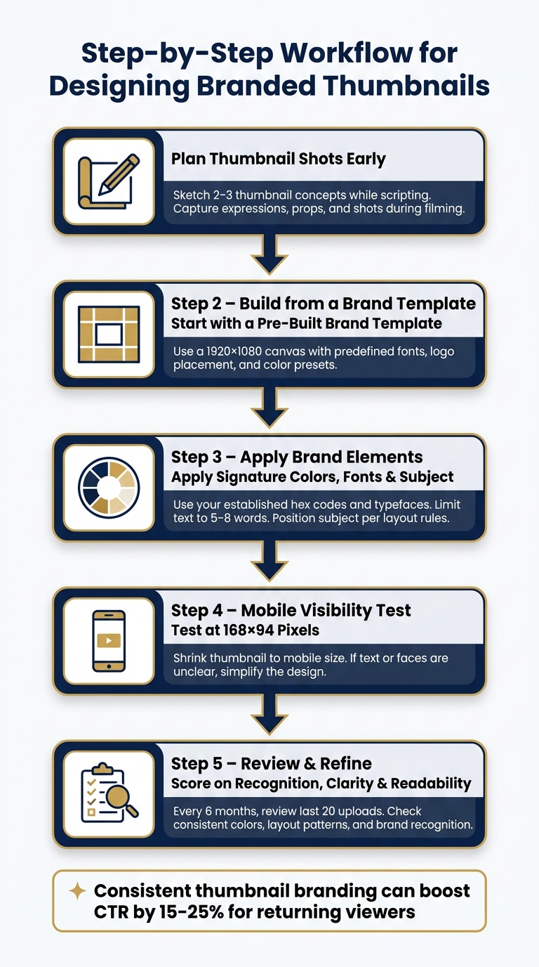
Step-by-Step Workflow for Designing Branded Thumbnails
Planning Thumbnail Shots During Content Production
Thinking about thumbnails during the planning stage can make a huge difference in maintaining a cohesive brand look. By sketching out 2–3 thumbnail ideas while scripting, you ensure your visuals align with the video's theme before you even start filming. This step helps you capture the right shots, expressions, and props during production, saving time later.
Jamie Whiffen, known for designing thumbnails for creators like Ali Abdaal, swears by his "pencil-first" workflow. He sketches 3–5 quick concepts in just five minutes to figure out the visual hierarchy before diving into design software. This method keeps the actual design process short - about 15–20 minutes of focused work.
Spending just 30 minutes on a photo session can give you 20–30 expressive shots, which can be stored as a library of assets to use for months.
A Checklist for Designing Each Thumbnail
Following a structured process can help keep your designs consistent and eliminate guesswork. Here’s a practical checklist to guide you through creating each thumbnail:
- Start with a pre-built brand template: Use a canvas set at 1920×1080 pixels with predefined font styles, logo placement, and color presets.
- Use your signature colors: Stick to your established color palette, ensuring it matches the content category.
- Add the subject and expression: Pull from your pre-shot asset library and position the elements based on your layout guidelines.
- Write concise text: Limit text to 5–8 words, using your chosen font.
- Test mobile-first vs desktop-first thumbnails: Shrink the thumbnail to 168×94 pixels to check if text and faces remain clear. If they don’t, simplify the design.
"The mobile test is the only quality gate that matters. If a detail is invisible at mobile size, it should not be in the thumbnail." - ThumbMentor Editorial
Once your thumbnail passes this checklist, review it to ensure it matches your overall channel style and branding.
Reviewing and Refining Your Thumbnails
Creating a standout thumbnail is important, but ensuring that all your thumbnails work together as a cohesive collection is equally essential. Every six months, review your last 20 uploads to check for consistent colors, stable layout patterns, and brand recognition.
A simple way to evaluate your thumbnails is by scoring them on three key factors:
- Recognition: Can returning viewers immediately tell it’s from your channel?
- Topic Clarity: Is the hook or message of the video obvious?
- Readability: Does it still work well on mobile devices?
If any of these areas feel lacking, tweak the design before publishing.
Channels that maintain consistent thumbnail branding often see a 15–25% boost in click-through rates from returning viewers. Over time, this creates a snowball effect, leading to steady growth.
Tracking and Improving Your Thumbnail Consistency
Thumbnail Performance Metrics to Watch
Once your branded thumbnail system is live, it’s time to track its performance. The key metric to monitor is your Click-Through Rate (CTR). A CTR of 6% or higher is considered above average on YouTube. However, CTR alone doesn’t paint the full picture.
Pay special attention to videos with high impressions but low CTR - these are prime candidates for improvement. When YouTube promotes your content but the thumbnail fails to grab clicks, it’s a clear sign that your design needs tweaking. Interestingly, thumbnails with more than three visual elements often see a 23% drop in CTR on average. This highlights the importance of keeping your designs clean and focused.
In addition to CTR, keep an eye on your audience retention during the first 30 seconds of a video. If 30–40% of viewers drop off early, it could mean your thumbnail is overpromising compared to the actual content. As of 2026, YouTube’s algorithm measures this "Quality CTR", prioritizing thumbnails that not only attract clicks but also retain viewers.
"The algorithm no longer just tracks whether people click - it evaluates what happens in the first 30 seconds after they click." - Hooksnap
Another useful comparison is between returning viewer CTR and new viewer CTR. Channels with consistent thumbnail branding often see a 15–25% higher CTR from returning viewers compared to channels with inconsistent visuals. If your returning viewer CTR is climbing, it’s a good sign that your brand visuals are resonating and building recognition.
When and How to Update Your Brand Visuals
CTR and retention data can guide you in refining your thumbnail templates to keep viewers engaged. Thumbnails don’t stay effective forever - over time, even the best designs can lose their appeal. To combat this "CTR decay", plan to refresh your templates every 6–12 months. Start with your top-performing videos, as updating the thumbnails on your top 20% of content typically drives 78% of performance gains and can lead to a 45% increase in CTR.
When updating, aim for gradual changes. Adjusting one element at a time is less disruptive than a total redesign, which can confuse loyal viewers who rely on familiar visual cues.
To test changes effectively, leverage YouTube’s "Test & Compare" tool. Run experiments for at least 7–14 days to gather meaningful data. Focus on altering one element at a time, such as the background color, facial expression, or text. If one variant outperforms another by 10% or more in CTR, you’ve likely found the winning design.
Conclusion: Build Brand Recognition Through Consistent Thumbnails
Creating a recognizable channel starts with intentional design - think consistent colors, fonts, and layouts. A unified thumbnail style beats random designs every time. Begin by developing a brand kit with 2–3 signature colors and 1–2 fonts. Stick to the 80/20 consistency rule and regularly review your last 12 uploads to check for visual alignment. This helps you avoid common thumbnail mistakes that can hurt your performance. If they don’t look like they’re part of the same channel, it’s time to adjust.
Experts back this approach:
"Consistent thumbnails are one of the few levers that improve both CTR and retention simultaneously." - Dan Kim, Founder, Hooksnap
By sticking to these principles, you strengthen your channel’s visual identity. You can also stay ahead of the curve by monitoring YouTube thumbnail trends to see what styles are currently resonating. A strong brand kit not only simplifies your workflow but also ensures long-term consistency. The hardest part? Staying consistent. That’s where tools like ThumbnailCreator can save the day. Its Brand Kit, Design Rules, and Style Cloning features let you set your visual identity once and apply it automatically to every upload. This cuts design time from about two hours per thumbnail to just six minutes, freeing up hours in your schedule every month.
Consistency doesn’t mean making every thumbnail identical - it’s about ensuring they all feel like they belong to your channel. Nail this, and your channel becomes instantly recognizable and builds trust with your audience.
FAQs
How do I pick 2–3 brand colors for thumbnails?
Start by identifying three words that capture your channel's vibe - think energetic, professional, or even mysterious. These words will shape your visual identity. For instance, warm, bold colors work well for high-energy channels, while cool, muted tones project professionalism.
Once you have a direction, build your palette with these key elements:
- Primary color: This will dominate your design and represent your brand.
- High-contrast accent: Use this to draw attention to key elements.
- Neutral tone: Balances out your palette and keeps it cohesive.
Before finalizing, test your combinations using tools like ThumbnailCreator. This ensures your colors not only look great but also fit seamlessly with YouTube's interface.
What should I change between video categories?
To make your thumbnails fit various video categories while keeping your channel recognizable, focus on maintaining consistent branding elements like fonts, colors, and layouts. Small tweaks, such as using a curious expression for educational content or a more enthusiastic one for entertainment, can help match the tone of each category. Tools like ThumbnailCreator, with its AI-driven templates and object-swapping features, can simplify the process of tailoring your thumbnails while preserving a unified style.
How do I know when to redesign my thumbnails?
If your thumbnails don’t have a consistent look - like matching colors, fonts, or layouts that reflect your channel’s branding - it’s time for a redesign. Start by prioritizing videos that have high impressions but a click-through rate (CTR) that’s at least 1.5 percentage points lower than your channel’s average. These are prime opportunities to grab more attention.
For evergreen content, think about refreshing thumbnails every 4–6 months to stay aligned with current design trends. Tools like ThumbnailCreator can make this process easier, offering professional templates and AI-powered editing to give your visuals a polished, modern feel.