

How to Optimize YouTube Thumbnails for Desktop
Design YouTube thumbnails for the smallest desktop view - not just the editor. Start with a 16:9 canvas at 1,280 × 720 pixels or larger, use one clear subject, and keep text to about two to five words.
Before publishing, check these basics:
- Preview all four desktop placements: Search, Home, Subscriptions, and the suggested-video sidebar. Check two browser-window widths.
- Make the image easy to read: Use strong contrast, remove clutter, and leave room for the duration badge.
- Pair it with the title: Add information rather than repeat the same words. Show what the video actually delivers.
- Test with viewing data: Use computer watch-time share to set priorities, then compare up to three thumbnail versions in YouTube Studio where available.
Choose based on watch-time test results, not clicks alone. Tools such as ThumbnailCreator can help build versions, but each still needs a small-size readability check and a match with the video.
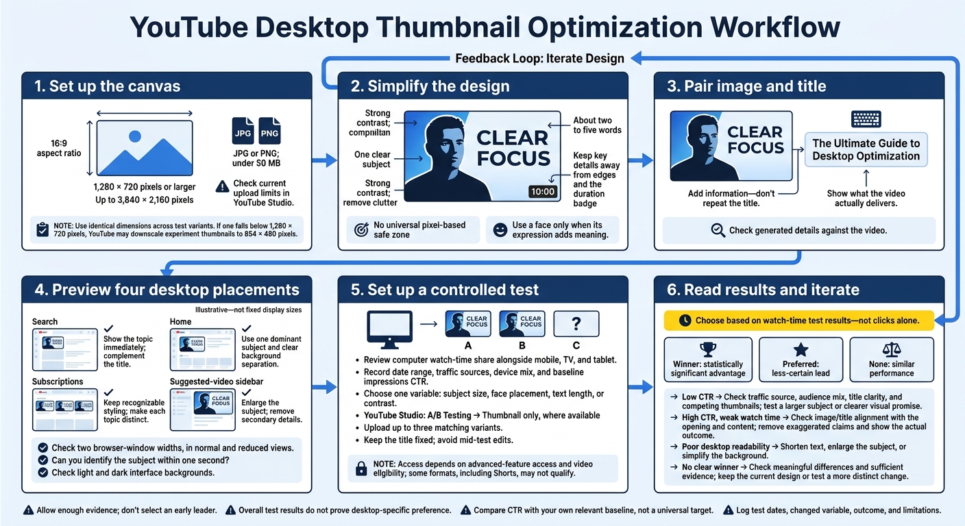
YouTube Desktop Thumbnail Optimization Workflow
1. Check Thumbnail Specifications and Desktop Placements
Start With a High-Resolution 16:9 Canvas
Use a 16:9 canvas at the highest practical resolution, up to 3,840 × 2,160 pixels. A larger file isn’t the goal - a thumbnail that stays clear when YouTube shrinks it on desktop is. Export as JPG or PNG, check the current upload limits in YouTube Studio, and keep the file under 50 MB.
Make every variant 1,280 × 720 pixels or larger, and use identical dimensions across all versions. This consistency is vital when you A/B test thumbnails to ensure data accuracy. If one falls below that size, YouTube may downscale the experiment thumbnails to 854 × 480 pixels.
Before uploading: Check the 16:9 aspect ratio, matching dimensions, supported format, and file size. Look for blur, compression artifacts, and cropping problems. Keep text and faces away from the edges.
Compare Search, Home, Subscriptions, and Sidebar Views
Next, check how the thumbnail looks on each desktop surface. Its display size changes with browser width, zoom, scaling, and layout. Each placement also has a different context, so check all four separately.
| Desktop surface | Viewing condition | Main risk | Fix |
|---|---|---|---|
| Search | Thumbnail appears beside a title among relevant results | Unclear subject or redundant wording | Show the topic immediately and complement the title |
| Home | Personalized grid with competing videos | Multiple focal points weaken recognition | Use one dominant subject and clear background separation |
| Subscriptions | Uploads appear among videos from familiar channels | Inconsistent styling slows recognition | Keep recognizable styling while making each topic distinct |
| Suggested-video sidebar | Compact thumbnails appear beside the playing video | Small text and subtle expressions disappear | Enlarge the subject and remove secondary details |
Build one preview sheet showing the thumbnail, title, and nearby videos for all four surfaces. Inspect it at two browser-window widths, in both normal and reduced views.
Check whether you can identify the subject within one second, whether the image adds information beyond the title, and whether it stands out from nearby videos. For Subscriptions, include several recent uploads from your own channel to spot designs that look too similar.
sbb-itb-b59debf
How to Improve YouTube Thumbnail Design | Fix These Common Mistakes
2. Build a Clear Thumbnail Layout
Start with the smallest desktop view, then scale the design up.
Choose the Size and Position of Faces and Objects
Make the main payoff the largest element. Include a face only if the expression adds meaning. Otherwise, put the product, demo, or result front and center.
Faces should stay readable at the smallest desktop size without overlapping text. Comparing centered vs rule-of-thirds layouts can help you balance the layout. Use gaze direction or a single arrow only when it points to something meaningful. Keep key details away from the edges and the bottom-right duration badge. There’s no universal pixel-based safe zone.
Once the main subject is in place, trim the text until it reads clearly in the sidebar.
Keep Thumbnail Text Short and Readable
Keep only words that add a new hook. The text should offer an outcome or a difference - not repeat the title. Choose large, bold, easy-to-read type with enough spacing and strong contrast.
Check the wording in a reduced desktop preview, especially the suggested-video sidebar. If you have to enlarge it to read it, cut the text.
Make the Subject Stand Out From the Background
Clear away background clutter before adding effects. Adjust brightness or color separation first. Then, where needed, add a subtle outline, shadow, or translucent panel behind the text.
Check that the subject stands out against both light and dark interface backgrounds. Don’t use color alone to convey meaning. Support important differences with labels, shapes, or positioning.
Get the core layout right before turning to tools.
Create Test Variants With ThumbnailCreator
ThumbnailCreator can help you test thumbnail layouts faster. Try AI generation or templates for layout tests, text edits to trim copy, and object or background swaps to change one element at a time.
Test clearly different concepts, then hold all other elements steady as you compare individual changes. Check every version for sidebar readability, and compare generated details with what’s actually in the video.
Use face swapping only with permission. Never suggest an appearance, reaction, endorsement, or participation that the video doesn’t support.
3. Test Thumbnails for Desktop-Heavy Traffic
Review Device Data and Pick One Test Variable
Once your layout works on desktop, test it with actual traffic. In YouTube Analytics, compare the share of watch time from computers with mobile, TV, and tablet viewing. Use the device metrics available in that Studio report. Record the date range, traffic sources, device mix, and baseline impressions click-through rate (CTR). Give desktop changes priority when computers account for a large share of viewing, but don’t overlook other devices.
Pick one variable: subject size, face placement, text length, or contrast. Record the baseline and what you expect the change to improve. Keep everything else steady, then test that change in Studio.
Run Thumbnail Tests in YouTube Studio
Open the thumbnail tool in YouTube Studio on desktop and select A/B Testing → Thumbnail only, where available. Upload up to three matching variants. Access depends on advanced-feature access and video eligibility. Some formats, including Shorts, may not qualify. Keep the title fixed and avoid mid-test edits, which may stop the test.
Judge watch time, not clicks alone. YouTube evaluates thumbnails using watch-time-based results. Follow the labels in your interface: Winner means a statistically significant advantage, Preferred means a less-certain lead, and None means similar performance. Give the test time to gather enough evidence instead of picking an early leader. Read the result alongside device data - it doesn’t prove that desktop viewers prefer a thumbnail.
Use Test Results to Plan the Next Change
Let each result guide the next controlled change.
| Observed result | What to check | Next action |
|---|---|---|
| Low CTR | Traffic source, audience mix, title clarity, and competing thumbnails | Test a larger subject or clearer visual promise |
| High CTR, weak watch time | Whether the image and title match the opening and content | Remove exaggerated claims; show the actual outcome |
| Poor desktop readability | Text size, contrast, face detail, and clutter | Shorten text, enlarge the subject, or simplify the background |
| No clear winner | Meaningful differences and sufficient evidence | Keep the current design or test a more distinct change |
Treat results as signals, not conclusions. Compare CTR with your own relevant baseline, not a universal target. A before-and-after swap can’t separate the thumbnail’s effect from changes in audience or traffic source. Log the test dates, changed variable, outcome, and limitations so your next test builds on evidence rather than guesswork.
Conclusion: Check Your Desktop Thumbnail Before Publishing
Before publishing, confirm your thumbnail is 16:9 and at least 1,280 × 720 pixels. If you're new to the process, follow a YouTube thumbnail beginners guide to get started. Check YouTube Studio’s current upload requirements, too.
Next, preview it beside its title in Search, Home, Subscriptions, and the sidebar at two window widths - the places desktop viewers will see it. Stick to one clear subject, short, readable text, strong contrast, and enough room for the duration badge. The title should add information rather than repeat the thumbnail.
Use desktop watch-time share to decide how much weight to give these checks, but review other devices as well. Choose the final version based on A/B testing vs. gut feeling results.
FAQs
How can I balance desktop and mobile thumbnail design?
Design for phones first. Mobile-first layouts scale well to desktop, while desktop-first designs often pack in too much detail or leave text unreadable on smaller screens.
Start with a 1280×720-pixel canvas, a clear central focal point, and 2–5 bold, sans-serif words. Keep the contrast ratio at 4.5:1 or higher. Then shrink the layout to 120×90 pixels to check that the subject is still recognizable.
How long should I run a thumbnail test?
Run your thumbnail test for 7 to 14 days, and wait at least 48 hours before making a decision. Early traffic from subscribers can skew the results, so give the data time to settle.
Aim for 1,000 to 2,000 impressions per variant. Getting 5,000 or more gives you much greater confidence in the results. Check watch time alongside click-through rates to see whether your thumbnail draws in the right audience.
Should I update thumbnails on older videos?
Yes - update thumbnails on older videos when their click-through rate (CTR) falls below your channel’s average. A new thumbnail may improve performance.
Test one variable at a time: background color, facial expression, or text. Make sure the thumbnail is easy to read on mobile, even if most of your traffic comes from desktop.
Let the new thumbnail run for at least 48 hours. Then review CTR and total impressions in YouTube Studio’s Reach tab over 7–14 days to see how it performs.