

Ultimate Guide to YouTube Thumbnail Design Basics
My rule for YouTube thumbnails: show one clear promise, then check whether it reads in 1–2 seconds at phone size. I put the subject first, use a two- to five-word hook only when it helps, and make sure the image matches the video.
Here’s the workflow I use:
- Set up the file: Use a 16:9 canvas and check YouTube’s current size, format, and upload limits. Check Shorts options separately.
- Make the message easy to see: Use one focal point, strong contrast, readable text, and quiet branding.
- Draft and review: Use tools such as ThumbnailCreator, then inspect the export for image errors, spelling, permissions, and policy issues.
- Test the result: Compare designs in YouTube Studio and review watch time and retention - not just clicks.
<u>A thumbnail should earn the click without promising something the video doesn’t deliver.</u>
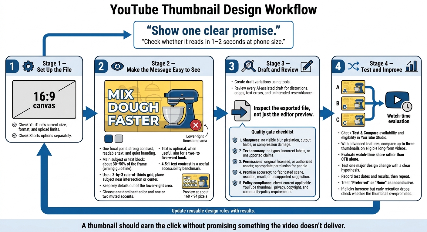
YouTube Thumbnail Design Workflow
how to make a killer youtube thumbnail (to blow up your channel)
sbb-itb-b59debf
Guide Attention With Layout, Color, and Contrast
After sizing and previewing your thumbnail, use layout and color to make its promise clear at a glance. Visual hierarchy determines what viewers notice first, second, and last. Give one subject the most emphasis, then keep only the text or imagery that supports the promise. Cut patterns, badges, and decoration that add no meaning. YouTube recommends using composition, color, and descriptive text without making thumbnails too complex.
Choose One Focal Point and Leave Space
Enlarge the subject before adding effects. Aim for a main subject or text block that fills about 30–50% of the frame. Use a 3-by-3 rule-of-thirds grid to place the subject near an intersection, leaving room for the message. Center it when symmetry works better. Give text some breathing room, and keep key details out of the lower-right timestamp area.
Example: Turn a busy bakery thumbnail into a clean two-part layout - mixer on the right, “MIX DOUGH FASTER” on the left, extras removed - to make the video’s promise clear.
Use Color and Contrast to Separate Elements
Choose one dominant color and one or two muted accents. Keep the background less saturated so the subject or key word gets the most emphasis.
Use brightness - not just color - to separate elements. Red and green can blend when their lightness is similar. Check your draft in grayscale to spot weak separation.
Test the thumbnail on both light and dark YouTube themes. Pale outlines can disappear against light surroundings, while dark subject edges can merge into dark surroundings. For text, 4.5:1 contrast is a useful accessibility benchmark, not a YouTube thumbnail requirement.
Compare Ways to Separate the Subject
Choose the simplest method that makes the subject easy to see.
| Method | Advantages | Limitations | Best use |
|---|---|---|---|
| Outline or stroke | Defines edges so a person or product stands out | Thick or poorly fitted strokes add visual noise | Separating a subject from a busy or similarly colored background |
| Drop shadow | Separates the subject from a flat background | Too much blur, opacity, or offset can muddy small details | Improving separation when the subject already has a clear edge |
| Color block | Creates a clear field behind text or a small subject | Can cover useful imagery or divide the composition | Supporting short text or organizing a two-part layout |
| Background blur | Reduces competing detail while keeping context | May not separate subjects with similar tones | Keeping a recognizable setting while emphasizing the foreground subject |
| Subject cutout | Controls placement, scale, and background contrast | Poor masking creates halos, missing edges, or unclear contours | Making a product or presenter the clear focal point |
Use the weakest effect that solves the problem. Then remove it and compare the thumbnail at a small size. Keep the effect only if the subject becomes harder to recognize without it.
Once the subject is easy to spot, tighten the hook and branding.
Use Clear Text and Consistent Branding
With layout and contrast in place, use text and branding to finish the thumbnail’s message. Text is optional: skip it if the image already makes the topic or result clear at a small size. When text helps, use it to explain the payoff, pose a relevant question, or clarify a transformation. Keep branding secondary to the hook.
Write a Short Hook That Extends the Title
Aim for two to five words, not a full sentence. Let the title and hook work together: one names the topic, while the other adds the payoff. Avoid vague promises or claims the video can’t support.
Keep Text Readable at Small Sizes
Choose large, bold, simple type, and break lines where the phrasing naturally pauses. Keep text away from faces, products, and interface overlays. Preview the thumbnail at about 168 × 94 pixels to check how it looks at a small size.
Check brevity, readability, contrast, and line breaks. If the hook doesn’t work at mobile size, shorten it.
Build a Reusable Design System
Set one font, one capitalization style, one accent palette, spacing rules, and logo placement. Keep logos and series tags visually quiet. Repeat the system, not the template: viewers should recognize the series without the branding weakening the main offer or making every thumbnail look the same.
Once you’ve set the system, create draft variations and test them. You can also use A/B testing to see which design performs best.
Create, Review, and Improve Thumbnails
Review the draft at this stage, then use performance data to guide edits.
Create and Edit Drafts With ThumbnailCreator
ThumbnailCreator offers AI-assisted generation, templates, face swapping, text editing, and object swapping to help you create and edit drafts. Replace generic images with an accurate image of the subject, sharpen the hook, and apply your channel’s style.
Review every AI-assisted draft yourself. Look for distorted hands or objects, rough cutout edges, incorrect text, and unintended resemblance to a real person. Never use face or object swapping to misrepresent who appeared, imply endorsement, or invent what happened. These tools speed up production - not results.
Once the draft matches the video, check the exported file.
Check Thumbnail Quality Before Uploading
Inspect the exported file, not just the editor preview. Before uploading, check YouTube’s current thumbnail, spam, deceptive-practices, and community policies. Misleading thumbnails can violate its rules.
| Check | What to inspect | Pass |
|---|---|---|
| Sharpness | Subject edges, facial details, and text | No visible blur, pixelation, cutout halos, or compression damage. |
| Text accuracy | Wording and spelling | No typos, incorrect labels, or unsupported claims. |
| Permissions | People, artwork, products, logos, and stock assets | Assets are original, licensed, or otherwise authorized; identifiable people have appropriate permission. |
| Promise accuracy | Relationship to the title and video | No fabricated scene, reaction, result, or unsupported suggestion. |
| Policy compliance | Current YouTube rules and audience restrictions | Meets applicable thumbnail, privacy, copyright, and community-policy requirements. |
After the thumbnail passes review, test how it performs.
Use Performance Data to Refine Designs
Check Test & Compare availability and eligibility in YouTube Studio. With advanced features enabled, it can compare up to three thumbnails on eligible public long-form videos or podcast episodes. It uses watch-time share rather than CTR alone.
Test one major design change with a clear hypothesis. Record the test dates and result, then repeat. Treat “Preferred” or “None” as inconclusive. If clicks increase but early retention drops, check whether the thumbnail promises more than the video delivers.
Conclusion: Use a Repeatable Thumbnail Checklist
Run this checklist before every upload:
- Confirm your export settings meet YouTube’s current requirements.
- Look for one clear focal point, strong contrast, a hook that’s readable on mobile, and branding that stays secondary.
- Preview the thumbnail at mobile feed size. Check cropping and overlays, and make sure it matches the video.
Save approved settings as reusable design rules. Use ThumbnailCreator to draft within those rules while keeping each video’s message distinct.
After uploading, use the results to update your checklist. Refine the system with data, not assumptions. Compare performance across similar topics, audiences, traffic sources, and publishing conditions.
FAQs
How do I make my thumbnail stand out without clickbait?
Make your thumbnail clear, useful, and easy to scan. Choose one focal point - an expressive face or key object - and let it fill 40%–60% of the frame.
Keep text to 3–5 words in a bold, sans-serif font. It should add to your title, not repeat it. Hint at a specific benefit or secret to give viewers a reason to get curious.
ThumbnailCreator’s AI-powered tools can help with layout, contrast, and professional-quality text overlays.
When should I update an underperforming thumbnail?
If your click-through rate (CTR) drops below the 2%–5% range, consider updating your thumbnail. Check audience retention as well. A high CTR paired with low watch time may mean the thumbnail misleads viewers.
After the redesign, track results for 24–72 hours to see how it affects performance. Use YouTube’s Test and Compare feature to test variations and find designs your audience responds to better.
How long should I run a thumbnail test?
When A/B testing thumbnails in YouTube Studio, run the test for at least 72 hours. For more reliable results, especially with lower-traffic videos, let it run for 7 days. A 7- to 14-day test helps account for differences between weekday and weekend traffic.
Before evaluating the results, make sure each thumbnail variation has at least 1,000 impressions, no matter how long the test runs.