
Live Stream vs. Premiere Thumbnails
The short answer: live stream thumbnails should push people to click now, while premiere thumbnails should make people want to come back later and still work after the video goes live.
If I were setting these up, I’d keep the rules simple:
- Both formats use the same YouTube specs: 1280 × 720 px, 16:9, and under 2 MB
- Live thumbnails should use short text like “Live Now” or “Q&A”, one clear face, and fast-to-read visuals
- Premiere thumbnails should use teaser-style text like “Final Reveal” or “Full Tutorial” that still fits after release
- Text should stay short: about 3–5 words
- Faces and text should stay inside the safe area so YouTube labels do not cover them
- Mobile readability matters most: if it fails at small size, it fails
A few numbers stand out. Faces can lift click-through rate by 30%–40%, and eye direction can add another 10%–15%. Premiere videos can also get 30% more views in the first 24 hours than standard uploads.
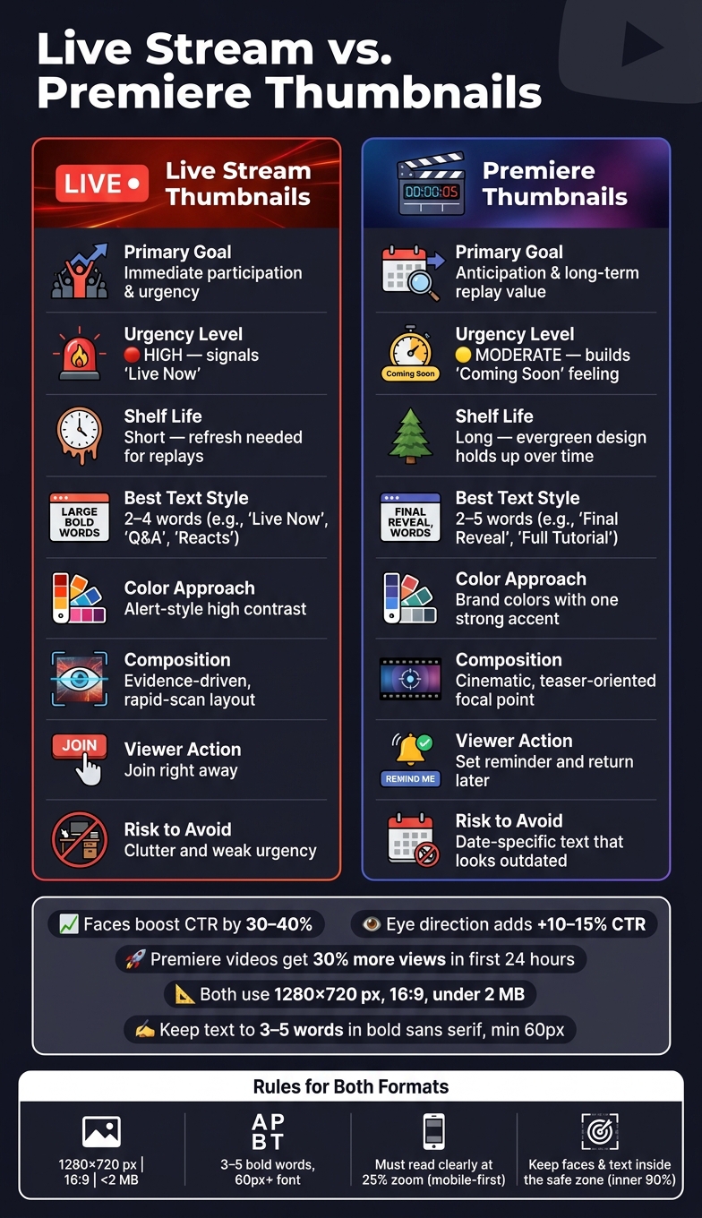
Live Stream vs. Premiere Thumbnails: Key Differences at a Glance
Quick Comparison
| Criteria | Live Stream Thumbnail | Premiere Thumbnail |
|---|---|---|
| Main goal | Get the click now | Build interest before release |
| Viewer action | Join right away | Set reminder and return later |
| Best text style | Direct and time-based | Teaser-style and long-life |
| Visual style | Fast, clear, event-driven | Polished, story-led, replay-safe |
| Shelf life | Short | Long |
| Risk to avoid | Clutter and weak urgency (one of the most common thumbnail mistakes to avoid) | Dates that look old later |
So the rule is simple: design for the viewer’s timing. If it is live, show urgency. If it is a premiere, make the image work both before and after launch.
sbb-itb-b59debf
Thumbnail Basics That Apply to Both Formats
Once the format goals are set, both thumbnail types still follow the same technical and readability rules.
Technical Specs and Safe Layout Rules
| Requirement | Specification |
|---|---|
| Resolution | 1280 × 720 pixels |
| Minimum Width | 640 pixels |
| Aspect Ratio | 16:9 |
| Max File Size | 2 MB |
| Accepted Formats | JPG, PNG, GIF (first frame only), BMP |
| Safe Zone | Inner 90% of frame (about 1,100 × 620 px) |
If you're exporting JPGs, 85–90% quality is a smart middle ground between image sharpness and file size. YouTube's interface can cover the outer edges of an image, so keep text and faces inside the centered safe zone. That helps prevent badges and labels from blocking key parts of the thumbnail.
Design Elements That Improve Click-Through Rate in Any Format
A few basics do most of the work here: 3–5 bold words, strong contrast, and one focal subject. Those three rules help keep thumbnails readable whether you're promoting a live stream or a premiere.
Use 3–5 words of text in a bold, sans-serif font at least 60 px at 1280 × 720. The text should add a hook, not just echo the title. High color contrast - like yellow on purple or blue on orange - helps the words stand out, and a stroke or drop shadow can make them easier to read over busy backgrounds.
Thumbnails with expressive faces can increase CTR by 30–40%, and eye contact - or eyes directed toward the title text - can lift CTR by another 10–15%. A simple gut check helps: view the thumbnail at 25% zoom. If the subject or text starts to disappear, it's a sign the design needs to be stripped back. A steady visual system also helps people spot your channel faster.
With those shared basics locked in, the next sections shift to what changes for live streams and premieres.
Live Stream Thumbnails: Designed for Urgency and Participation
A live stream thumbnail needs to tell people, right away, that the stream is live, relevant, and worth joining now. That changes the job of the thumbnail. It’s not just a promo image. It’s a live-status signal.
What a Live Stream Thumbnail Needs to Show at a Glance
The fastest way to create urgency is with clear text cues and one expressive face. Keep the wording practical, not hype-driven. Labels like "Live Now", "Q&A", "Watch Along," or "Reacts" tell viewers what they’re stepping into without making them guess.
If the topic leans on data or news, add a chart, ticker, map, or interface screenshot. That gives the thumbnail visual proof without turning it into a mess.
A close-up face that takes up about half the frame also helps. A look of focus, concern, or surprise makes it feel immediate, like something is happening right now. Keep the face and text large with strong contrast so both still read well on mobile.
Once the live cue is clear, keep the layout simple. That makes it easier to reuse for series branding and leaves room for platform overlays.
How to Handle Time Labels, Series Branding, and YouTube Overlays
For recurring streams, use a fixed layout so regular viewers can spot the show fast. If you add a time label, make it big but secondary, and stick to only what matters, such as "Live Now" or the show time.
Also, keep text and faces inside the safe zone so badges and overlays don’t cover them.
Using ThumbnailCreator for Faster Live Thumbnail Updates
Use ThumbnailCreator to update the same base live-stream template when the topic, guest, or time changes. That kind of template-based speed is useful when live plans shift and you need to swap details without rebuilding the thumbnail from scratch.
Premiere Thumbnails: Designed for Anticipation and Long-Term Performance
Live-stream thumbnails sell urgency. Premiere thumbnails do something different: they sell anticipation.
That matters because a premiere thumbnail has to do two jobs. Before launch, it needs to earn the click. After the premiere ends, it still needs to work like a normal video thumbnail. So every design choice has to hold up over time.
What a Premiere Thumbnail Needs to Communicate Before and After Release
Before release, think of the thumbnail like a launch graphic. You want evergreen, teaser-style positioning. In plain English, the visual and copy should make the video feel worth waiting for without tying it to one exact moment.
That approach lines up with performance data too. Videos using the Premiere feature generate 30% more views in the first 24 hours than standard uploads.
For text, use hooks that describe the value of the video, not the event around it. Phrases like "Full Tutorial", "Final Reveal," or "The Truth Revealed" work well because they still fit months later. And that matters, because once the premiere is over, the replay turns into a regular video and can keep pulling in views.
So the goal is simple: write for the video’s long shelf life, not just the launch window.
How to Avoid Date-Specific Designs That Look Outdated
A common slip-up is putting exact dates or countdown language right on the thumbnail. It may feel useful before launch, but after the Premiere ends, that same text can make the video feel old in search results and recommendation feeds.
A better move is to use polished, high-contrast visuals that suggest a launch without locking the image to a calendar date. That keeps the thumbnail usable for people who find the video days, weeks, or months later.
Using ThumbnailCreator for Premiere Thumbnail Iteration
Once the thumbnail has that evergreen angle, move into thumbnail A/B testing.
Use ThumbnailCreator to generate a few concepts fast, then compare evergreen hooks, swap objects, and tighten the text without rebuilding the whole layout each time.
Live Stream vs. Premiere Thumbnails: Side-by-Side Comparison and Key Takeaways
Direct Comparison of Design Strategy, Text, and Lifespan
The core difference is straightforward: live thumbnails sell right now. Premiere thumbnails sell come back for this.
Use the comparison below to pick the right visual focus for each format.
| Feature | Live Stream Thumbnails | Premiere Thumbnails |
|---|---|---|
| Primary Goal | Immediate participation and urgency | Anticipation and replay value |
| Urgency Level | High - signals "Live Now" status | Moderate - builds a "Coming Soon" feeling |
| Interactivity | Drives viewers to join live now | Drives viewers to return at the scheduled time |
| Evergreen Value | Low - often needs a refresh for replays | High - designed to keep pulling views over time |
| Common Text | 2–4 words; Live, Update, Reacts | 2–5 words; The Secret, Why I Quit, Results |
| Color Approach | Alert-style contrast | Brand colors with one strong accent |
| Composition Style | Evidence-driven, rapid-scan layout that avoids misleading clickbait | Cinematic, teaser-oriented focal point |
That timing gap should shape every choice below, from text length to color use. In both cases, the thumbnail still needs to read cleanly on a mobile-first design.
Conclusion: Match Your Thumbnail Strategy to the Format
Match the thumbnail to the format, not the other way around. Live thumbnails need to answer what’s happening now. Premiere thumbnails need to keep working after launch.
ThumbnailCreator can help you move faster with both. If you need to swap text for a live update or test evergreen hooks for a premiere, its AI generation and object-swapping tools make it easier to build polished thumbnails without starting from scratch.
FAQs
Can I use the same thumbnail for live and replay?
Yes, you can use the same thumbnail for both a live stream and its replay.
That said, it’s often smarter to tweak the replay thumbnail so it fits that moment better and pulls in more clicks.
A lot of creators change the replay thumbnail to match what the stream ended up being about or to spotlight a different angle of the video. That can make the message clearer and help the replay stand out once the live event is over.
Where is the safe area on a YouTube thumbnail?
The safe area sits in the middle 60–70% of the thumbnail, or about 900×430 pixels. Put your main text, subject, and other key details in that center zone so they stay visible on different devices.
Also, stay away from the bottom-right corner. That’s where YouTube shows the video duration, and it can block part of your image.
How often should I test new thumbnail versions?
Test new thumbnail versions for at least one full day before you make a call. For videos with steady traffic, that’s usually enough time to see what’s working without overreacting to normal day-to-day swings.
If a video gets less traffic, give the test more time. In some cases, that means running it for weeks or even months, especially for evergreen or niche content. And don’t swap the thumbnail in the middle of the test. Once you do that, the data resets, and the comparison stops being clean.