
Best Practices for Mobile Thumbnails 2026
Over 70% of YouTube traffic comes from mobile devices, and users decide whether to click on a video in just 1 second. If your thumbnails don’t grab attention immediately, you risk losing viewers. Designing thumbnails for mobile screens isn’t optional anymore - it’s a necessity. Here's what you need to know:
- Keep it simple: Focus on one subject and one message. Cluttered designs don’t work on small screens.
- Use high-contrast colors: Bold color combinations like yellow on black or red on white stand out better.
- Text matters: Stick to fewer than four words, use bold fonts, and avoid placing text in the bottom-right corner (YouTube’s timestamp will cover it).
- Faces work: Close-ups with clear, expressive emotions can boost click-through rates by up to 35%.
- Test your designs: Use tools like YouTube's A/B testing or ThumbnailCreator to see what resonates with your audience.
Mobile-friendly thumbnails can double your click-through rate and increase watch time by up to 30%. Take it from creators like MrBeast, who gained 15 million extra views in 30 days by optimizing his thumbnails for mobile. Ready to make yours stand out? Let’s dive in.
11 Thumbnail Design Hacks Top Creators Use on YouTube
sbb-itb-b59debf
Technical Requirements for Mobile Thumbnails
YouTube Mobile Thumbnail Technical Specifications and Requirements 2026
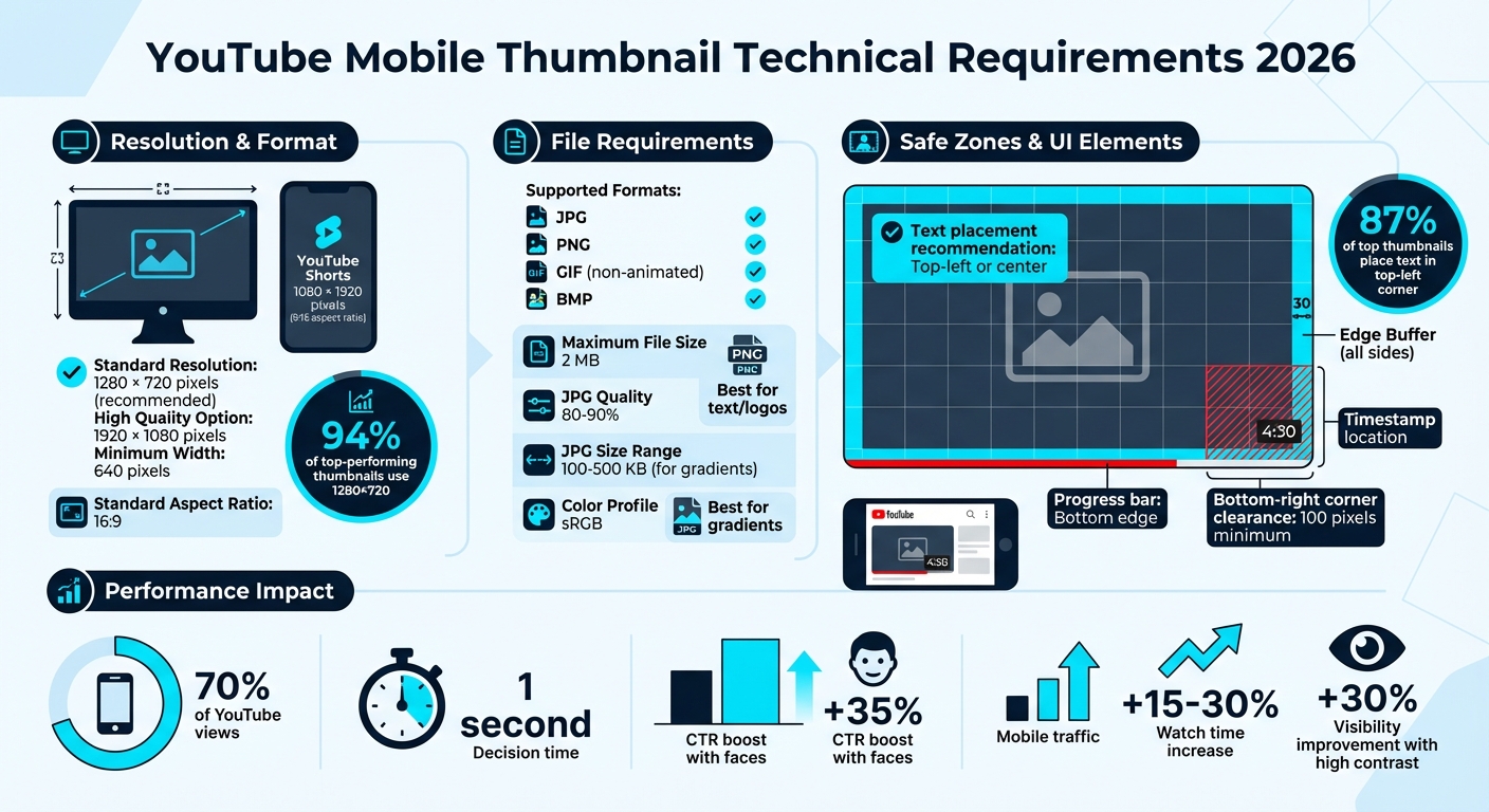
Getting the technical details right is key to making your mobile thumbnails stand out. To ensure your thumbnail performs well, stick to the recommended specs. YouTube suggests a resolution of 1280 × 720 pixels with a 16:9 aspect ratio for optimal results. Interestingly, 94% of top-performing thumbnails follow this guideline.
If you want sharper visuals, you can go for 1920 × 1080 pixels, but 1280 × 720 strikes a great balance between quality and file size. Just remember, your thumbnail must be at least 640 pixels wide to upload successfully. For YouTube Shorts thumbnails, it’s a different game. Use a vertical format of 1080 × 1920 pixels with a 9:16 aspect ratio.
File Format and Size Requirements
YouTube supports JPG, PNG, GIF (non-animated), and BMP formats, and the file size must stay under 2 MB to ensure quick loading on mobile networks. For images with gradients, JPG works best (aim for 100–500 KB). If your design is heavy on text or logos, go for PNG to maintain clarity. For JPGs, save at 80–90% quality to keep a good balance between clarity and file size. Also, make sure to use the sRGB color profile so your colors look vibrant on mobile browsers.
YouTube UI Elements and Safe Zones
YouTube’s mobile interface overlays elements like the timestamp in the bottom-right corner and a progress bar at the bottom edge. To avoid these covering up important parts of your thumbnail, keep critical details - like faces, text, or logos - at least 100 pixels away from the bottom-right corner and leave a 30-pixel buffer around the other edges. A helpful tip: 87% of top thumbnails place text in the top-left corner to avoid these overlays.
Before you finalize your thumbnail, try the 10% Zoom Test: shrink it down to 10% of its original size. If the text or focal points aren’t clear, they likely won’t work well on smaller mobile screens.
| Specification | Requirement | Mobile Performance Note |
|---|---|---|
| Resolution | 1280 × 720 px | Ensures clarity across devices |
| Aspect Ratio | 16:9 | Matches YouTube's native player shape |
| File Size | ≤ 2 MB | Crucial for fast loading on mobile |
| Format | JPG, PNG, GIF, BMP | PNG is ideal for text-heavy designs |
| Safe Zone | 100 px from bottom-right | Avoids UI overlays covering key content |
If you are just starting out, check out our YouTube thumbnail beginners guide to master the basics. Next, we’ll dive into design strategies that make the most of these technical guidelines for mobile success.
Design Principles for Mobile Thumbnails
Creating a Clear Focal Point
You’ve got less than a second to grab the attention of fast-scrolling mobile users. The trick? Keep it simple - focus on one subject and one message. Overloading your thumbnail with multiple ideas only makes it easier for viewers to scroll past.
A good rule of thumb is to ensure your main subject - whether it’s a face, product, or object - takes up 30% to 50% of the thumbnail's area. This creates a strong visual hierarchy, instantly drawing the viewer’s eye to the focal point. To test this, shrink your thumbnail to postage stamp size. If the main subject doesn’t stand out, make it larger.
Another tip: isolate your subject by simplifying the background. Use tools like blur effects, gradients, or solid colors to remove distractions and make the primary subject pop. For example, AI-generated thumbnails optimized for mobile have shown noticeable increases in click-through rates. Once you’ve nailed the focus, you can enhance it further with color choices that improve visibility on mobile screens.
Choosing High-Contrast Colors
After establishing a clear focal point, the next step is to use high-contrast colors to make your thumbnail even more eye-catching. Mobile screens are small, and users view them under all kinds of lighting conditions - from bright sunlight to dimly lit rooms. High-contrast colors can improve thumbnail visibility by 30%, so it’s crucial to pick combinations that clearly separate text, subjects, and backgrounds.
Some proven color combos? Yellow text on black backgrounds offers unbeatable visibility. If you’re aiming to convey urgency, red on white is a strong choice. And to stand out against YouTube’s red interface, try cyan or teal on dark backgrounds. These complementary contrasts ensure your thumbnail grabs attention in a crowded feed.
For OLED screens, bold and saturated colors look especially vibrant. Keep in mind, what looks sharp on your desktop may not translate well to a phone screen in bright daylight - so always preview your designs on mobile.
Text and Typography Guidelines
When it comes to text, less is more. Thumbnails with fewer than four words tend to achieve 30% higher click-through rates. Longer text can dilute your message, making it harder to read on small screens.
"If they have to squint to read your text or guess what that blurry object is in the background, they're already gone." - Alex Rivera, Banana Thumbnail
Stick with bold, sans-serif fonts like Arial, Impact, or Bebas. Use a minimum font size of 30 points, and add thick outlines or drop shadows to increase readability. A quick way to check your design? Try the “squint test”: step back and squint at your thumbnail - if the text isn’t instantly clear, adjust the contrast or simplify the design.
Position your text thoughtfully. The top-left or center of the frame works best. Avoid the bottom-right corner, as YouTube’s timestamp overlay often hides details there, which accounts for 62% of thumbnail-related complaints. Give your text enough breathing room, and make sure it doesn’t compete with the focal point for attention.
Visual Elements That Drive Mobile Engagement
Using Faces and Expressions
Expressive faces can work wonders for mobile engagement. Thumbnails featuring human faces with clear expressions can increase click-through rates by as much as 35%. The key is to ensure the emotion is instantly recognizable, even on a small screen.
Focus on close-up shots that highlight one clear emotion. Mobile users decide in a fraction of a second, so bold expressions like surprise, joy, or shock are more likely to grab attention. AI tools can even help identify which expressions are trending in viral images, giving you an edge in crafting engaging visuals.
Where you position the face matters just as much as the expression. Avoid placing faces in the bottom-right corner, as YouTube's timestamp overlay can obscure key details. Instead, aim for the top-left or center. To test its effectiveness, try the "squint test" - if the emotion isn’t clear when you squint, it won’t stand out to mobile users.
Keeping Designs Simple and Clear
Once you’ve nailed the facial expressions, shift your focus to simplifying the overall design. A clutter-free thumbnail with one clear subject and message is far more effective than a busy layout. Mobile users scroll quickly, so your design needs to make an instant impact.
Stick to clean compositions with minimal distractions. For example, a single subject against a solid color or softly blurred background tends to perform better than a chaotic scene filled with competing elements. With over 70% of YouTube traffic coming from mobile devices, clarity is not just helpful - it’s essential.
Maintaining Brand Consistency
Clear visuals are important, but consistent branding takes your engagement to the next level. Using the same color palette, fonts, and logo placement across all your thumbnails helps build trust and makes your channel more recognizable.
Pick two or three signature colors that align with your brand identity, and stick to a consistent font style for any text overlays. (See our guide on adding text to thumbnails for more tips.) This uniformity not only sets your channel apart but also reinforces familiarity, which can lead to higher click-through rates. Consistency is a simple yet powerful way to enhance mobile engagement.
Testing and Optimizing Mobile Thumbnails
Preview Thumbnails at Mobile Size
Before uploading a thumbnail, check how it looks on mobile devices. Use the 10% zoom test and squint test to ensure the design is clear and easy to read, even at smaller sizes. Avoid placing important text or facial features in the bottom-right corner, as YouTube's timestamp overlay could block them. This step helps ensure your thumbnail design works well within mobile-safe zones and maintains its visual focus.
Running A/B Tests
Once you've confirmed that the thumbnail is mobile-friendly, it's time to test its effectiveness. YouTube's "Test & Compare" feature lets you upload three different thumbnail versions for comparison. Experiment with these three styles:
- Face version: A close-up showing strong emotions.
- Action version: An image highlighting a dynamic moment or event.
- Text version: Bold text posing a clear question or statement.
Focus on watch time metrics during these tests. YouTube tends to favor thumbnails that lead to longer viewer retention. Research shows that mobile-optimized custom thumbnails can boost watch time by 15–30% in A/B tests.
Improving Templates Based on Data
After gathering insights from testing, refine your YouTube thumbnail templates to match what performs best. Review the data to pinpoint which designs resonate most with mobile users. Simpler designs, like the "Text" version, often perform better since mobile viewers prefer thumbnails that are easy to process at a glance. Consider using AI tools to analyze your designs against popular thumbnails, helping you identify effective color schemes and facial expressions. Keep revisiting your performance metrics and updating your templates to consistently drive clicks and boost watch time.
Using ThumbnailCreator for Mobile Thumbnails
Mobile-Optimized Features
ThumbnailCreator offers AI-powered tools designed to create thumbnails that stand out on mobile screens. When you input a video topic or image, the tool generates layouts with clear focal points and high-contrast colors. These designs are tailored for mobile readability, featuring enlarged text (minimum 24pt) and ensuring faces take up 30-50% of the frame. The AI Layer Splitting feature is especially handy, as it separates elements like text, objects, and backgrounds, allowing you to tweak each one for better visibility on smaller screens without disrupting the overall design.
Another standout feature is the drag-and-drop canvas, which helps you adjust elements to avoid interference from mobile UI overlays. For instance, you can move text or faces away from the bottom-right corner, where YouTube timestamps often appear. The face and object swapping options let you add expressive reactions or high-contrast visuals, which can significantly boost mobile click-through rates. For example, gaming thumbnails with neon-edged glowing objects or tutorials featuring expressive creator reactions have shown CTR increases of up to 25% during mobile A/B tests. ThumbnailCreator simplifies integrating mobile-friendly design principles into your workflow.
Saving Time and Money
ThumbnailCreator doesn’t just improve your designs - it also makes the entire process faster and more cost-effective. By automating tasks like resolution scaling (to 1280x720) and file compression (under 2MB), the platform reduces production time from hours to mere minutes. Many creators have reported saving up to 80% of their time, with AI templates instantly applying brand colors and safe zones. What used to take 2-3 hours for a weekly batch of thumbnails can now be done in under 30 minutes.
The pricing is another big advantage. With a freemium model (basic free, pro at $9.99/month), you can avoid expensive design software subscriptions, saving over $240 annually. Plus, it eliminates the need for outsourcing, which can cost $50-100 per thumbnail. For solo creators, this means producing 50+ professional-quality thumbnails per year without hiring a designer. Case studies highlight channels that increased CTRs from 5% to 12% on mobile while cutting monthly outsourcing expenses by around $500. These savings free up resources for testing and refining your content strategy.
Using Templates for Brand Consistency
ThumbnailCreator’s template system makes it easy to maintain a consistent look across your channel while still keeping thumbnails fresh and engaging. You can save custom templates with your brand’s colors, fonts, and layouts, all pre-optimized for mobile viewing. Templates can be set up with centered focal points and a 60:40 image-to-text ratio, which you can then adapt for different types of content. For vlogs, swap in expressive face reactions; for reviews, replace faces with product images - all while sticking to your brand’s style. According to user feedback, this approach reduces variation errors by 90%, ensuring your thumbnails remain cohesive and aligned with your channel’s identity.
Conclusion
Summary of Best Practices
Designing thumbnails with a mobile-first approach is a must for succeeding on YouTube in 2026. Focus on creating a single, clear focal point, use bold, high-contrast colors that stand out on OLED screens, keep text short and easy to read, and place elements strategically to avoid common thumbnail mistakes like overlapping with UI features like the timestamp in the bottom-right corner. These strategies help ensure your thumbnails are effective and visually appealing on smaller screens.
Building a Mobile-First Workflow
Always preview your thumbnail on a phone screen before publishing to ensure it looks good in real-world conditions. Leverage YouTube's "Test & Compare" feature to A/B test different designs and find what resonates best with your audience. Tools like ThumbnailCreator simplify this process by automatically resizing designs to 1280×720 pixels, keeping file sizes under 2 MB for quick mobile loading, and offering templates with pre-defined safe zones and vibrant color palettes. Using such tools can make your workflow more efficient and directly improve your results.
The Impact of Optimized Thumbnails
Well-optimized thumbnails designed for mobile can significantly boost your channel's performance. For instance, mobile-friendly thumbnails have been shown to double click-through rates and increase watch time by 15–30%. A great example is MrBeast, who saw a 34% increase in his CTR by using mobile-optimized thumbnail variations, resulting in 15 million extra views in just 30 days. As Alex Rivera wisely puts it:
"The reality of YouTube thumbnail design 2026 isn't about how much detail you can cram in; it's about how fast someone can understand your image".
Prioritizing mobile optimization not only enhances your channel's visibility but also drives measurable growth and sets you up for long-term success.
FAQs
How do I make one thumbnail work for both regular videos and Shorts on mobile?
When creating a thumbnail that works well for both regular videos and Shorts on mobile, simplicity and clarity are key. Here’s how to make it stand out:
- Keep it bold and simple: Use clean designs that remain clear even at smaller sizes.
- Choose high-contrast colors: These grab attention and make the thumbnail pop.
- Use expressive faces: Faces with strong emotions or expressions are eye-catching.
- Limit text: Stick to 3-5 words to keep it readable.
- Avoid overlay zones: Stay away from areas like the bottom-right corner, where platform overlays might obscure your design.
- Preview at small sizes: Check how it looks at dimensions like 168x94 pixels to ensure it’s effective on mobile screens.
By following these tips, your thumbnail will stay visually appealing and functional, no matter where it’s viewed.
What should I change first if my mobile click-through rate is low?
If your mobile click-through rate isn't where you'd like it to be, try simplifying your thumbnail design. Focus on removing any unnecessary clutter, using high-contrast colors, and ensuring that any text is easy to read on smaller screens. These small tweaks can make your thumbnails stand out and grab the attention of mobile viewers more effectively.
How often should I A/B test thumbnails before picking a winner?
When running an A/B test for thumbnails, aim to test each variation for 7–14 days. During this period, make sure each version receives between 1,000 and 5,000 impressions. This approach ensures you gather enough data to make a reliable comparison of performance.