

5 Tips for Music Video Thumbnails
Your thumbnail can decide the click before your title gets a chance. If I had to boil this article down, the formula is simple: use the right colors for the song, put a clear face up front, keep text short, make everything easy to read on a phone, and match the thumbnail to what the video shows.
Here’s the short version:
- Color sets the mood fast. Genre-linked palettes help viewers read the vibe in under a second. Exploring music thumbnail ideas can help you find the right look for your specific sound.
- Faces pull attention. The article notes that 58% of top-performing music thumbnails put the performer’s face first, and face-focused viewing gets a big share of first looks.
- Text should stay short. Think 3–5 words max so the message still reads at small size.
- Mobile is the main test. If the face, text, and mood fall apart around 168 × 94 pixels, the thumbnail needs work.
- The thumbnail should match the video. If the image promises one thing and the first 30–60 seconds show another, clicks may not turn into watch time.
A few numbers stand out. The article points to 7:1+ contrast thumbnails getting a 6.5% CTR, compared with 4.7% for low-contrast ones. It also suggests using a face that fills about 30%–50% of the frame, which gives you enough emotion without losing all scene context.
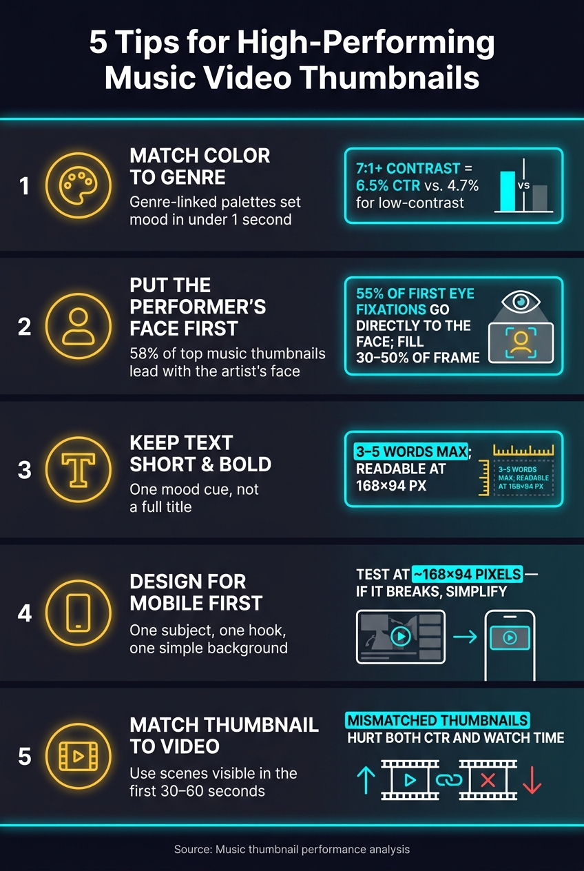
Music Video Thumbnail Best Practices: 5 Tips at a Glance
Insane Music Video Thumbnails: Pro Tutorial for Directors & Editors! (Photoshop)
sbb-itb-b59debf
Quick Comparison
| Tip | Main Focus | What I’d keep in mind |
|---|---|---|
| 1 | Color | Match palette to genre and keep contrast high |
| 2 | Face | Use one clear face with easy-to-read emotion (understanding the science of faces can help here) |
| 3 | Text | Add a short mood cue, not a full title |
| 4 | Layout | Build for phone screens first |
| 5 | Story match | Make sure the thumbnail reflects the video |
In short, this article says a strong music thumbnail is not about stuffing in more details. It’s about making one feeling clear at a glance.
1. Match Your Color Palette to the Music Genre
Color is one of the first things a thumbnail says. Long before someone reads the title or spots the artist, they get a gut-level read from the colors alone. That split-second reaction can help you win the click. So it helps to lean on palette cues people already link with a genre. The table below shows common genre cues.
Genre-to-color fit
| Genre | Common Palette | Feel |
|---|---|---|
| EDM / festival | Neon blues, pinks, purples | Energetic, high-impact |
| Hip-hop / trap | Black, gold, red, chrome, cyan | Bold, premium, intense |
| Rock / metal | Dark tones, black, deep red | Powerful, gritty |
| Lo-fi / acoustic | Pastels, earth tones, creams | Calm, warm, authentic |
| Pop | Bright pinks, yellows, turquoise | Fun, upbeat, youthful |
| R&B / soul | Warm gradients, moody depth | Emotional, atmospheric |
These are common patterns, not hard rules. Once the genre is clear, shift your attention to high vs low contrast so the main subject stands out.
Emotional clarity at small size
Your palette should communicate mood in less than a second. Keep it tight: one background color, one supporting color, and one accent. If you shrink the thumbnail to mobile size and it turns into visual noise, cut it back.
Visual contrast and focal hierarchy
Strong contrast helps the subject stay readable on phones. One study found thumbnails with 7:1+ contrast averaged a 6.5% CTR, versus 4.7% below 4:1. Complementary color pairs like blue and orange or red and cyan can help pull the subject away from the background.
Keep one main focal point. Let everything else sit back. A quieter background gives the face or text room to stand out.
2. Put Performer Faces Front and Center With Clear Emotion
Top music thumbnails often put a face first for one simple reason: people read emotion fast. Color can set the tone, but the face is what makes that feeling land right away. Analysis of high-performing music channel thumbnails found that 58% of winning designs feature a performer's face as the primary visual element.
The expression should fit the song. An open-mouth, high-energy shot makes sense for an upbeat pop track. A serious, reflective, or tearful look fits a breakup ballad. The goal isn't just to show the artist looking polished. It's to hint at the song's emotional payoff.
Mobile makes this even more important. The face needs to make sense in a split second, so crop in tight enough that the eyes and mouth are easy to read on a small screen. Those features carry most of the emotional signal. Eye-tracking research supports that point: about 55% of first fixations go directly to the face, and roughly 81% of those fixations stay on the face for a second look.
A straight-to-camera gaze can hold attention longer, so it's often worth using when it fits the song's tone. If the expression feels muddy on mobile, tighten the crop or strip back the background.
Keep the focus on one dominant face, and never cover the eyes or mouth. Using music thumbnail templates can help ensure your layout keeps the artist's features clear and centered.
3. Write Short, Bold Text That Reflects the Song's Mood
After the face sets the tone, the text should do one job only: add a fast mood cue, not compete as a second focal point. Once the face pulls someone in, the words should sharpen the feeling. Keep it to 3–5 words max. The text should feel like it belongs with the thumbnail’s colors and the performer’s expression.
Use Text as a Mood Signal
Thumbnail text should hint at the song’s mood, not just repeat the title. Short, punchy phrases work best. Think Heartbreak, Summer Vibes, Dark Remix, or Live Session. Those kinds of phrases give the viewer a feeling in a split second.
If you copy the video title word for word, you waste the space. A short emotional hook does more. It gives people a reason to pause and click.
Mobile Text Readability
Use bold text. Thin fonts tend to vanish when the thumbnail gets small. White or yellow text on dark backgrounds usually works well, especially with a slight stroke or drop shadow so the letters stay sharp when the image shrinks to about 168×94 pixels in the YouTube feed.
Check the thumbnail at mobile size. You can also use a music thumbnail generator to test different layouts quickly. If the main word isn’t easy to read right away, make it bigger or increase the contrast. At a glance, the mood word should hit first.
Keep the setup simple:
- One bold mood word
- One small secondary tag
- No more than two font styles
Secondary text should stay smaller and use less contrast, so it supports the main word instead of fighting with it.
Font choice matters too. Rounded sans-serifs fit pop and dance. Lighter, spaced-out type can suit sad tracks. Heavy condensed lettering often fits rock or trap. The type should match the song’s energy.
4. Build High-Contrast Layouts That Work on Small Screens
Once your text is in place, set up the frame so it still works on a phone. That's where most people will see a music thumbnail. It needs to make sense at a glance, and it should feel like the song, not just fit a small screen.
Visual Contrast and Focal Hierarchy
Keep the layout tight: one main subject, one short hook, and one simple background. Too many parts fighting for attention can make the thumbnail fall apart at mobile size.
The performer's face should be the biggest and clearest thing in the frame. Put the text in one steady spot, usually at the top or bottom, so it's easy to read and doesn't clash with the image.
Thumbnail color contrast matters too. Blue and orange work well together. So do purple and yellow. You can also darken or blur the background while keeping the face and text brighter. That split helps the subject stand out, which is a big deal in a crowded mobile feed. Without that contrast, the thumbnail can just melt into the scroll.
Emotional Clarity at Small Size
If the face is the hook, skip the wide shot. It loses punch fast when the image shrinks. A close head-and-shoulders crop keeps the performer's expression easy to read, even in a small preview.
Go with emotions that read fast, like joy, anger, or sadness. Subtle looks often disappear at that size. Lighting helps here too. Keep the face bright and even. Heavy shadows over the eyes or mouth can hide the expression, so it's better to light the face clearly and let the background stay darker.
A clean layout also makes the video's story easier to read in Tip 5.
5. Connect the Thumbnail to the Video's Visual Story and Use AI Tools to Speed Up the Process
Once your thumbnail layout is set, the last step is simple: make sure it lines up with the video's actual story. If a thumbnail promises one thing and the video shows another, you can hurt both clicks and retention.
Use one or two visual moments that show up early in the video, like a location, outfit, prop, or strong facial reaction. Stick to scenes viewers will see in the first 30–60 seconds of the video. That helps set the right expectation.
It also helps to match the thumbnail's colors to the video's lighting and color grade. When the thumbnail looks like it came from the same world as the video, the whole package feels more consistent.
Once you've picked the scene, AI tools can help you move faster. ThumbnailCreator can make quick variations from a prompt or a reference image. It can also swap faces or objects so the image better fits the video's story.
When you test, keep it clean. Change just one element between two versions, then compare CTR and watch time in YouTube Analytics after 7–14 days.
Before you publish, run through this quick check:
| Checkpoint | What to Verify |
|---|---|
| Story alignment | A key scene, prop, or outfit from the video appears in the thumbnail |
| AI usage review | All AI-generated elements honestly represent the video's content |
Helpful Tables and Visual References
Use these tables as a quick check before you publish.
Genre Color Palette
Your color palette sets the mood before anyone reads a title or recognizes the artist. A pop thumbnail can feel bright and playful. A rock thumbnail, on the other hand, usually leans darker and more intense.
| Genre | Primary Color | Accent Color | Emotional Tone | Background Style |
|---|---|---|---|---|
| Pop | Bright pink or yellow | Cyan or purple | Energetic, playful | Clean studio background |
| Hip-Hop | Deep black or charcoal | Gold, chrome, or neon red | Confident, intense | Urban streetscape or minimalist |
| Rock | Dark red or black | High-contrast white | Raw, intense | Gritty concert or textured stage |
| EDM | Electric blue or purple | Neon cyan or magenta | Euphoric, high-energy | Abstract gradients or light trails |
| R&B | Warm burgundy or deep purple | Amber or soft gold | Smooth, intimate | Soft focus or moody lighting |
| Acoustic | Earthy beige or sage | Warm white or soft cream | Calm, authentic | Natural light or outdoor setting |
Once you lock in the palette, framing does the next big job: keeping the subject easy to read at a glance.
Close-Up Portrait vs. Full-Body Shot
Close-ups usually work best when emotion is the main draw. Full-body shots make more sense when scale, movement, or stage presence needs to come through.
| Format | Mobile Clarity | Emotional Impact | Best Use Cases | Pros | Cons |
|---|---|---|---|---|---|
| Close-Up Portrait | High | High | Official MVs, ballads, reaction videos | Strong focal point, clear emotion | Less context about setting or choreography |
| Full-Body Shot | Medium | Medium | Live shows, dance videos, band shots | Conveys scale and energy | Details shrink on small screens; needs high contrast |
A face taking up about 30–50% of the frame often gives you a good middle ground between emotion and enough background context to tell a story.
Text Strategy by Video Type
Text should support the image, not fight with it. If the thumbnail already says a lot with expression, color, and pose, a few words are usually enough.
| Video Type | Ideal Text Length | Placement | Font Style |
|---|---|---|---|
| Official Video | 0–3 words | Bottom or side | Bold, minimal branding |
| Live Performance | 3–5 words, such as LIVE IN NYC | Top left, clear of the timestamp | High-contrast sans-serif |
| Lyric Video | 2–4 words | Top or bottom | Stylized or thematic |
| Behind-the-Scenes | 3–5 words | Overlapping the subject's edge | Bold with stroke or shadow |
| Cover / Reaction | 3–5 words | Near the face | Bold, action-oriented |
Layout Comparison
Choosing between mobile-first vs desktop-first thumbnails can make or break clarity on small screens. A simple single-subject layout often wins because the viewer knows where to look right away.
| Layout | Best Use Case | Mobile Clarity |
|---|---|---|
| Single-Subject | Solo artists, close-ups | Highest - one clear focal point |
| Artist + Logo | Established branding, label releases | High - keep the logo small |
| Artist + Album Art | New album campaigns | Medium - can get crowded quickly |
| Stage Performance | Concerts, live sessions | Medium - requires strong contrast |
| Abstract Art | Lo-fi, EDM, experimental releases | Lower - relies heavily on color and mood |
Manual vs. AI-Assisted Workflow
When the idea is solid, AI can help you move faster and test more options without starting from scratch each time. That matters a lot when you’re comparing versions side by side and trying to spot what reads best on a phone screen.
| Factor | Manual Workflow | AI-Assisted (ThumbnailCreator) |
|---|---|---|
| Time to First Draft | Hours of layering and masking | Fast professional concept generation |
| Iteration Speed | Slow - one or two versions at most | Fast - multiple variations for A/B testing |
| Consistency Across Videos | Hard to maintain over time | High - repeatable branding and saved palettes |
| Mobile Optimization | Manual resizing and checking | Faster mobile review and easier text adjustments |
Conclusion
Strong music video thumbnails usually come down to a few simple things: genre-fit color, a clear face, bold text, strong contrast, and visuals that match what the video delivers.
The last two checks are what often separate an okay thumbnail from one that holds up under pressure. Before you publish, shrink the image to about 120–160 pixels wide and make sure the face, emotion, and text still read clearly. On a big screen, almost anything can look fine. On a phone, common thumbnail mistakes fall apart fast.
For the shoot itself, plan for the thumbnail before the camera starts rolling. Hold expressive poses, think through contrast in wardrobe and lighting, and capture dedicated stills after the main take. That extra minute on set can save a lot of guesswork later.
ThumbnailCreator can help move things along. ThumbnailCreator can help with variation testing, expression swaps, and text hooks. This helps move beyond intuition by comparing A/B testing vs gut feeling results.
The goal is simple: make the right viewer stop and click.
FAQs
How often should I update my music video thumbnail?
Review your thumbnails once a month by checking the previous 30 days. It’s a simple way to spot brand drift and keep your visual style in line.
Beyond that, use ThumbnailCreator to test different versions. If a thumbnail doesn’t look clear on mobile, swap it out right away.
What if my video has multiple artists or faces?
Avoid overcrowding the thumbnail. In many cases, one expressive face gets more clicks than a bunch of smaller faces, often lifting click-through rate by 15% to 25%.
For better clarity, stick with one main subject that takes up about 30% to 60% of the frame. If you want to try different artists, use ThumbnailCreator to make variants and run an A/B test instead of cramming everyone into one image.
Should every music video thumbnail use the same style?
No. Consistency helps your channel feel familiar, but if every thumbnail looks the same, your videos can start to blur together.
A better approach is to keep your main brand cues in place, like your logo position, fonts, and color palette, while changing the image, facial expression, and main subject from one video to the next.
That way, your channel still feels connected, but each video gets room to stand out. ThumbnailCreator can help you keep that balance.