
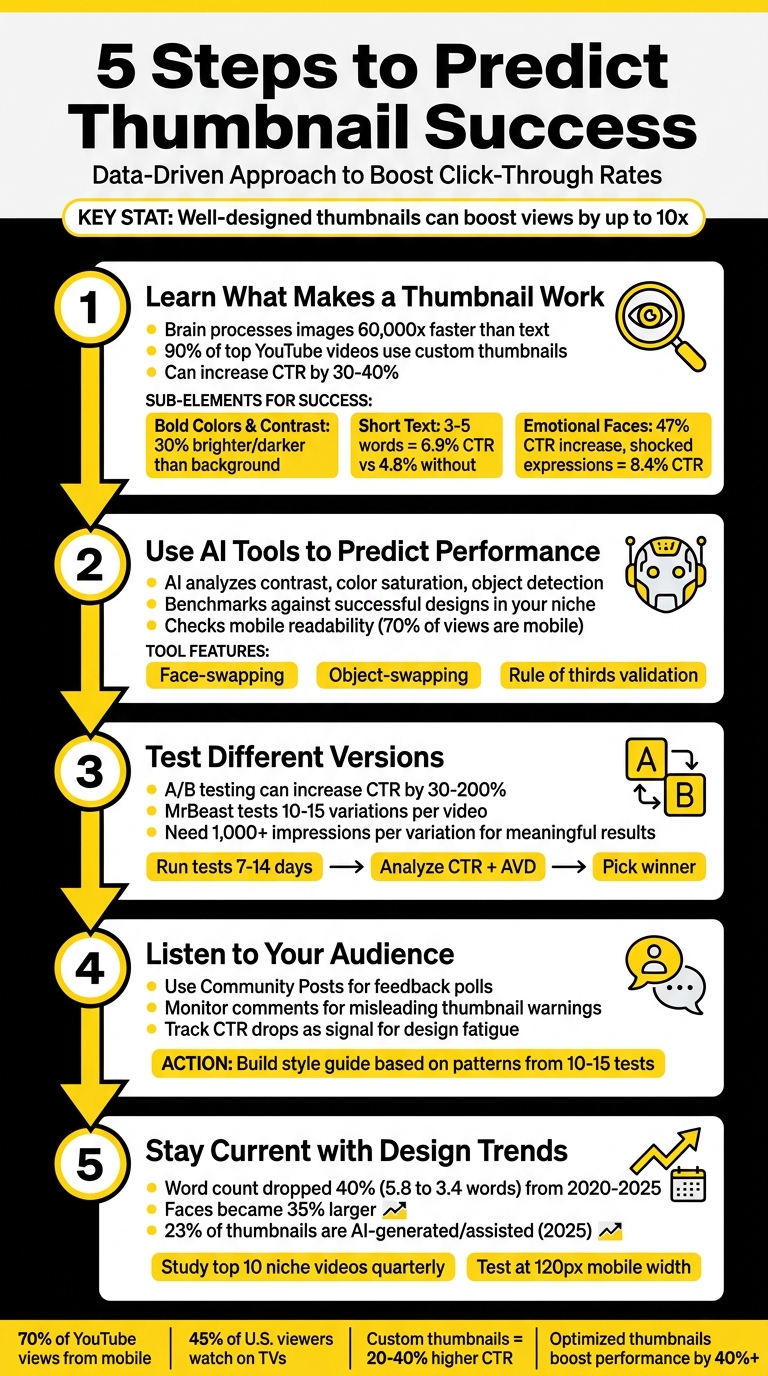
5 Steps to Predict Thumbnail Success
Your thumbnail determines whether viewers click or scroll past your video. A well-designed thumbnail can boost views by up to 10x, while a poor one risks being ignored. With 70% of YouTube views coming from mobile and 45% of U.S. viewers watching on TVs, your design must work on both small and large screens. Here's how to create thumbnails that drive clicks:
- Use high contrast and bold colors to grab attention in crowded feeds.
- Limit text to 3–5 words for readability, especially on mobile.
- Include emotional faces to create instant connections, with exaggerated expressions performing best.
- Leverage AI tools like ThumbnailCreator to analyze and refine your designs before publishing.
- A/B test multiple versions to see what resonates with your audience.
5-Step Process to Predict YouTube Thumbnail Success with Key Statistics
Step 1: Learn What Makes a Thumbnail Work
To create a winning thumbnail, you need to understand what grabs attention instantly. Thumbnails that succeed follow simple but effective design principles that catch the eye and spark curiosity. Since the brain processes images 60,000 times faster than text, you have less than a second to make an impact. That’s why 90% of top-performing YouTube videos use custom thumbnails rather than the ones auto-generated by YouTube.
The secret lies in three key elements: visual contrast to make your thumbnail stand out, minimal text for quick readability (especially on mobile), and emotional faces to create an instant connection. Nail these, and your click-through rate (CTR) could jump by 30% to 40%, turning an underperforming video into a hit.
Use Bold Colors and Strong Contrast
Your thumbnail is competing with hundreds of others in a single scroll, so it needs to stand out. High contrast vs low contrast designs can make or break your performance. The main subject should be at least 30% brighter or darker than the background. Without contrast, your thumbnail risks blending into the noise, especially on smaller screens.
"Contrast is communication, and on a platform where your thumbnail competes with hundreds of others in a single feed view, communication speed is everything." - TubeAI Learn
Color combinations play a huge role. For example, yellow and black work great for tutorials with high energy, while red and white create urgency for news or big announcements. Studies show high-contrast color schemes can boost CTR by 39% compared to low-contrast designs. On the flip side, avoid white backgrounds - they blend into YouTube’s light mode and can lower CTR by 28%.
Keep Text Short and Easy to Read
Text on your thumbnail isn't there to explain everything - it’s a quick signal of value. Keep it simple: 3–5 words (ideally under 12 characters) in bold, sans-serif fonts like Bebas, Impact, or Montserrat. Use a size of 100–200 pixels on a 1280×720 canvas to ensure readability. Thumbnails with more than six words see a 31% drop in CTR.
In one study of 1,247 videos, thumbnails with 3–5 words achieved a CTR of 6.9%, compared to 4.8% for those without text - a 44% increase. Adding text outlines or shadows further boosted CTR by 23%.
To make text pop, add a 3–5 pixel outline or drop shadow. And steer clear of the bottom-right corner - that’s where YouTube places the video duration timestamp.
Add Faces and Emotions
Faces are powerful. Humans are naturally drawn to them, and thumbnails featuring faces with clear emotions can increase CTR by 47% compared to those without. But the type of expression matters. Shocked or surprised faces perform best, with an average CTR of 8.4%, while confused or questioning expressions follow closely at 7.9%.
The trick is to make the emotion exaggerated. Use close-ups where the face takes up 30–40% of the thumbnail. Position the eyes using the rule of thirds - place them at the intersections of a 3×3 grid using the rule of thirds vs centered layout for a balanced look that naturally draws attention.
"The thumbnail is the bouncer at the door." - TubeAI Learn
This technique creates a "curiosity gap." The face hints at something intriguing but incomplete, compelling viewers to click to find out more. It’s a subtle way to make the thumbnail irresistible.
sbb-itb-b59debf
Step 2: Use AI Tools to Predict Performance
Once you’ve grasped the basics of thumbnail design, it’s time to put AI to work for smarter, faster results. AI tools can analyze key data points to predict which thumbnails will drive clicks - even before you hit publish. This approach not only boosts precision but also saves you hours of trial and error.
The trend is clear: top creators are now designing and refining thumbnails during pre-production rather than waiting until after filming. By providing instant feedback, AI tools help fine-tune designs based on what’s likely to perform well. Paired with solid design principles, AI takes the guesswork out of predicting success.
How AI Evaluates Thumbnail Design
AI doesn’t just analyze your thumbnail - it predicts how viewers will interact with it. Using Generative Adversarial Networks (GANs) trained on eye-tracking data, these tools can accurately forecast where people’s attention will go first. They pinpoint high-impact areas, showing where viewers’ eyes naturally gravitate.
Here’s what AI focuses on:
- Contrast: Ensures the subject stands out clearly from the background.
- Color Saturation: Highlights bold pairings, like electric yellow against deep purple, to grab attention.
- Object Detection: Verifies that the main subject is sharp and well-defined.
- Emotional Appeal: Analyzes whether facial expressions align with the tone of the video.
- Mobile Readability: Checks that the thumbnail remains clear and effective on smaller screens, which is critical for mobile viewers.
AI also compares your thumbnail against successful designs in your niche. For instance, gaming thumbnails often feature exaggerated, high-energy expressions, while educational content might benefit from focused or inquisitive looks. By benchmarking your design against these patterns, AI suggests tweaks to improve performance.
Apply ThumbnailCreator's Prediction Features
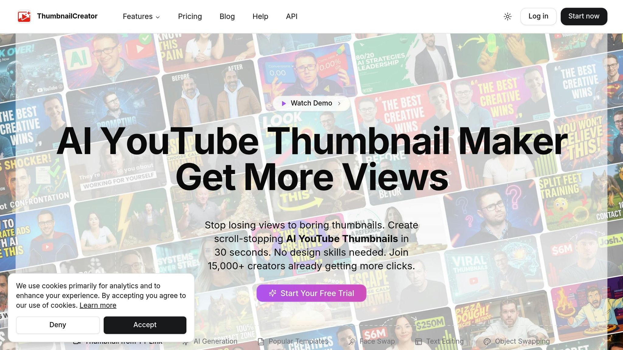
ThumbnailCreator makes this process even easier by automating much of the work. Instead of starting from scratch, you can generate multiple variations in seconds using AI-powered templates tailored to your content niche. Its face-swapping feature lets you test different emotional expressions - like curiosity versus excitement - to see which resonates better with your audience. Meanwhile, the object-swapping tool allows you to experiment with different subjects or backgrounds without needing a complete redesign.
This tool doesn’t just create thumbnails; it evaluates them. ThumbnailCreator checks for critical factors like:
- Rule of Thirds: Ensuring elements are visually balanced.
- Text Length: Keeping text short (3–5 words) for mobile readability.
- Dead Zone Awareness: Avoiding the bottom-right corner, where YouTube’s timestamp can obscure key design elements.
By flagging potential issues instantly, the tool helps you make adjustments before publishing. These insights align your thumbnail with proven success factors, giving you a competitive edge.
Why does this matter? Because half of all YouTube channels have a click-through rate between 2% and 10%. Even small improvements can make a noticeable difference in your views. By using AI to "beta test" your thumbnails, you can identify what works best before your audience even sees it. This not only speeds up the process but also ensures a more accurate, data-driven approach - taking much of the guesswork out of the equation.
Step 3: Test Different Versions
Testing is the key to finding out which thumbnails truly resonate with your audience. Thumbnails play a huge role in click decisions - impacting up to 90% of them - so testing helps you fine-tune your approach. A/B testing can increase your click-through rate (CTR) by anywhere from 30% to 200%. Even a small bump, like a 1% improvement, can translate into 10–20% more views. It’s no wonder creators like MrBeast often test 10–15 thumbnail variations for a single video. While AI tools can predict success, A/B testing puts those predictions to the test with actual audience behavior.
Run A/B Tests on Your Thumbnails
To put your thumbnail comparisons to the test, A/B testing is your go-to method. YouTube offers a free tool called Test and Compare, which splits your audience and shows different thumbnails at the same time. This simultaneous testing avoids time-of-day biases and automatically determines the best-performing thumbnail based on the data collected. Keep in mind, though, that this feature requires advanced YouTube Studio access and at least 1,000 impressions per variation for reliable results.
If YouTube’s tool isn’t an option, third-party tools like TubeBuddy (about $49–$99/month) or VidIQ (around $39–$79/month) can step in. However, these tools typically rely on sequential testing, where thumbnails are swapped every 24 hours. This can introduce some bias since audience behavior might change depending on the time of day. For smaller channels, you can even run manual tests by changing thumbnails weekly and tracking results in a spreadsheet.
When setting up your tests, focus on one change at a time. For instance, if you’re testing a red background versus a blue one, keep everything else - like text, layout, and facial expressions - the same. In one case, MrBeast’s creative director Tyler Conklin discovered that a red background increased CTR from 11.2% to 14.8%, a 32% jump across more than 2 million impressions. Another strategy to try is the Safe-Safe-Wildcard method: test your usual style, a slight tweak, and one completely out-of-the-box design. Just make sure all thumbnails are at least 720p (1280×720 pixels) to prevent YouTube from downscaling them. For the most accurate results, run your tests for 7–14 days to account for both weekday and weekend viewing habits. Be cautious about early data, as it can be misleading during the first 24–48 hours.
Review the Data and Pick the Winner
Once your tests are complete, the data will point you toward the best thumbnail. Focus on two key metrics: CTR and average view duration (AVD). A high CTR combined with low AVD might signal clickbait, which could hurt your video’s performance in the long run. Make sure your results are statistically significant - Tim Schmoyer, founder of Video Creators, advises waiting until each variant has at least 1,000 impressions:
"The biggest mistake creators make is calling a test after 100 clicks. You need at least 1,000 impressions per variation for statistically meaningful results".
For deeper insights, analyze how your thumbnails perform across different traffic sources. Thumbnails that shine on YouTube’s home page (Browse) often feature surprised expressions, while those that do well in search results tend to highlight close-ups with clear, descriptive text. For example, productivity creator Ali Abdaal found that a thumbnail with a surprised expression and direct eye contact achieved a 9.4% CTR, compared to 6.8% for a neutral expression - a 38% improvement over 127,000 impressions.
Keep in mind that even winning thumbnails might not hold up over time. About 18% of top-performing thumbnails may underperform when re-tested due to seasonal trends or algorithm shifts. For high-priority videos, consider running a second round of tests to confirm your results before applying the changes across your channel.
Step 4: Listen to Your Audience
A/B testing can show you what works, but audience feedback helps you understand why. The numbers from your tests are just one piece of the puzzle - the other comes from observing how viewers respond to your thumbnails. Subscribers often reveal what connects with them, and spotting these trends can help you avoid design missteps. By combining audience insights with testing data, you can fine-tune your thumbnail designs even further.
Collect Feedback from Comments and Posts
One of the easiest ways to gather feedback is by asking directly through Community Posts. YouTube's Community Posts feature lets you share multiple thumbnail options and ask your subscribers to vote for their favorite before the video goes live. As Reddit user u/sabkimaaki (r/youtubers) shared:
"I post versions as a post and ask subs which is better".
In addition to polls, keep an eye on your comment sections for feedback. If viewers mention that a thumbnail feels misleading, it’s a red flag that the design doesn’t align with the content. This mismatch can lead to viewers disengaging quickly, which could hurt your video's performance in YouTube’s algorithm. It’s also worth noting how different audience groups behave: loyal subscribers often prefer thumbnails featuring your face, while new viewers might be drawn to bold text or product-focused images.
Another key indicator is your click-through rate (CTR). If your CTR starts to drop and you’ve been using repetitive designs, it’s a sign that your audience is craving something fresh.
Apply Audience Preferences to Future Designs
Take what you’ve learned from your audience and use it to refine your designs. Pair their feedback with your testing results to create actionable insights. One way to stay organized is by keeping a testing log. Record details like your hypothesis, the variables you changed, the resulting CTR, and watch time. After running 10–15 tests, you’ll start to notice patterns that highlight what your audience clicks on most.
From there, you can build a style guide based on these insights. This guide should evolve as your audience’s preferences change. For example, track whether your viewers respond better to thumbnails featuring your face versus product images, which colors get more clicks, and what text styles or emotional expressions resonate most. Here’s a real-world example: in November 2025, a tech review channel with 287,000 subscribers tested two thumbnails for a smartphone comparison video. One thumbnail (Variant A) showed only the product, while the other (Variant B) included the creator’s face with a surprised expression. Variant B outperformed Variant A with a 9.19% CTR compared to 7.32% - a 25.5% improvement. Plus, the average view duration remained consistent (6:47 for Variant B versus 6:52 for Variant A), showing that the face-inclusive thumbnail was both engaging and honest.
Lastly, conduct a quarterly review of your top and bottom 10 videos. This will help you identify what works in your best-performing thumbnails and spot areas for improvement in the lower-performing ones. Use these findings to create reusable templates with pre-set text blocks and proven color schemes, ensuring your designs continue to reflect what your audience loves.
Step 5: Stay Current with Design Trends
Relying on outdated design trends can seriously hurt your click-through rate. Viewer preferences and YouTube's algorithm are constantly evolving, which means thumbnail designs from just a few years ago might not cut it anymore. For example, between 2020 and 2025, the average word count on thumbnails dropped by 40%, from 5.8 words to just 3.4. Meanwhile, faces in thumbnails became 35% larger, and color saturation increased by 28% to grab attention more effectively. With more people consuming content on smaller screens and making snap decisions, simplifying your thumbnail design is no longer optional - it’s essential.
If you’re still using strategies from two or three years ago, there’s a good chance your thumbnails are falling behind. By 2025, around 23% of thumbnails are either AI-generated or created with AI-assisted editing tools. On top of that, creators who use custom thumbnails see a 20–40% higher click-through rate compared to those who rely on YouTube’s auto-generated options. Staying relevant means keeping a close eye on what’s working now and tweaking your approach before your audience loses interest.
Study Successful Channels in Your Niche
One of the quickest ways to spot new trends is by looking at what’s already working for top creators in your niche. Check out the top 10 videos in your category from the last three months and analyze their thumbnails. Look for patterns in colors, layouts, and facial expressions. As Jay Kim from Miraflow.ai puts it:
"The growing channels have better thumbnails... because they follow specific visual patterns that trigger clicks".
Pay special attention to how these creators use color. For instance, finance channels often lean on red to create urgency, while tech channels favor blue to project authority. Notice other recurring elements, like consistent branding or unique design features, that make their thumbnails stand out. Use this research to refine your own approach. If everyone in your niche is using a specific color scheme, you might stand out by going with a completely different palette.
Don’t forget to test how your thumbnails look at 120 pixels wide - the size most people will see on their mobile devices, which account for over 70% of YouTube views. Keep text overlays short and punchy (under six words), and use bold, high-contrast fonts with strokes or drop shadows to improve readability. Avoid placing text or key visuals in the bottom right corner, where YouTube’s timestamp will cover them.
Adjust for Platform and Viewer Changes
Once you’ve identified current trends, adapt your strategy to fit different viewing contexts. YouTube’s algorithm prioritizes immediate engagement, so your thumbnails need to accurately reflect your content. Misleading clickbait might get you clicks, but if viewers leave quickly, it’s a clear sign your thumbnail didn’t deliver on its promise.
Keep an eye on your channel’s performance metrics. If your click-through rate (CTR) drops by more than 20% over a four-week period, it’s probably time to rethink your thumbnail design. Conduct quarterly reviews of your top 10 and bottom 10 videos to see what’s resonating with your audience. Update small design elements - like fonts, colors, or layouts - every three to four months to keep things fresh and avoid viewer fatigue. As Vicki Larson explains:
"The tool matters way less than your understanding of your audience".
With nearly half (45%) of U.S. views now happening on TVs, it’s more important than ever to ensure your designs work for both mobile and TV screens. Here’s a quick test: squint at your screen. If the main subject or emotion isn’t immediately clear, your design probably needs simplifying. Tools like ThumbnailCreator, which use AI to predict performance, can help you stay ahead of these shifts.
Conclusion
Stop relying on guesswork when it comes to thumbnail success - use a structured, data-driven approach instead. By applying design principles like visual hierarchy and high contrast, you can create thumbnails that instantly catch the eye. And with AI tools like ThumbnailCreator, you can merge creative instincts with data-backed insights. These tools analyze your designs against thousands of top-performing examples, helping you refine your thumbnails before they even go live.
As mentioned earlier, combining AI analysis with real-world testing sharpens your strategy. A/B testing vs. gut feeling not only confirms your design decisions but also ensures you’re optimizing for both click-through rates (CTR) and watch time. Striking this balance is crucial. As Thumbmagic wisely points out:
"A thumbnail that drives clicks but tanks watch time will hurt your channel more than a lower-CTR thumbnail that attracts engaged viewers." – Thumbmagic
Paying attention to audience feedback through performance reviews and staying updated on design trends keeps your thumbnails relevant. Studies show that optimized thumbnails can boost video performance by over 40%, and in some cases, a single well-designed thumbnail can increase views tenfold. This methodical approach ensures every element of your design works to its fullest potential.
By combining sound design fundamentals, AI-driven predictions, and audience insights, your thumbnails can become powerful tools for engagement. As MrBeast famously said:
"We sketch out the thumbnails beforehand. I'd rather have that existential crisis before I filmed the video that way I can make changes." – MrBeast
Stick to your core design rules, review your top and bottom-performing thumbnails quarterly, and test variations for 7–14 days to gather meaningful data. With most viewers consuming content on mobile devices, ensuring your thumbnails are clear and impactful on smaller screens is non-negotiable. Use AI insights, validate your ideas with A/B testing, listen to your audience, and stay current with design trends to make every thumbnail count.
FAQs
What thumbnail changes improve CTR fastest?
To give your thumbnail's CTR a quick lift, try making small but impactful tweaks. Use expressive faces - think surprised or happy expressions - paired with high-contrast color combinations like yellow and black or red and white. Keep the text bold and minimal for clarity. Run A/B tests on these elements over 7–14 days, aiming for 1,000–5,000 impressions per variation. This method helps pinpoint what grabs attention and drives more clicks.
How many impressions do I need for A/B tests?
To conduct precise A/B testing for thumbnails, aim to gather between 1,000 and 5,000 impressions for each variation. Run the test for 7 to 14 days to ensure the data is reliable. This duration allows enough time to identify viewer preferences and capture meaningful trends.
How do I use ThumbnailCreator to predict clicks?
ThumbnailCreator’s AI tools are designed to help you fine-tune thumbnails for better click-through rates (CTR). With this tool, you can create multiple thumbnail variations, run A/B tests, and leverage predictive analytics to pinpoint the design most likely to perform well. It evaluates factors like color schemes, facial expressions, and text placement to estimate CTR. This means you can make informed decisions and design thumbnails that grab attention and connect with your audience.