
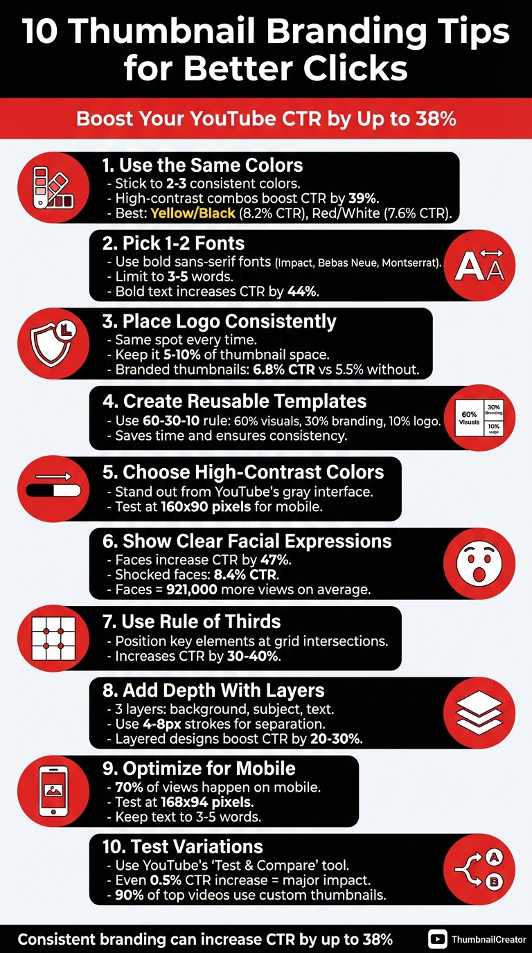
10 Thumbnail Branding Tips for Better Clicks
Want more viewers to click on your YouTube videos? Start by optimizing your thumbnails. Thumbnails are the first impression your content makes, and consistent branding can increase click-through rates (CTR) by up to 38%. Here’s how to create thumbnails that stand out and drive clicks:
- Stick to a Color Palette: Use 2–3 consistent colors to make your thumbnails instantly recognizable. High-contrast combos like yellow/black or red/white can boost CTR by 39%.
- Choose 1–2 Fonts: Limit text to 3–5 words using bold, sans-serif fonts like Impact. Keep text legible on mobile by testing at 168x94 pixels.
- Add Your Logo: Place your logo in the same spot every time to build brand recognition. Keep it small but visible.
- Use Templates: Reusable templates save time and ensure consistency across all thumbnails.
- Highlight Faces: Thumbnails with clear facial expressions can increase CTR by 47%. Use emotions like surprise or excitement to grab attention.
- Apply the Rule of Thirds: Position key elements (like faces or text) along a 3x3 grid for a balanced, professional look.
- Test Variations: Use YouTube’s "Test & Compare" tool to find what works best for your audience.
Pro Tip: Tools like ThumbnailCreator simplify the process by offering templates and built-in mobile previews. Whether you’re just starting or looking to refine your strategy, these tips will help your thumbnails work harder for you.
10 Thumbnail Branding Tips to Increase YouTube CTR
1. Use the Same Colors in Every Thumbnail
Visual Consistency with Branding
Sticking to a consistent color palette in your thumbnails is key to building a recognizable brand. Think of it as your channel's visual signature - those familiar colors help viewers instantly identify your content, even before reading the title. Sacha Dumay, Founder of DataFuel, puts it perfectly:
"Your visual consistency acts like a mental bookmark, making it easier for people to find and trust your content".
To keep things clean and effective, limit your palette to just 2–3 colors. This is especially important for small-sized thumbnails (160x90 pixels on mobile), where too many colors can create visual clutter. A good approach is to choose one primary color (like bright blue #0066FF), one contrasting accent (such as orange #FF6600), and one neutral shade (white or black). Stick to these defined HEX codes for uniformity, helping your thumbnails stand out and boosting recognition.
Effectiveness in Improving Click-Through Rates (CTR)
Using the right colors can have a big impact on your click-through rates (CTR). High-contrast color combinations, for example, can increase CTR by up to 39% compared to low-contrast designs. Some standout combinations include yellow and black, which average an 8.2% CTR, and red and white, which hit 7.6%.
For niche content, color psychology can guide your choices. For example:
- Red: Creates urgency, great for drama or news.
- Blue: Builds trust, ideal for tech reviews or professional topics.
- Yellow: Grabs attention, perfect for tutorials or lifestyle videos.
Even specific topics benefit from tailored palettes - green works particularly well for finance-related content, outperforming other colors by 23%.
Ease of Implementation for Creators
The good news? Applying these strategies isn’t hard. Start by defining your 2–3 brand colors and locking in their HEX codes. Create reusable templates where only the images and text change, keeping the colors consistent. Tools like ThumbnailCreator (https://thumbnailcreator.com) can make this even easier with customizable templates and AI features designed to maintain your branding.
Before you hit publish, always shrink-test your thumbnail to the mobile size (160x90 pixels). If the colors or subject don’t pop, tweak the contrast. Also, avoid placing key elements in the bottom-right corner, as YouTube’s timestamp will cover them.
sbb-itb-b59debf
2. Pick One or Two Fonts and Stick With Them
Visual Consistency with Branding
Just like consistent color schemes define your visual identity, sticking to a unified typography style strengthens your channel’s branding. By using one or two fonts across all your thumbnails, you create a recognizable "visual DNA" for your content. A great approach is to establish a typography hierarchy - use a bold font for headlines and a secondary font for supporting text. This not only makes your thumbnails visually appealing but also helps viewers instantly associate your content with your brand. Keeping font choices limited also reduces mental effort for viewers, making it easier for them to identify your channel while signaling professionalism and reliability. A strong, cohesive design can lead to better viewer engagement and retention.
Effectiveness in Improving Click-Through Rates (CTR)
The data speaks volumes about how typography impacts performance. Thumbnails with bold text containing 3–5 words achieve a 44% higher average CTR compared to those without text. When paired with consistent font branding and other design elements, CTR can improve by up to 38%. However, overcrowding your thumbnail with too much text can backfire - thumbnails with more than six words often suffer a 31% drop in CTR due to readability issues. To maximize impact, opt for bold sans-serif fonts like Impact, Bebas Neue, or Montserrat Extra Bold. These fonts remain clear and legible, even at small sizes. For thumbnails designed at 1280x720 resolution, aim for a primary headline size of 150–200px and secondary text between 80–120px. Adding a 4–8px outline or drop shadow can make your text stand out against complex backgrounds, boosting CTR by 23%.
Adaptability for Different Devices and Platforms
With over 70% of YouTube watch time happening on mobile devices, your fonts must stay legible even when thumbnails are scaled down to 168x94 pixels in mobile search results. This is where the "168x94 Test" becomes essential - if your text isn’t clear at this size, it’s time to switch to a bolder, simpler font. Mobile viewers typically decide in under two seconds whether to click, so keeping your message short (3–5 words) ensures it’s easy to grasp.
Ease of Implementation for Creators
To streamline your workflow, consider creating a Thumbnail Text Style Guide. This guide should outline your primary and secondary fonts, recommended sizes, and outline styles. It simplifies the design process and ensures consistency across all your content. Tools like ThumbnailCreator (https://thumbnailcreator.com) can further simplify things by offering customizable templates that lock in your font choices while allowing easy adjustments to images and text. Always test your designs at mobile size before publishing - if the text isn’t sharp and readable at 168x94 pixels, adjust the font size or reduce the word count. For optimal mobile readability, position text in the top-left area of the thumbnail and keep it at least 8–12% inside the edges to prevent cropping. Standardizing your fonts not only strengthens your brand but also helps boost your click-through rates.
3. Place Your Logo in the Same Spot
Why Logo Placement Matters
Just like consistent use of colors and fonts, placing your logo in the same spot across all thumbnails strengthens your channel’s branding. A fixed logo position creates a visual signature that helps viewers recognize your content instantly - even in a crowded feed. This consistency not only builds trust and professionalism but also avoids the cluttered look that random logo placement can cause. A clear, predictable design reinforces your identity and can positively influence your channel's performance metrics.
Boosting Click-Through Rates (CTR)
Branding consistency has a measurable impact on how well your videos perform. Thumbnails featuring branded elements often achieve an average CTR of 6.8%, compared to 5.5% for those without - a jump of 24%. When the logo placement remains consistent, CTR can increase by as much as 38%. To get the best results, your logo should take up just 5–10% of the thumbnail space. Use the 60-30-10 layout rule: dedicate 60% to visuals, 30% to brand elements, and 10% to the logo.
"Your logo should feel like a natural part of the layout, not an afterthought slapped on at the end." – Sacha Dumay, Founder of DataFuel
Optimizing for Mobile and Other Platforms
With more than 70% of YouTube watch time happening on mobile devices, your logo placement needs to work at smaller sizes. The top-left corner is an ideal location, but make sure all key elements are positioned 8–12% inside the edges to avoid cropping and maintain clarity. Before publishing, test your thumbnail at a resolution of 168×94 pixels to ensure your logo remains visible on mobile screens.
Making It Easy for Creators
For a smoother workflow, consider using YouTube thumbnail templates with your logo locked in place. Tools like ThumbnailCreator (https://thumbnailcreator.com) can simplify this process, allowing you to quickly swap out images and text while keeping your logo placement consistent. This approach saves time and ensures your branding stays polished and professional.
4. Create Reusable Templates for Your Brand
Visual Consistency With Branding
Templates play a key role in shaping your visual identity. By locking in essential brand features - like your color palette, fonts, and logo placement - you create a recognizable "visual DNA" that instantly signals your content to viewers. The trick is to decide which elements stay constant (like your brand colors and primary fonts) and which can vary (such as images and headlines).
Think of your templates as a three-tier system. Use a Standard template for most of your uploads (around 70–80%), a Special template for collaborations or premium content, and a Seasonal template for holiday themes or trending topics. This structure not only strengthens your channel's identity but also ensures every thumbnail consistently reflects your branding. Plus, this approach can lead to measurable improvements in performance.
Effectiveness in Improving Click-Through Rates (CTR)
Branded thumbnails have a direct impact on click-through rates. A good rule of thumb is the 60-30-10 principle: dedicate 60% of your thumbnail to content visuals, 30% to branding elements (like colors and fonts), and 10% to your logo.
Ease of Implementation for Creators
Reusable templates don’t just make your content look cohesive - they simplify your workflow. By mastering templates in design tools, you eliminate the guesswork from each upload. Tools like ThumbnailCreator (https://thumbnailcreator.com) make it even easier by allowing you to swap images and text while keeping your branding intact.
Stick to 2–3 main brand colors and 1–2 bold, sans-serif fonts, such as Montserrat or Impact. Before finalizing any template, test it on mobile devices to ensure your branding and message remain clear.
Adaptability for Different Devices and Platforms
With over 70% of YouTube watch time happening on mobile devices, your templates must look great even at thumbnail size. Design them at a minimum YouTube thumbnail resolution of 1,280×720 pixels - or go for Full HD at 1,920×1,080 - to keep them sharp on desktops and TVs while scaling down seamlessly for mobile. Also, avoid placing important text or branding in the bottom-right corner, as YouTube’s timestamp will cover it.
Limit text to 20% of the thumbnail space and aim for around six impactful words. Use high-contrast color combinations, like yellow on black or red on white, to make your thumbnails pop against light and dark interface modes. Since the human brain processes visuals 60,000 times faster than text, focus on bold, expressive faces that fill 30–40% of the frame.
5. Choose Colors That Stand Out
Visual Consistency With Branding
Colors do more than just make your thumbnails look good - they grab attention and reinforce your brand identity. The trick is to pick colors that stop the scroll while staying true to your brand's established style. YouTube’s interface is heavy on white, light gray, and dark gray tones, so your thumbnails need to stand out from that neutral backdrop.
Stick to your 2–3 color palette and follow the 60-30-10 rule to keep your designs balanced and recognizable. This approach ensures viewers can instantly identify your content, even in a quick scroll. Once you’ve nailed your palette, focus on practical steps to make sure those colors pop on any screen.
Effectiveness in Improving Click-Through Rates (CTR)
Using high-contrast colors can significantly boost your click-through rate (CTR) - by as much as 39% compared to low-contrast designs. But not all color combinations work equally well. For example:
- Yellow and black: Tops the charts with an average CTR of 8.2%, perfect for grabbing attention.
- Red and white: Delivers a 7.6% CTR, often used for urgent or dramatic content.
- Blue and orange: Averages 7.1%, ideal for tech or professional themes.
Colors also evoke emotions. Use them strategically to create urgency, trust, or excitement, depending on your content’s vibe. As YouTube Tools Hub puts it:
"Color isn't decoration. It's a weapon".
Ease of Implementation for Creators
Start with your brand’s existing palette and add complementary colors like blue and orange or red and green to make your subject stand out from the background. To create a clear focal point, ensure your subject is at least 30% brighter or darker than the background.
Before you hit publish, test your thumbnail at 160x90 pixels in both light and dark YouTube modes. This "shrink test" will reveal if your colors hold their impact and if your subject is easy to spot. If they don’t, the contrast likely needs tweaking. Tools like ThumbnailCreator (https://thumbnailcreator.com) make it simple to try different combinations without starting over every time.
Adaptability for Different Devices and Platforms
With more than 70% of YouTube watch time happening on mobile devices, your colors need to work even at smaller sizes. Bold, saturated colors tend to hold up well when scaled down, whereas muted tones or subtle gradients can lose their punch, reducing CTR by up to 18%.
Try the "contrast sandwich" technique: begin with a bold, simple background color, add a high-contrast subject with a 2–4 pixel glow or stroke, and finish with bold text in a third contrasting color. This method ensures your thumbnail remains clear and eye-catching, whether it’s viewed on a large monitor or a tiny phone screen during a quick scroll.
6. Show Clear Facial Expressions With Brand Elements
Visual Consistency With Branding
Incorporating consistent facial expressions into your visuals can strengthen your brand identity. Think of your face as a signature element of your brand. By positioning your face consistently - like always in the left or right third of the frame - you create a "visual fingerprint" that makes your content instantly recognizable, even before viewers read the title.
A good rule of thumb is the 60-30-10 rule: dedicate 60% of the thumbnail to your face, 30% to brand colors and fonts, and 10% to your logo. To make your face pop against the brand colors, apply a 4-8 pixel stroke or an outer glow around your cutout. These small design tweaks not only create a cohesive look but also boost viewer engagement.
Effectiveness in Improving Click-Through Rates (CTR)
Facial expressions aren’t just about aesthetics - they directly impact performance. Thumbnails with expressive faces average a 7.8% CTR, compared to just 4.2% for those without faces. That’s a 47% higher click-through rate. Even more striking, thumbnails featuring human faces average 921,000 more views than those without.
The type of expression matters too. Thumbnails with shocked or surprised faces achieve an 8.4% CTR, confused faces hit 7.9%, and excited expressions reach 7.2%. On the flip side, serious expressions drop to 5.8%, while neutral or unclear emotions can sink to just 4.3%. The trick is to match your expression to the content - shock works for big reveals, confusion for tutorial thumbnails, and excitement for upbeat topics.
Ease of Implementation for Creators
To ensure your face is clear and impactful, aim for it to occupy 25-40% of the thumbnail height - perfect for mobile viewing. Use the Rule of Thirds to position your eyes at key grid intersections, naturally drawing attention to your face and any accompanying text.
Before publishing, try the "postage stamp test." Shrink your thumbnail to 168x94 pixels to see if your facial expression is still recognizable. If it isn’t, adjust the contrast or scale up your face. Avoid placing important features in the bottom-right corner, as YouTube’s timestamp may obscure them. Tools like ThumbnailCreator (https://thumbnailcreator.com) can help you test and refine your thumbnails while keeping brand elements intact.
Adaptability for Different Devices and Platforms
Since over 70% of YouTube views come from mobile devices, your thumbnails need to work at smaller sizes. Slightly exaggerate your expressions - widen your eyes or open your mouth more - to ensure emotions are clear without looking overdone.
Direct eye contact can create a stronger connection with viewers, while a pointed gaze can guide attention to your hook text. To make your face stand out, blur or darken the background, creating a "contrast sandwich" that ensures your thumbnail remains readable on any screen size. These adjustments help maintain clarity and engagement across all platforms.
7. Use the Rule of Thirds for Layout
Visual Consistency With Branding
The rule of thirds divides your thumbnail into a 3x3 grid, helping you position key elements - like faces, logos, or products - at the grid's four intersections. This setup creates a balanced and visually appealing design, making your thumbnails instantly recognizable.
By placing the main subject on one side of the grid, you leave room on the opposite side for brand typography. This keeps the design clean and avoids clutter, all while reinforcing your brand identity across every thumbnail. A consistent layout like this ensures your thumbnails stand out and remain memorable in any feed.
Effectiveness in Improving Click-Through Rates (CTR)
Using an off-center composition can create a sense of visual tension, making your design more engaging. In fact, this approach has been shown to increase CTR by 30%-40%. For example, placing a face with eyes in the upper third of the thumbnail can draw attention, while leaving space for 3–5 words of brand text on the opposite side.
"Off-centre composition creates visual tension that feels more dynamic and professional. It also leaves room for text on the opposite side without covering your subject." – Unkoa
Designs that follow this method can outperform poorly structured layouts by up to 300%. The grid naturally directs the viewer's eye to the most important elements, giving your thumbnail a polished and professional look that grabs attention.
Ease of Implementation for Creators
Most design tools, like Canva or Photoshop, allow you to enable a 3x3 grid overlay. Use this feature to align your subject on one vertical line and place your brand text on the opposite side. To ensure your thumbnail works well across devices, test it at 168×94 pixels - this is especially important since 70% of YouTube viewing happens on mobile devices.
For an even simpler process, tools like ThumbnailCreator (https://thumbnailcreator.com) come with built-in grid overlays and reusable templates. These features make it easy to apply the rule of thirds while maintaining a consistent and professional look.
Once you've nailed the layout, you can focus on adding depth and layering brand elements for even greater impact.
8. Add Depth With Layered Brand Elements
Visual Consistency With Branding
Creating depth in your thumbnails relies on layering, which helps differentiate the background, subject, and text. This approach reinforces your brand's visual identity and ensures your thumbnails don't look flat or unprofessional. A good rule of thumb is to aim for three distinct layers: a slightly blurred or darkened background, a sharp and well-lit subject in the center, and bold text or brand elements on top for emphasis.
"Layered contrast means making sure every element - background, subject, text - is visually distinct from the others. This creates three visual layers that your brain can instantly parse, even at thumbnail size." – Unkoa
One simple way to achieve this is by adding a 4–8 pixel stroke or outer glow around your main subject. This technique separates the subject from the background, creating a clear visual hierarchy. By keeping the layers balanced, you avoid overwhelming viewers and maintain a polished, professional look for your thumbnails.
Effectiveness in Improving Click-Through Rates (CTR)
Layered designs are not just visually appealing - they're also more effective. Thumbnails with high contrast and bold colors can boost click-through rates (CTR) by 20–30%. Additionally, custom thumbnails have been shown to increase viewer engagement by up to 154%. The layered contrast ensures that even at smaller sizes, like on mobile feeds, your thumbnail's key elements remain visible and attention-grabbing.
To ensure your layers work effectively, try the black-and-white test during the design process. Convert your thumbnail to grayscale - if each layer is still distinct, your tonal contrast is strong enough. This quick check helps guarantee that your design will stand out across all devices.
Ease of Implementation for Creators
The good news? Most design tools make layering simple. For the background, apply a Gaussian or lens blur of 4–8 pixels, and use similar stroke techniques on your main subject to separate it from complex backdrops. Adding a dark vignette (20–30% intensity) around the edges can further draw attention to the central elements. For text, adding 3–5 pixel outlines in contrasting colors keeps it readable, even against busy backgrounds.
If you're not a design expert, tools like ThumbnailCreator (https://thumbnailcreator.com) are a great option. They offer built-in features for background removal and layering, making it easy to create professional-looking thumbnails without advanced skills. This layered design approach not only adds depth but also ensures your thumbnails are ready for the next step: achieving mobile-friendly design.
9. Make Sure Text Is Readable on Mobile
Keeping Text Clear on Mobile Screens
Did you know that over 70% of YouTube views happen on mobile devices? At such a small scale - thumbnails as tiny as 168×94 pixels in search results - too much text can make your headline hard to read. To tackle this, stick to 3–5 words and use fonts that stay sharp even at reduced sizes. A good way to test this is with the shrink test: resize your design to 168×94 pixels and check if the text is still legible. Tools like ThumbnailCreator can make this process quicker and easier. For larger dimensions like 1,280×720, aim for primary headlines sized between 150–200px and secondary text at 80–120px. This ensures your thumbnail stays clear and readable, reinforcing your brand’s identity across devices.
Aligning Readability With Branding
Keeping your thumbnails readable doesn’t mean sacrificing branding. Position your text in the upper or side areas to avoid being covered by YouTube’s timestamp overlay. To make your text pop, add 4–8px outlines or drop shadows. Stick to your brand’s established color hierarchy to maintain cohesion, even on smaller screens.
"The biggest mistake creators make with thumbnail text is writing too much. Your title already handles the detail - the thumbnail text is a billboard, not a paragraph." – Unkoa
Boosting Click-Through Rates (CTR) With Simplicity
Readable, uncluttered thumbnails don’t just look good - they perform better. Thumbnails with 0–3 words tend to drive more engagement than those packed with excessive text, especially on mobile where space is limited. In one example, simplifying a busy gaming thumbnail to a single subject with clear text led to a CTR jump from 1.8% to 4.2% in just seven days. Every pixel matters, and keeping it simple can make a big difference.
10. Test Different Versions to Find What Works
Effectiveness in Improving Click-Through Rates (CTR)
Testing is the secret to understanding what resonates with your audience. YouTube's "Test & Compare" feature allows you to upload up to three thumbnail variations simultaneously, while the platform measures which one performs best. The key metric here isn't just clicks - it's watch time share. This ensures the winning thumbnail not only grabs attention but also sets authentic expectations, keeping viewers engaged.
Even a slight difference - like a 0.5% increase in CTR - can have a major impact when you're dealing with millions of impressions. Small tweaks, such as adding faces, adjusting background colors, or repositioning text, can reveal what makes your audience pause and click. One creator updated thumbnails for older evergreen videos and saw a 2% CTR boost, which led to a steady rise in daily views months after the changes. Regular testing doesn't just improve performance; it also strengthens your branding over time.
Ease of Implementation for Creators
YouTube Studio's Test & Compare tool makes it simple to test one variable at a time - whether it's background color, text, or facial expression. By isolating changes, you can pinpoint exactly what drives results.
To keep your branding intact while experimenting, create master templates with fixed brand elements and customizable sections. Tools like ThumbnailCreator can help you generate multiple variations using AI, ensuring consistency while optimizing designs. Before launching any test, apply the shrink test to confirm everything remains clear on mobile screens. Run tests for 7–14 days, documenting results with screenshots and dates. Over time, this builds a data-backed style guide for your brand. This structured approach ensures your thumbnails perform better across the board.
Adaptability for Different Devices and Platforms
Since more than 70% of YouTube watch time happens on mobile devices, it's crucial to design thumbnails that work on smaller screens. Test thumbnails at 160×90 pixels to ensure clarity, and avoid placing key elements in the bottom-right corner, where they might get cropped. To check tonal contrast, convert thumbnails to black and white - if elements blend together, they won't stand out on smaller displays.
"A thumbnail with slightly lower CTR but higher retention may still 'win' because it sets better expectations." – ThumbnailCreator
YouTube Thumbnail Design - 50% More Views With This Strategy!
Conclusion
Building a strong thumbnail brand means crafting a visual style that viewers recognize instantly - even when they’re quickly scrolling through their feed. By consistently using the same colors, fonts, and logo placement, you’re not just making your thumbnails look polished - you’re creating mental shortcuts that help viewers identify your content at a glance. And the data supports this approach. The next step? Test these branding elements to see what resonates most with your audience.
YouTube's Test & Compare feature is a game-changer for creators. It allows you to run experiments, measuring not just click-through rates but also key watch time metrics - critical factors for long-term channel growth. Even small tweaks to your thumbnails can lead to noticeable improvements, as real-world testing has shown.
Of course, finding the time to implement these strategies can be tough. That’s where ThumbnailCreator steps in. This AI-powered tool helps you create professional thumbnails in seconds, using reusable templates that lock in your brand’s key elements - like colors, fonts, and logos - while still allowing for content-specific customization. You can quickly test multiple versions, maintain a cohesive look across your channel, and ensure your designs shine on mobile devices, where over 70% of YouTube views happen. It simplifies your workflow and ensures your thumbnails are optimized for every screen.
Thumbnails are your one chance to grab a viewer’s attention. With 90% of top-performing videos using custom thumbnails, creators who prioritize branded and tested designs are the ones who stand out. Put these strategies into action, compare them to your current approach, and let the data guide your decisions. Consistent branding, combined with informed testing, is the foundation for long-term channel success. Start building a system that ensures your thumbnails work as hard as you do.
FAQs
What should I test first to improve thumbnail CTR?
To get more people clicking on your thumbnails, focus on tweaking the key design elements. Use high-contrast colors that grab attention, expressive faces to add emotion, and bold text to make your message stand out. Running A/B tests with different thumbnail versions is a smart way to figure out what works best for your audience. By analyzing the results, you can fine-tune your designs and steadily improve your click-through rates.
How can I make my thumbnails readable on mobile?
To make sure thumbnails are easy to read on mobile devices, use high-contrast colors, bold sans-serif fonts (like Montserrat or Bebas Neue), and keep text short - ideally between 3 to 5 words. Thumbnails should still look sharp and clear even at smaller dimensions, such as 120×90 pixels. Always preview your designs at reduced sizes to ensure they remain legible and visually engaging. With more than 70% of YouTube views coming from mobile devices, designing for smaller screens is a must.
How can I stay consistent without every thumbnail looking the same?
To keep thumbnails visually consistent without making them look identical, focus on creating a recognizable style using your core branding elements. These might include bold colors, specific fonts, or even familiar faces that viewers associate with your content. You can mix things up by changing layouts, facial expressions, or background details while sticking to a consistent color scheme or typography. This strategy helps your thumbnails stay cohesive, represent your brand, and remain visually appealing without feeling repetitive.