

7 Color Adjustments for Higher Thumbnail CTR
Make the subject easier to see - not just brighter. Choose one focal point, then check the thumbnail at 160 × 90 pixels. If the subject or text is hard to read, these seven color adjustments can help:
- Brightness: Lighten the subject without washing out detail.
- Warmth: Set the mood while keeping skin and product colors natural.
- Contrast: Separate the subject, text, and background.
- Vibrance: Boost muted colors without making them look unnatural.
- Black point: Deepen dark areas without losing shadow detail.
- White point: Clarify bright areas without erasing texture.
- Background separation: Reduce distractions so the subject stands out.
The goal is fast recognition. Check edits in grayscale and against light and dark backgrounds, then test one change at a time. YouTube Studio can compare up to three thumbnails, with results based on watch time - not CTR alone. Color may help earn clicks, and while CTR benchmarks vary by niche, but the topic, title, and audience still matter.
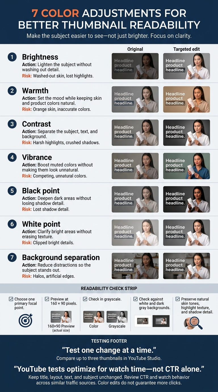
7 Thumbnail Color Adjustments: What to Fix and Avoid
How to Color Grade YouTube Thumbnails as A Beginner
sbb-itb-b59debf
Before Editing: Choose Your Focal Point
Set your subject and composition before editing color. Every adjustment works better when viewers know where to look. Choose one primary focal point - a face, product, or object that best explains the video's value. Put it where viewers will notice it, remove competing elements, and use the rule of thirds to position it off-center while leaving room for text.
Choose a mood that helps viewers recognize the topic fast and makes them want to click. Warm colors suggest energy and urgency; cool colors suggest calm and trust. Treat these as guides, not rules. Keep skin tones and product colors believable, and don't choose a color just because it's bright.
Start with a sharp subject, a simple background, and a crop that remains clear at small sizes. Keep text brief, include only what matters most, and use an easy-to-read font. Save the original so you can compare edits and spot color shifts in skin tones, products, or branding.
Once you've set the focal point, preview the thumbnail at 160 × 90 pixels, then check it on your phone. Viewers should understand the subject, text, and topic as they scroll. Poor readability can cost clicks. If anything is unclear, simplify the crop, improve contrast, or cut text. Then check in grayscale: if the subject blends into the background, increase the light–dark separation.
Next, test the thumbnail against white and dark gray YouTube backgrounds. Look for weak text contrast or areas that blend into the interface and make the subject hard to see in the feed. Tighten the crop, simplify the background, or add separation before fine-tuning individual colors.
1. Brightness: Make the Subject Easier to See
Start with brightness. Hard-to-see subjects can lose clicks, and adjusting brightness is the fastest way to make a thumbnail readable.
Targeted adjustment
Brighten the subject, not the whole image. Use a soft mask to brighten a dark face, product, or key detail without changing the background. Stop once expressions, shapes, and textures are clear.
Editing tips
Increase exposure in small steps, or lift shadows if only the dark areas need help. Check highlights after each change. If bright areas start losing texture, reduce the highlights.
Overadjustment risk
Too much brightness can wash out skin, erase detail in white packaging, flatten the image, and expose noise. Instead of helping your focal point stand out, it can make it harder to read. This is one of several thumbnail mistakes to avoid when editing.
Why it can help CTR
Viewers can recognize clear subjects more easily while scrolling, which may help your click-through rate (CTR). A/B test the brighter version against the original, keeping the title and video the same. Then compare CTR and watch behavior.
2. Warmth: Set the Mood
Once the subject is visible, use warmth to set the thumbnail’s mood.
Targeted adjustment
Match color temperature to the mood: warm tones suggest energy or comfort, while cool tones suggest calm, mystery, or tech. These shifts should help viewers recognize the topic faster. Adjust the subject or background separately rather than tinting the whole image.
Editing tips
Start by correcting white balance against a neutral white or gray reference. Then make a small temperature shift. Check that skin tones look natural, and compare warm, neutral, and cool versions in the feed view. Does the mood still come through clearly?
Overadjustment risk
Too much warmth can turn skin orange or red and make whites look dirty. Too much cooling can make faces look blue or gray. Keep skin natural, and put stronger color shifts in the background.
Possible CTR benefit
A clear color mood may help viewers grasp the video’s promise faster. Pairing a warm subject with a cool background - or the reverse - can help the focal point stand out. Test warm, neutral, and cool versions with the same composition, then compare CTR and watch behavior.
If mood alone doesn’t make the subject stand out, compare high contrast vs low contrast thumbnails next.
3. Contrast: Separate Text, Subject, and Background
Targeted adjustment
Once you’ve chosen the focal point, use contrast to draw attention to it. Separate the subject and headline from nearby colors: place light text over dark areas, dark text over light areas, or add a subtle outline or shadow on uneven backgrounds. Use Levels, Curves, or a local mask for precise control.
Keep the reading order clear: subject, text, background.
Editing tips
Darken only the areas that compete with the subject. Apply a mask or Curves adjustment behind text without losing facial detail. For busy backgrounds, try a subtle stroke or shaded panel.
WCAG’s 4.5:1 ratio for normal text offers a quick readability check. Measure it against the background directly beneath the letters - not a plain color swatch.
Overadjustment risk
Back off if hair disappears into black, highlights lose texture, or halos appear around cutout edges. Rather than increasing contrast across the whole image, lift shadows locally or reduce highlights. Watch clipping warnings to protect important detail.
Possible CTR benefit
Clear separation can help viewers recognize the subject and read the promise faster. Use advanced thumbnail optimization to test your baseline against one selectively adjusted version, keeping the wording and layout the same. Compare CTR across similar traffic periods, and treat any gains as test results - not guarantees. If the thumbnail still looks flat, try vibrance next.
4. Vibrance: Add Color Without Overdoing It
Targeted adjustment
Vibrance favors muted colors, while saturation changes color intensity more evenly. Start with vibrance when an image looks flat but some colors are already saturated. Many editors protect skin tones, though the exact behavior varies.
Adjust the focal point first. Then match the background only if needed.
Editing tips
Increase vibrance in small steps until the subject’s muted colors become easier to recognize. Check skin and hands at 100% zoom and in a 160 × 90 preview. If the background starts pulling attention away, keep the mask on the subject.
Overadjustment risk
Watch for orange skin, neon clothing, or lost color detail. Vibrance reduces the risk of oversaturation, but it doesn’t eliminate it. Compare your edit with the original and lower the setting if the color starts competing with the focal point.
Possible CTR benefit
If the thumbnail still looks flat after adjusting contrast, a small vibrance boost can make muted subject colors easier to read - and the subject easier to spot. Aim for immediate recognition, not more saturation. Test up to three versions and keep the one with stronger CTR and watch time.
If the subject still blends into the frame, use black point next to deepen dark areas without losing detail.
5. Black Point: Deepen Darks and Keep Detail
Targeted adjustment
After vibrance, deepen the darkest tones to give the thumbnail more shape. Black point is the deepest shadow level in an image. Adjusting it can add depth and strengthen the subject’s silhouette. Focus only on the darkest areas that support the visual message.
Editing tips
Use a local mask or selective adjustment to darken areas that need more definition, such as faces, product edges, or text cutouts. Use Blacks for the deepest tones and Shadows for a broader range of dark tones. Turn on the clipping preview to spot when shadow detail starts to disappear.
Overadjustment risk
Crushed blacks turn separate dark tones into a flat patch. Stop before hair, clothing folds, or product edges lose definition. Check the thumbnail on both bright and dim screens. Once the darks look balanced, move on to white point to protect highlights.
Possible CTR benefit
A stronger silhouette may help viewers recognize the subject faster as they scroll, which could lead to more clicks. But adjusting black point doesn’t guarantee a higher CTR. Test two otherwise identical thumbnails, then compare CTR and watch time per impression.
6. White Point: Keep Highlights Clear
After deepening shadows, protect detail in the brightest areas.
Targeted adjustment
Adjust the brightest tones selectively. Focus on catchlights in the eyes, white lettering, and product reflections. Use Whites for the brightest tones and Highlights for a broader range of bright areas.
Editing tips
Check for clipping, then inspect texture at 100% zoom and readability at 160 × 90 pixels.
Overadjustment risk
Clipped highlights lose texture and color information. Look for flat white patches on skin or packaging, or white text that blends into a light background. Reduce the local adjustment or lower Highlights instead of dimming the whole image. Small, intentional reflections can stay pure white.
Possible CTR benefit
Clear highlights can make reflective details easier to read and help them stand out against darker areas. Test a version with only the white point adjusted, then compare CTR and watch time in YouTube Studio.
If highlights still blend into the background, the next step is background separation.
7. Background Separation: Help the Subject Stand Out
Targeted adjustment
If contrast, vibrance, and white point still don’t make the subject clear, adjust the background first. Mask the subject, then use the smallest change that helps it stand out: darken a bright background, tone down distracting colors, common in aesthetic thumbnails, or add mild blur to clutter.
Editing tips
Use complementary color pairs, then check the image in grayscale. The subject should stand out even during a fast scroll - different hues can have the same brightness. Feather the mask around hair and clothing, and place text over a calm area.
Overadjustment risk
Heavy blur and aggressive recoloring can distract from the subject. Leave enough background detail to show the setting, and keep color shifts off skin and products, a key rule for vlog thumbnails. Color should support shapes and edges, not compete with them.
Possible CTR benefit
Compare a background-only edit with the original, keeping the title and layout the same. Then check CTR and retention. Use the results to judge when color makes the image clearer - and when it adds risk.
Color Adjustments: Uses and Risks
Use this table to match each adjustment to a readability problem - and check what might go wrong.
| Adjustment | Use | Common risk | How it can help |
|---|---|---|---|
| Brightness | Make details easier to see | Washed-out skin, lost highlights | Makes the subject easier to recognize |
| Warmth | Set the mood | Orange skin, inaccurate colors | Strengthens mood |
| Contrast | Make visual order clearer | Harsh highlights, crushed shadows | Helps viewers recognize the subject faster |
| Vibrance | Boost muted colors | Competing, unnatural colors | Draws attention to key color cues |
| Black point | Deepen dark areas | Lost shadow detail | Defines the silhouette |
| White point | Clarify highlights | Clipped bright details | Makes bright focal details clearer |
| Background separation | Isolate the subject | Halos, artificial edges | Reduces distractions |
For headlines inside images, aim for WCAG 2.2’s 3:1 contrast ratio for large text. Check the exact area behind each letter: a headline can pass in one spot and fail in another.
Use these readability checks to find the smallest fix. Then compare that version with the original in YouTube Studio to test which reads fastest.
How to Edit and Test Thumbnail Colors
Test one color adjustment at a time, always starting from the original thumbnail. Work through brightness, black point, white point, contrast, warmth, vibrance, and background separation separately. After each change, check contrast in both color and grayscale. Label each version with the single adjustment you made.
Compare thumbnail versions side by side at 160 × 90 pixels. Apply the same checks to every version.
| Check | Compare original and edited thumbnails |
|---|---|
| Subject visibility | Is the subject clear at a glance? |
| Text readability | Can you read the text without zooming? |
| Natural skin tones | Do skin tones still look natural? |
| Highlight detail | Do bright areas still show texture? |
| Shadow detail | Do dark areas still show shape? |
Keeping changes separate helps you see which adjustment improves readability. Use YouTube Studio’s Test & compare feature to compare up to three thumbnail versions. Keep the title, layout, text, and subject unchanged. YouTube’s tests optimize for watch time - not CTR alone - so the version with the most clicks doesn’t automatically win.
In YouTube Analytics, review impressions CTR, views from impressions, and watch time from impressions. Also check average view duration, retention, and traffic source. Compare similar traffic sources: a shift from Search to Home can change CTR without proving that the color edit caused it.
Wait until you have enough impressions before choosing a winner. If native testing isn’t available, log when each thumbnail runs and keep other variables stable. Treat these sequential comparisons with caution, though, because audiences change over time. Clearer color can help viewers recognize the subject faster, which may lift CTR. Use the winning version only after results stay consistent across similar traffic.
Conclusion: Keep Colors Clear and Measure Results
Use these seven edits together so viewers can spot one clear subject and one clear idea at a glance. Decide what they should notice first. Faster recognition can help earn the click. Your thumbnail and title synergy should make the same honest promise: a clear subject, outcome, and expectation.
Treat color edits as choices to test. Use watch time and CTR to find the strongest version. Choose what performs best in real traffic - not what looks best on its own.
FAQs
Which color adjustment should I try first?
Start with light–dark contrast: make your subject and text stand out from the background so they don’t blend into YouTube’s light or dark interface.
Check the thumbnail in grayscale. If elements blend together, lighten or darken the background behind the subject, or add a thin outline in a contrasting color. Adjust warmth or vibrance after that. This makes the thumbnail easier to read at small feed sizes and can help increase CTR.
How can I improve contrast without changing brand colors?
Focus on light-dark contrast, not saturation. Make the background a darker or lighter shade of your brand color. Or place a semitransparent neutral overlay at 40–80% opacity behind text so it stands apart from busy areas.
Use thin, contrasting outlines or subtle drop shadows around subjects and text to define their edges without changing your palette. Test in grayscale to check that elements stay distinct without relying on color.
What if my thumbnail gets more clicks but less watch time?
More clicks but less watch time may suggest your thumbnail promises something the video doesn’t deliver. Review CTR, watch time, and impressions together. Color alone won’t guarantee clicks.
Use ThumbnailCreator to test color treatments while keeping the subject, wording, and layout the same. Look for the option that aligns viewer expectations with what your video delivers.