

Thumbnail Color Mistakes That Hurt CTR
I check thumbnail colors at feed size before publishing: can I spot the subject and read the text in 1–2 seconds? If not, I simplify the palette, improve light–dark contrast, and remove distracting effects.
Here are the nine color mistakes I check for:
- Too many colors competing for attention.
- A subject that blends into the background.
- Edges that disappear in YouTube’s light or dark mode.
- Strong saturation everywhere.
- Color choices based on fixed emotion rules.
- Text colors that make words hard to read.
- Meaning conveyed through color alone.
- Brand colors that hide the video’s topic.
- Borders, glows, and shadows that add clutter.
My rule: <u>make the topic clear before adding decoration</u>. I compare color variations with the subject, wording, and layout unchanged, then review CTR alongside impression sources and watch time. Clear colors help people scan a thumbnail - they don’t guarantee clicks.
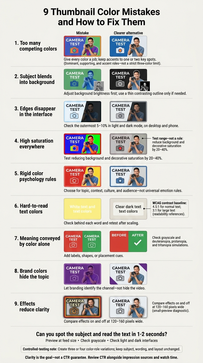
9 Thumbnail Color Mistakes and How to Fix Them
Stop complicating your thumbnails!
sbb-itb-b59debf
1. Using Too Many Colors
When the background, text, borders, and effects all compete for attention, viewers don’t know where to look first. At feed size, those colors turn into visual noise. Start by reducing the number of colors competing for attention.
Assign three color roles before adding decorative colors: dominant, supporting, and accent. The dominant color anchors the design, the supporting color separates elements, and the accent draws attention to the main detail. Keep the accent to one or two key spots - not every word, border, and icon. This hierarchy helps viewers spot the subject faster.
Use this as a starting framework, not a strict three-color limit. Skin tones, product colors, and natural details can stay.
Give every added color a job. Remove it, then check: Is anything harder to read or distinguish? Is it less clear where to look next? A glow or border should earn its place by making the design clearer. If you’ve limited the colors but the thumbnail still looks muddy, check whether the subject blends into the background. Remove any color that doesn’t improve separation, readability, or focus.
2. Letting the Subject Blend Into the Background
Even with fewer colors, weak contrast can leave the subject lost in the background. Different hues don’t guarantee clear separation. The subject and background can have similar brightness despite their different colors, making the subject’s edges hard to recognize at small sizes.
Test the thumbnail in grayscale. Focus on the area directly behind the subject - not the entire background. If the subject blends in, adjust the light–dark contrast.
Use this table as design guidance, not CTR data:
| Color relationship | Potential small-size effect | Corrective action |
|---|---|---|
| Strong light–dark separation | Subject stays easier to distinguish | Keep that separation and check the intended focal point |
| Similar subject and background values | Subject may blend into the background | Adjust background brightness or add a thin, contrasting outline |
Adjust the background first. Use a local adjustment or subtle gradient to lighten or darken the area behind the subject. Simplify that area, too. If the background must stay intact, try a thin, contrasting outline - not a thick border that competes for attention.
Then check a small, phone-sized preview in both color and grayscale. Give yourself one or two seconds to spot the intended subject. This is a core principle of mobile-first vs desktop-first thumbnails. If it’s still unclear, improve the separation before adding effects.
3. Blending Into YouTube’s Interface
Strong subject contrast won’t help if your thumbnail blends into YouTube’s page. White edges can disappear in light mode, while near-black edges can merge with dark mode. Both make the image’s boundary harder to see.
Check your thumbnail on YouTube - not just in your editor. Look closely at the outermost 5–10%, including corners, thin borders, shadows, and large flat areas. Preview it in light and dark mode on both desktop and phone, using an actual feed view or an accurate mockup.
If the edges disappear, try a mid-tone background or a thin edge treatment. Compare the boundary with neighboring thumbnails; no background color works best everywhere, as light and dark modes present different challenges. If your design uses white or black, add a thin contrasting border or subtle inset frame only where the edge blends in. Then check both themes again to make sure the fix defines the boundary without pulling attention away from the subject.
4. Using High Saturation Everywhere
When the background, subject, text, and effects all have equally intense color, they compete for attention. Saturation means color intensity - not necessarily brightness. Start by muting secondary areas: backgrounds, decorations, textures, and glow effects. Save the strongest saturation for one focal point so viewers know where to look first. If the subject already has the strongest color, keep supporting text neutral.
Compare two versions at feed size: (you can use thumbnail comparisons to evaluate different styles) your current design and one with background and decorative saturation reduced by 20–40%. Treat that range as a test, not a rule. Check which version makes the subject and message easier to identify.
Then use grayscale only to check light–dark separation. If the subject disappears, fix lightness contrast before adding more color.
5. Following Rigid Color Psychology Rules
No single thumbnail color guarantees clicks. Color–emotion associations depend on context, so treat color as a support tool - not a fixed emotion code.
Red, yellow, blue, green, and purple can all change meaning based on surrounding colors, culture, and audience expectations. Choose a palette that fits those factors rather than trying to force a universal reaction.
Start with the video’s subject and intended tone. Then use contrast, saturation, and temperature to guide attention and make the topic and tone clear in the feed.
Read CTR alongside watch time. Clicks aren’t a win if the thumbnail sets the wrong expectation, even when its palette follows an emotion chart. Test different color treatments while keeping the subject, wording, and layout the same.
6. Choosing Hard-to-Read Text Colors
Once you’ve set the palette, check text color at the letter level. Look at the background behind each word, not the image as a whole. Preview it at phone size, check whether you can read every word in one second, and confirm that it’s readable in grayscale. Use W3C’s WCAG contrast targets - 4.5:1 for normal text and 3:1 for large text - as a baseline, then check again after scaling.
If contrast fails at a small size, move the text before adding decoration. Look for a simpler, lighter or darker area. If needed, place a subtle panel or small gradient behind the words without covering the subject.
Add thin outlines or short shadows only after fixing contrast. Keep the open spaces inside letters clear and shadows tight. If the text is still hard to read, change the contrast between the text and background.
7. Using Color Alone to Convey Meaning
After checking contrast and text readability, make sure color isn’t doing all the work. Color should not be the only cue. If red means problem and green means success, some viewers may miss the comparison.
Start with a grayscale test: can you still tell the two states apart without color? Then test deuteranopia, protanopia, and tritanopia simulations. Check that the comparison still makes sense at feed size. This is a critical step when testing thumbnails at scale for high-volume channels. An unclear comparison makes viewers work harder and may cost clicks.
Add labels, shapes, or placement cues so the meaning holds up without color.
For before-and-after thumbnails, consistently place BEFORE on the left and AFTER on the right, label both panels, and add a check mark to the improved state.
8. Letting Brand Colors Hide the Topic
Brand colors should identify your channel, not hide the subject. This is especially vital for professional business thumbnails where brand recognition must balance with clear messaging. A consistent look helps, but thumbnails shouldn’t all look alike, as there are pros and cons to consistent vs varied styles. If every upload uses the same background, text color, and effects, viewers might recognize your channel without seeing what sets the new video apart.
Keep the elements viewers recognize at a glance. Use one fixed brand accent, and let the topic guide the main colors. Leave that accent in the same spot, but change the rest to suit each video. You don’t need your full brand palette in every thumbnail. Branding should be a cue, not the main visual.
Before publishing, compare your draft with recent uploads at feed size. Can you tell the topics apart? Cut back on repeated color blocks or effects that make the thumbnails blend together until the new topic is clear. If the thumbnail still looks busy, effects - not branding - are usually the next thing to check.
9. Adding Effects That Reduce Clarity
Once your color and brand choices are set, use effects only to make the hierarchy clearer. Every effect needs a purpose: separating the subject or making text easier to read. Thick borders, oversized glows, heavy drop shadows, busy gradients, lens flares, and texture overlays can all compete with the subject.
Choose one restrained border treatment instead of stacking outlines, strokes, and shadows. Keep glows behind the subject, softer than the subject itself, and away from faces and text. The glow should help define the subject - not become the first thing people notice.
Use gradients to darken the area behind text or gently separate the subject from the background. Keep overlays transparent enough to preserve skin tones, product colors, and important details. Then check the text at small sizes: have letter edges softened or the spaces inside letters closed up? If the text is still hard to read, simplify the background or remove the effect instead of adding more decoration.
Before publishing, compare the thumbnail with effects on and off at 120–160 pixels wide, its actual feed size. Allow one or two seconds to identify the subject and read the text. Check it in grayscale and against both light and dark backgrounds. Remove any effect that makes either task harder.
Final Color Checklist Before Publishing
Once you’ve fixed the common color mistakes above, check the design once more at feed size. Treat these checks as diagnostics, not CTR guarantees.
Check Subject Contrast and Color Roles
☐ The main subject stands out clearly from the background.
☐ Each color has a clear role instead of competing for attention.
☐ The brightest or most saturated area draws attention to the intended focal point.
Check Readability and Accessibility
☐ The design stays clear in both light and dark interfaces.
☐ Text is readable at small sizes.
☐ Meaning doesn’t depend on hue alone.
☐ Grayscale and color-vision-deficiency simulations show no critical loss of information.
Use 4.5:1 as a readability reference, and add labels, shapes, or icons to communicate key distinctions.
Check Topic Fit and Feed Clarity
☐ The palette suits the topic rather than following a one-size-fits-all color rule.
☐ Branding doesn’t hide what the content is about.
☐ The thumbnail stays clear beside other feed items.
☐ Borders and effects help separate elements rather than add clutter.
Compare the thumbnail with its title and nearby feed items. This helps you gauge performance against thumbnail CTR benchmarks for your niche. Then hide the logo or branded frame - the topic should still be obvious.
Make Color Variations With ThumbnailCreator
Once you finish the color checklist, use ThumbnailCreator to test a few controlled variations in less time. You can also browse trending YouTube thumbnails for inspiration before finalizing your design. Start with one layout and use it as the base for each color version.
Create three or four versions that change only color roles. Adjust the main background color, the supporting colors around the subject, and one accent on a priority element. Keep the subject, text, and placement unchanged so you can see how color alone affects the design.
Use text editing to test headline color, weight, outline, and shadow. Check that the headline stays readable at small sizes, and keep these styling tests separate from your color-only comparisons. Wait until those comparisons are complete before trying face or object swaps. Every change should still reflect the video.
Review each version manually at feed size. Pick the clearest few, then compare their actual CTR after publication while keeping the title and layout the same.
Conclusion: Keep Thumbnail Colors Clear
Use color for clarity, not noise, so viewers can read the thumbnail at a glance. After publishing, review CTR, impression sources, and watch time together. No palette guarantees clicks. Let the data guide your next thumbnail rather than treating one palette as a rule.
FAQs
How can I tell if thumbnail colors are hurting my CTR?
Look for hard-to-read text, low contrast, or colors that don’t fit the emotion you want to convey. Switch to grayscale: your subject and text should still stand out from the background. Aim for a contrast ratio of 4.5:1 for body text and 3:1 for large, bold text.
View thumbnails at mobile size in YouTube’s light and dark modes. If you suspect a color issue, run an A/B test. Change just one variable at a time, and use a consistent testing period.
How long should I test a thumbnail color change?
Run your A/B test for at least 48 hours to collect enough data. For more reliable results, let it run for 7 to 14 days to account for differences in weekday and weekend viewing habits. Aim for 1,000 to 5,000 impressions per version.
Keep every other thumbnail element identical. That way, you can measure the effect of the color change alone.
Should I use different palettes for different video topics?
Yes. Match your palette to each topic’s goals and mood, but keep your brand colors consistent so viewers can recognize your content.
Warm colors like red and yellow often suit high-energy topics, such as challenges or commentary. Cool tones like blue and white typically work better for instructional or tech content.
ThumbnailCreator lets you quickly test topic-specific palettes while keeping text readable with strong contrast.