
Ultimate Guide to Thumbnail Composition
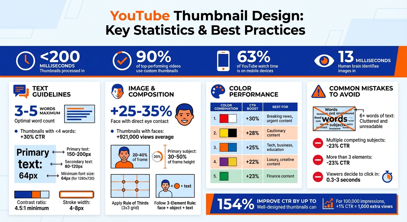
Creating a great YouTube thumbnail is about grabbing attention in less than a second. Thumbnails are processed in under 200 milliseconds, and 90% of top-performing videos use custom designs. With mobile devices accounting for 63% of YouTube watch time, clarity and simplicity are key. Here's what matters most:
- Text: Keep it short - 3 words or fewer.
- Images: Use faces with strong emotions; direct eye contact boosts clicks by 25–35%.
- Colors: High-contrast colors guide focus. Pair complementary tones like blue/orange or yellow/purple.
- Layout: Follow the Rule of Thirds or centered layouts and visual hierarchy to ensure the main subject stands out.
Thumbnails with concise text and expressive visuals can improve click-through rates (CTR) by up to 154%. Tools like ThumbnailCreator simplify this process, helping you refine text, colors, and composition for maximum impact. A well-designed thumbnail not only increases views but also signals YouTube to recommend your content more often. Keep it simple: one subject, one message, and clear visuals.
YouTube Thumbnail Design Statistics and Best Practices
How To Make The Best Thumbnails in 2026
sbb-itb-b59debf
Core Principles of Thumbnail Composition
Designing a standout thumbnail takes more than just piecing together random elements. In fact, the human brain can identify an image in as little as 13 milliseconds. To make sure your thumbnail grabs attention and communicates effectively, every visual element - text, imagery, and layout - needs to work together seamlessly. Two key principles, the Rule of Thirds and visual hierarchy, form the backbone of successful thumbnail design.
The Rule of Thirds and Focal Points
The Rule of Thirds breaks your thumbnail into a 3x3 grid, creating nine equal sections. The four points where the grid lines intersect naturally attract the viewer's gaze. Instead of centering your subject, position the main element - like a face, object, or text - at one of these intersections. This creates a more visually engaging and balanced composition.
To further guide attention, align the subject's eyes along the top third of the grid. This taps into natural eye-tracking patterns. For close-ups, crop the image so that the face occupies 20–40% of the frame. This ensures the face remains clear and recognizable, even on smaller mobile screens. If your thumbnail features a person, have them point or look toward the text or object you want to highlight - this subtle gesture directs the viewer’s focus.
"Your thumbnail's #1 job, which it shares with your title, is to put a burning question in the mind of your viewer." - Thomas Frank, Creator
Another tool for simplicity is the 3-Element Rule: limit your thumbnail to a face, a key object, and short text. This keeps the design clean and avoids overwhelming the viewer. For example, YouTuber Ryan Trahan applied this principle in his "$0.01 Survival" video thumbnail. It featured only a high-contrast penny, his face, and the text "7 DAYS." This straightforward approach made the message instantly clear, contributing to the video’s success.
Once the main elements are positioned, visual hierarchy ensures that viewers notice them in the intended order.
Visual Hierarchy and Balance
Visual hierarchy determines the order in which viewers process elements in your thumbnail. For Western audiences, this often follows a Z-pattern: starting at the top-left, moving to the top-right, then diagonally to the bottom-left, and finally to the bottom-right. To leverage this, place your most critical elements along this path. The primary subject should take up 30–50% of the frame’s height to maintain visibility on smaller screens.
Contrast is another powerful way to guide attention. Use a 4–8 pixel Gaussian blur on the background or add a 4–10 pixel stroke around the subject to make it stand out. A subtle dark vignette (20–30% intensity) around the edges can also pull the viewer’s focus toward the brighter center. To test your composition, try the squint test: squint at the thumbnail - if the focal point isn’t immediately clear, the design might need simplification.
In December 2025, creator Thomas Frank ran an A/B test on a software tutorial thumbnail. One version showed only the software interface, while the other featured his frustrated face alongside the text "FINALLY." The version with the human element and a clear visual hierarchy achieved a 2.1% higher click-through rate within 48 hours. This emphasizes how thoughtful design choices can directly improve performance.
"Thumbnail design is 80% marketing psychology, and only 20% design skill." - Thomas Frank
To ensure text remains legible, maintain a minimum 4.5:1 contrast ratio between the text and background. Use a font size of at least 64px for a 1280x720 frame to keep text readable on all screen sizes. Adding a black-to-transparent gradient behind text can further improve readability, especially over busy backgrounds. And don’t forget - avoid placing critical details in the bottom-right corner, as the video timestamp will cover this area.
Balancing Text, Images, and Colors
Once you’ve nailed down your composition principles, it’s time to align text, images, and colors so your message grabs attention in under one second. Fine-tuning your text design and color choices plays a huge role in making everything crystal clear.
Text Placement and Readability
Keep your text short and to the point - ideally just 3 to 5 words. Thumbnails with fewer than 4 words can increase click-through rates by 30%. On mobile devices (≈168×94 pixels), even one extra word can make your message harder to grasp.
Stick to bold, sans-serif fonts like Impact, Bebas Neue, or Montserrat Extra Bold. For a 1280x720 thumbnail, aim for primary text sizes between 150–200px and secondary text between 80–120px. Avoid decorative fonts, as they tend to lose readability on smaller screens.
Place text opposite the main subject to avoid competing for attention. For instance, if the subject’s face is on the left, position your text on the right. The lower third of the frame often works well due to natural reading patterns, but avoid centering the text unless it’s the main focal point. Leave at least 40–60px of margin to prevent cropping on various devices.
To ensure your text pops against busy backgrounds, add a 4–8px outline (stroke) or drop shadow. White text with a black stroke is a reliable choice. For even better readability, place your text on semi-transparent shapes or banners. Layering text behind subjects, a technique called "layer stacking", can add depth and visual interest.
Once your text placement is finalized, use color to make it even more impactful.
Using Color Theory for Contrast and Appeal
Stick to a palette of 2–3 complementary colors, such as blue/orange or yellow/purple, to create a clean and visually appealing design. These combinations naturally draw the eye and help your thumbnail stand out in crowded feeds.
| Color Combination | Performance Boost | Best For |
|---|---|---|
| Red and White | 30% higher CTR | Breaking news, urgent tutorials |
| Yellow and Black | 28% higher engagement | Cautionary content, announcements |
| Orange and Blue | 25% higher CTR | Tech reviews, business, education |
| Purple and Yellow | 22% above baseline | Luxury topics, creative content |
Warm colors like red, orange, and yellow create energy and urgency, making them perfect for action-driven content. Cool tones like blue, green, and purple evoke trust, making them great for tutorials and educational videos. For example, red thumbnails can boost clicks by 30% due to their sense of urgency, while green performs 23% better for finance-related content.
Ensure your text remains legible by maintaining a contrast ratio of at least 4.5:1 for normal text and 3:1 for larger text. Avoid pure black (#000000) and pure white (#FFFFFF); instead, use dark grays or off-whites for a softer, more visually appealing look.
These guidelines create a strong foundation for tools like ThumbnailCreator, which can help you bring these principles to life effortlessly.
Common Thumbnail Composition Mistakes to Avoid
Even if your design basics are solid, some common pitfalls can still hurt your click-through rate (CTR). Research suggests viewers decide whether to click on a video in just 0.3 to 3 seconds. That means even small mistakes can cost you valuable views. Here are some key issues to steer clear of.
Overcrowding Elements
Packing too many faces, props, emojis, or text into a thumbnail creates visual chaos. Studies show thumbnails with more than three distinct elements can see a 23% drop in CTR compared to simpler designs. This is especially problematic on mobile devices, where about 70% of YouTube watch time takes place.
The solution? Stick to the 3-Element Rule. Eliminate unnecessary items and make the key elements larger. Use the squint test: if the main focus isn’t immediately clear when you squint, your thumbnail is likely too cluttered.
"One subject, one message, one second to understand." – Alici.ai
Simplify your background by blurring or desaturating it to make your primary subject stand out. Leave some negative space to guide the viewer’s eye and create a cleaner, more professional look.
Once you’ve decluttered, it’s time to focus on how your text and images work together.
Poor Text and Image Integration
While overcrowding creates confusion, poor alignment between text and images can weaken your message. This happens when text is placed over a busy background, fonts clash with the imagery, or there’s no sense of depth. Such missteps can make viewers skip over your video.
To fix this, position text opposite your main subject - if the face is on the right, put the text on the left. Use a 4–8px outline or drop shadow to make the text stand out against the background. White text with a black outline is a safe choice for readability. For a polished look, try "layer stacking", where letters partially overlap or tuck behind your subject.
Keep the text concise - no more than 3–5 words. At mobile thumbnail size (around 168×94 pixels), longer text becomes hard to read. Make sure to leave 40–60px margins so your text doesn’t get cut off by YouTube’s interface.
"If you try to say or show too much, you'll end up confusing the message and focal point." – Approachable Design
| Common Mistake | Impact | Quick Fix |
|---|---|---|
| 6+ words of text | Cluttered and unreadable | Limit to 3–4 words max |
| Multiple competing subjects | 23% lower CTR | Focus on one clear focal point |
| Busy background | Visual noise | Blur or use a solid/gradient background |
| Excessive icons/emojis | Dilutes the message | Use 1–2 visual cues max |
Using ThumbnailCreator to Improve Your Composition
Let’s talk about ThumbnailCreator, an AI-powered tool that simplifies the process of crafting eye-catching thumbnails. Even if you are new to YouTube thumbnails, this tool helps you create thumbnails that align with the principles of effective composition to boost your video’s performance.
Key Features for Thumbnail Composition
ThumbnailCreator uses advanced AI to produce thumbnails designed to grab attention and drive engagement. It analyzes video transcripts and visual data to pick frames with the strongest emotional appeal and ideal lighting for your base images. By applying concepts like the Rule of Thirds and visual hierarchy, it ensures your thumbnails are visually striking and well-balanced.
One standout feature is the AI Face Swapping tool, which lets you seamlessly add your face to any thumbnail design. This not only reinforces personal branding but also builds an emotional connection with viewers. Research backs this up - thumbnails featuring faces tend to get, on average, 921,000 more views than those without.
The tool also simplifies background removal, isolating your main subject or key props to keep the focus where it matters most. By following composition principles - like creating a clear focal point and avoiding clutter - it helps prevent designs that could hurt your click-through rate.
When it comes to text, ThumbnailCreator keeps it bold, high-contrast, and concise, limiting overlays to just 3–5 words. This ensures legibility even on smaller screens, like mobile devices (168×94 pixels), while keeping essential visual elements unobstructed. Plus, predictive analytics suggest tweaks - such as increasing saturation or adjusting text placement - based on proven design patterns.
In short, these features work together to apply the composition techniques you need for thumbnails that stand out.
How to Get Started with ThumbnailCreator
Getting started is quick and easy. Log in with your Google account, choose a YouTube template, and upload a base image - ideally a landscape photo with plenty of space for text. The AI will analyze your image and recommend adjustments to contrast, saturation, and sharpness for that polished, professional look.
From there, you can personalize your thumbnail with branding elements, face or object swaps, and short, impactful text. Once you’re happy with the result, export your design as a PNG file and upload it directly to YouTube Creator Studio using the "Custom Thumbnail" option.
In just minutes, you’ll have a thumbnail crafted with AI precision, designed to drive clicks and engagement.
Conclusion
Creating effective thumbnails doesn’t require advanced design skills - it’s all about sticking to a few simple, proven principles. Simplicity is key: focus on a single, clear subject, use bold, high-contrast colors to grab attention, and keep text to four words or fewer for instant readability.
Thumbnails with expressive human faces can increase click-through rates (CTR) by 20–30%, while designs with minimal text outperform cluttered ones by 30%. Even small gains can have a big impact: for a video with 100,000 impressions, a 1% boost in CTR means 1,000 extra views.
Thomas Frank sums it up perfectly:
"Thumbnail design is 80% marketing psychology, and only 20% design skill".
The real secret? Understand your audience and spark their curiosity.
Tools like ThumbnailCreator make the process even easier. They streamline design by automating tasks like high-contrast color pairing, text placement, and AI-driven tweaks. This cuts design time from nearly two hours to just 5–10 minutes, while ensuring thumbnails meet technical specs and look great on mobile devices.
Once you’ve created your design, A/B test your thumbnails to keep refining them. Test how it looks at smaller sizes, stay consistent with your channel’s branding, and use performance data to tweak and improve. With the right approach and tools, you’ll craft thumbnails that not only look polished but also drive more clicks and views for your content.
FAQs
How do I pick the main focal point?
When designing your video, establishing a clear visual hierarchy is key to grabbing attention. Highlight the most important element by using bold colors, expressive faces, or a standout subject that naturally draws the eye.
Keep the overall design simple and uncluttered, ensuring the focal point remains obvious - even on smaller screens. This approach makes it easier for viewers to quickly understand your video's message, increasing the likelihood they'll click and engage.
What’s the fastest way to test thumbnail clarity on mobile?
The fastest way to evaluate thumbnail clarity on mobile is by using a preview tool that simulates how your design looks across various screen sizes. These tools give you instant visual feedback, making it easier to ensure your thumbnail stays sharp and eye-catching on mobile devices. This approach helps fine-tune your design for improved visibility and interaction.
When should I use ThumbnailCreator vs. designing from scratch?
When you need professional and attention-grabbing thumbnails in a hurry but don’t have advanced design skills, ThumbnailCreator is a great solution. With AI-powered tools like customizable templates, face swapping, and easy text editing, it helps you save time while improving your click-through rates. If you’re an experienced designer or have a specific creative vision, starting from scratch might be your best bet. However, for most content creators, ThumbnailCreator provides a quick and efficient way to craft high-quality thumbnails with minimal effort.