
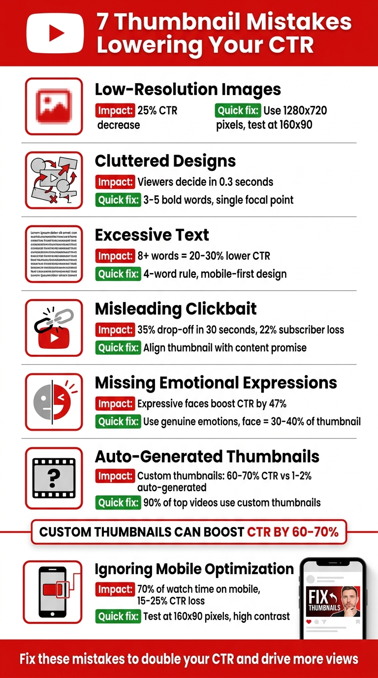
7 Thumbnail Mistakes Lowering CTR
Your video thumbnail has less than a second to grab attention. If it fails, your content might never get noticed. With YouTube's algorithm in 2026 heavily prioritizing click-through rate (CTR), avoiding common thumbnail design errors is critical. Here's a quick rundown of the seven mistakes that could be costing you views:
- Low-Resolution Images: Blurry thumbnails can cut CTR by up to 25%. Use high-quality visuals (1280x720 pixels) and test clarity at smaller sizes.
- Cluttered Designs: Too many elements confuse viewers. Stick to 3–5 bold words, a clean background, and a single focal point.
- Excessive Text: Thumbnails with over 8 words can lower CTR by 20–30%. Keep text short, bold, and readable on mobile.
- Misleading Clickbait: Thumbnails that don’t match content lead to retention drops and algorithm penalties. Align visuals with your video’s message.
- Missing Emotional Expressions: Thumbnails with expressive faces boost CTR by up to 47%. Use clear, genuine emotions that match your content.
- Auto-Generated Thumbnails: Custom thumbnails outperform auto-generated ones by 60–70%. Avoid random video frames and design with intent.
- Mobile Thumbnail Optimization: Over 70% of YouTube watch time happens on mobile. Test thumbnails at 160x90 pixels to ensure readability and clarity.
Fixing these mistakes is simple and can double your CTR, driving more views and engagement. Use tools like ThumbnailCreator to design professional, mobile-friendly thumbnails in minutes.
7 YouTube Thumbnail Mistakes That Lower Click-Through Rates
16 YouTube Thumbnail Mistakes That Kill CTR
sbb-itb-b59debf
1. Using Low-Resolution Images
Blurry thumbnails are a CTR killer. They give off an impression of low effort and lack of professionalism before viewers even glance at your title. When faced with pixelated thumbnails, people are more likely to scroll past, missing out on content that could have otherwise captured their attention.
Impact on CTR
Low-resolution thumbnails can slash your CTR by 15% to 25%. On the flip side, sharp, high-quality images attract 27% more clicks compared to similar content with poor visuals. Interestingly, 90% of the top-performing videos use custom-designed thumbnails rather than auto-generated ones. This issue becomes even more pronounced on TV apps, where larger thumbnail displays make blur and pixelation impossible to ignore.
These stats highlight just how crucial quality visuals are, especially as viewer habits continue to evolve.
Relevance to YouTube Trends in 2026
By 2026, viewers have become even pickier about image quality. With high-resolution displays on phones and desktops, imperfections are glaringly obvious. Thumbnails might be displayed as small as 168 pixels wide, which means low-quality text can become an unreadable blur. To keep up, YouTube now supports file sizes up to 50MB for 4K thumbnails, leaving no excuse for substandard visuals.
If you want to keep both viewers and the algorithm on your side, prioritizing image clarity is non-negotiable.
Practical Solutions for Creators
To ensure your thumbnails look crisp, export them using the correct YouTube thumbnail dimensions of 1,280 x 720 pixels with a 16:9 aspect ratio. For clear text and graphics, use PNG files, while high-quality JPGs work best for photo-based thumbnails. Keep your file size under 2MB and test its clarity at 160 x 90 pixels. If the thumbnail looks blurry, try boosting the contrast or using a higher-resolution source image. Avoid relying on raw video screenshots - they often suffer from motion blur and lack optimization.
For a hassle-free way to create professional, high-quality thumbnails, try tools like ThumbnailCreator (https://thumbnailcreator.com). This AI-powered platform simplifies the design process, helping you craft eye-catching thumbnails without needing advanced design skills.
2. Cramming Too Many Elements
Packing a thumbnail with too many faces, objects, or text creates a visual overload that viewers can’t process in under a second. That fleeting moment is all it takes for someone to scroll past without clicking. Creator Vy Qwaint sums it up perfectly:
Cramming too much text is the top rookie mistake.
Impact on CTR
Thumbnails with multiple competing elements - like several faces, busy backgrounds, or excessive text - tend to have lower click-through rates. Why? Because viewers decide whether to click in just 0.3 seconds. On mobile devices, where 70% of YouTube watch time happens, cluttered thumbnails turn into an "illegible smear" that’s hard to interpret. This confusion often leads to viewers skipping your video entirely.
Ease of Fixing the Mistake
The good news? This issue is simple to fix. In most cases, you can declutter your thumbnail in under five minutes by removing extra text or overlapping objects. To make sure your thumbnail communicates clearly, try these quick tests: the One-Second Test, the Three-Element Test, and the Squint Test. These approaches help ensure your thumbnail’s message is clear at a glance. As mobile design dominates by 2026, keeping things simple will only become more important.
Relevance to YouTube Trends in 2026
By 2026, designing with a mobile-first mindset isn’t optional - it’s essential. Leading creators now start with small-scale designs, rather than shrinking desktop thumbnails, to ensure clarity on smaller screens. Minimalist designs with a single focal point are becoming the norm, cutting through the clutter of busy feeds. AI tools are also being used to spot visual clutter and identify videos with high impressions but low click-through rates due to poor thumbnails. The takeaway? Simplicity wins.
Practical Solutions for Creators
To boost your click-through rate, focus on clarity and minimalism. Here’s how:
- Use 3–5 bold words.
- Keep the background clean.
- Stick to a simple two- or three-color palette.
If your channel doesn’t feature a recognizable face, simplicity becomes even more crucial. Highlight one striking object or try a dramatic "before and after" image to grab attention. Tools like ThumbnailCreator (https://thumbnailcreator.com) can help you test designs and ensure your thumbnails look great on any screen size.
3. Adding Too Much Text
Text-heavy thumbnails can overwhelm viewers and hurt your click-through rate (CTR). On average, people spend just 0.3 seconds deciding whether to click on a thumbnail. If it’s cluttered with excessive text, they’re likely to scroll right past it. This issue is even worse on mobile devices, where thumbnails shrink to as small as 168 pixels wide.
Impact on CTR
The data paints a clear picture: thumbnails with eight or more words can lower CTR by 20–30% compared to those with minimal or no text. Among creators with CTR below 2%, 52% use text that’s unreadable on mobile. In contrast, creators who adopt the "gap strategy" - using short, emotional text on thumbnails while leaving descriptive details for the title - achieve an average CTR of 5.83%, far outperforming the 3–4% seen with text-heavy designs.
| Words in Thumbnail | Relative CTR Performance | Effect |
|---|---|---|
| 0 (no text) | Baseline | Varies by niche |
| 1-2 words | +10-20% | Highly scannable and impactful |
| 3-4 words | +5-15% | Ideal for adding context |
| 5-7 words | -5-10% | Harder to read, less effective |
| 8+ words | -20-30% | Often unreadable, especially on mobile |
With these stats in mind, let’s look at how to fix this issue quickly.
Ease of Fixing the Mistake
This is an easy fix that takes less than five minutes: remove unnecessary words and enlarge the remaining text. The key is to treat your thumbnail and title as a "click package" - they should complement each other, not repeat the same information. As Jay Kim puts it:
If your thumbnail needs a paragraph of text to explain what the video is about, the visual composition itself is not doing its job.
Relevance to YouTube Trends in 2026
By 2026, neo-minimalism is the dominant style. Top creators are embracing designs with plenty of white space, a single focal point, and just 1–2 words in bold, clean fonts like Bebas Neue, Montserrat Black, or Anton. Mobile-first design is now standard practice, with creators starting at the "postage stamp" size (about 160 pixels wide) before scaling up to high-resolution versions. Overused fonts like "Impact" have fallen out of favor, replaced by cleaner, more modern options.
Practical Solutions for Creators
To create effective thumbnails, focus on clean visuals and concise text. Stick to the four-word rule: limit your thumbnail text to four words or fewer so it’s easy to process instantly. Use the Stamp Test - shrink your thumbnail to 120–160 pixels wide on your screen. If the text isn’t readable, simplify or enlarge it.
Here are some tips to make your text work harder:
- Avoid repeating your title. For example, instead of duplicating "How to Save Money", use emotional hooks like "The Truth" or specific outcomes like "I Saved $8,400".
- Ensure your text contrasts sharply with the background (aim for a 4.5:1 contrast ratio) and avoid placing it in the bottom-right corner where YouTube’s duration stamp will cover it.
- Use tools like ThumbnailCreator (https://thumbnailcreator.com) to test different text placements and ensure readability across all screen sizes.
4. Using Misleading Clickbait
Deceptive thumbnails might grab attention initially, but they can damage your video's long-term performance. When viewers click on a misleading thumbnail and leave within the first 30 seconds, it creates what's called a "CTR-Retention Trap." This steep drop in retention sends a clear signal to YouTube's algorithm that your content isn't meeting expectations.
Impact on CTR
The numbers don't lie - misleading thumbnails can seriously hurt your channel. For example:
- A mismatch between the thumbnail and video content can cause a 35% drop-off in viewership within the first 30 seconds.
- Misleading thumbnails lead to an estimated 22% subscriber drop rate as disappointed viewers lose trust.
By 2026, YouTube's algorithm penalizes videos with high click-through rates (CTR) but low retention, reducing their overall reach. On the flip side, aligning your thumbnail with your video's content can boost overall reach by as much as 79%, even if CTR drops slightly.
| Metric | Misleading Thumbnail Impact | Honest Thumbnail Impact |
|---|---|---|
| Initial CTR | High (Initial Surge) | Moderate to High |
| 30-Second Retention | Low (Retention Cliff) | High (Validation) |
| Algorithm Signal | Negative (Demotion) | Positive (Recommendation) |
| Subscriber Loyalty | Decreased (22% drop) | Increased (Trust) |
| Long-term Reach | Limited/Penalized | Compounded Growth |
These figures make it clear: misleading thumbnails don't just hurt retention - they also trigger algorithm penalties that limit your video's reach.
Relevance to YouTube Trends in 2026
By 2026, YouTube places more emphasis on "viewer satisfaction" and "watch time share" rather than just raw clicks. Essentially, your thumbnail is like a promise to the viewer, and if your video doesn't deliver, the algorithm takes notice. As GrowthOS explains:
A thumbnail is a contract between you and the viewer. It promises an experience, and the video has to deliver it.
The algorithm is also quick to spot "mirage success", where a video gets a high CTR but suffers from poor retention. These patterns lead to reduced impressions and fewer recommendations for your content.
Practical Solutions for Creators
Instead of relying on misleading tactics, focus on creating thumbnails that spark genuine curiosity. Here's an example: a personal finance creator in late 2025 switched from a generic thumbnail like "Tax Savings Tips" to something more outcome-driven, such as "I Cut $8,400 Off My Taxes." This change boosted their CTR from 4.1% to 7.8%, resulting in an additional 150,000 views and an extra $1,200–$2,000 in revenue.
You can also apply the 30-Second Alignment Rule: make sure the key visual or claim in your thumbnail is addressed within the first 30 seconds of your video. This builds trust and keeps viewers engaged. To refine your approach, audit videos with high CTR but low retention to identify mismatches. Tools like ThumbnailCreator (https://thumbnailcreator.com) can help you test thumbnails that accurately reflect your video's content while maintaining viewer interest.
5. Skipping Emotional Expressions
Faces have a unique ability to grab attention almost instantly. They trigger subconscious engagement, prompting a reaction even before viewers take in other details. By leaving out emotional expressions in your thumbnails, you miss out on a powerful psychological tool that could significantly boost viewer interest and clicks. These emotional cues act as a bridge between visual appeal and meaningful engagement, as we’ll see in the following analysis.
Impact on CTR
A 2026 study examining 1,247 videos revealed that thumbnails featuring expressive faces achieved a 7.8% click-through rate (CTR) compared to just 4.2% for non-expressive ones - a 47% improvement. Even more striking, thumbnails with no clear expression performed as low as 4.3%. Different types of expressions also had varying results:
- Shocked/surprised: 8.4% CTR
- Confused: 7.9% CTR
- Excited/happy: 7.2% CTR
- Serious/focused: 5.8% CTR
Relevance to YouTube Trends in 2026
The exaggerated "YouTube face" with an open mouth has started to lose its charm, often dismissed as untrustworthy clickbait. Viewers now prefer thumbnails featuring authentic emotions that match the video’s actual content. As ThumbMentor puts it:
"A face with a clear emotion tells the viewer 'this video made someone feel something,' which creates curiosity about the content."
Considering that over 70% of YouTube viewing happens on mobile devices, it’s essential for emotional expressions to stand out even on small screens. To achieve this, ensure the face occupies about 30–40% of the thumbnail area.
Practical Solutions for Creators
Using genuine emotional expressions in thumbnails not only enhances engagement but also helps your content stand apart from generic clickbait. Match your expression to the theme of your video: use surprise for big reveals, confusion for problem-solving videos, or excitement for upbeat content. For better composition, follow the Rule of Thirds by placing the subject’s eyes at the upper intersections of a 3×3 grid.
Avoid using raw screenshots, as they’re often blurry or unflattering. Instead, take a dedicated high-resolution photo during filming with proper lighting. Alternatively, tools like ThumbnailCreator (https://thumbnailcreator.com) can help you replace neutral expressions with more engaging ones using AI-powered features.
6. Using Auto-Generated Thumbnails
When it comes to thumbnail psychology, relying on YouTube's auto-generated thumbnails is a major misstep. These thumbnails are essentially random frames pulled from your video, lacking any intentional messaging, visual appeal, or proper composition. It's like trying to sell a book without a cover - it just doesn’t work.
Impact on CTR
Here’s a key statistic: 90% of YouTube's top-performing videos feature custom thumbnails rather than the auto-generated ones. Why? Custom thumbnails consistently achieve a click-through rate (CTR) of 60–70%, compared to the dismal 1–2% that auto-generated frames typically deliver.
The situation worsens on mobile, where 70% of YouTube's viewership happens. On smaller screens, default thumbnails often appear blurry, shrinking to as little as 168 to 280 pixels wide. This makes it even clearer that well-designed thumbnails are essential.
Relevance to YouTube Trends in 2026
By 2026, YouTube’s algorithm has grown even more focused on balancing CTR with retention. Auto-generated thumbnails fail to deliver here - they often highlight random moments that don’t align with the video’s title or promise. As Chris Munch, CEO of AmpiFire, puts it:
"The first few seconds of your video must confirm to the viewer that what is promised in the title and thumbnail will be delivered. Otherwise people don't watch and it reduces the chance of your video being recommended."
When viewers quickly leave after clicking, YouTube’s algorithm interprets this as poor performance. Now, the platform emphasizes "watch time per impression", meaning thumbnails that mislead or don’t match the content can hurt your video's chances of being recommended.
Practical Solutions for Creators
Custom thumbnails do more than just grab attention - they set the right expectations for viewers. You can create one in as little as 5–20 minutes with modern tools. Instead of relying on a random frame, take high-quality photos during filming to ensure proper lighting and composition. Follow the "Three-Element Maximum" rule: include one face, one object, and one text overlay.
To ensure your thumbnail works on mobile devices, try the "Postage Stamp Test." Shrink your design to about 25% of its original size (roughly 120×68 pixels). If the subject isn’t clear or the text becomes unreadable, simplify the design.
For quick and professional results, tools like ThumbnailCreator offer AI-powered features - like face swapping and background removal - that make designing thumbnails easy, even without advanced skills.
7. Ignoring Different Screen Sizes
Designing a thumbnail that looks great on a desktop monitor is one thing, but most viewers are using mobile devices. What might seem sharp and eye-catching at 1280×720 on a desktop can blur and lose its impact at 280×157 - the typical size on many mobile screens.
Impact on CTR
This oversight can have a significant effect on your click-through rate (CTR). On mobile, low-resolution thumbnails can reduce CTR by anywhere from 15% to 25%. Statistics show that around 52% of new creators with a CTR below 2% have thumbnails with unreadable text on mobile devices. At the smallest size shown in search results - just 160×90 pixels - small design flaws become glaring. If viewers can’t immediately understand your thumbnail on their phone, they’ll likely scroll right past it.
Ease of Fixing the Mistake
The good news? Fixing this issue is simple. Keep your text short - just 3 to 5 bold words in a thick sans-serif font. Make sure your subject stands out by using a background with at least 30% contrast, and leave the bottom-right corner free so the video duration badge doesn’t cover anything important. Before you publish, try the "Squint Test": shrink your thumbnail to 160×90 pixels. If the subject doesn’t pop out at that size, simplify the design further.
Relevance to YouTube Trends in 2026
As YouTube continues to prioritize mobile-friendly content, thumbnails that perform well across all screen sizes are more critical than ever. The platform's algorithm now evaluates how thumbnails - the key part of your "click package" - perform on both mobile and desktop. With most impressions happening on mobile, a poorly designed thumbnail can limit your video's reach, no matter how good the content is.
Practical Solutions for Creators
Adopt a mobile-first mindset. Start with a design optimized for smaller screens and then scale up for larger ones. Always preview your thumbnail on a mobile device to ensure text and facial expressions are clear. Use high-contrast, thick sans-serif fonts, and steer clear of decorative fonts that can vanish at smaller sizes. Tools like ThumbnailCreator make it easy to compare thumbnail tools and designs and ensure your thumbnails work well on any screen size.
Conclusion
Every design choice - from image clarity to mobile-friendliness - shapes how your video performs. Your thumbnail is often the first (and sometimes only) opportunity to grab someone's attention. The seven mistakes we’ve highlighted can hurt your click-through rate (CTR), but fixing them is straightforward. Stick to 3–5 bold words, use high-contrast colors to make your subject stand out, keep the layout clean with no more than three elements, and always design with mobile-first vs desktop-first principles in mind. Skip auto-generated frames and focus on authentic emotional expressions.
Custom thumbnails can boost CTR by 60%–70%, while consistent branding has been shown to double subscriber growth. When you pair a strong CTR with good watch time, YouTube’s algorithm takes notice, promoting your video to more viewers through browse and suggested feeds.
For creators who lack design experience, tools like ThumbnailCreator simplify the process. These tools let you create professional-looking visuals using text prompts, niche-specific templates, and mobile previews - all without advanced design skills. They help you avoid common issues like low resolution, clutter, and poor contrast.
"A thumbnail does not win because it looks fancy. It wins because it gets understood quickly." - Thumbcrafted
Take action by auditing your existing videos. Sort them by CTR, find the bottom 20%, and replace those thumbnails this month. Updating your thumbnails gives YouTube’s algorithm a reason to re-evaluate your content, offering underperforming videos a fresh opportunity to gain traction. Even small changes, like fixing unreadable text, can double CTR from 3% to 6%, effectively doubling your views. Applying these strategies consistently builds a recognizable visual brand that supports your overall content success.
FAQs
What CTR should I aim for on YouTube in 2026?
In 2026, what counts as a good YouTube click-through rate (CTR) largely depends on your niche. Generally, a CTR between 4% and 10% is typical. If your CTR is above 6%, that's a strong performance, and anything over 10% is outstanding. However, these numbers can shift depending on your audience and the type of content you create.
How can I test if my thumbnail works on mobile before publishing?
To see how your thumbnail looks on mobile, try manually resizing it to about 120×68 pixels. This will help you check if the text and visuals stay clear and easy to read. You can also use tools that preview thumbnails on different devices to ensure they look good everywhere. Focus on creating mobile-friendly designs to boost your click-through rates.
How do I improve CTR without hurting retention?
Creating thumbnails that catch attention and drive clicks is an art. The key is to make them visually appealing while staying true to your content. Here’s how you can do it:
- Keep it clean and bold: Avoid clutter and use high-contrast colors to make your thumbnail pop. Simplicity often stands out.
- Text that works on mobile: Stick to 3-5 words in bold, sans-serif fonts. This ensures your message is clear, even on smaller screens.
- Use emotion and expression: Thumbnails with expressive faces or emotional elements can create an instant connection with viewers.
One crucial tip: steer clear of misleading designs. While clickbait might grab attention, it can hurt retention and trust. Always test your thumbnails for readability and ensure they align with your branding for a consistent, professional look.