

Checklist for Evaluating Thumbnail Performance
A thumbnail is working only if it brings in the right click. If CTR is high but viewers leave in the first 30–60 seconds, the image may be pulling in the wrong people.
I’d sum the article up like this: judge thumbnails by the full chain, not one number. That means I look at impressions, CTR, views from impressions, watch time, audience retention, traffic source, and test history before I decide to keep or change anything.
Here’s the short version:
- Start with a baseline: log the video, publish date, thumbnail version, title changes, and review window.
- Use a fair time range: compare videos at the same age, like 24 hours, 7 days, or 28 days.
- Split traffic sources: Browse, Suggested, Search, External, and playlists do not behave the same.
- Read CTR benchmarks with watch time: a 10% CTR on low watch time can be worse than a 5% CTR with strong retention.
- Check feed-size clarity: if the subject or text fails at about 120–160 pixels wide, the thumbnail may be hard to read on mobile.
- Match the promise: the title, thumbnail, and first minute of the video should point to the same thing.
- Test one change at a time: one variable makes results easier to read.
- Use watch-time share to pick winners: not clicks alone.
If I had to reduce the whole piece to one rule, it would be this: the best thumbnail does not just get more clicks; it gets clicks from viewers who stay and watch.
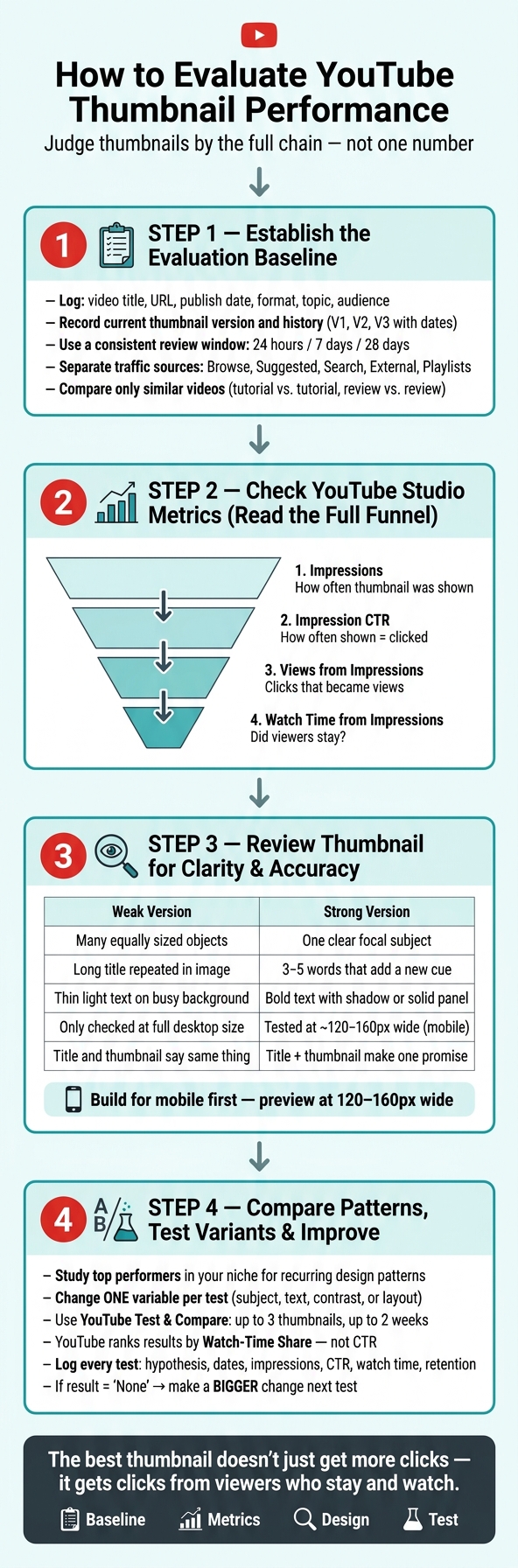
How to Evaluate YouTube Thumbnail Performance: A 4-Step Framework
The Thumbnail Experiment: Using Science to Boost CTR
sbb-itb-b59debf
1. Establish the Evaluation Baseline
Before you try to make sense of any number, log the basics first: video title, URL, publication date, video format, topic, intended audience, the thumbnail now in use, and the main metrics for that review window - impressions, CTR, views, and watch time, plus average view duration or retention when available. Use the same review window you already picked. If you skip this step, launch-day data and week-four data start to blur together.
Start with a simple record of the video and its thumbnail history.
Document the Video and Thumbnail History
Keep a plain log of each thumbnail version - what it looked like, the date it went live, what changed, and why. A simple entry could look like this: Original - Sep. 1; V2 - larger face, shorter text - Sep. 8; V3 - simpler background - Sep. 15. If you update the title and thumbnail at the same time, mark it as a title-and-thumbnail change, not a thumbnail-only update. Otherwise, you won't know which version actually shifted the numbers.
YouTube counts an impression when a thumbnail is shown on YouTube, stays visible for more than 1 second, and is at least 50% visible on screen. That detail matters. Low impression counts can make CTR swing all over the place: 2 clicks from 20 impressions equals 10%, but that number is far less steady than 200 clicks from 2,000 impressions, even though the percentage is the same. Give CTR enough impressions before you judge it.
Separate Traffic Sources Before Judging Results
In YouTube Studio, break out Browse, Suggested, Search, Channel pages, Playlists, and External traffic on their own. Each source reflects different viewer intent, so log impressions, CTR, views, watch time, and retention for each one.
Once you've reviewed results source by source, compare only videos that had similar intent and distribution.
Compare Only Similar Videos
A gaming highlight, a beginner tutorial, a vlog, and a product review might all sit on the same channel, but they pull in viewers for different reasons. Compare videos with similar audience intent, format, topic, length, age, and distribution opportunity. In plain English: compare your last five tutorials to each other, not to one viral hit or a standard upload. If the videos don't match well, treat the comparison as directional, not conclusive.
| Evaluation factor | More reliable | Less reliable |
|---|---|---|
| Review period | Same number of days after publication or thumbnail change | Lifetime results for videos of different ages |
| Traffic source | Browse vs. Browse, Search vs. Search | Blended channel-wide CTR |
| Video type | Tutorial vs. tutorial; review vs. review | Gaming highlight vs. product review |
| Thumbnail version | Clearly labeled V1, V2, V3 | Several undocumented changes |
| Sample size | Results after sufficient impressions | CTR from very few impressions |
| Distribution context | Videos with similar promotion and audience reach | Organic video compared with externally promoted video |
Next, judge whether the thumbnail itself is clear, accurate, and readable at feed size.
2. Check the YouTube Studio Metrics That Matter
Use the same review window you used for your baseline. Then open YouTube Studio and read the funnel from impressions to watch time. Look at the full path: impressions → impression CTR → views from impressions → watch time from impressions.
That full chain tells you a lot more than CTR by itself. If you only look at click-through rate, you can miss what happens after the click. So record all four numbers together before you decide whether the thumbnail should stay as-is, be changed, or be tested. If you decide to iterate, follow a thumbnail A/B testing guide to ensure your changes are data-driven.
Record the Core Reach and Click Metrics
Impressions show how often YouTube counted your thumbnail as shown. But don’t treat that as a full exposure count. Some surfaces and playback situations aren’t included, so impressions work better as a directional signal.
What matters first is the trend. Are impressions going up, staying flat, or slipping? That context changes how you read the rest of the data. For example, if CTR drops while impressions jump, YouTube may simply be showing the video to a broader and colder audience. In plain English: the platform may be pushing the video past your core viewers. That doesn’t always mean the thumbnail got worse.
Views from impressions show how many of those impressions turned into views. This is where things get practical. If impressions look healthy but views from impressions stay low, the problem is often the thumbnail-title combo, not reach alone.
Read CTR Together With Watch Time and Retention
A high CTR with weak watch time usually points to a mismatch. The thumbnail may have promised more than the video delivered, or the opening may have moved too slowly. A video can win the click and still lose the viewer fast. If people bail in the first 30 seconds, the packaging did its job, but the handoff failed.
On the other hand, a moderate CTR with strong watch time and retention often signals better audience fit. That kind of video may not look flashy at first glance, but it tends to pull in the right viewers. Before you swap the thumbnail, check the traffic source mix. A lower CTR can look fine if the audience quality is strong.
Metrics Interpretation Table
| Metric | Measures | Strong or weak movement may indicate | Check next |
|---|---|---|---|
| Impressions | How often the thumbnail was counted as shown | Rising: broader distribution. Flat or falling: limited reach or weaker recommendations | Traffic sources, topic demand, and publishing age |
| Impression CTR | How often a shown thumbnail led to a view | Rising: stronger packaging or better fit. Falling: weaker appeal or colder audience | Thumbnail clarity, title alignment, and impression volume |
| Views from impressions | How many impressions converted to views | Higher: thumbnail converts exposure. Lower: distribution or click conversion is the constraint | Whether the issue is reach or appeal |
| Watch time from impressions | Watch time from impression-driven views | Strong: thumbnail attracts viewers who stay. Weak despite high CTR: overstated promise or poor fit | Average view duration, early retention, and the opening minutes |
| Average view duration | Average minutes watched per viewer | Higher: stronger viewing depth. Lower: slow opening or packaging mismatch | Similar-length videos and the retention curve |
| Audience retention | How well each part of the video holds attention | Strong early: click led to relevant content. Steep early drop: promise not delivered quickly enough | First 30–60 seconds, intro length, and whether the promised subject appears promptly |
Once the numbers show what the thumbnail is actually doing, the next step is to look at the design itself and check whether it’s clear, accurate, and easy to understand at a glance.
3. Review the Thumbnail for Clarity and Accuracy
If the numbers suggest a thumbnail issue, the next step is simple: look hard at the thumbnail itself.
Check Subject Clarity and Visual Hierarchy
A viewer should be able to spot the main subject in about one second. That subject might be a face, product, object, result, or action. Either way, it needs to stand out first.
When too many elements fight for attention with the same size, color, or contrast, the eye has nowhere to land. And when that happens, people may scroll right past it.
A simple way to check this is to blur the thumbnail or step back from the screen. If the focal point disappears, the design likely needs work. Try stripping back the background, removing extra decoration, or making the subject stand apart more clearly from what's behind it. YouTube also suggests staying away from busy designs and using layout methods like the rule of thirds vs. centered compositions. In practice, that usually means this: lead with the subject, add one supporting cue, then branding.
Once the subject is easy to spot, look at the title and image together.
Confirm the Title and Thumbnail Make One Promise
The title and thumbnail should work as one clear promise, with each doing a different job. Good thumbnail text adds something new instead of repeating the title line by line.
For example, a title like "I Tested Budget Noise-Canceling Headphones" pairs well with thumbnail text like "$30 vs. $300" plus a side-by-side product image. The title sets up the topic. The thumbnail adds tension and context.
Then compare that promise with the video itself. Ask what someone would expect to see in the first minute based on the thumbnail alone. Now check the opening minute. If the video delivers something else, the thumbnail is misleading.
After that, look at the design where people will actually see it.
Preview the Design at Feed Size
Build for mobile first. A thumbnail can look crisp at 1280 × 720, then become much harder to read once it shrinks to about 120–160 pixels wide in Home or Suggested feeds.
So don't stop at the full-size file. Export it at full resolution, then shrink it down or check it on a phone. The core pieces, especially the subject, text, and contrast, should still read clearly.
Also check both light and dark mode. Text that looks fine on a white background can fade into a dark interface. A contrast ratio near 4.5:1 between text and background is a good target. Keep faces, headlines, and main objects away from the edges. And leave the lower-right corner open, since YouTube's duration label can block that area.
| Review area | Weak version | Strong version |
|---|---|---|
| Subject | Several equally sized objects with no obvious focal point | One large, recognizable face, object, or result |
| Text | Long title repeated inside the image | 3–5 words that add a clear cue |
| Contrast | Thin light text over a detailed background | Bold text separated with color, shadow, or a solid panel |
| Title relationship | Title and image say the same thing | Title and image make complementary parts of one promise |
| Mobile preview | Details are readable only at full-size desktop resolution | Main subject and message remain clear at approximately 120–160 pixels wide |
| Accuracy | Image implies a result or event absent from the video | Image reflects the actual topic, tone, and payoff |
| Edge placement | Important text or faces touch the frame edges | Key elements remain safely inside the crop and duration-overlay areas |
4. Compare Patterns, Test Variants, and Improve the Next Version
If your review suggests a packaging issue, look at competitor patterns to shape the next test.
Study Recurring Thumbnail Patterns in Your Niche
Start with recent top performers in your niche and topic cluster. Look for repeated choices like subject placement, framing, text length, contrast, simple backgrounds, faces, expressions, arrows, numbers, and color.
The key here is simple: patterns are signals, not proof. A thumbnail style can line up with strong performance without being the reason for it. Channel size, topic demand, timing, title strength, and traffic source matter too. So don’t treat patterns like rules to copy. Treat them like ideas to test.
| Design pattern | Likely viewer signal | Risk | How to adapt it for your channel |
|---|---|---|---|
| One large subject positioned on the left | The subject is immediately recognizable in a feed | May look indistinguishable from competitors | Keep the clear subject placement but use a distinct color treatment or setting |
| Two to four words in large type | The viewer can understand the promise quickly | Text may duplicate the title or become vague | Use a specific benefit or tension point that complements the title |
| High contrast between subject and background | The thumbnail remains legible on small screens | Excessive contrast can look artificial or sensational | Preserve separation while matching the channel's visual identity |
| Expressive face or visible reaction | The video may offer emotion, surprise, or conflict | The expression can feel exaggerated or misleading | Use an authentic expression that reflects the actual video |
| Clear before-and-after composition | The viewer expects transformation or comparison | The result may overpromise what the video delivers | Show a truthful, representative comparison and test the emphasis |
For your next thumbnail test, change one pattern at a time. That makes the result easier to read.
Run Simple Thumbnail Tests With Clear Hypotheses
Turn what you noticed into one clean test.
Pick a single hypothesis and change only one variable. For instance, swapping a three-word headline for one outcome-driven phrase may bring in more qualified clicks because viewers can read it at feed size. Keep the video, title, and audience the same.
YouTube’s Test & Compare feature lets eligible creators test up to three thumbnails and ranks them by watch-time share, not CTR. The test can run for up to two weeks. YouTube then reports Winner, Preferred, or None.
Track every test in a simple log:
- hypothesis
- labels
- dates
- impressions
- CTR
- watch time
- average view duration
- retention
- traffic source
If the result is None, the gap between versions was likely too small to matter. In that case, make a bigger change next time. For example, test a close-up subject against a scene with context instead of comparing two near-identical color tweaks.
Use ThumbnailCreator to Produce Labeled Test Versions
Use ThumbnailCreator to make labeled thumbnail variants fast. Create a version, label it, run the test, and then check the result in YouTube Studio.
Conclusion: A Simple Checklist for Better Thumbnail Decisions
After each test, use this checklist to decide whether to keep, revise, or retest the thumbnail.
Review thumbnails in four steps: document the baseline, read metrics in context, check feed-size clarity, and test one change at a time.
A high CTR by itself doesn't mean a thumbnail worked. The test that wins is the one that earns more watch-time share, because weak retention usually means the wrong viewers clicked.
Use this checklist before you lock in a thumbnail or move to the next test:
| Check | What to confirm |
|---|---|
| Baseline is documented | Topic, publish date, traffic source, and thumbnail version are logged |
| Metrics reviewed | Impressions, CTR, watch time, and retention are reviewed together |
| Design is clear at feed size | Subject is immediately recognizable; text is readable on a phone screen |
| Title and thumbnail make one promise | The two elements complement each other without repeating or contradicting each other |
| Test was structured | One variable changed, hypothesis defined in advance, results logged |
If the result is unclear, make the next test more different, not more complicated.
The goal isn't a bigger CTR number. It's the right click from the right viewer.
FAQs
How many impressions are enough to judge a thumbnail?
Hold off on judging a thumbnail until it has at least 1,000 impressions.
If you want a steadier comparison, a lot of creators wait for 1,000 to 5,000 impressions per variant. That gives each option more of a fair shot instead of calling it too soon.
For A/B tests, 10,000+ total impressions across all variants is the most dependable benchmark. It also helps to let the test run for 7 to 14 days so normal shifts in viewer behavior don’t skew the result.
Should I change the thumbnail if CTR is high but retention is low?
Yes, you should think about changing it.
A high CTR with low retention usually means the thumbnail is pulling people in, but the video isn't matching what they expected. In plain English: people click, then bounce.
That can be a problem on YouTube because watch time matters. If there's a gap between the promise in the thumbnail and what the video delivers, your long-term reach can take a hit.
A better move is to update the thumbnail so it lines up more closely with the actual video. The goal isn't just to get the click. It's to get the right click from viewers who are likely to stick around.
What should I test first in a weak thumbnail?
Start with a quick visual audit. Shrink the thumbnail to 120–160 pixels wide and look at it the way a viewer would. If the text is hard to read or the subject feels muddy, trim the design down.
It also helps to check the bottom-right corner. That’s where the YouTube timestamp sits, so anything important there can get covered up.
If the thumbnail already looks good but still isn’t getting clicks, use ThumbnailCreator to fine-tune contrast, composition, and facial expressions before you run an A/B test.