

How Face Placement Impacts Thumbnail Performance
Where you put a face in a thumbnail can change what people notice first, and that can change clicks.
If I had to boil the research down to a few points, it’s this:
- Faces can help CTR, but not in every niche
- Placement matters after face choice is made
- Left-side or near-center placement often gets early attention
- Large face crops work better than small ones, mainly on mobile
- Eyes and gaze direction matter because people often look where the face looks
- Lower-right placement is risky because YouTube’s timestamp can cover part of the face
- One clear face usually works better than many faces
- Testing one change at a time is the only way to know what works on your channel
A few numbers stand out. One study found 6.8% CTR for thumbnails with faces vs. 4.1% without. Another large study found that, once niche and channel size were controlled for, faces had no steady overall edge. Eye-tracking research also shows strong attention to the center of an image, while many viewers start scanning from the left side. That helps explain why face position can change performance.
Here’s the short version: I’d treat face placement as a layout test, not a rule. Start with a single face, make it large enough to read on mobile, place it away from the lower-right corner, and test whether left, center, or right gives your text or main object more room to do its job.
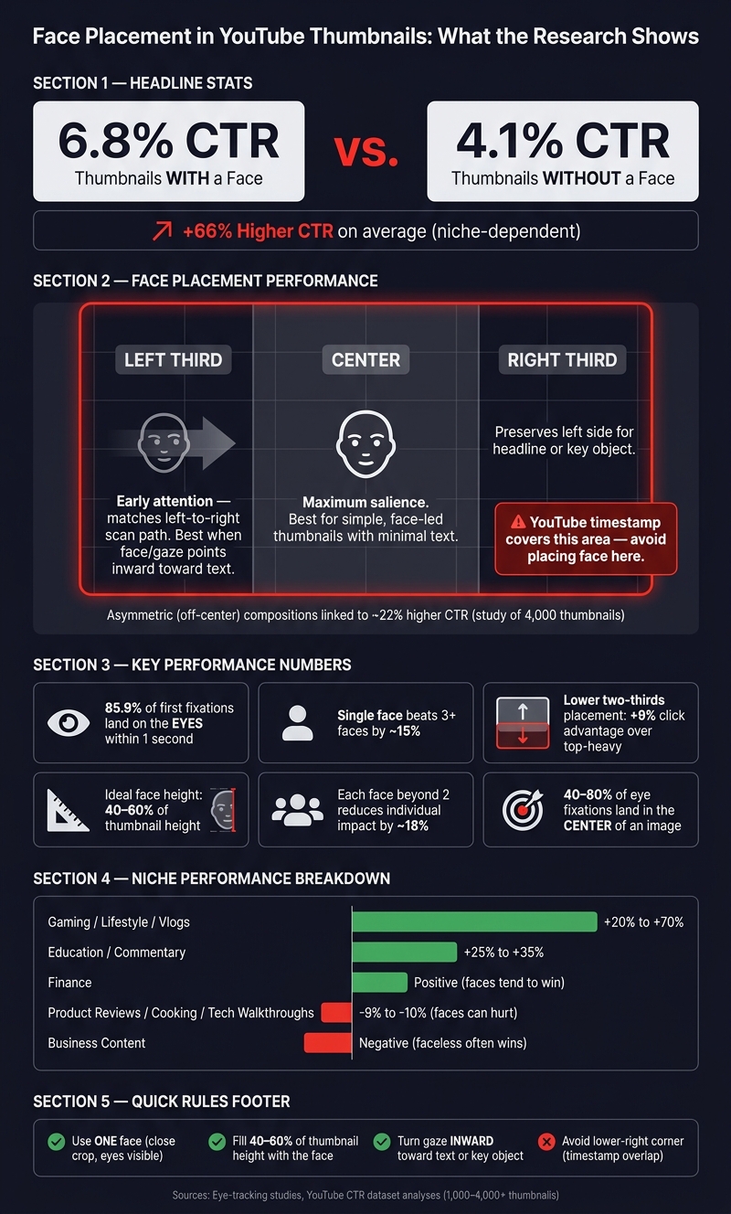
Face Placement in YouTube Thumbnails: What the Research Shows
Quick Comparison
| Factor | What the research leans toward | What I’d do first |
|---|---|---|
| Face thumbnails vs no face | Often better, but niche-dependent | Test by content type |
| Left / center / right | Left and center get early attention; side placement can help layout | Start with left-third vs. center |
| High / low placement | Lower areas can help in busy layouts; lower-right is risky | Keep face clear of timestamp |
| Face size | Bigger crops pull more attention | Use a close crop with clear eyes |
| Gaze direction | Looking toward text/object can guide attention | Turn face inward |
| Number of faces | One face tends to beat crowded layouts | Use one lead face |
If you already use faces in thumbnails, the next question isn’t “should I use a face?” It’s “where should I put it so the whole thumbnail reads fast?”
sbb-itb-b59debf
What Research Says About Faces vs. No-Face Thumbnails
Faces often help, but not in every case. The result shifts by niche, thumbnail layout, and what the viewer wants in that moment. So the next thing to test isn't just whether to use a face. It's where that face goes.
Baseline CTR and Attention Differences Across Niches
Across large YouTube datasets, thumbnails with a clear human face often beat faceless ones when impressions are held constant. One study of 1,000 thumbnails found an average 6.8% CTR for face thumbnails versus 4.1% for thumbnails without faces, which is about 66% higher CTR. But a larger analysis showed a smaller average lift, which tells you the pattern is real but not automatic.
Niche plays a huge role here. In gaming, lifestyle, vlogs, and personal development, face thumbnails tend to beat faceless ones on a steady basis, often by 20–70% in relative CTR. In education and commentary, faces that signal expertise or trust often lift CTR by 25–35% compared with no-face designs.
That said, some categories lean the other way. In product reviews, cooking, and some technical walkthroughs, object-first thumbnails can do better, with face versions testing about 9–10% lower in some cases.
Once researchers controlled for channel size and niche, faces did not show a steady global edge. That matters. It suggests audience intent carries more weight than face presence by itself. In finance, faces tended to do better, while in business content faceless thumbnails often won. So if faces help in your niche, the next step is obvious: test left, center, or right placement.
Why Face Presence Alone Does Not Answer Placement Questions
A face by itself isn't enough to lift clicks. Neutral or generic expressions bring almost no CTR gain over no-face designs, and they can even hurt results if they take up space that could have delivered a stronger visual hook.
Size and framing matter too. Faces that are too small, cropped in an awkward way, or fighting with text for attention tend to weaken the thumbnail. Instead of guiding the eye, they split focus and muddy the message.
Traffic source also changes performance, which is another reason face presence alone doesn't answer the bigger question. A thumbnail that works on the Home feed may not work the same way in Suggested or Search.
So once you've decided a face belongs in the design, placement becomes the part that matters. The real job is making sure the face supports the hook instead of competing with it. This is a core principle of advanced thumbnail optimization. That leads straight to the next test: where the face should sit in the frame.
Visual Attention Studies: Where Faces Get Noticed First
Eye-tracking research shows that people follow fairly repeatable scan paths. So when you change where a face sits in a thumbnail, you also change what viewers notice first. That's a big deal because thumbnails get scanned, not read from left to right like a paragraph.
Center Bias, Left-Side Attention, and 16:9 Frame Scan Paths
Multiple eye-tracking studies point to a strong center bias, with 40–80% of fixations landing in the central area of an image, depending on the content and viewing setup. For YouTube thumbnails, that means a face placed near the center has a better shot at being noticed fast.
There’s also an early left-side tendency in many viewing tasks. In Western reading cultures, people often begin near the upper-left and then move across the frame. On a 16:9 thumbnail, that makes the upper-left or mid-left zone a smart spot for a face if you want it to appear in the first scan path.
Of course, placement alone won’t save it. If the face is too small, it can fall apart on mobile.
How Face Size and Crop Affect Viewer Attention
Eye-tracking studies show that close-up faces pull more attention than medium or full-body shots, especially on mobile. A good rule is to make the face fill about 40–60% of the thumbnail’s height, with the eyes easy to see. Eyes matter most inside the face itself. One study found that 85.9% of first fixations to faces during a 1-second exposure landed on the eyes.
That’s why crop matters so much. If the face hits the viewer’s first scan path fast, and the eyes are clear, the thumbnail has a better chance of supporting the click.
How Gaze Direction Pulls Attention to Text or Other Elements
People tend to follow where a face is looking. A face aimed at text, a number, or a product image can pull attention in that direction. In split layouts, turning the face toward the text side can help guide the eye to the main message.
This matters even more on mobile, where people have less time to process small details. So when you compare A/B testing vs gut feeling for placement, don’t just test whether a face is there. Test where the face is looking too.
Research Summary: Which Face Placements Tend to Perform Better
Once face size and gaze are locked in, placement becomes the big composition choice. There isn't one spot that wins every time. But placement changes what people see first and how easy the thumbnail is to read at a glance.
Left, Center, and Right Placement: What Studies Show
Centered vs rule of thirds data shows that off-center placement often beats dead-center framing. In one analysis of 4,000 thumbnails, asymmetric compositions were linked to roughly 22% higher CTR. That doesn't mean left or right always beats center. It does mean that putting a face on one side of the frame can create a stronger visual setup than placing it right in the middle.
| Placement | Attention Tendency | Best Used When |
|---|---|---|
| Left third | Leaves room for text or a key object on the right | The thumbnail uses a left-to-right reading flow, or the face/gaze points inward |
| Center | Maximizes immediate salience | The thumbnail is simple, face-led, and uses minimal text |
| Right third | Preserves space on the left for a headline or object | The left side holds a strong hook, logo, or scene element |
A simple way to think about it: center placement puts the face front and center, while side placement gives the rest of the thumbnail room to do some work too.
Upper vs. Lower Placement in Crowded Thumbnail Layouts
Vertical position matters most on crowded mobile thumbnails. Faces placed in the lower two-thirds of the thumbnail have shown a 9% click advantage over top-heavy placement.
In practice, top placement can still work better if the lower half is already packed with text, product shots, or other visual elements. The aim is pretty simple: keep the face easy to spot without making it compete with the busiest part of the frame.
One spot needs extra care: the lower-right corner. YouTube's timestamp badge sits there by default, so a face placed too close to that edge can end up partly covered.
Single Face, Multiple Faces, and Overloaded Compositions
Single-face thumbnails beat thumbnails with three or more faces by about 15%. And each face beyond two cuts individual impact by about 18%. That's not hard to picture. When too many faces are fighting for attention, none of them hits as hard.
Two-face layouts can still work well, but usually only when one face clearly leads. Treat these patterns as a starting point for single-variable A/B tests.
How Creators Can Test Face Placement More Efficiently
Treat the research as a starting point, not a final answer. The patterns above give you a solid hypothesis. Your job is to test those ideas on your channel and see what your audience responds to.
A Simple A/B Testing Workflow for Placement Variables
Change one variable at a time. That part matters more than people think.
Create two thumbnail versions that differ only in face position or gaze direction. Keep the photo, font, colors, and text the same. For example, Version A can place the face on the left with the gaze pointed toward the title text. Version B can move the face to the right while keeping that same gaze angle. Everything else should stay identical.
Then wait until both versions have similar impression volume before you pick a winner. If your account has YouTube Studio's thumbnail experimentation feature, use it to split traffic for you. If not, run each version for 48–72 hours and avoid changing the title, promotion, or any other variable during the test.
ThumbnailCreator can help you make controlled variants faster with AI generation, templates, face swapping, text editing, and object swapping.
Key Metrics to Review After Publishing
Once the test is live, don't judge the result by CTR alone. Look at what happens after the click.
Watch time and audience retention show whether the thumbnail matched the video. A close-up might lift CTR, but if viewers drop off in the first 10–30 seconds, that can still hurt performance. YouTube rewards videos that keep people watching, not just videos that earn the click.
Review these metrics together:
- Impressions
- CTR
- Average view duration
- Audience retention
If a new placement lifts CTR and keeps retention steady, that's a win worth writing down. Record both the change and the result so, over time, you build a channel-specific playbook instead of guessing every time.
Conclusion: What the Current Research Actually Supports
The current evidence points to a pretty clear pattern: left-side placement, upper-half placement in crowded layouts, and single person vs multiple people thumbnails all look promising. But results still depend on niche, audience, and content type.
The safest path is controlled testing: one variable, clear metrics, and small, repeated changes. In the end, channel-level results are the measure that counts.
FAQs
Should I use a face in every thumbnail?
Not always. Thumbnails with faces often get a 38% higher click-through rate, but that doesn’t mean every video needs one.
A lot comes down to your niche and what you want the video to do. Finance channels often do well with faces because they can help build trust and make the content feel more personal. On the flip side, some Gaming, Food, and Product Review channels can do better without faces, especially when the game, dish, or product is the main thing viewers care about.
The best move is to test both styles instead of guessing. ThumbnailCreator can help you try different layouts and see what your audience clicks on most.
What face placement is best for mobile viewers?
For mobile viewers, clarity matters most. Thumbnails can shrink to about 120 pixels, so small details get lost fast.
A good rule of thumb is to keep the face at 30%–50% of the thumbnail area. Once it drops below 20%, it can get tough to read on a phone screen.
Placement matters too. Put the face in the lower two-thirds of the frame, and use the rule of thirds instead of dead-center positioning.
How long should I test a thumbnail before judging results?
Judge performance mainly in the first 24 hours. That early stretch matters most.
Research suggests viewers spend about 2.6 seconds analyzing a thumbnail, and high-performing thumbnails get 67% of total engagement during that first window. So if a thumbnail is going to work, you'll usually see signs of it early.
You can use ThumbnailCreator to make a few variations, then compare click-through rates or run A/B tests on things like:
- facial expressions
- layouts
- gaze direction
One more thing: make sure the thumbnail stays clear and easy to read on mobile. If it falls apart on a small screen, you're likely losing clicks before people even think about the video.