

Study: How Thumbnails Impact CTR in Niche Channels
The big point is simple: thumbnail CTR is niche-specific. A gaming thumbnail can get buried on an education channel, while a clean business thumbnail can look flat in entertainment.
Here’s what I’d take from the study right away:
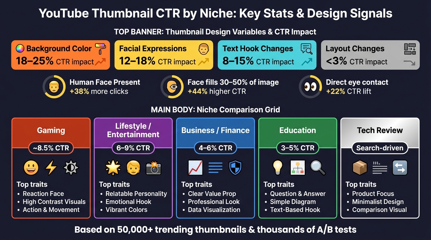
- Background color had the biggest test swings: 18%–25%
- Facial expression changes moved CTR by 12%–18%
- Text hook changes shifted CTR by 8%–15%
- Small layout edits often stayed under 3%
- Thumbnails with a human face got 38% more clicks
- Faces that filled about 30%–50% of the image saw a 44% higher CTR
- Direct eye contact added another 22%
But those numbers don’t mean “use the same thumbnail style everywhere.”
What works depends on why people are browsing.
If I’m making a gaming video, viewers often click for energy, payoff, and reaction.
If I’m making an education or business video, viewers often click for clarity, trust, and a clear outcome.
If I’m making a tech review, the product itself may beat a face, mainly on search traffic.
That’s the main lesson: I’d A/B test thumbnails by niche, not by platform average.
A few patterns stood out across the study:
- Gaming: reaction faces, gameplay moments, strong contrast
- Education: curiosity gaps, custom diagrams, short readable text
- Tech review: product-led thumbnails, minimal text, comparison or result cues
- Lifestyle / entertainment: personality-led visuals and fast visual payoff
- Business / finance: clean type, calm framing, authority signals
The 3 Thumbnail Layouts Winning on YouTube in 2026
sbb-itb-b59debf
Quick Comparison
YouTube Thumbnail CTR by Niche: Key Stats & Design Signals
| Niche | Typical CTR Pattern | Thumbnail cues that tended to work |
|---|---|---|
| Gaming | Higher CTR, around 8.5% | Reaction faces, action moments, bold contrast |
| Education | Lower CTR, about 3%–5% | Curiosity, diagrams, clean readable text |
| Tech Review | Search-led pattern | Product as hero, short text, result-focused cue |
| Lifestyle / Entertainment | Often 6%–9% | Personality, reactions, aspirational visuals |
| Business / Finance | About 4%–6% | Clean typography, trust cues, calm visuals |
So if I wanted a short action plan from this study, it would be this:
- Test background color first
- Then test face vs. product focus
- Then test the text hook
- Keep the layout simple
- Measure results by traffic source and niche
In short: CTR is less about “best design” and more about viewer fit. The thumbnail has to match what your audience expects to see before they click. This balance is key to avoiding clickbait while staying authentic.
Research Method and Data Scope
To figure out which thumbnail signals actually change CTR, the study looked at more than 50,000 trending thumbnails and paired that with thousands of A/B tests.
Sample Size, Date Range, and Niche Categories
The dataset includes more than 50,000 trending thumbnails plus thousands of individual A/B tests.
It spans six niche categories:
- Gaming
- Tech
- Education
- Lifestyle
- Business
- Finance
Those niches were picked because viewer intent changes a lot from one category to the next. Someone clicking a Gaming video often reacts to very different cues than someone sizing up a Finance video. That difference matters when you're trying to see what drives a click.
CTR Measurement, Impression Thresholds, and Traffic Filtering
CTR was measured by comparing control thumbnails against live A/B tests. Each test ran for at least 48 hours, which helps cut down low-volume noise. The data was also segmented by channel size, niche, and content type.
That setup makes the design-variable results below easier to compare across niches.
The table shows the measured CTR impact of each variable.
| Variable Tested | Average CTR Impact |
|---|---|
| Background Color | 18–25% |
| Facial Expressions | 12–18% |
| Text Changes | 8–15% |
| Layout Changes | <3% |
CTR Patterns by Thumbnail Design Element
Across the study’s six niche categories, the clearest patterns came from three buckets: faces, expressions, and subject focus; text length, contrast, and readability; and layout simplicity, branding, and curiosity cues.
Faces, Expressions, and Subject Focus
Thumbnails with at least one human face got 38% more clicks than thumbnails without one. When the face took up about 30% to 50% of the thumbnail, CTR was 44% higher than with smaller faces that were tougher to make out. Direct eye contact added another 22% CTR lift.
That said, this wasn’t universal. In tech review, product-led thumbnails often beat face-led ones, especially for search traffic. So the big idea isn’t just “use faces.” It’s simpler than that: the main subject of the thumbnail needs to line up with what the viewer came for.
Text Length, Contrast, and Readability
Short text overlays with 3 to 6 strong words in large, bold type beat longer phrases again and again. Once text went past about 8 to 10 words, thumbnails started to feel cramped and harder to read.
Contrast also mattered. If people can’t read the text at mobile size, the rest doesn’t matter much. In gaming and entertainment, glow or stroke effects around letters helped. In education and business, a solid color band or semi-transparent strip behind the text worked better and fit the cleaner visual style.
The best cue still shifts by niche, which becomes clearer in the breakdown below.
Layout Simplicity, Branding, and Curiosity Cues
Small layout tweaks moved CTR by less than 3%, so layout is a lower-priority thing to test. What had more impact was whether the thumbnail gave the eye one clear focal point. When too many elements fought for attention, CTR usually dropped across almost every niche in the study.
One pattern stood out: the same visual cue didn’t work the same way everywhere. Curiosity hooks like specific numbers - “5 Steps,” “$50 vs. $500” - and before/after images drove strong CTR lifts in lifestyle, gaming, and entertainment. In education and business, they still helped, but the gains were more moderate and worked best when tied to the actual structure of the content.
| Thumbnail Trait | Gaming / Entertainment | Education / Business | Tech Review |
|---|---|---|---|
| Close-up face, strong expression | High CTR lift | Moderate; calm expressions preferred | Low–Moderate |
| Object/product as hero | Moderate | Moderate–High | High CTR lift |
| 3–6 word bold text overlay | Moderate | High | High |
| Clean single-focus layout | High | High | High |
| Specific numbers as curiosity cue | High | Moderate | Moderate |
| Before/after imagery | Moderate | High | Low |
| Consistent brand colors and framing | Low–Moderate | High | High |
How CTR Patterns Differ Across Niches
Thumbnail cues don’t work the same way in every niche. What gets clicks for a gaming channel can fall flat for a business video. That’s where generic thumbnail advice starts to crack. The same design move can win in one feed and lose in another.
Education, Gaming, and Tech Review Channels
In education, curiosity gaps vs direct value strategies tend to pull people in. Viewers want to feel there’s something useful or surprising on the other side of the click. That’s one reason custom diagrams and illustrations beat stock photography by 31% in this niche. Educational thumbnails usually land in the 3%–5% CTR range, and one benchmark puts the figure at 4.5%.
Gaming is a different beast. It reacts more to energy and payoff than trust cues. Gaming channels average about 8.5% CTR, which is well above most info-heavy niches. In practice, that means the thumbnail has to show a clear moment: a win, a fail, a shock, or some other instant payoff. If that signal isn’t obvious, it gets buried in a crowded feed.
Tech review sits closer to product marketing. Here, the thumbnail usually works best when the product is the main subject and the message is easy to read at a glance. Minimal text, plus a clear outcome cue like a comparison, surprise result, or spec callout, tends to do best.
Lifestyle, Entertainment, and Business Channels
Lifestyle and entertainment channels lean hard on personality. Face-first layouts, strong reactions, and aspirational visuals tend to pull more clicks because viewers respond to personality-led signals. But there’s a catch: people still need to grasp the video idea in a split second.
Business and finance play by different rules. These audiences are often more cautious and more focused on information, which helps explain CTR averages of about 4%–6%. Authority cues matter more here than emotional hooks. Clean typography, blue or green color palettes, and professional framing tend to help. The thumbnail needs to say, fast: this is worth your time and you can trust it.
| Niche | Avg. CTR Range | Strongest Thumbnail Traits |
|---|---|---|
| Gaming | ~8.5% | Reaction faces, gameplay moments, high contrast |
| Entertainment / Lifestyle | 6–9% in entertainment/vlog-style channels | Personality-forward, aspirational visuals, creator branding |
| Education | ~3%–5%; 4.5% reported in one benchmark | Curiosity gaps, custom diagrams, blue/green palette |
| Business / Finance | ~4%–6% | Authority cues, clean typography, trust-signaling colors |
| Tech Review | Search-driven; product-led | Product as hero, minimal text, outcome-focused cue |
Use these niche differences to figure out which variables to test first.
What Niche Creators Should Do Next
Which Variables to Test First on Your Channel
Start with the thumbnail elements most likely to change CTR. Background color tends to create the biggest swings, at 18% to 25%, so it makes sense to test that first. Facial expressions are next, with expression changes shifting CTR by 12% to 18%. Bigger changes to the text hook can move CTR by 8% to 15%, depending on the niche. By contrast, small layout edits usually don't do much and often stay under 3%.
The key is to test one variable at a time. If you change three things at once, you won't know what did the work. Let each test run long enough to get past the early noise. Then check YouTube Studio → Analytics → Reach to spot which videos and traffic sources should be tested first.
Your own niche should be the standard you measure against. A face-led thumbnail might work in one space and fall flat in another. In education, tech, and business, viewers often look for different signals. So start with niche-based tests, then use your own analytics to fine-tune from there.
Applying the Findings Faster With ThumbnailCreator
Speed matters, but only if you can make new versions without a ton of extra work. ThumbnailCreator helps with that through AI generation, templates, face swapping, and object swapping. In plain English, it lets you make face-led and object-led versions faster, then try different text hooks without slowing down your workflow.
Conclusion: Key CTR Lessons From the Study
The main takeaway from the research is pretty clear: thumbnail CTR depends on the niche. Some variables show repeatable patterns, but their effect changes from one niche to another. That’s why the smartest move is to test the highest-impact variables in your space and let your own CTR data guide the next step.
FAQs
How long should I run a thumbnail test?
Run a thumbnail test for 3 to 14 days, but put more weight on data volume than the calendar.
Don’t make a call too early. Wait until the video gets at least 500 to 1,000 impressions before you judge the result. If you want more confidence, some analyses suggest aiming for 2,000 to 5,000 impressions per variant.
Channel size changes the pace. Larger channels may get steady results in 24 to 48 hours, while smaller channels may need 1 to 2 weeks to gather enough data.
Should I optimize thumbnails by traffic source?
Yes. Viewer intent changes based on where people find your video, so thumbnails often perform differently by traffic source.
In subscriber feeds, you may see 8% to 15% CTR because people already know you and have some trust in your content. Suggested videos are a different story. Those often land around 2% to 6% because viewers are busy watching something else and your thumbnail has to pull their attention away.
What should I test first on a small channel?
Start with background color and overall image brightness. Those two usually have the biggest CTR impact, often in the 18% to 25% range.
After that, test facial expressions. Then move to major text changes instead of tiny wording swaps that barely move the needle.
Stick to one variable at a time. And give each test at least 48 hours to run.