
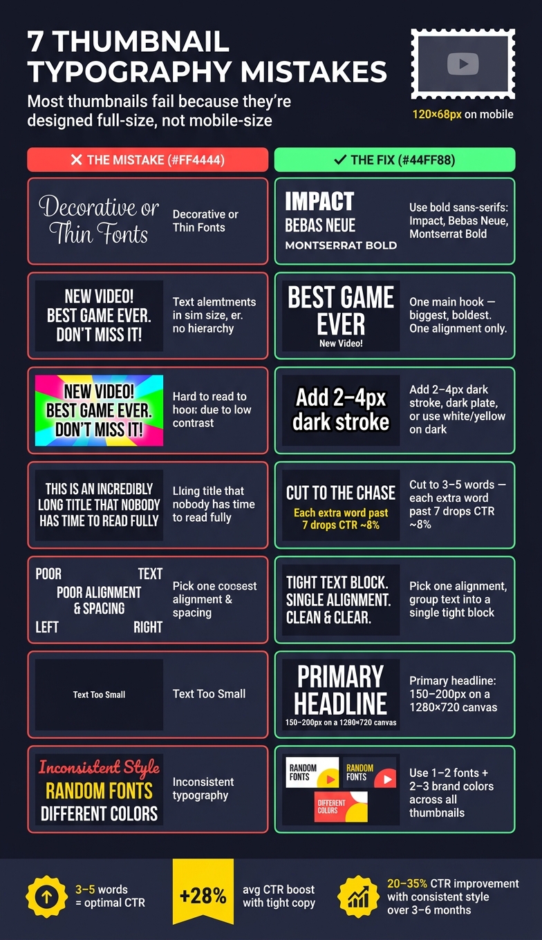
7 Typography Mistakes in Thumbnails
Most thumbnail text fails for one simple reason: it’s made to look good full size, not to read at mobile size.
If I boil this down, the fix is simple: use fewer words, bigger bold fonts, stronger contrast, cleaner spacing, and one repeatable style. That matters because many views happen on mobile, where thumbnails may appear around 320 × 180 pixels or even shrink near 120 × 68 pixels. At that size, thin fonts, weak contrast, and crowded copy fall apart fast.
Here’s the full checklist of thumbnail mistakes to avoid:
- Fonts are too decorative and get hard to read when small
- No text hierarchy so nothing stands out first
- Low contrast makes words blend into the image
- Too many words turn the thumbnail into a second title
- Bad alignment and spacing make the layout feel off
- Text is too small for mobile screens
- Fonts and styles change too much from one thumbnail to the next
A few numbers stand out:
- 3–5 words tends to be the sweet spot
- 7+ words can hurt click-through rate
- A 2–4 px outline can help text stand off the background
- On a 1,280 × 720 thumbnail, main text often needs to be around 150–200 px
- A monthly review of your last 30 days of thumbnails can help keep your style steady
7 Thumbnail Typography Mistakes: Quick Fix Guide
A Simple Way for You to Pick Easy-to-Read Thumbnail Fonts
sbb-itb-b59debf
Quick Comparison
| Mistake | What goes wrong | Simple fix |
|---|---|---|
| Decorative fonts | Hard to read when small | Use bold sans-serif fonts |
| No hierarchy | Viewer doesn’t know where to look | Make one phrase the main focus |
| Low contrast | Text blends into background | Compare high vs low contrast and add outline, shadow, or dark backing |
| Too many words | Text gets crowded | Cut to 3–5 words |
| Poor spacing/alignment | Layout feels messy | Keep one alignment and add breathing room |
| Small text | Fails on mobile | Increase font size and weight |
| Style inconsistency | Thumbnails look disconnected | Use the same 1–2 fonts and colors |
If I’m checking a thumbnail fast, I shrink it down and ask one question: can I read the main hook in under a second? If not, the typography needs work. For more fundamentals, see our YouTube thumbnail beginners guide.
Why Thumbnail Typography Goes Wrong
A lot of creators handle thumbnail text at the very end, after the image and colors are already locked in. That sounds harmless, but it often leads to weak results. Instead of pulling people in, the text ends up summarizing the video or repeating the title. That’s usually the wrong job for thumbnail text. It should spark curiosity.
The workflow gets even messier when the design is made using a desktop-first vs mobile-first approach. A thumbnail can look fine on a desktop monitor and still fall apart on mobile, where most people will see it first. Small text, cluttered layouts, and poor spacing show up fast.
When text is rushed, built for the wrong screen, and written to explain instead of tease, the outcome is predictable: a thumbnail that looks busy but says almost nothing. The image may be strong, but messy or hard-to-read text adds friction - and friction makes people keep scrolling.
These issues show up again and again in the seven mistakes below, starting with fonts that are too decorative.
1. Using Fonts That Are Too Decorative
Decorative fonts - thin serifs, handwriting styles, and ornate display fonts across various thumbnail styles - may look fine on a desktop screen. But thumbnails usually get seen on mobile, where small text and delicate strokes become hard to read fast. Instead of helping the design, that kind of typography turns into clutter that people can't scan in a split second.
The fix is simple: judge readability at thumbnail size, not full size.
Use the postage stamp test: shrink the thumbnail to about 120×68 pixels while you're designing it. If the text isn't instantly readable, the font is too decorative or too thin.
For main text, stick with bold sans serifs like Impact, Bebas Neue, Anton, or Montserrat Bold.
Once the font is readable, the next thing to check is hierarchy: what should viewers read first?
2. No Clear Text Hierarchy
When every word in a thumbnail has the same size, weight, and color, viewers don't know where to look first. And on a thumbnail, that's a problem. The hook needs to land in less than a second.
Text hierarchy fixes that. It tells the eye what to read first, then what to read next.
Keep it simple: one thumbnail, one main idea. Make the hook the biggest thing on the screen. Keep any supporting text smaller, and keep branding subtle. Use one bold font for the hook and a simpler font for the rest. Once you go past two fonts, the layout gets harder to scan.
A quick way to check this is the squint test. Blur your eyes until the thumbnail is tough to read. If the main word or phrase doesn't jump out right away as the top element, your hierarchy isn't doing its job.
But hierarchy alone isn't enough if the text fades into the background.
3. Low Contrast Between Text and Background
Mobile thumbnail optimization is critical because low contrast tends to fail first on small screens. And that matters because thumbnails can shrink to just 120–168 pixels wide. At that size, text that looks fine on desktop can turn into a blurry mess. If people can't read it right away, clicks drop fast.
The fix is usually simple: give the text more separation from the background. That can mean a 2–4px dark stroke, a dark plate behind the text, or using white or yellow text on a dark background.
| Contrast Fix | Best For | How to Apply |
|---|---|---|
| Dark Stroke (2–4px) | Busy footage | Outline around light text |
| Drop Shadow | Smooth gradients or simple backgrounds | 3–5px offset, 50–80% opacity |
| Dark Plate | Very busy or high-detail backgrounds | Semi-transparent dark box, 20–40% opacity |
| White/Yellow on Dark | Universal, mobile-first designs | No extra effects needed |
But contrast isn't just about color choice. Placement matters too. Even high-contrast text can fail if it sits in the wrong area or lands over a bright patch in the image.
A good gut check: shrink the thumbnail to 160×90 pixels and squint. If the text doesn't pop at a glance, the contrast needs more work. Also check the area directly behind the text, not just the image as a whole. A single bright spot behind one word can wreck legibility, even if the rest of the thumbnail looks dark enough.
One more thing: avoid the bottom-right corner. YouTube's timestamp can cover the text.
4. Fitting Too Many Words Into the Thumbnail
A lot of creators treat the thumbnail like a second title. They squeeze in a full sentence and try to explain the video before anyone even clicks. But that’s not what thumbnail copy is there to do. When you add too much text, it fights the image instead of backing it up.
People scan thumbnails in less than a second. More words mean smaller text, and smaller text gets messy fast. At thumbnail size, crowded copy turns into visual noise. Thumbnails with 3–5 words tend to do best. Once you go past 7 words, CTR drops by about 8% for each extra word. That’s why the thumbnail should carry just one strong idea.
Use the title for context and the thumbnail for the hook, balancing clickbait vs authentic thumbnails. Don’t repeat the title inside the image. Fewer words push you to sharpen the hook, which is usually a good thing. After the wording is tight, the next problem is often the layout itself. It can start to feel cramped or off-balance.
Shrink the thumbnail to 120×68 pixels. If you can’t read it right away, cut words.
| Words | Mobile Readability | CTR |
|---|---|---|
| 3–5 | Optimal | +28% average boost |
| 6–7 | Moderate | Average |
| 8+ | Poor | –8% per extra word |
5. Uneven Alignment and Spacing
After you cut the copy down, alignment and spacing do a lot of the heavy lifting. They decide whether the thumbnail looks clean at a glance or just feels off. This is especially true for vlog thumbnails where personal connection relies on a polished look. The main problem is usually a shaky text block. If one line is centered and the next is left-aligned, the eye doesn't get a clear place to start.
The fix is simple: choose one alignment and use it across the whole text block. For most English-language thumbnails, left alignment works best. Center alignment makes sense only when the phrase is very short.
Once the text reads as one unit, look at where it sits on the thumbnail. If it's jammed against the edges or pushed into the main image, the whole design starts to feel crowded. That kind of crowding makes the thumbnail seem rushed and uneven. A good rule of thumb: place the text opposite the subject. And keep the bottom-right corner open, since YouTube's timestamp can cover text there.
| Alignment Issue | What It Does to Viewers | Quick Fix |
|---|---|---|
| Mixed alignments | Eye can't find a starting point | Use one alignment throughout the whole block |
| Floating words | Text looks accidental, not intentional | Group all lines into a single, tight unit |
| Cramped spacing | Feels rushed and unpolished | Add breathing room between text and edges |
| Text in bottom-right | Covered by YouTube's timestamp | Keep that corner clear of essential text |
6. Text That Is Too Small to Read
Good alignment and strong contrast can only do so much. If the text is too small, people won't read it.
This gets missed all the time. A thumbnail can look fine on a desktop screen, then fall apart once it shows up in a feed. And that matters, because over 70% of YouTube views happen on mobile devices. In some mobile search results, thumbnails can shrink to about 120×68 pixels. At that size, thin or tiny text is a lost cause.
A simple fix is the shrink test. Before you publish, resize your thumbnail preview to around 160×90 pixels. Then look at it cold. If the main text isn't easy to read right away, the text is too small or the font weight is too light.
Bold, thick sans-serif fonts like Impact, Bebas Neue, or Montserrat Extra Bold tend to hold up better after compression than lighter options.
For a 1,280×720 canvas, use this sizing guide:
| Text Element | Recommended Size | Purpose |
|---|---|---|
| Primary Headline | 150–200px | Main hook; must read at 120px wide |
| Secondary Text | 80–120px | Supporting detail; use sparingly |
| Essential text minimum | 100px | Absolute floor for essential text |
| Text Stroke/Outline | 2–4px | Helps separate text from busy backgrounds |
Once the size is dialed in, check the next thing: whether the same font and weight stay consistent across thumbnails.
7. Inconsistent Fonts and Style Across Thumbnails
Once your text is easy to read, the next typography check is consistency. If every thumbnail uses different fonts, colors, and text effects, your channel stops feeling like one clear series. And when that happens, returning subscribers are less likely to spot your content right away.
That doesn't mean every thumbnail should look the same. It means you need a simple system you can repeat. A repeatable setup makes your channel easier to recognize at a glance.
A good place to start:
- Pick 1–2 fonts and use them every time. One bold font for headlines. One clean font for support text.
- Choose 2–3 brand colors and use them again and again for text, outlines, or small accents.
That kind of visual pattern matters more than people think. Channels that use a consistent thumbnail system can see a 20% to 35% improvement in average CTR over 3 to 6 months.
It also helps to keep a small brand kit. This can be as simple as a note or doc with your exact font names, HEX codes, and 2–3 thumbnail templates you rotate between. That way, you don't slowly drift into a new style every few weeks without noticing. If you want to move faster, ThumbnailCreator can help with templates and text editing tools.
Quick Fix Table for Common Thumbnail Text Problems
Need a fast cleanup pass? Use this table to spot the issue and fix it fast, or follow our AI thumbnail generation guide for a fresh start. Each row lines up with one of the seven problems above.
| Mistake | Why It Hurts | Practical Fix |
|---|---|---|
| Too many words (7+) | Too much to process | Trim to 3–5 words |
| Low contrast | Text gets hard to read | Add a 2–4 px black outline or a dark overlay behind the text |
| Small or thin fonts | Becomes unreadable at small sizes | Switch to bold sans-serif fonts like Impact, Bebas Neue, or Montserrat Extra Bold |
| Bottom-right placement | YouTube's timestamp covers it | Move all key text to the top or left side of the frame |
| Uneven alignment | The layout feels messy | Group all text into one aligned block and stick with one alignment style |
| Repeating the video title | It adds clutter and says the same thing twice | Use the title for context and the thumbnail text for a short emotional hook |
| No text hierarchy | Nothing stands out | Make one line the main focal point and keep any extra text minimal |
Here’s a simple check: shrink the thumbnail to about 120 px wide. If the text isn’t easy to read right away, cut it down.
How to Keep Thumbnail Text Clear and Consistent
A quick fix can clean up one thumbnail. A simple system keeps the next ten from going off track.
The hard part isn't picking a better font once. It's staying consistent from upload to upload. If your text style keeps shifting, your thumbnails can start to look scattered fast.
Set up one thumbnail system and stick with it. Use 1–2 bold sans-serif fonts, keep a fixed color palette, and apply the same layout choices every time. That way, your thumbnails start to feel connected instead of random.
Templates help a lot here. They take the guesswork out of repeat decisions and make your process easier to stick with.
ThumbnailCreator can automate layouts, text styling, and mobile previews to keep thumbnails consistent without manual setup.
Once a month, review your last 30 days of thumbnails. Look for drift in:
- font choice
- color use
- text placement
If something starts to slip, fix it early before that inconsistency shows up across your channel.
Conclusion
Good thumbnail typography comes down to a handful of habits: use fewer words, pick bold fonts, create strong contrast, leave clean spacing, and keep a steady look across your channel. Do that, and your text stays easy to read at thumbnail size.
Short text almost always wins. Keep your thumbnail copy as tight as you can - just enough to sell one idea. Then check it at the size people will see. Before you publish, shrink the thumbnail to about 168 × 94 pixels and make sure the text is clear at a glance on mobile.
FAQs
How do I test thumbnail text for mobile?
Resize your thumbnail to 168 × 94 pixels before you publish. Another simple check: view it at 10% scale.
If the text feels hard to read at that size, trim it down to 3–5 words or make the font larger. Small thumbnail text can fall apart fast, especially on mobile.
You can also use the squint test: step back, squint, and see if the message is clear right away. If you have to work to figure it out, your viewers will too.
ThumbnailCreator can help by showing mobile-ready previews and using AI tweaks to improve readability.
What font size works best for YouTube thumbnails?
For a 1,280 × 720 thumbnail, your main headline should usually be 150 to 200 pixels tall. That works out to about 20% to 30% of the total thumbnail height.
But here’s the part that matters most: the text still needs to be easy to read when the thumbnail shrinks to just 120 to 168 pixels wide. If the words get hard to read at that size, make the font bigger or use fewer words.
Should thumbnail text match my channel branding?
Yes. When your thumbnail text lines up with your channel branding, people can spot your content faster in a crowded feed.
Stick with the same fonts, colors, and text placement across uploads. A simple style guide, plus one or two main fonts, can keep your thumbnails consistent, easy to read, and polished.